Daily Report : TradingEdge Weekly for May 5 - New uptrends, big money skepticism, bond seasonality

| View/Print a PDF version of this Report |
Headlines
|
TradingEdge Weekly for May 5 - New uptrends, big money skepticism, bond seasonality: This week, we saw a new long-term trend buy signal for the S&P 500, but Big Money investors still don't seem to be buying into it. Retail investors continue to shovel money into cash equivalents. Many industries continue to underperform the S&P 500, and on the Nasdaq, "breadth" has reached a new low. We also look at seasonal influences on Treasury bond prices. |
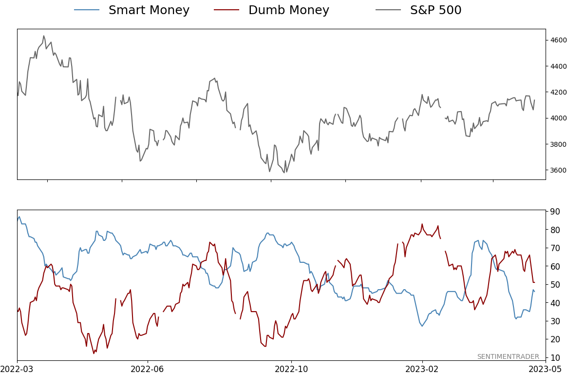
Smart / Dumb Money Confidence
|
|
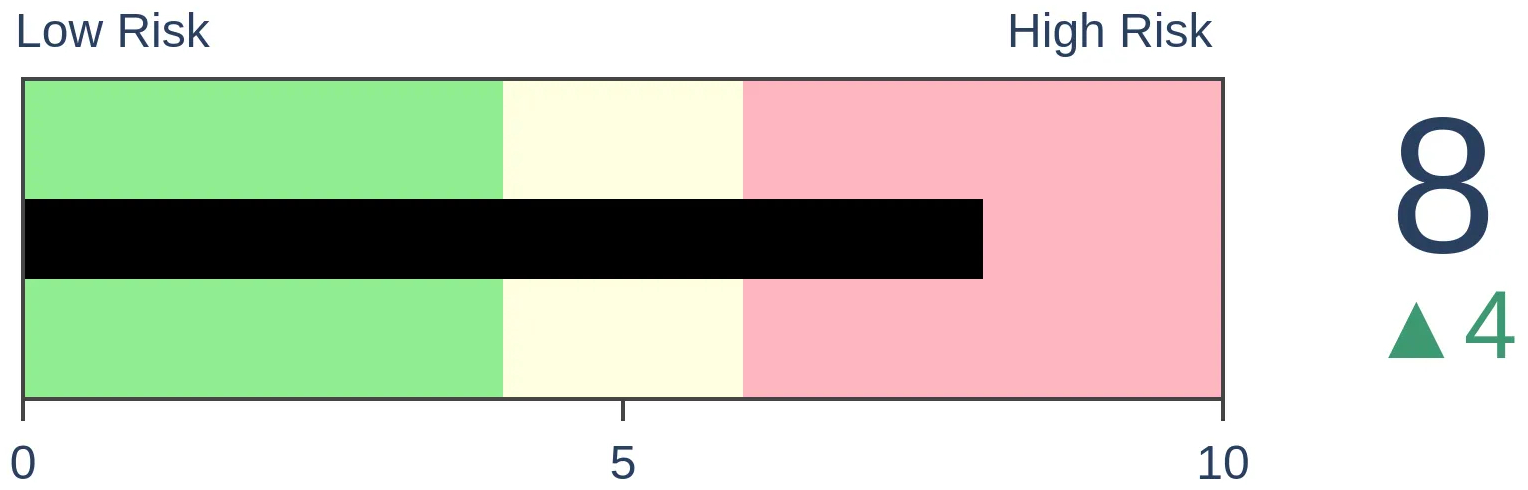
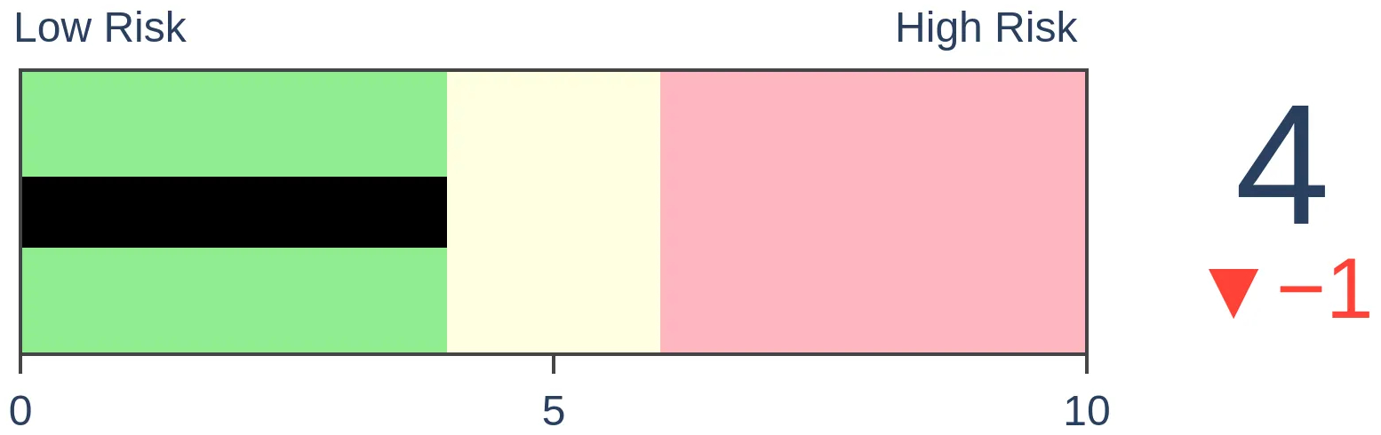
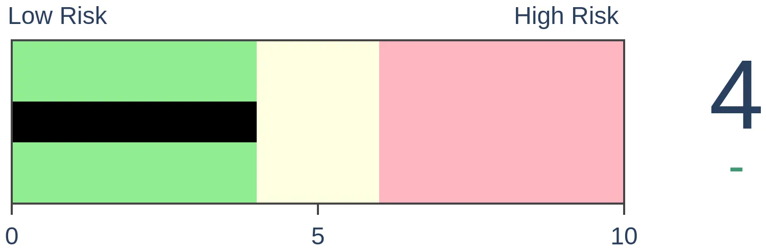
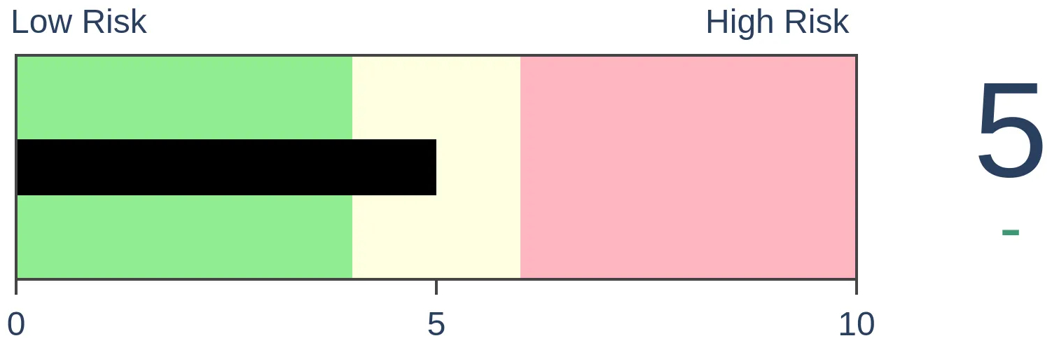
Risk Levels
|

|
|

Research
TradingEdge Weekly for May 5 - New uptrends, big money skepticism, bond seasonalityBy Jason GoepfertBOTTOM LINEThis week, we saw a new long-term trend buy signal for the S&P 500, but Big Money investors still don't seem to be buying into it. Retail investors continue to shovel money into cash equivalents. Many industries continue to underperform the S&P 500, and on the Nasdaq, "breadth" has reached a new low. We also look at seasonal influences on Treasury bond prices. FORECAST / TIMEFRAME |
Key points:
- The S&P 500 has triggered a new long-term trend buy signal
- Investors continue to shovel money into cash
- The Big Money isn't buying into the idea of a new bull market
- Industries are underperforming the S&P 500 index
- The average Technology stock is underperforming, thanks to big rallies in big stocks
- Corporate insiders are showing more interest in Tech and Financials
- A new low in Nasdaq's Cumulative Advance/Decline Line
- Sector seasonality for May
- There has been a big spike in new lows among Energy stocks
- Looking a presidential election seasonality in T-bond futures
- T-bonds have also shown a consistent intra-year seasonal bias
A new long-term trend buy signal
The most benchmarked index in the world continues to recover. Dean showed that a composite that contains ten trend-following indicators cycled from -4 to +9, and similar reversals over the past 100 years preceded outstanding returns for the S&P 500.
With April coming to a close, a composite trend model that uses monthly data for the S&P 500 increased to a bullish score of +10, triggering a trend change buy signal for a member of the TCTM Composite Confirmation Model. The new alert represents the 35th signal since 1922.
The monthly composite trend model eliminates intra-month noise, which helps to see the big picture more clearly. The composite assigns an individual score of +1 or -1 to each of the ten components in the model.
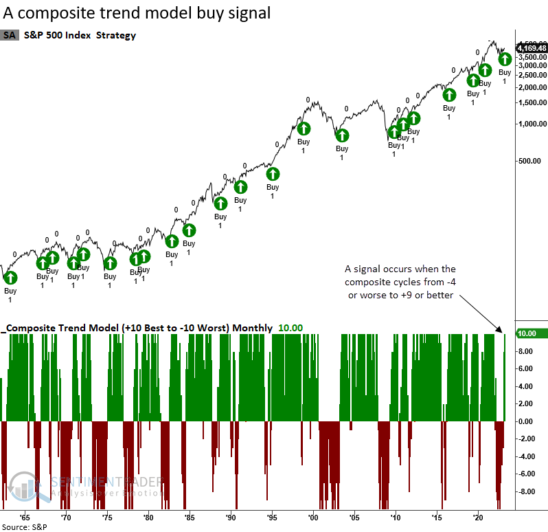
When the composite trend model cycles from -4 or worse to +9 or better, the S&P 500 rose 91% of the time over the next six months. Since 1922, only two signals showed a loss in the six and twelve-month time frames, both in the pre-1950 era.
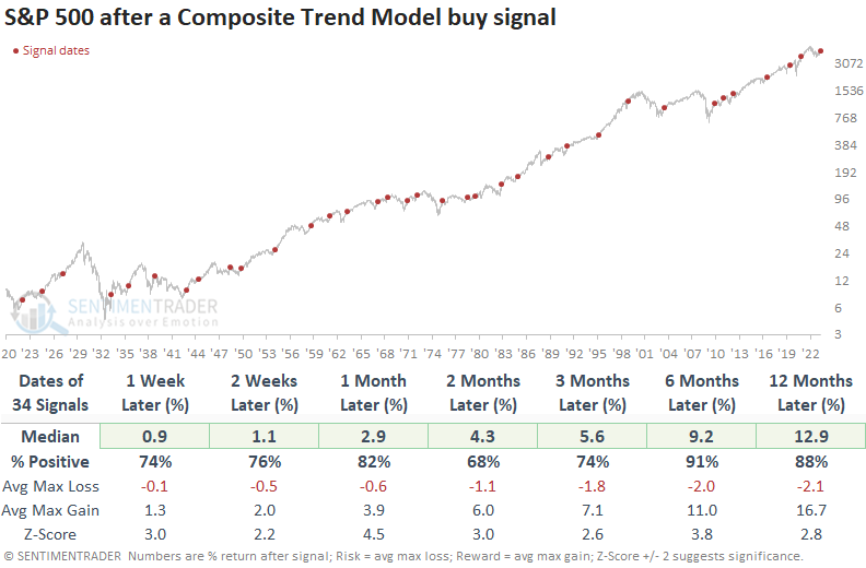
Only two signals preceded a maximum loss greater than -10% within the next six months, and four within twelve months.
The Composite Confirmation Model signal count increased to 30% with the new trend change signal. While still below the threshold level for an alert, it's moving in the right direction.
Investors continue to shovel money into cash
Investors have been shoving money into cash, and there's no slowdown in sight.
According to the Federal Reserve, retail investors held more than $1.3 trillion (with a "t") in money market assets as of early April. That is, by far, a record high.
Perhaps the most notable aspect is the drastic growth rate in these assets over the past year. The only other time in 40 years when money market assets grew by more than a third was February 1990, also when the country was dealing with a banking crisis and a near-doubling of interest rates in the years prior.
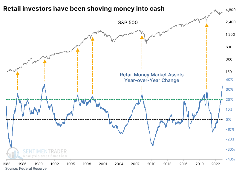
Avoiding the circular argument about "cash on the sidelines," whenever there has been a rush of cash into money market funds, the medium-term performance of the S&P 500 has been quite good. The biggest caveat is 2008, which was decidedly not.
Assets were growing by more than 20% year-over-year by January of this year, so the table below looks at longer-term returns. Outside of 2008, returns were positive, with particularly outsized gains over the next two years.
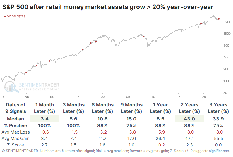
Other markets didn't respond nearly as favorably. Over the next nine months, Treasury note prices, gold, and commodities generally showed consistent losses, typically in concert with a rising dollar.
Technology and Health Care tended to show some of the strongest returns among sectors and factors. Thanks in part to 2008, the Defensive sector held up the best, as did Large-Cap stocks. Also, thanks to solid returns outside of 2008, Growth stocks sported the best returns one and two years later.
The Big Money isn't believing a new bull market
Twice each year, we usually update the sentiment among some of the largest money managers in the world. For more than 20 years, Barron's has been polling these managers to get their takes on markets. And lately, they have not had much conviction toward stocks.
Only 8% more managers consider themselves bullish than bearish. That's the 2nd-lowest spread in the history of the survey. The only time sentiment was lower was during the fall 2019 survey, after which the S&P 500 surged for a few months before falling into the pandemic panic.
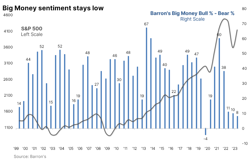
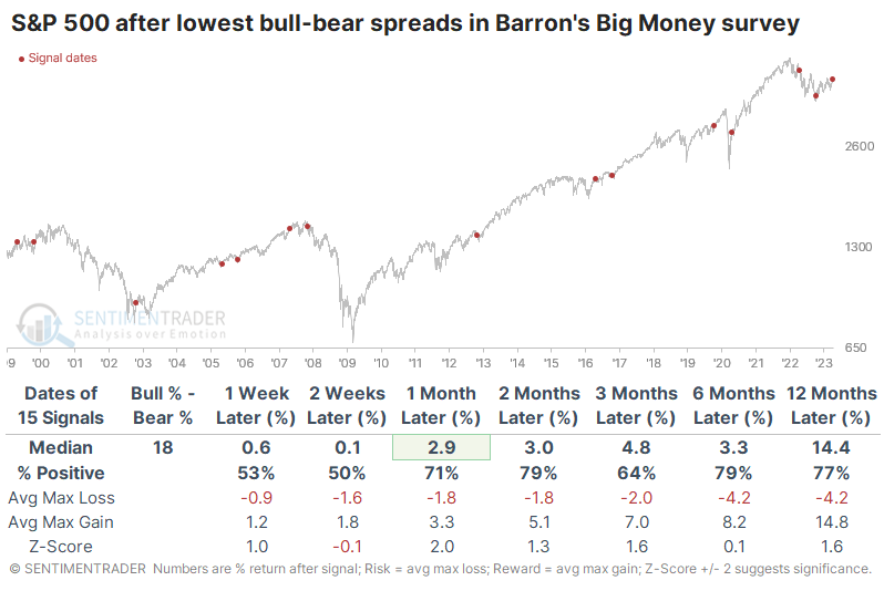
The table below shows returns in the S&P 500 after the lowest spreads between bulls and bears in the Big Money survey. Because the poll is conducted consistently in the spring and fall, some returns are due to seasonality. Over the next two months, the index rallied after 13 out of 15 signals, though two losses were significant.
The Barron's survey confirms some other indicators that large investors aren't too keen on stocks. Commercial hedgers hold about $174 billion worth of major equity index contracts in the futures market. Large speculators are on the opposite side of most of those, meaning they're net short a record amount.
In the options market, across all U.S. exchanges, large traders continue to focus heavily on buying put options to open. The LOBO Put/Call Ratio (Large-Only Buy-to-Open) has ticked up again and remains in the upper 30% of all readings since 2000. The S&P 500's annualized return when the ratio is above 94% is over +15%, drastically outperforming weeks when the ratio is lower.
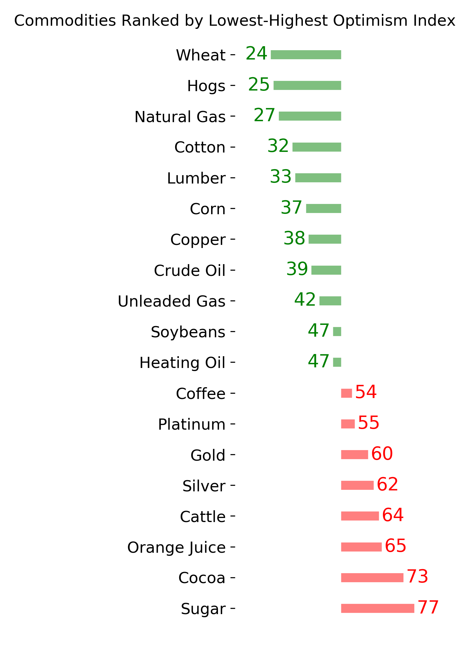
Industries are underperforming the index
Dean noted that sub-industry group trends are deteriorating relative to the S&P 500. After similar divergences, returns for the S&P 500 were bullish across most time frames and when slumping participation follows a period of healthy participation, results are excellent.
Last week, the percentage spread from a 1-year high between the S&P 500 and the median sub-industry group crossed below -8% for the first time since August 2020. While counterintuitive, annualized returns for the S&P 500 are significantly better when the spread declines to a level associated with a deteriorating market breadth environment, like now.
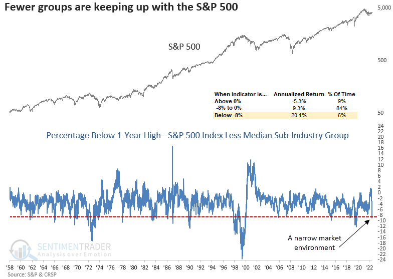
When the spread falls below -8%, the S&P 500 tends to trend upward over time after the first few weeks. A cluster of signals occurred in 1970, 1972-74, 1984, 1998-99, and 2020. Except for 1972-74, those precedents were more bullish than bearish.
Let's add some context to the signal. Before the recent indicator deterioration, the spread closed above 0%. i.e., sub-industry groups looked better than the S&P 500. The table below identifies the first cross below -8% after the spread reset above 0%.
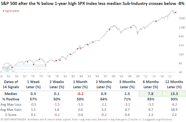
While the first month is somewhat mixed, the six and twelve-month returns and win rates are excellent. So, we must remember that the initial warning of a narrow market environment is often not the one where a cautious stance is warranted.
The average tech stock is lagging
Dean further showed that over the last four months, the cap-weighted Tech sector outperformed the equal-weighted version by 14%. That's a concern for some, but after similar divergences, both the cap and equal-weighted indexes showed strong results.
Over the last four months, the rate of change spread between the cap-weighted S&P 500 Technology sector and the equal-weighted S&P 500 Technology sector exceeded 14% for only the 16th time since 1960.
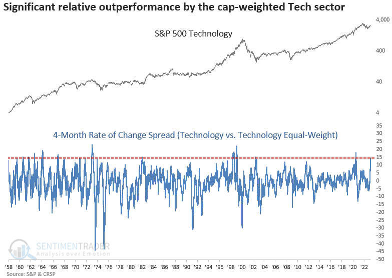
An equal-weighted index maintains an identical weighting for each member. In contrast, a market capitalization-weighted index holds an amount based on the company's size. i.e., Apple has a 7% weighting in the S&P 500 Index but only 0.2% in the equal-weighted version.
When the 4-month rate of change spread between the cap and equal-weighted Technology sectors exceeds 14%, forward returns and win rates for the cap-weighted index are excellent. The only instance to show a negative return across all time frames was the untimely signal in 1973.
When applying the signals to the equal-weighted Technology sector, win rates and returns look better across most time horizons. The median return over the six and twelve-month windows is notable compared to the cap-weighted version.
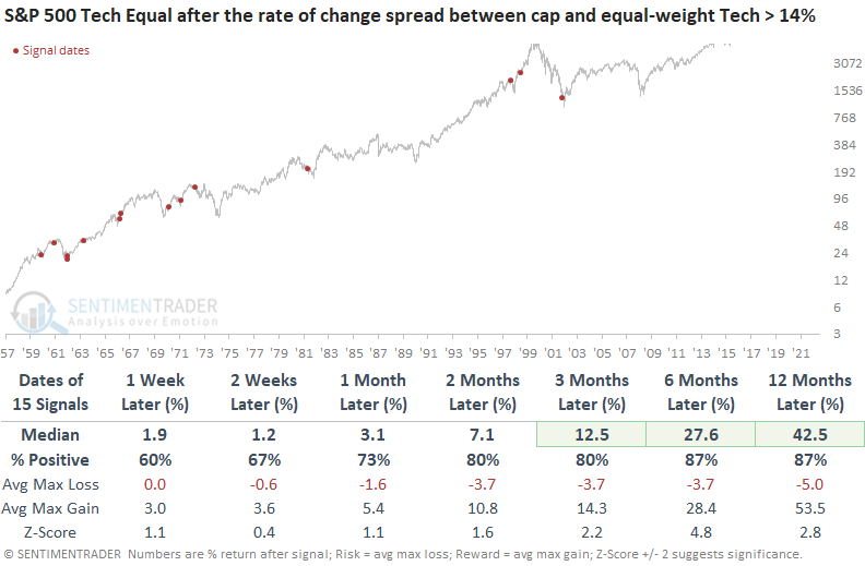
The cap-weighted index underperformed the equal-weighted version across all time horizons. So, if you're holding a cap-weighted Technology ETF like XLK, it might be beneficial to monitor the relative ratio between XLK and RYT, the equal-weighted Technology ETF, for a reversal in the ratio trend.
Insiders are becoming more interested in Tech
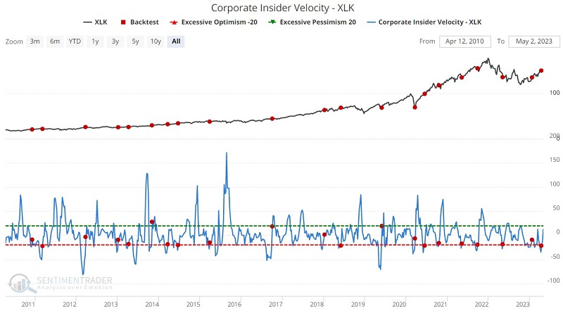
Jay noted that corporate insiders know their companies' prospects best; following their lead is typically wise. And those insiders in the Technology and Financial sectors continue to favor the buy-side.
The Corporate Insider Velocity - XLK indicator shows the velocity of corporate insider buying versus selling in the Technology Select Sector SPDR ETF (ticker XLK) stocks. It takes a 4-week rate of change for insider buys and subtracts a 4-week rate of change for insider sales. Upside reversals for this indicator can highlight times when tech insiders shift from selling to buying.
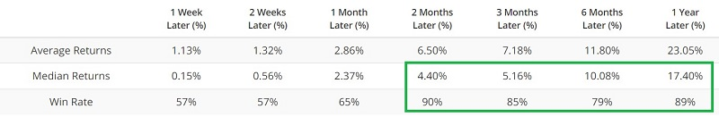
In the chart below, the red dots highlight when this indicator has crossed above 0.23 for the first time in three months. Over the following two months, XLK rallied 90% of the time, with a healthy average return.
The bank collapses in recent months have understandably heightened concerns in the financial sector. So far, however, one group of investors who have not panicked are the corporate insiders in the financial sector. Based on their collective actions in the open market, financial sector insiders appear to be treating the selloff in financial stocks as a buying opportunity.
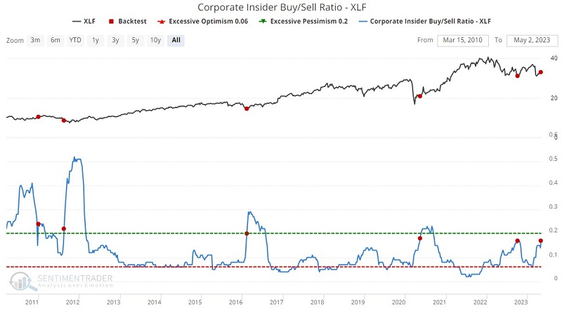
As stated earlier, insiders, on the whole, can often be early. So the decline could easily get worse before it gets better. But insiders are also rarely wrong when they act in concert. Thus, the continued pick up in buying relative to selling appears to be a positive sign for the financial sector for the next one to three years.
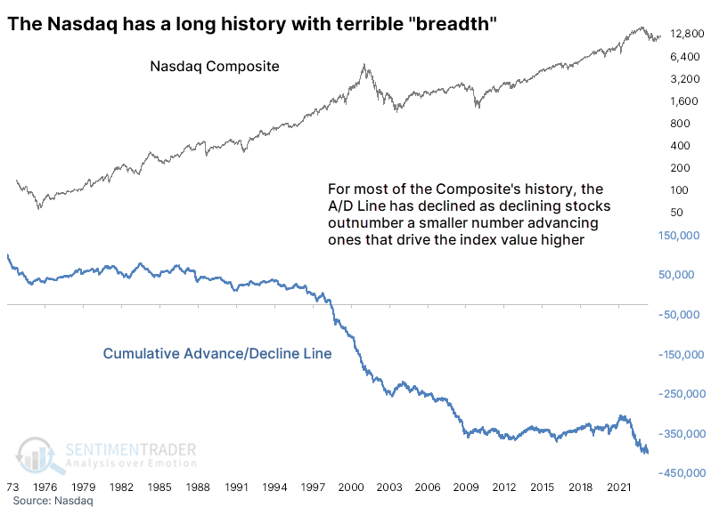
A new low in Nasdaq "breadth"
The new shiny object for the "bad breadth" crowd is the Cumulative Advance/Decline Line using all securities listed on the Nasdaq. We've looked at this several times over the decades, and there's a reason why we don't discuss it often; the Nasdaq is littered with iffy securities and always has been.
The most common condition daily on that exchange is for more securities to decline in price than rise. Since inception, the cumulative effect of the daily net number of advancing minus declining securities has been negative.
The table below shows every time the line has reached a new low for the first time in months. Historically, the Composite has declined more often than not in the first month after these signals, but after that, it was not a good excuse to be negative. A year later, the Nasdaq's median return was nearly three standard deviations above a random one-year return.
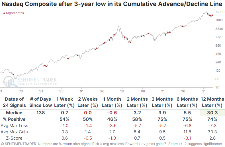
The Nasdaq Composite suffered double-digit losses within the next year after nine of these signals, which is a bit of a worry. But it also enjoyed double-digit gains within the next year after twenty of them. That speaks to the index's volatile nature and a long-term uptrend, especially after many of its stocks have declined.
May sector seasonality
Jay showed that monthly sector performance can vary considerably from year to year, but two sectors have stood out during May.
For testing purposes, we will start the test in 1945 and look at the total return for each of the 11 major S&P 500 sectors only during May each year.
The table below displays the raw output.
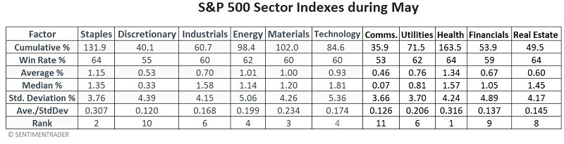
Note the "Rank" row at the bottom of the table above. To arrive at this rank, we:
- Ranked each sector from 1 to 11 for each factor
- Summed up the total value of all rank values for each sector
- The sector with the lowest total sum is ranked #1, and the sector with the highest total rank sum is ranked #11.
Health Care and Consumer Staples are the top two sectors for May using this methodology. The bottom two rated sectors for May using this methodology were Communications and Consumer Discretionary.
The chart below displays the cumulative growth of $1 invested separately in the Top 2 sectors (black line), all sectors combined (blue line), and the Bottom 2 sectors (green line).
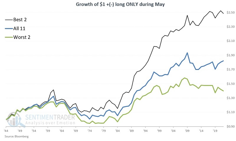
During May, the Top 2 showed a gain 63% of the time, versus 58% of the time for the Worst 2. However, the median return for the Top 2 was +1.5% versus only +0.3% for the Worst 2.
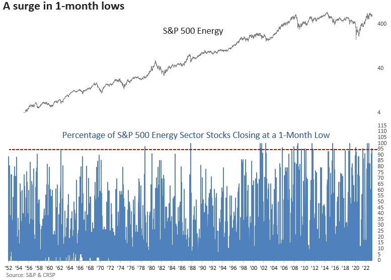
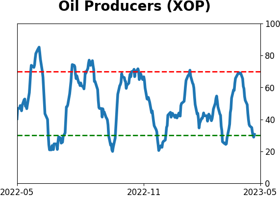
A big spike in new lows for Energy stocks
Dean mentioned that over 95% of S&P 500 energy sector stocks closed at a 1-month low this week. The breakdown in energy issues occurred within 15 trading days of a 6-week high, and after similar conditions, the energy sector was negative 69% of the time over the next two weeks.
The downward momentum in energy equities pushed several breadth-based time series to an extreme level. One such indicator, the percentage of S&P 500 Energy sector stocks closing at a 1-month low, increased above 95% for only the 18th time since 1952. When I include the context of the spike in new lows occurring in 15 or fewer trading days from a 6-week high, like now, the signal returned 13 other precedents.
When the percentage of S&P 500 energy sector stocks closing at a 1-month low exceeds 84% in 15 days or fewer of a 6-week high for the sector, the downside momentum tends to beget more downside momentum. Two weeks later, the sector closed lower 69% of the time.
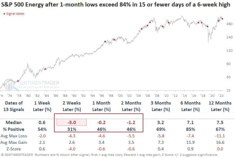
In the first two weeks, the max loss was greater than the max gain in 8 out of the last 10 signals. And the median max loss exceeded the median max gain in the one and two-month time frames.
Within the energy sector, most sub-industries underperformed the large-cap sector, which is not too surprising considering the sub-groups contain large, mid, and small-cap companies. Consistency in the first few weeks was extremely weak in the exploration and production group, which is accessible via the ETF (XOP).
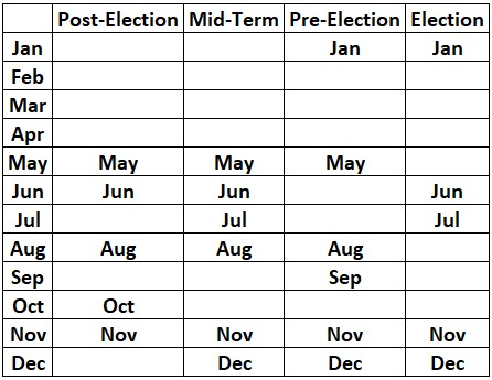
Treasuries during the presidential election cycle
Many investors are familiar with the impact of the election cycle on stocks, but Jay noted that far fewer are familiar with the impact of the election cycle on T-bonds.
The table below displays the four years of the election cycle and the months of each year. The favorable months for Treasuries for each list the month name in the table. Months that are left blank are considered unfavorable (or possibly neutral) for Treasuries.
For testing purposes, we use a continuous futures contract that tracks the daily performance of 30-year Treasury futures. For T-bond futures, each 1.00 point in price movement is worth $1,000.
The chart below shows the hypothetical cumulative $ + (-) for t-bonds futures held long during favorable, unfavorable, and all months.
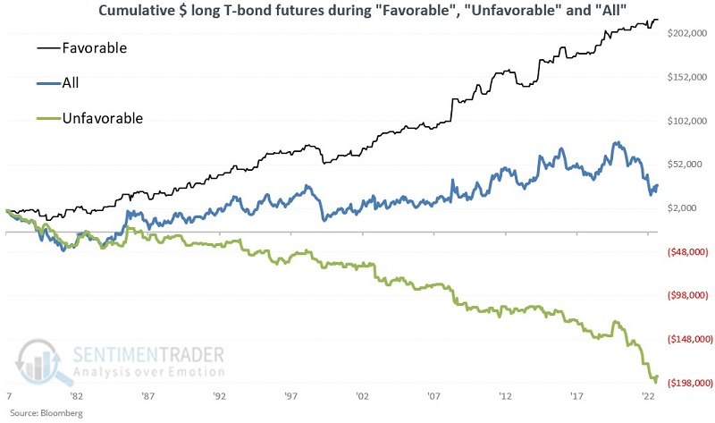
During favorable months, the contract rallied 61% of the time, versus only 41% of the time during unfavorable months. T-bonds also showed a much stronger tendency to show strong gains (larger than $5,000), and minor losses, during favorable months versus unfavorable ones.
T-bonds intra-year seasonality
While the election cycle may have some influence, Jay noted that T-bond futures have displayed a surprisingly consistent intra-year seasonal pattern.
The chart below displays the annual seasonal trend for t-bond futures. The table below displays these favorable and unfavorable periods using Trading Day of the Year (TDY).
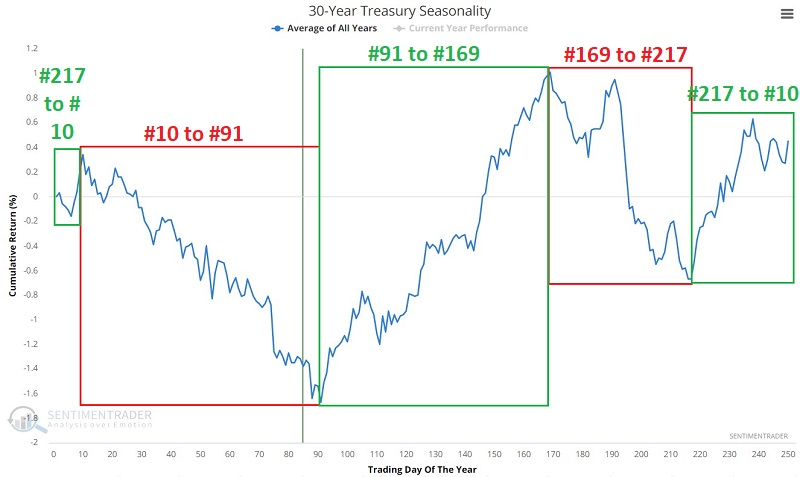
As always, seasonal trends are "climate, not weather," and actual performance can vary widely from year-to-year. It is also essential to remember that the pattern shown in the charts above represents an average of what has happened in the past.
The chart below displays the hypothetical cumulative $ +(-) from holding a long position in t-bond futures only from the close of the two favorable periods above.
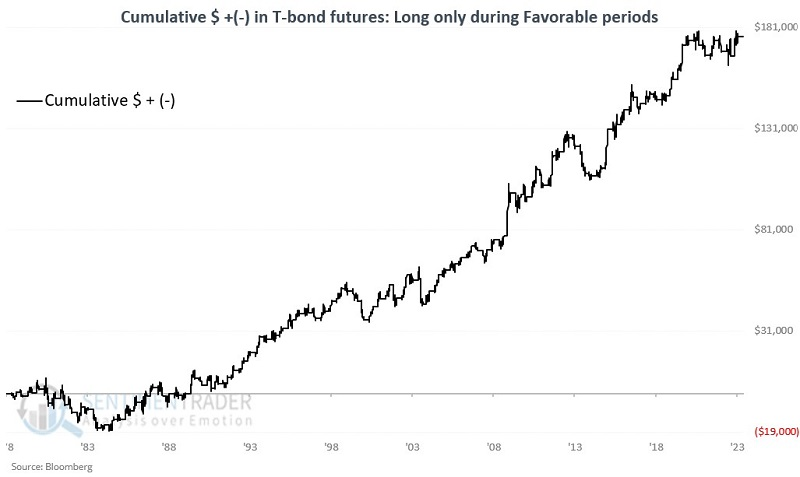
Jay further looked at the unfavorable windows and combined the performance of going long during the favorable periods and short during the unfavorable ones, which nearly doubled the performance of the long-only strategy.
About TradingEdge Weekly...
The goal of TradingEdge Weekly is to summarize some of the research published to SentimenTrader over the past week. Sometimes there is a lot to digest, and this summary highlights the highest conviction or most compelling ideas we discussed. This is NOT the published research; rather, it pulls out some of the most relevant parts. It includes links to the published research for convenience, and if you don't subscribe to those products, it will present the options for access.
Indicators at Extremes
|
|
|
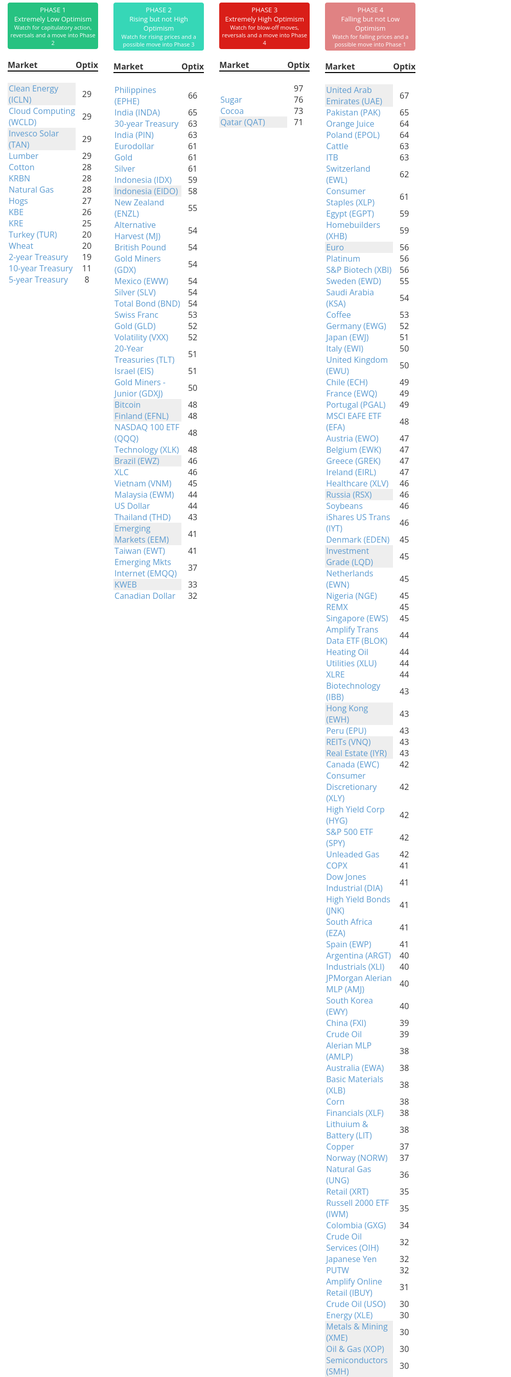
Phase Table
|
|
|
Ranks
|
|
|
|
|
|
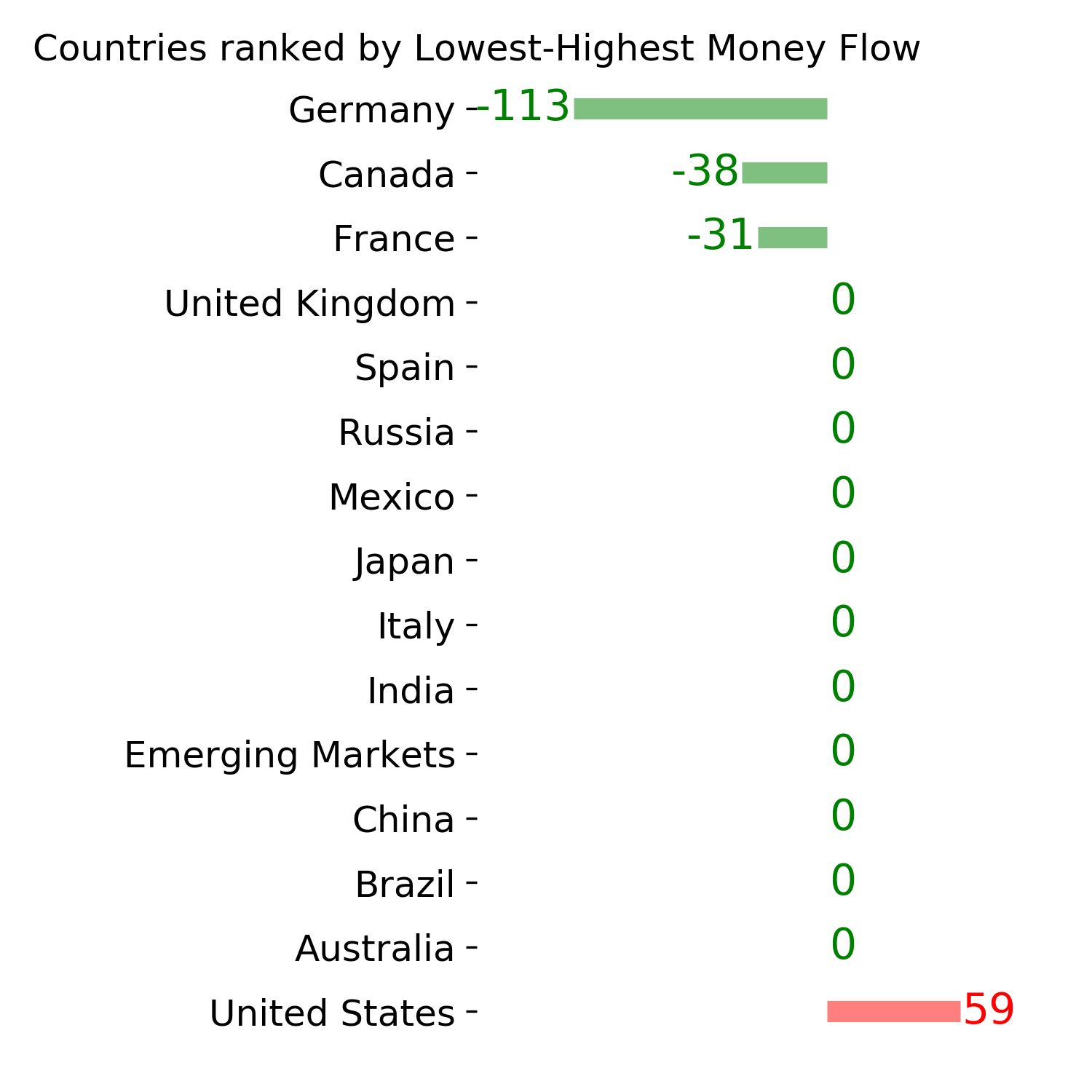
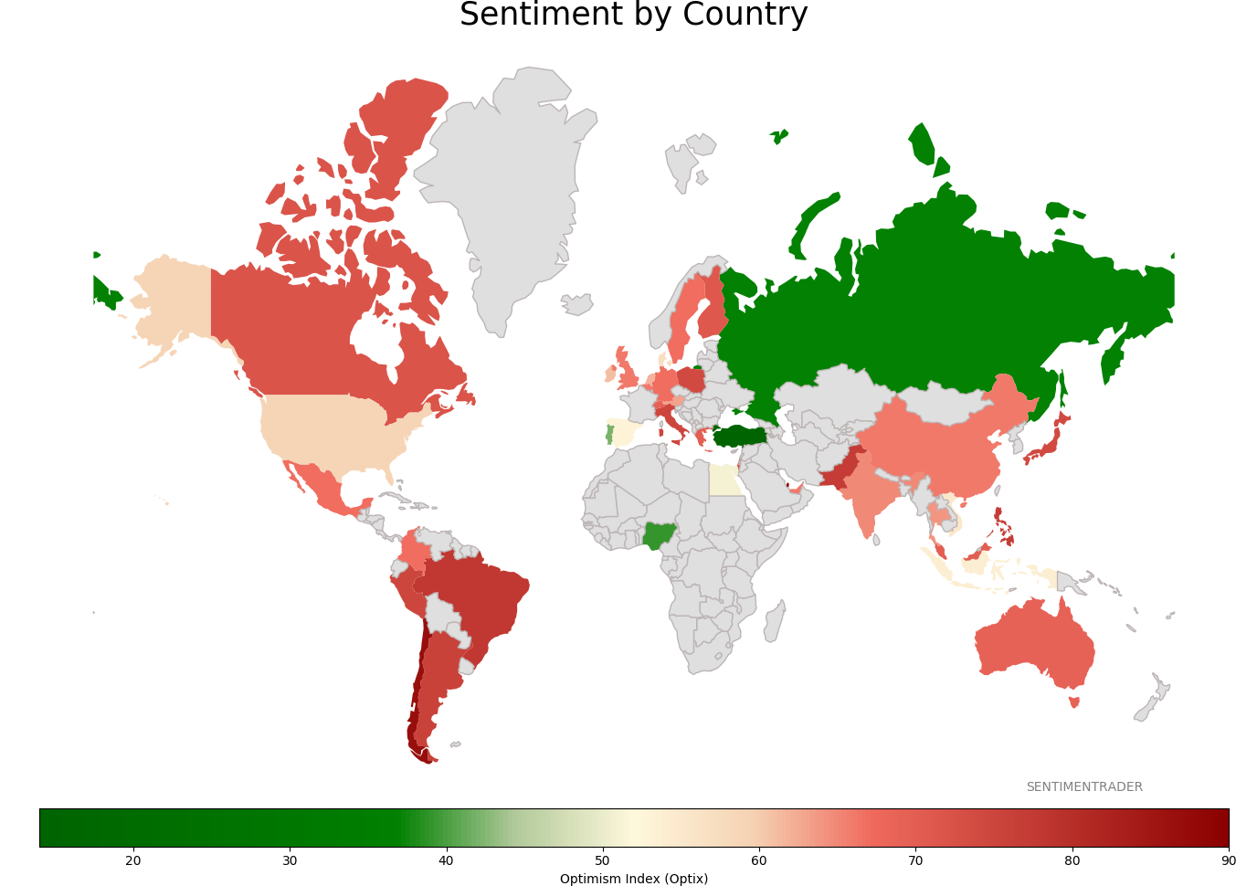
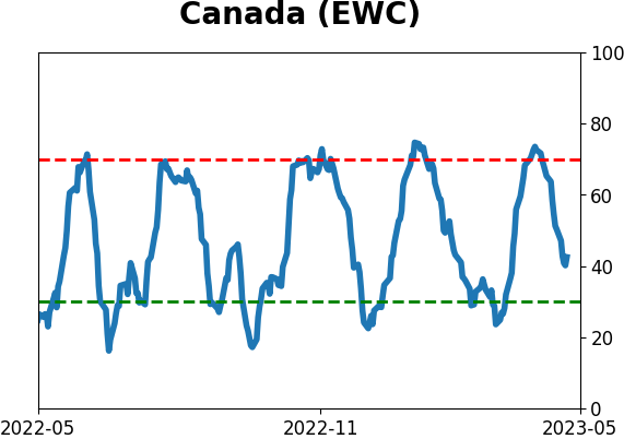
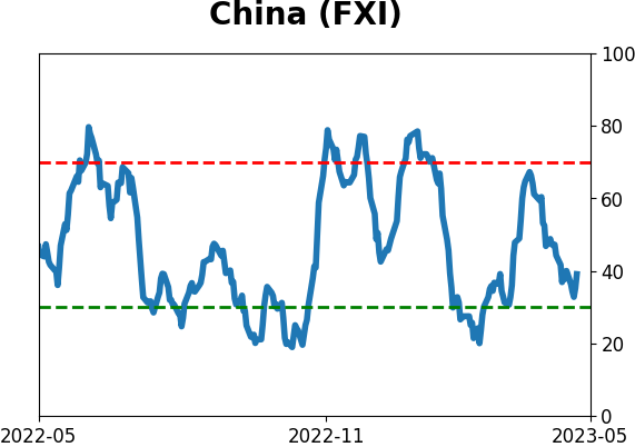
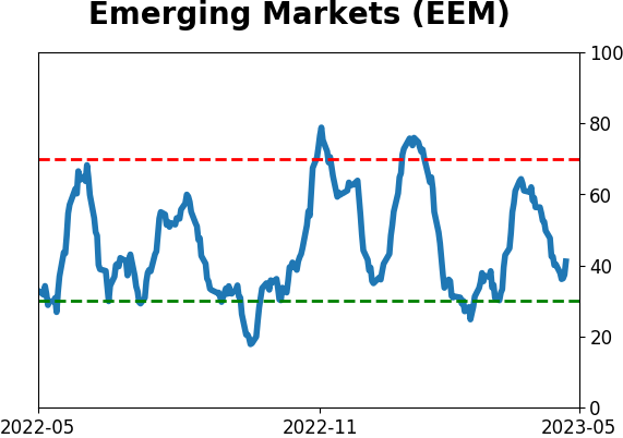
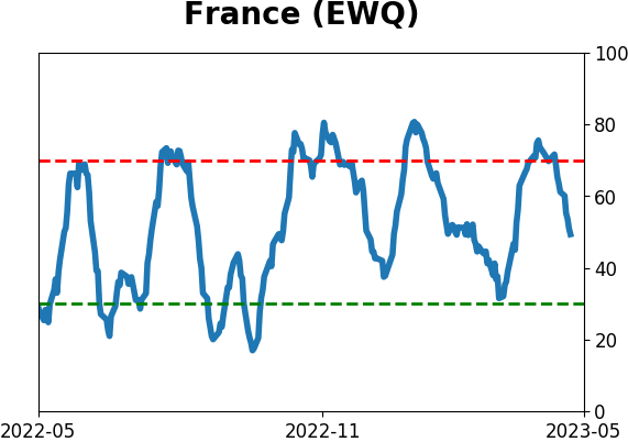
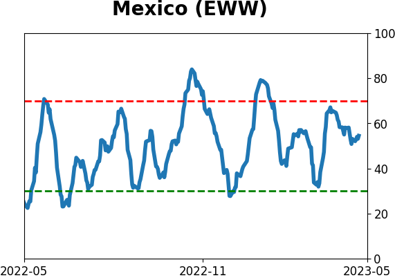
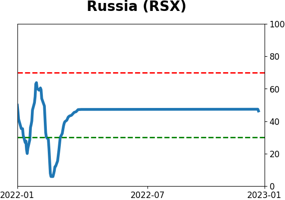
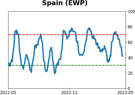
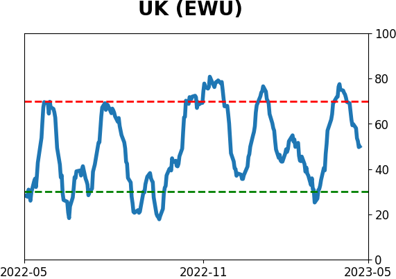
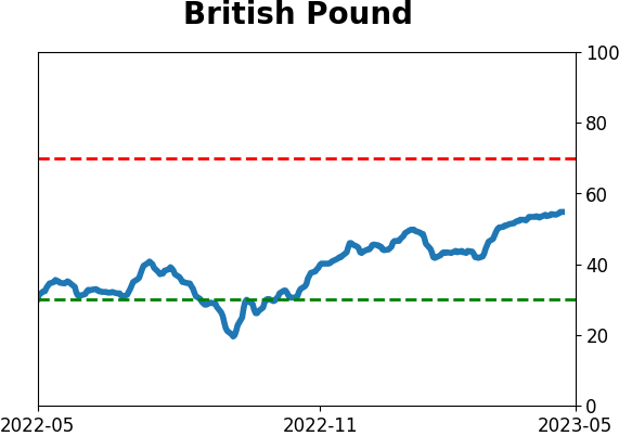
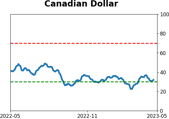
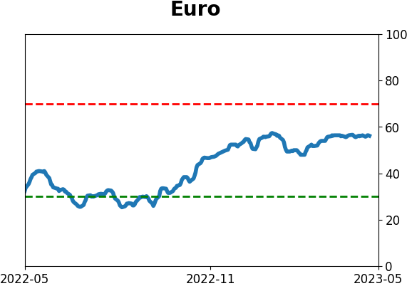
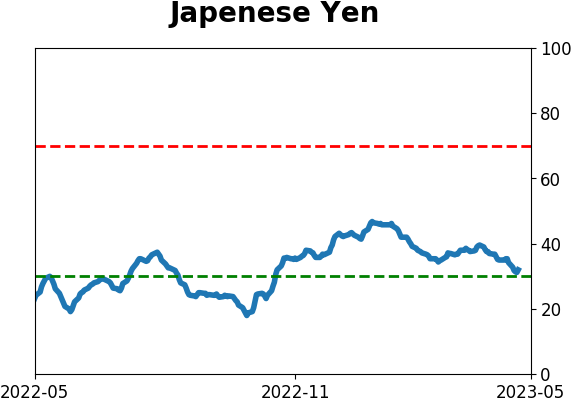
Sentiment Around The World
|
|
|
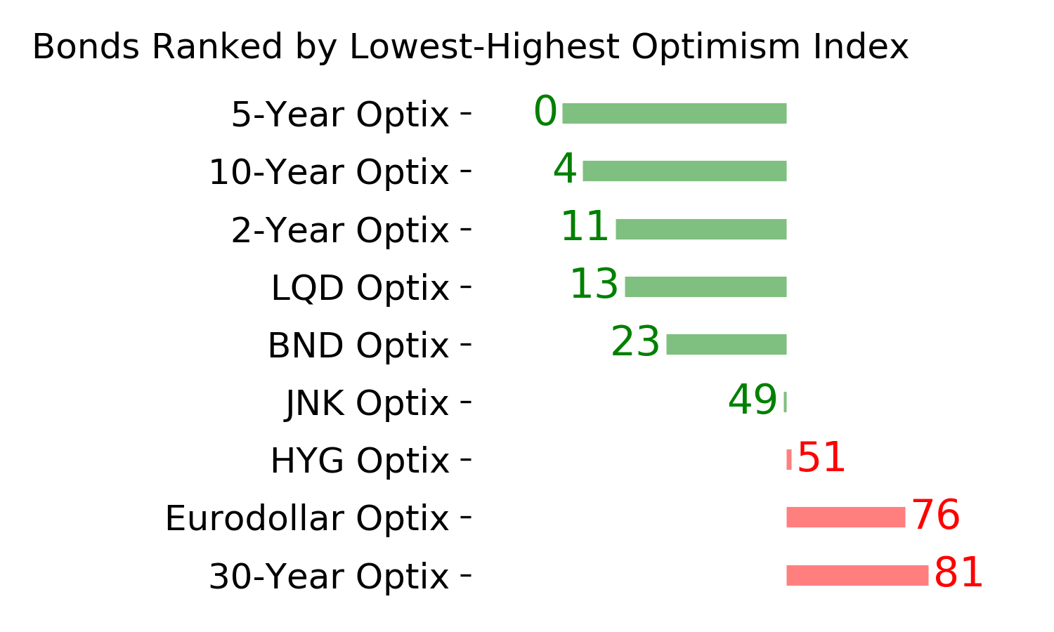
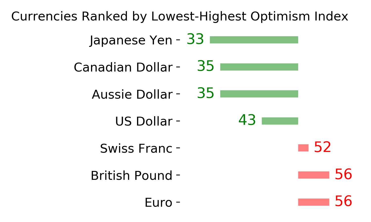
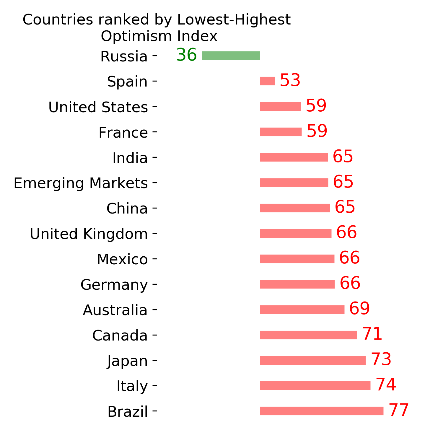
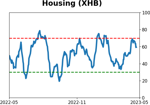
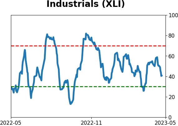
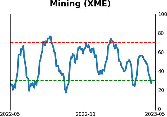
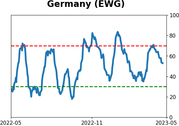
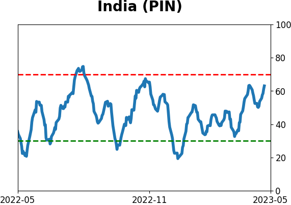
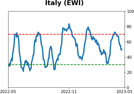
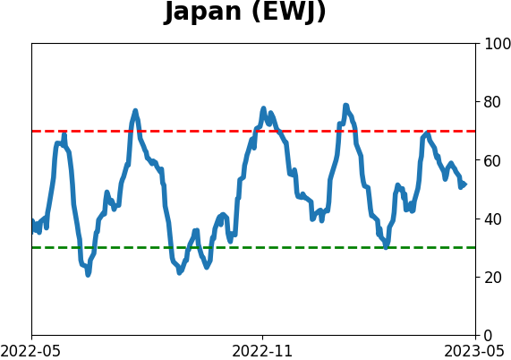
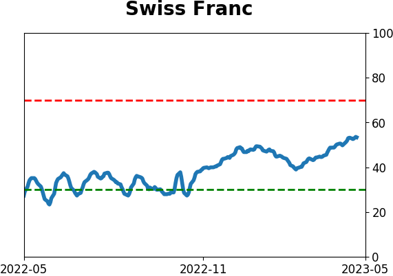
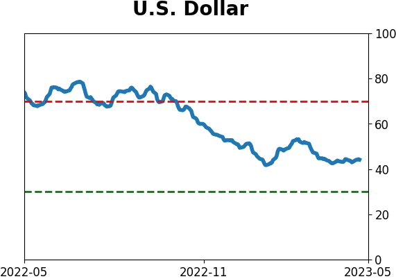
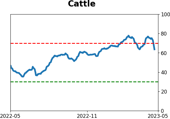
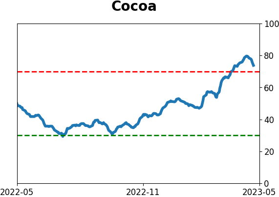
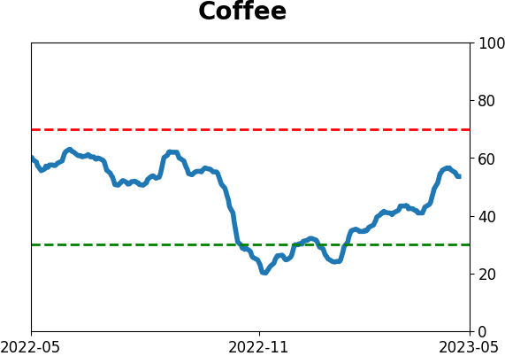
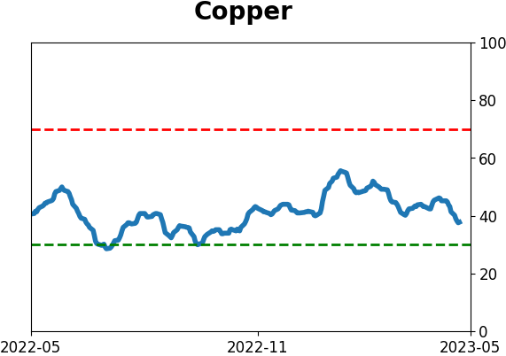
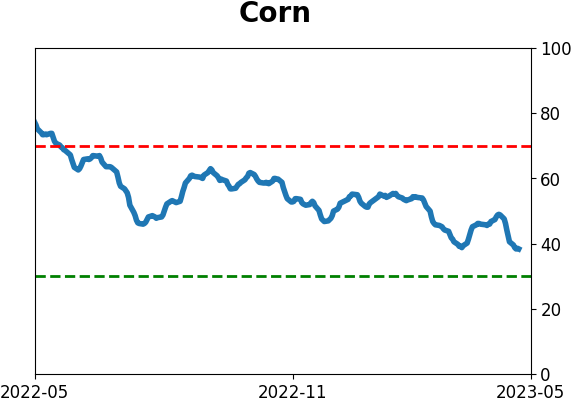
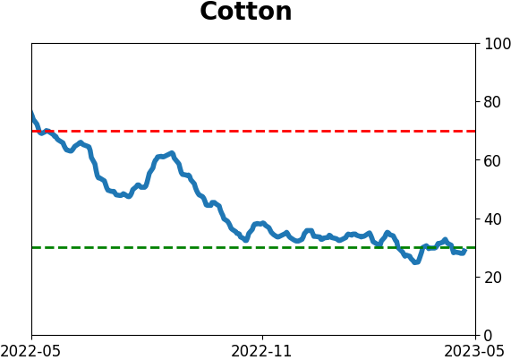
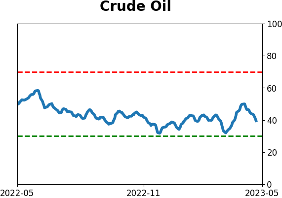
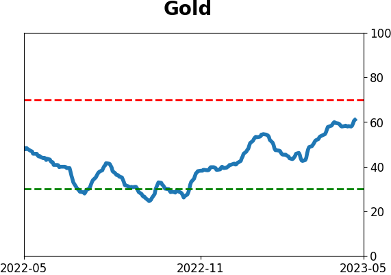
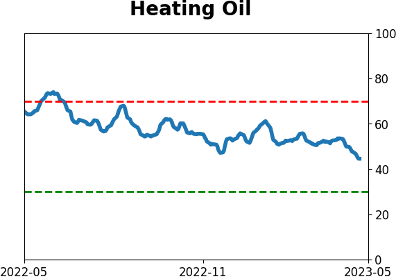
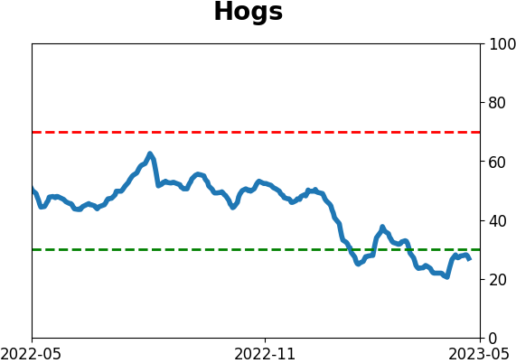
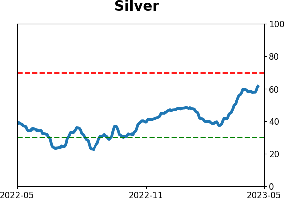
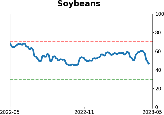
Optimism Index Thumbnails
|
|
|
|
|
|
|
|
|
|
|
|
|
|
|
|
|
|
|
|
|