Daily Report : TradingEdge Weekly for Apr 19 - Extremely heavy selling pressure, oversold conditions, rising yields

| View/Print a PDF version of this Report |
Headlines
|
TradingEdge Weekly for Apr 19 - Extremely heavy selling pressure, oversold conditions, rising yields: This week, we saw that new lows are starting to dominate new highs. There have been many days with many more declining than advancing stocks, and we've now seen 3 days of 90% downside volume with no intervening 90% upside volume days, and more stocks are getting oversold. Confidence is evaporating as yields across the curve rise. Silver seasonality isn't in bulls' favor. |
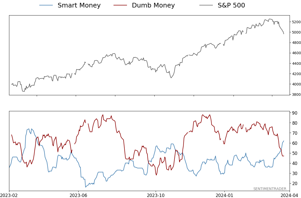
Smart / Dumb Money Confidence
|
|
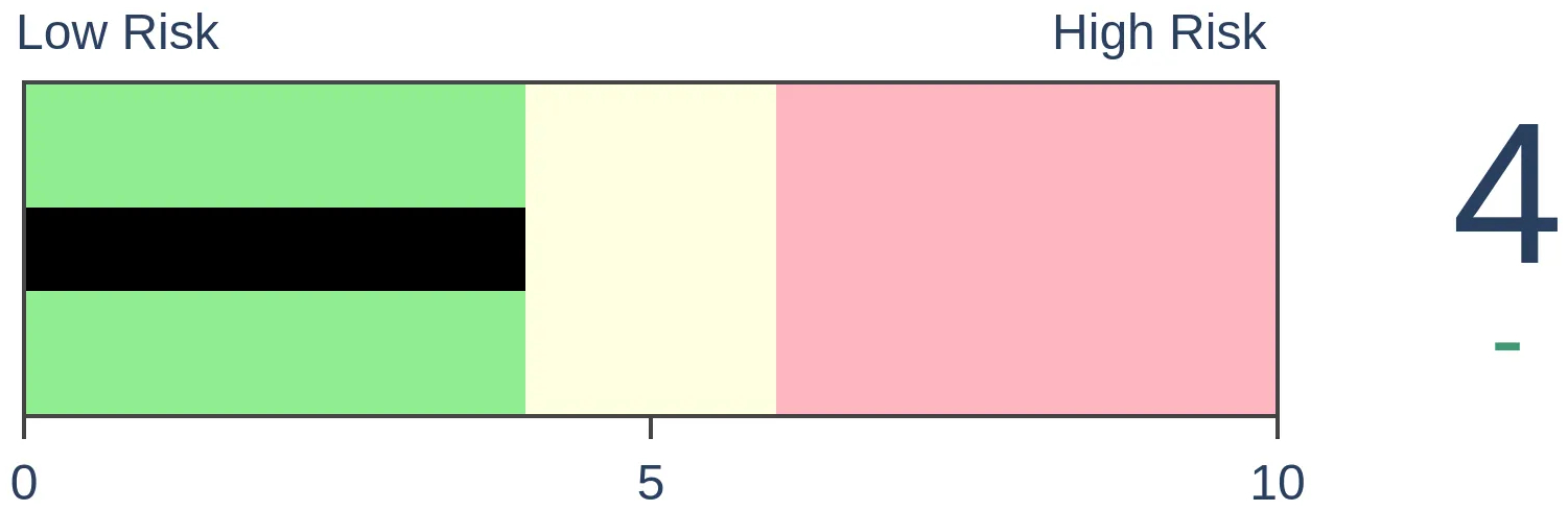
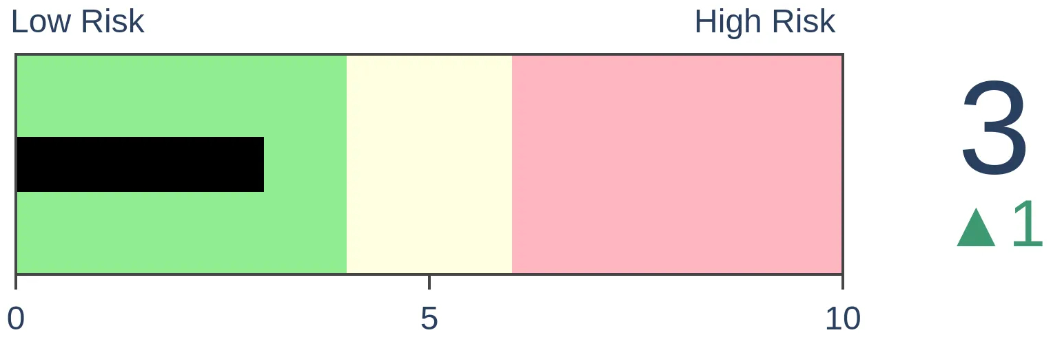
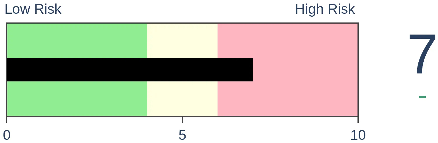
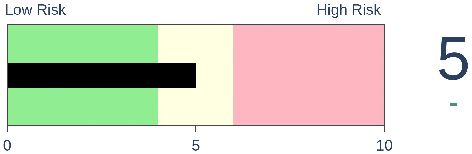
Risk Levels
|

|

|
Research
TradingEdge Weekly for Apr 19 - Extremely heavy selling pressure, oversold conditions, rising yieldsBy Jason GoepfertBOTTOM LINEThis week, we saw that new lows are starting to dominate new highs. There have been many days with many more declining than advancing stocks, and we've now seen 3 days of 90% downside volume with no intervening 90% upside volume days, and more stocks are getting oversold. Confidence is evaporating as yields across the curve rise. Silver seasonality isn't in bulls' favor. FORECAST / TIMEFRAME |
Key points:
- New lows are starting to dominate
- There have been some recent bouts of heavy selling pressure
- More than 3/4 of stocks are hitting oversold levels
- When downside volume dominates without any days of heavy upside volume, it's not necessarily a bad sign
- Turning an indicator into a trading system
- Confidence is evaporating
- Housing indicators show a downturn
- Yields across the curve are rising
- Using the equity risk premium for bonds
- Silver is spiking, but seasonality may have a say
New lows are starting to dominate
Toward the end of last month, there was finally a touch of underlying weakness among stocks in the S&P 500. For the first time in months, fewer stocks pushed to new highs as the index climbed. By Wednesday, more stocks were falling to 52-week lows than rising to 52-week highs, which is never a good sign.
This is something to watch; the S&P's annualized return when this figure is positive was +11.8%. When there were more lows than highs, that return craters to -1.1%.
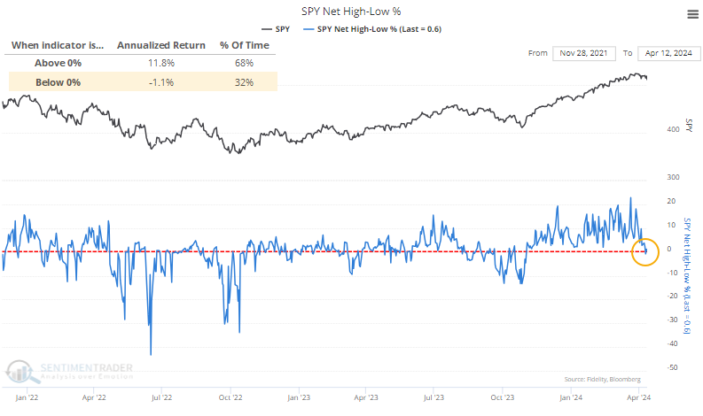
The drop in stocks hitting new highs and rise in one hitting new lows ended the 17th-longest streak of net positive readings since 1928.
As we've seen so often in various studies, exhibits of prolonged momentum have a strong habit of inducing long-term investors once that momentum wobbles. Six months after these streaks ended, the S&P suffered only 3 losses out of 20 precedents. All three losses were relatively minor and essentially the lows for months afterward.
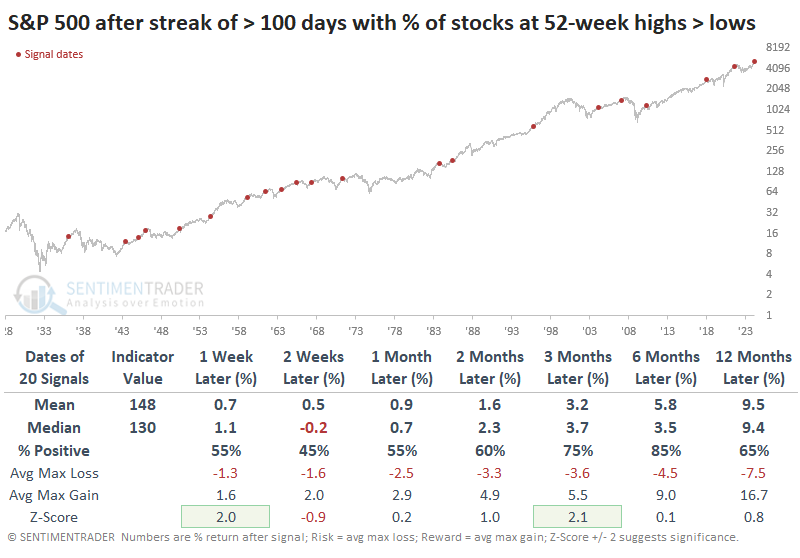
A table of maximum gains and losses across time frames shows us that only two instances preceded further losses of -10% or more within the next six months.
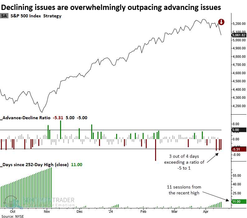
Many more losers than winners
Declining issues on the NYSE have outpaced advancing issues by a wide margin over the last four sessions. Dean showed that similar market breadth dynamics near a high led to negative returns over the following two weeks.
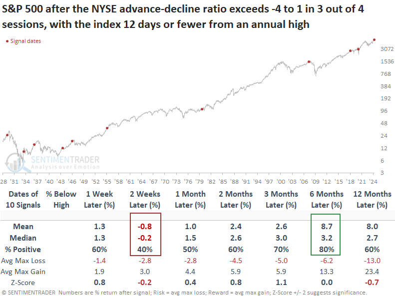
Over the last four trading sessions, declining issues on the NYSE have exceeded advancing issues by a ratio of 5 to 1. Since 1928, this type of lopsided breadth has occurred only 48 times. Most of the precedents happened in the depths of significant corrections and bear markets, not within 11 days of a high, like now.
When the advance-decline ratio overwhelmingly favors declining issues in 3 out of 4 sessions with the S&P 500 twelve or fewer days from a high, the world's most benchmarked index tends to struggle over the subsequent few weeks. At some point over the following two months, the large-cap index was negative in 7 out of 10 precedents.
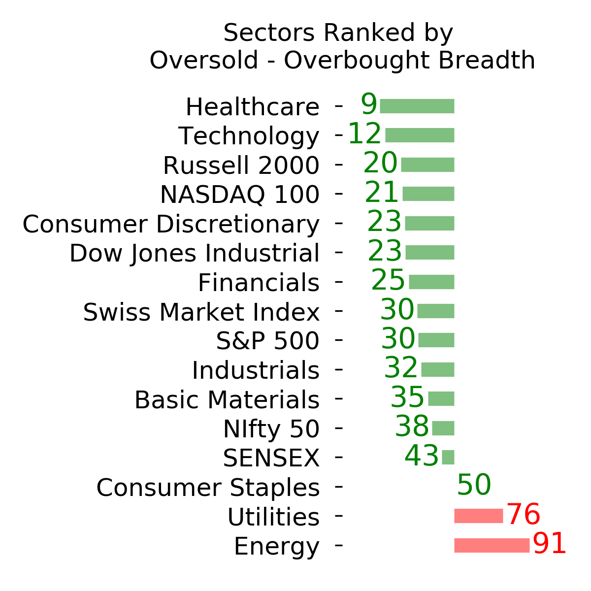
Getting oversold
The percentage of S&P 500 stocks reaching an oversold status increased above a washout threshold. Dean noted that similar oversold conditions preceded positive returns and favorable win rates for the S&P 500.
Purchasing stocks during a market downturn, especially when indexes are veering toward an oversold condition, can pose significant risks for an investor.
For example, when the percentage of S&P 500 stocks reaching an oversold status hovers between 50% and 73%, the S&P 500 produced a -13.8% annualized return since 1928. However, once the indicator increases to a level that suggests most stocks are oversold, the world's most benchmarked exhibits outstanding annual returns of 152%.
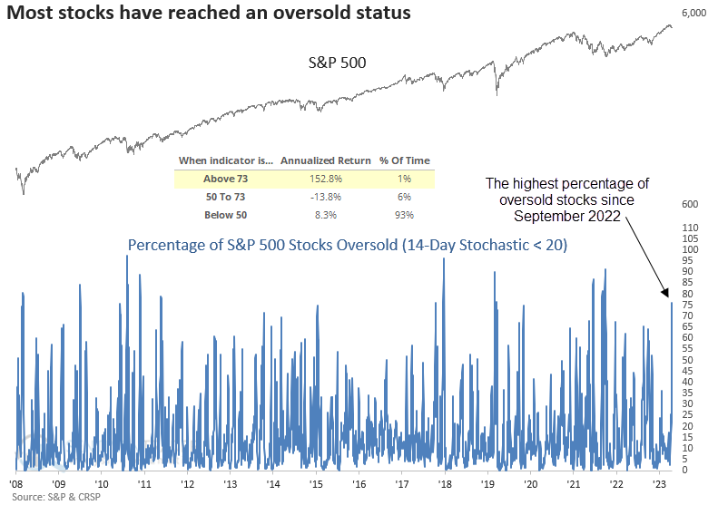
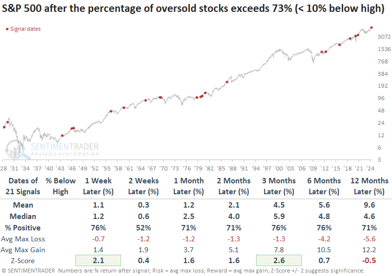
With the S&P 500 trading 3.86% below its recent high, this latest oversold signal represents the shallowest decline from its peak ever recorded.
Whenever oversold conditions emerged while the index remained within 10% of its peak, win rates improved significantly across most time frames, accompanied by marginally more favorable median returns in the subsequent three months.
Uninterrupted heavy selling
Since the latest momentum push began last fall, there haven't been any days when more than 90% of NYSE volume flowed into advancing issues. But with Friday's session, there have now been three days with less than 10% advancing volume.
During persistent bull markets, streaks of three or more frequently occurred. During some bear markets, streaks never got much beyond three days because conditions were volatile, and we would periodically see a 90% up day.
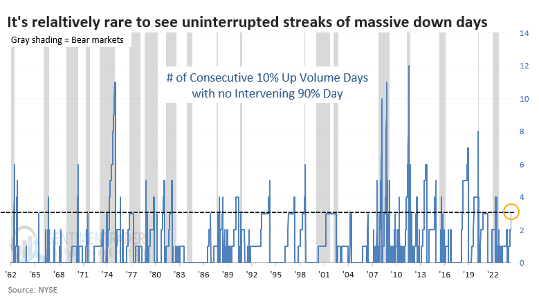
Most instances of such heavy down volume with no significant down volume occurred during ongoing bear markets. Very few of them were triggered when stocks were sitting near all-time highs.
The table below filters the signals to only include those when the S&P 500 was within 7% of a high. Short-term returns were relatively weak, but the risk/reward was heavily positive for stocks over the next two to three months. There was essentially only one failure near the peak before the global financial crisis.
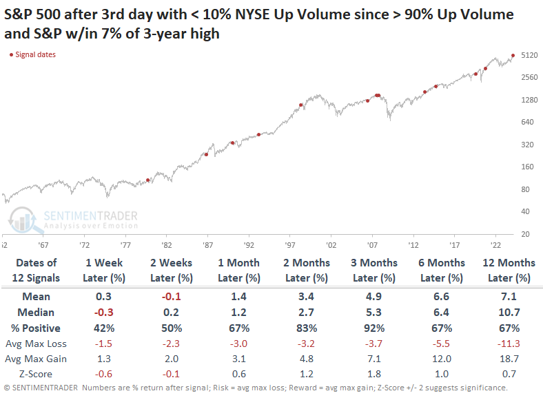
If we relax the parameters again, this time looking for signals when the S&P is still out of correction territory, the two- to three-month time frame continues to exhibit unusual strength after short-term weakness. Even though the sample size doubled again, the only true failure was near the peak in 2007-08.
Turning an indicator into a trading system
Jay noted that indicators convey single pieces of information; trading systems generate actual buy and sell signals. An oversold indicator recently flashed a signal - we will look at what happens if we use this indicator as a trading system.
The chart below highlights with a red dot those dates when the percentage of stocks in the S&P 1500 index fell so much that more than 75% of them had a 2-day Relative Strength Index (RSI) in oversold territory and the S&P 500 Index closed above its 150-day moving average.
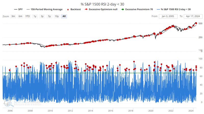
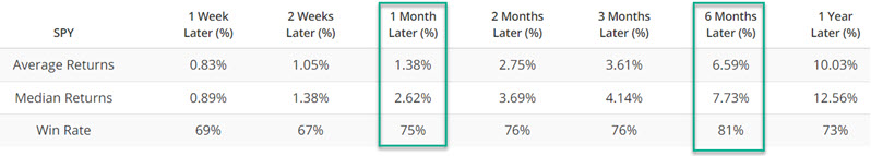
In the table above, we note that 1-month results show a Win Rate of 75%, and 6-month results show a Win Rate of 81%. Jay looked at using both one-month and six-month periods, but we'll focus on the latter.
We will treat any overlapping as a continuation signal; a new indicator within an existing six-month holding period will extend the holding period an additional six months. No stop-loss provision is included.
For a six-month strategy, we will technically use a 126-trading-day holding period. The first signal occurred on 2005-09-21. Because there were no new signals within a month of that date, the holding period ended on 2006-03-23. The chart below displays the hypothetical growth of $1 invested in the S&P 500 Index only when a trading signal is active.
The six-month strategy outperformed buy-and-hold, as shown in the chart below.
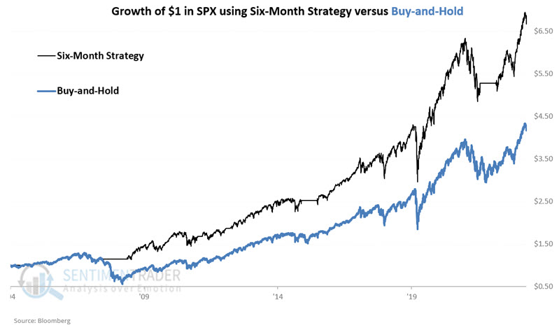
We see a 91% Win Rate with a maximum loss of a mere -0.4%. But as we can see in the equity curve chart above, these summary results mask much of the intra trade volatility. In the chart below, we see the maximum drawdowns for the six-month strategy.
A maximum drawdown of -31.3% is different from claiming that "the only losing trade lost just -0.4%." The good news is that -31.3% is still quite a bit better than the -56.8% maximum drawdown suffered using a buy-and-hold strategy.
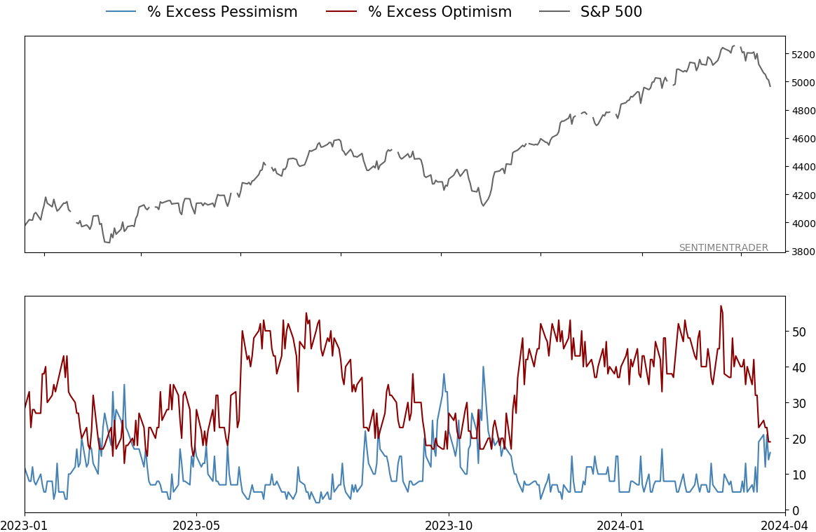
Evaporating confidence
After nearly six months, investors' optimism has evaporated. For the first time since November, Smart Money is assigning the same confidence of a rising market as Dumb Money. This is a stark change from just a week ago.
When we look at the spread between the two sentiment measures, we can see more clearly that they have equalized after a prolonged period of extreme. This ended the 7th-longest streak of excess since we began calculating these models in 1998.
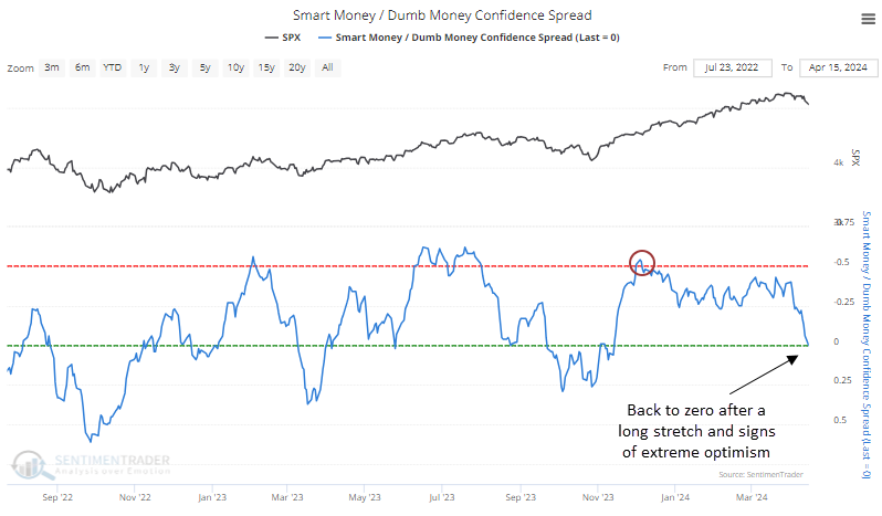
After sentiment became normalized following a long period of extreme, the S&P 500 has done very well over the medium term. It didn't suffer any losses of magnitude during the next one to three months. Note that the table only includes streaks when Dumb Money exceeded Smart Money by at least 50% at some point.
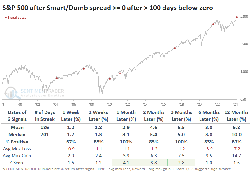
The most significant drawdown over the next three months was a minuscule -3.0%, while the average drawup (maximum gain) was +7.5%.
We reach the same general conclusion if we relax the parameters and look at the ends of streaks of three months or more with excessive sentiment. There were twice as many precedents, but every signal showed a gain either three or six months later.
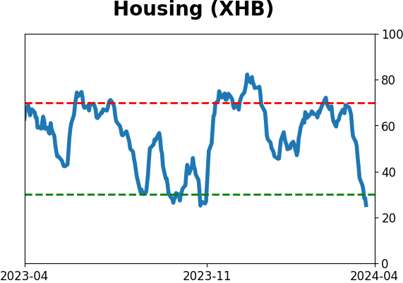
Housing woes
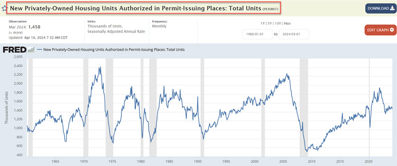
Housing Starts and Housing Permits both ticked lower in the latest month. Jay suggested these measures are often a good bellwether for the homebuilding sector and the broader market.
With both measures below their respective 12-month exponential moving averages, housing as a market factor will fall on the unfavorable side of the weight of the evidence ledger at the end of April.
Housing permits (technically known as New Privately-Owned Housing Units Authorized in Permit-Issuing Places: Total Units) also ticked lower in the latest monthly update. During April, the number of housing starts for March was reported. We technically evaluate this data at the end of the month in which the data is reported. The chart below displays the raw data from FRED.
Housing Starts (technically known as New Privately-Owned Housing Units Started: Total Units) ticked lower in the latest monthly update. The number of housing starts for March is reported in April. We technically evaluate this data at the end of the month in which the data is reported. The chart below displays the raw data from FRED.
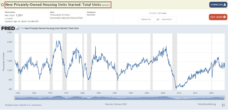
Unsurprisingly, the two data series above are similar but also not as closely joined at the hip as one might expect. For the record, the correlation of monthly readings between the two data series is roughly 68%.
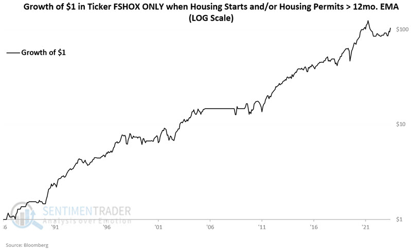
If at least one of the two data series exceeds its 12-month EMA, it bodes well for homebuilders, the broader market, and the overall economy.
We will use Fidelity Select Construction and Housing Portfolio (ticker FSHOX) to test homebuilding stocks. FSHOX is a managed fund, but it has a history back to 1986 and a roughly 96% correlation to the SPDR Home Builders ETF (XHB) and a 93% correlation to the iShares Dow Jones Home Construction ETF (ITB).
The chart below displays the growth of $1 invested in ticker FSHOX only when one or more of the housing indicators above are favorable. Since 1986, $1 invested in this manner hypothetically grew to $104.
Now, let's look at homebuilder performance when both indicators are unfavorable. The chart below displays the growth of $1 invested in ticker FSHOX when both housing indicators above are unfavorable. Since 1986, $1 invested in this manner hypothetically shrank to $0.89.
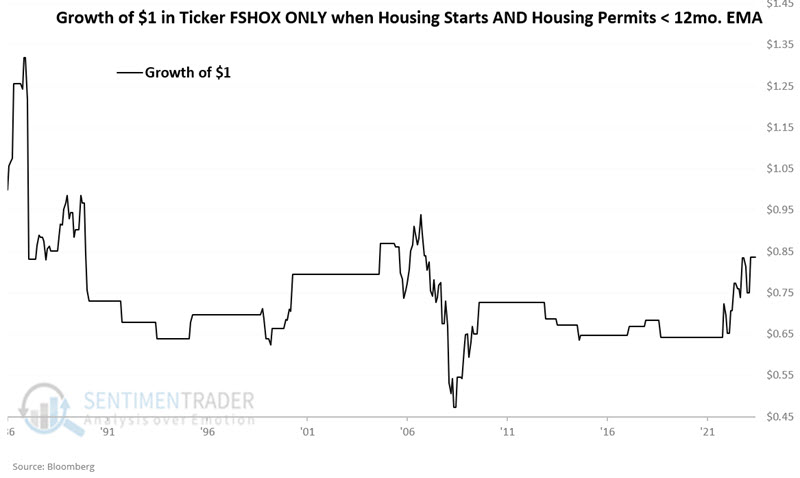
With both Starts and Permits below their 12-month EMAs, May 2024 will be deemed "unfavorable" for homebuilders. This does not mean that homebuilder stocks are doomed to decline. It simply means that the probabilities will shift to unfavorable.
Jay showed similar divergences in performance for the S&P 500 based on these indicators.
Yields rising
Every single Treasury yield, ranging from two to ten years, closed at a 3-month high. Dean noted that similar breakouts in yields suggest interest rates could continue to creep higher.
With economic activity showing resilience and consumer inflation stabilizing, interest rates began to inch upwards once more, reaching a climax last week as Treasury yields spanning 2 to 10 years hit their highest levels in three months.
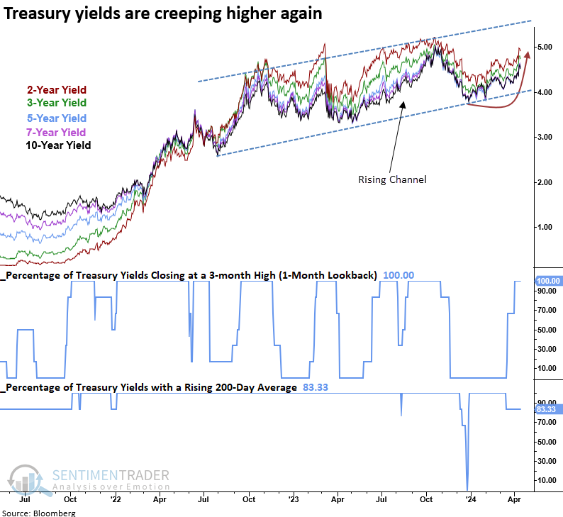
When every single Treasury yield ranging from two to ten years closed at a three-month high, with four out of five yields exhibiting a rising 200-day average, the 10-year yield tended to rise further, especially over the ensuing three months.
After the June 2023 signal, the 10-year yield climbed 73 basis points in three months, the most significant increase over that period since 1984.
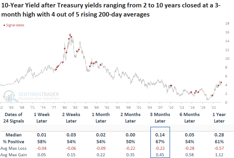
With interest rates showing a propensity to rise further over the medium term after similar breakouts, history suggests the S&P 500 could struggle over that same time frame.
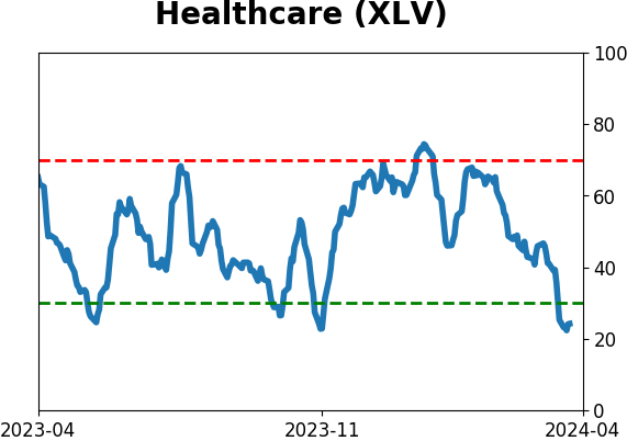
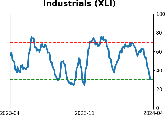
Consumer Staples, a defensive sector, outperformed all other groups over the subsequent three months. Once stocks adjusted to the higher rate environment, often a sign of improving economic activity, Industrials outpaced all other groups a year later.
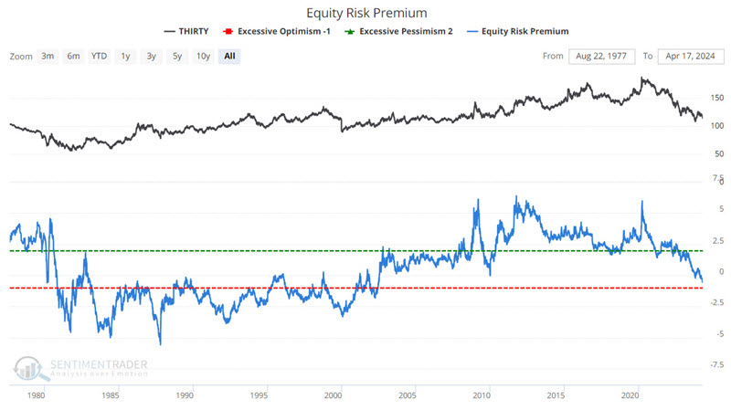
Using the Equity Risk Premium to trade bonds
Equity Risk Premium is an indicator that has long been well-known to stock market investors. Jay noted that much lesser known is this indicator's potential utility as a bond market indicator.
The Equity Risk Premium (ERP) indicator shows the earnings yield on the S&P 500 minus the interest rate on 10-year Treasury notes. The higher the risk premium, the more attractive stocks are relative to bonds. Most investors attempt to discern trends in ERP and how they relate to stock price movements.
However, we will take a different route and compare ERP to the 30-year treasury bond, as shown in the chart below.
The chart below displays the difference between the Equity Risk Premium and its 33-week exponential moving average.
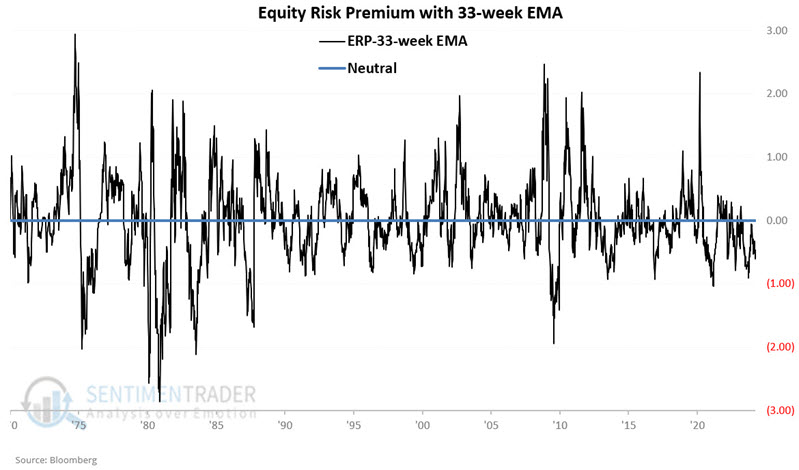
We will designate positive readings as favorable for long-term treasury bonds and negative readings as unfavorable for long-term treasury bonds.
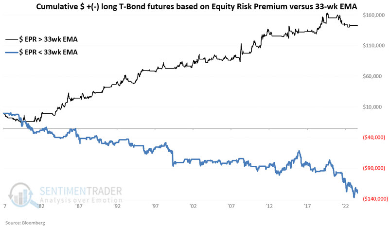
The hypothetical $ +(-) achieved by holding a long position in 30-year treasury bond futures only when the Equity Risk Premium closed the previous week above its 33-week exponential moving average is +$143,569.
The hypothetical $ +(-) achieved by holding a long position in 30-year treasury bond futures only when the Equity Risk Premium closed the previous week below its 33-week exponential moving average is -$130,312.
The chart below combines the two above to highlight the contrast - and the potential value as a trend-following indicator.
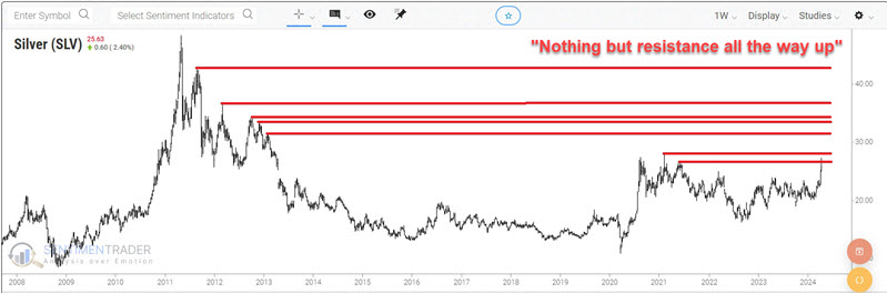
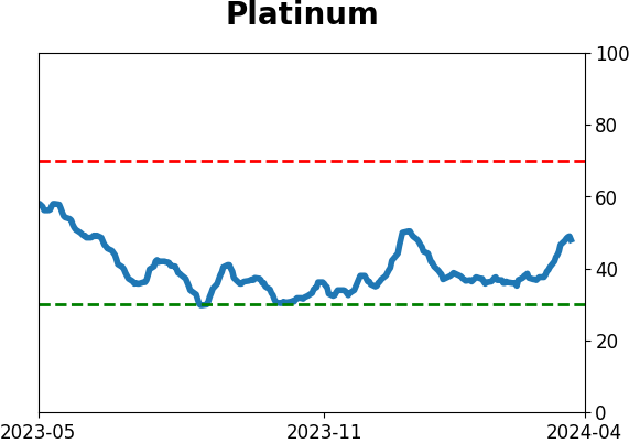
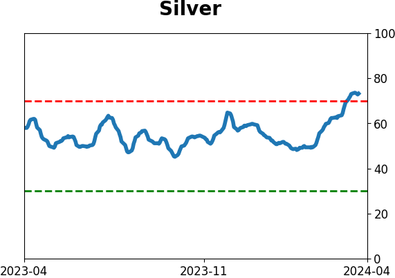
Silver spiking
Silver has followed gold's lead and shot higher in recent weeks. Jay suggested that traders might be cautious about chasing silver at the moment.
With charts, individuals can often see what they want to see. Some will look at silver and see a breakout from a descending trendline; others will look at the horizontal lines in the chart below and forecast much tougher sledding for Silver.
Seasonality could influence a slowdown in the ascent rate or portend a period of more choppy and volatile price action. The chart below displays silver futures seasonality (blue line), with this year's action represented by the red line.
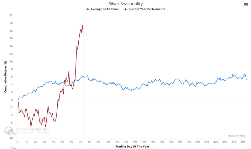
We are close to a period that tends to experience seasonal weakness. This period extends from the close of Trading Day of Year (TDY) #78 through TDY #127. For 2024, this period extends from the close on 2024-04-19 through 2024-06-21.
The chart displays the hypothetical $ +(-) from holding a long position in silver futures every year since 1970, only from TDY #78 through TDY #127.
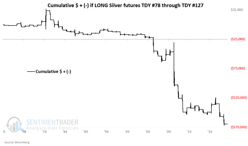
Silver rallied during these seasonal windows only 39% of the time. Its average gain was only half as large as its average loss. It gained more than +$10,000 twice while losing more than -$10,000 seven times.
It is not a secret that silver often follows gold's lead. A recent signal in a gold indicator flashes yellow for both gold and silver. The chart below displays those dates when the 3-day moving average of our GLD Optix indicator crossed above 92 for the first time in eighteen months versus the iShares Silver Trust (ticker SLV).
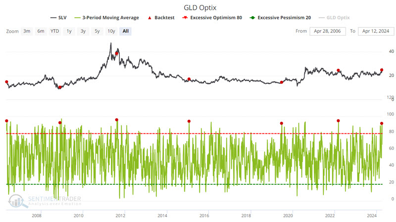
Again, this one indicator signal is not enough reason to panic and automatically abandon a bullish position in silver and/or sell short. But it is a reason not to fall in love with the "Silver to the Moon" swan song.
About TradingEdge Weekly...
The goal of TradingEdge Weekly is to summarize some of the research published to SentimenTrader over the past week. Sometimes there is a lot to digest, and this summary highlights the highest conviction or most compelling ideas we discussed. This is NOT the published research; rather, it pulls out some of the most relevant parts. It includes links to the published research for convenience, and if you don't subscribe to those products, it will present the options for access.
Indicators at Extremes
|
|
|
|
Phase Table
|
|
|
Ranks
|
|
|
|
|
|
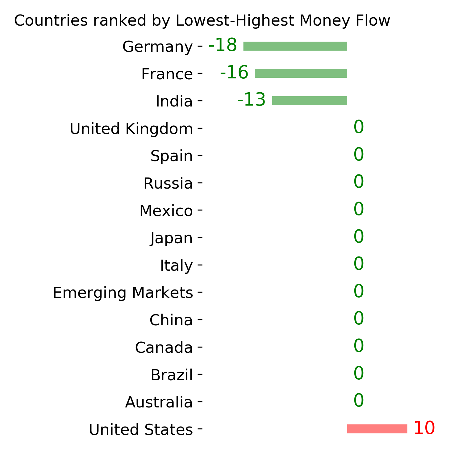
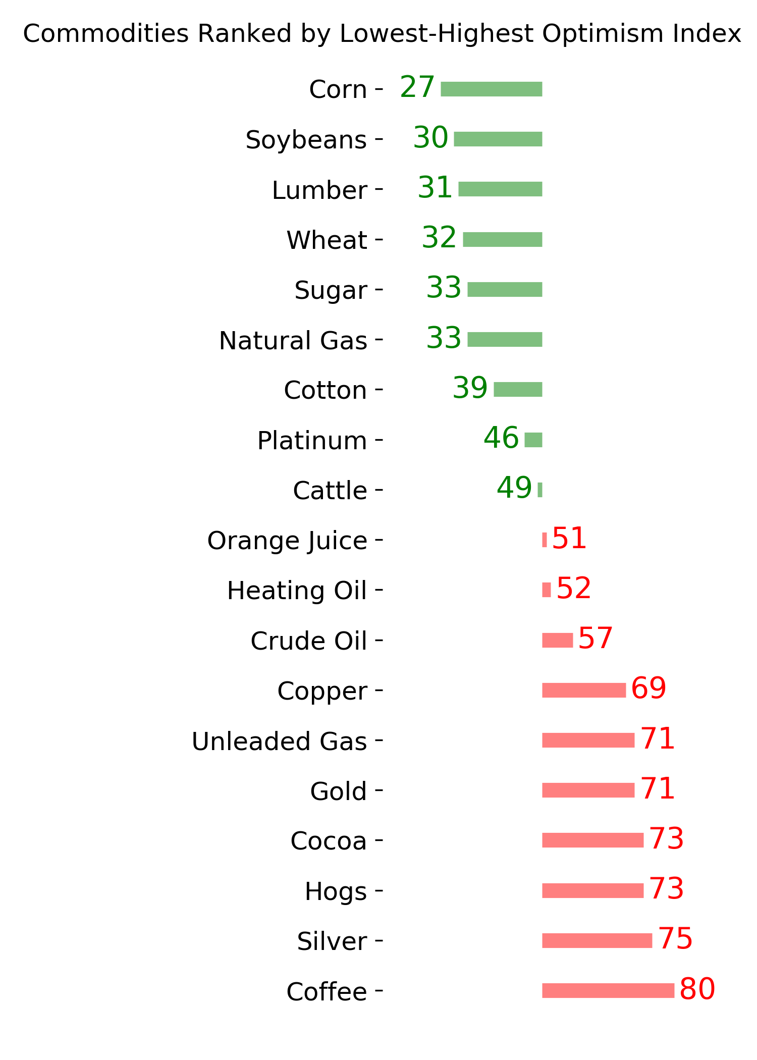
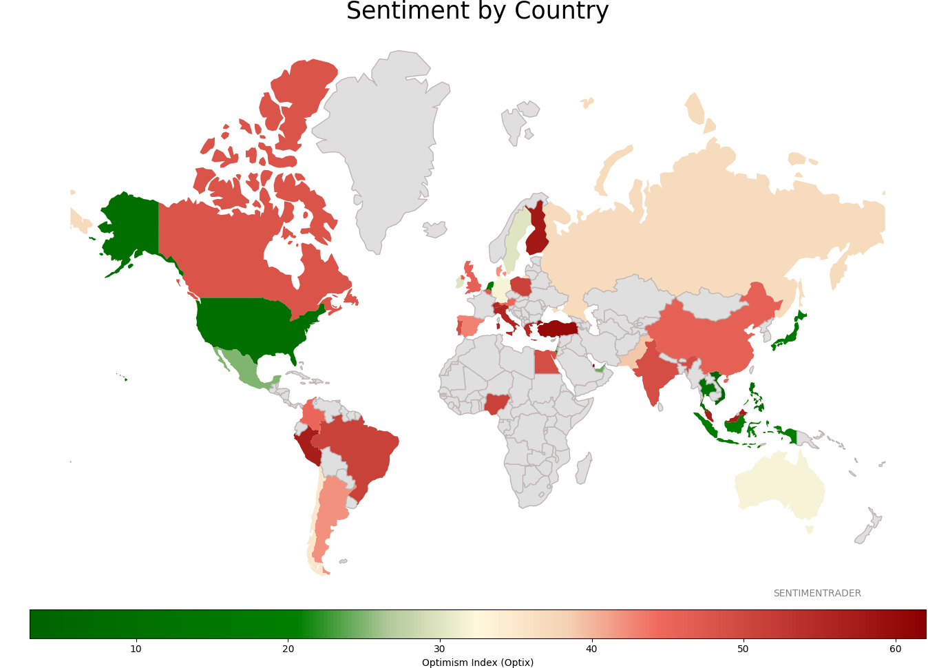
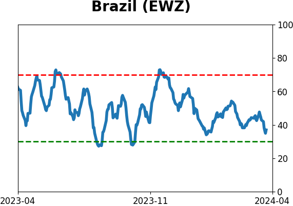
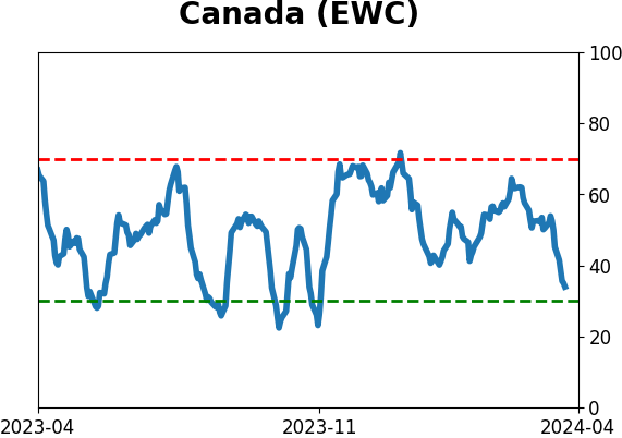
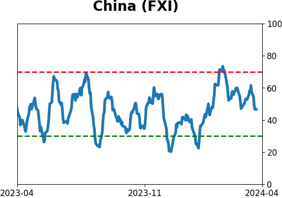
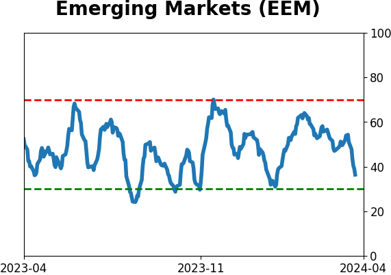
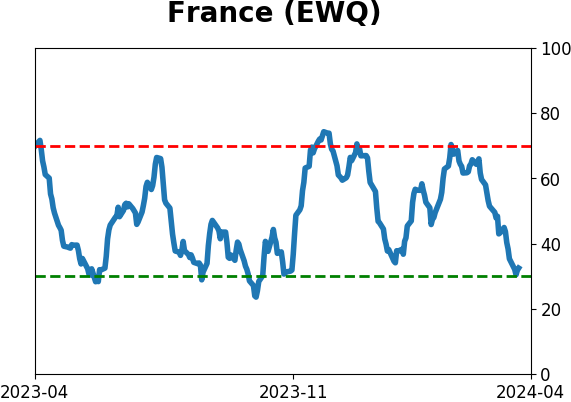
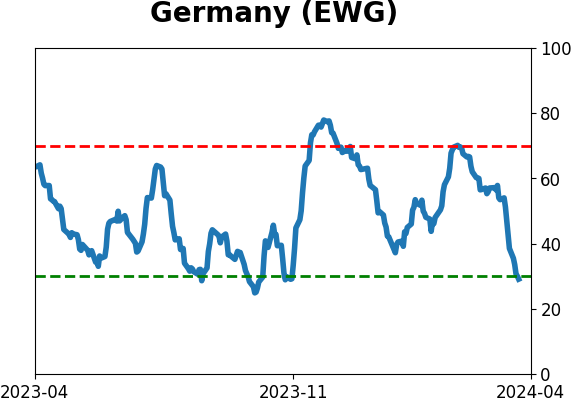
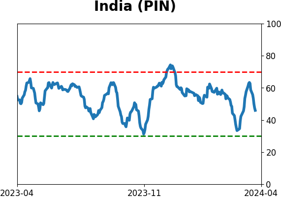
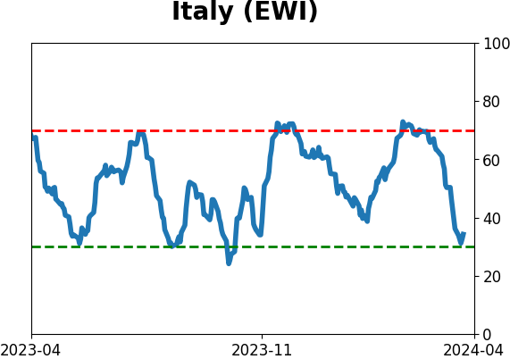
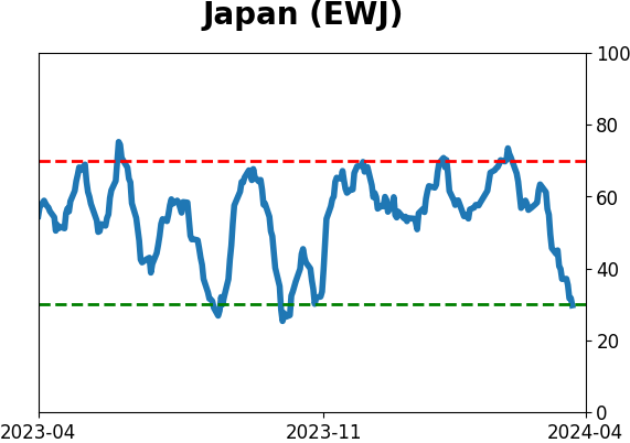
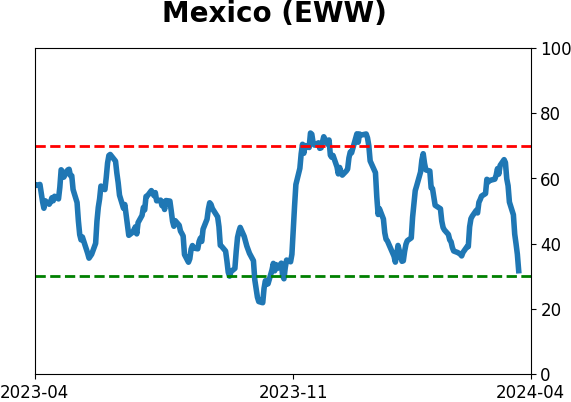
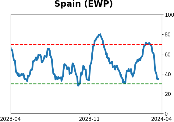
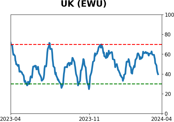
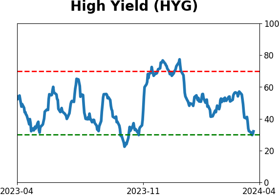
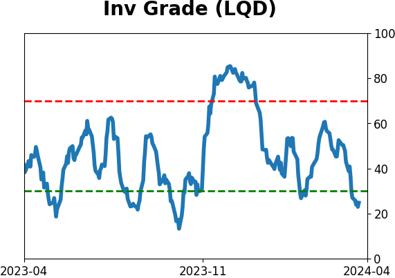
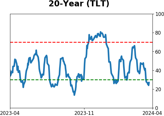
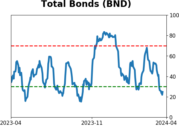
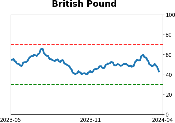
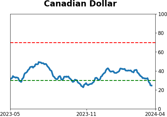
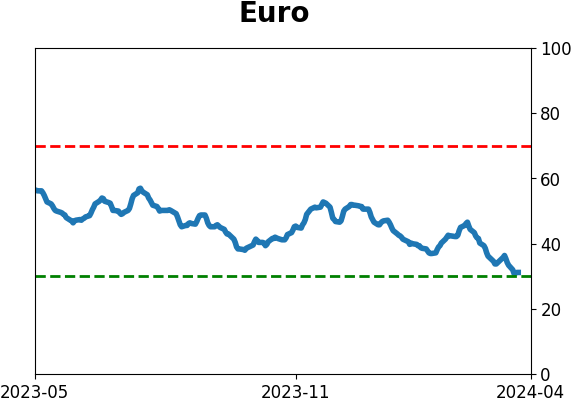
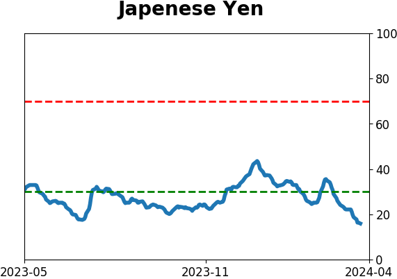
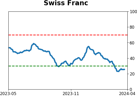
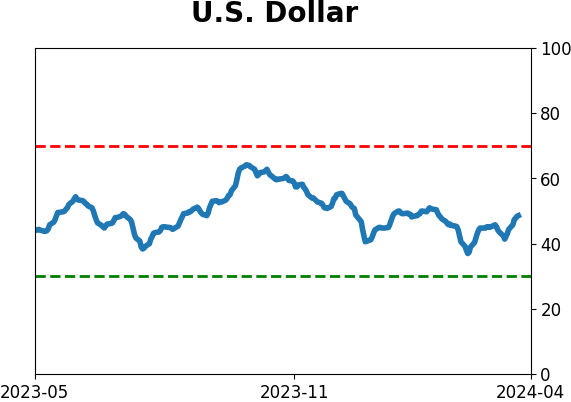
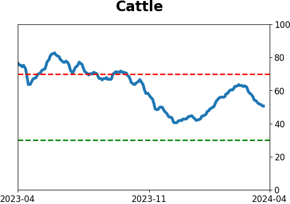
Sentiment Around The World
|
|
|
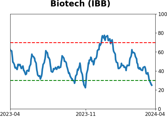
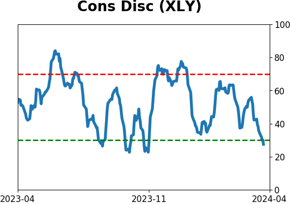
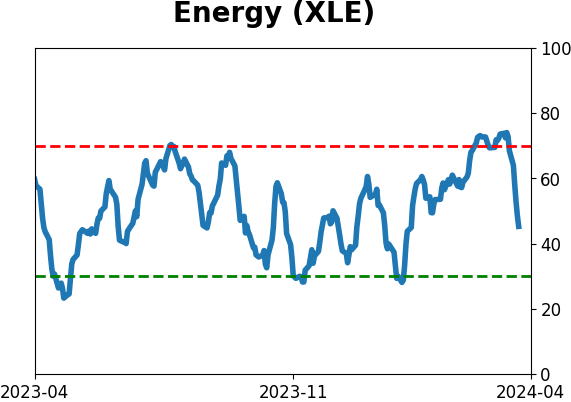
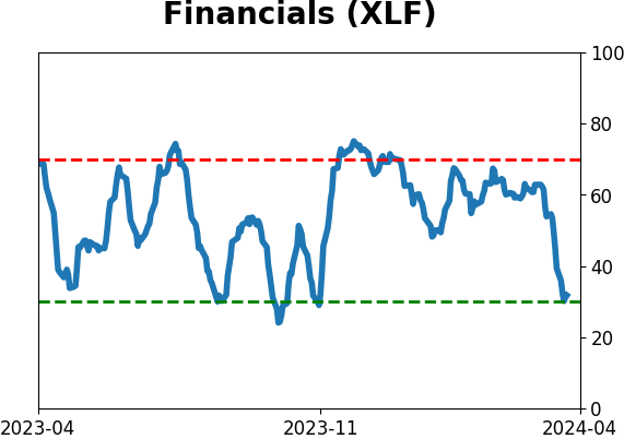
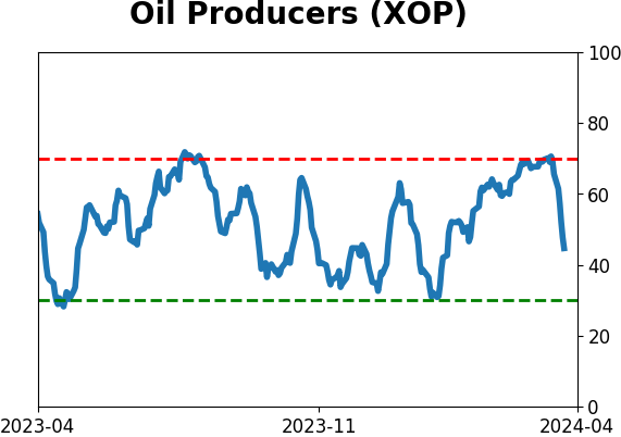
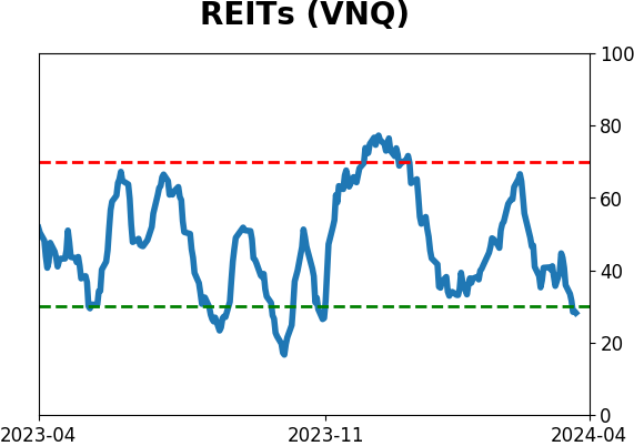
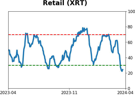
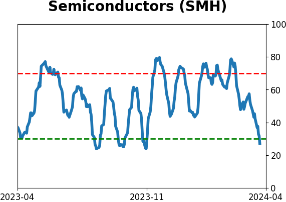
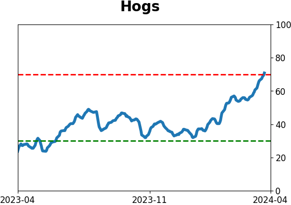
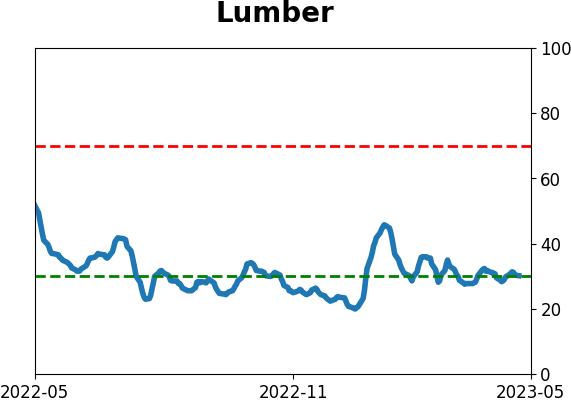
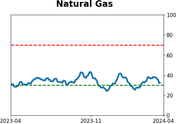
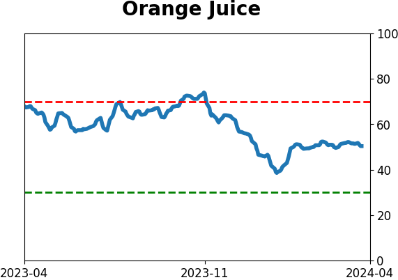
Optimism Index Thumbnails
|
|
|
|
|
|
|
|
|
|
|
|
|
|
|
|
|
|
|
|
|