Headlines
|
|
The crumbling premium of stocks over bonds:
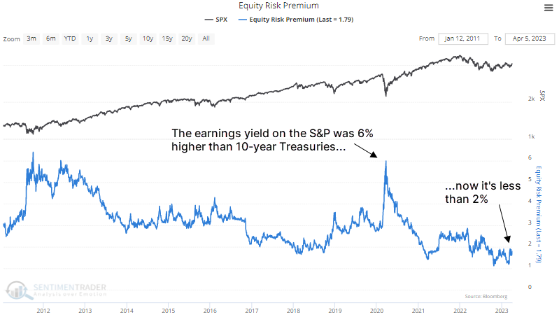
Due to a rally in stocks and a decline in bonds, the Equity Risk Premium has cratered. This is the amount of the S&P 500 earnings yield versus the 10-year Treasury yield. Historically, the premium is still relatively high, and even new lows in the premium have not preceded consistently negative returns for stocks.
|
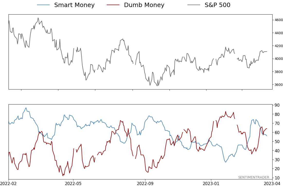
Smart / Dumb Money Confidence
|
Smart Money Confidence: 56%
Dumb Money Confidence: 64%
|
|
Risk Levels
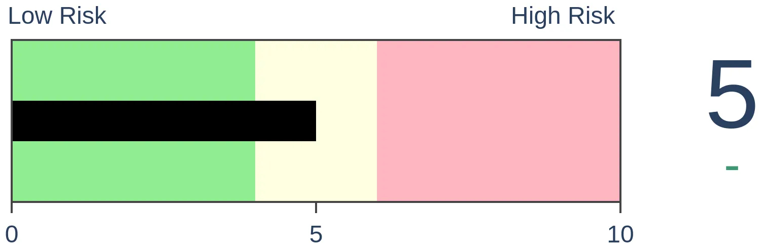
Stocks Short-Term
|
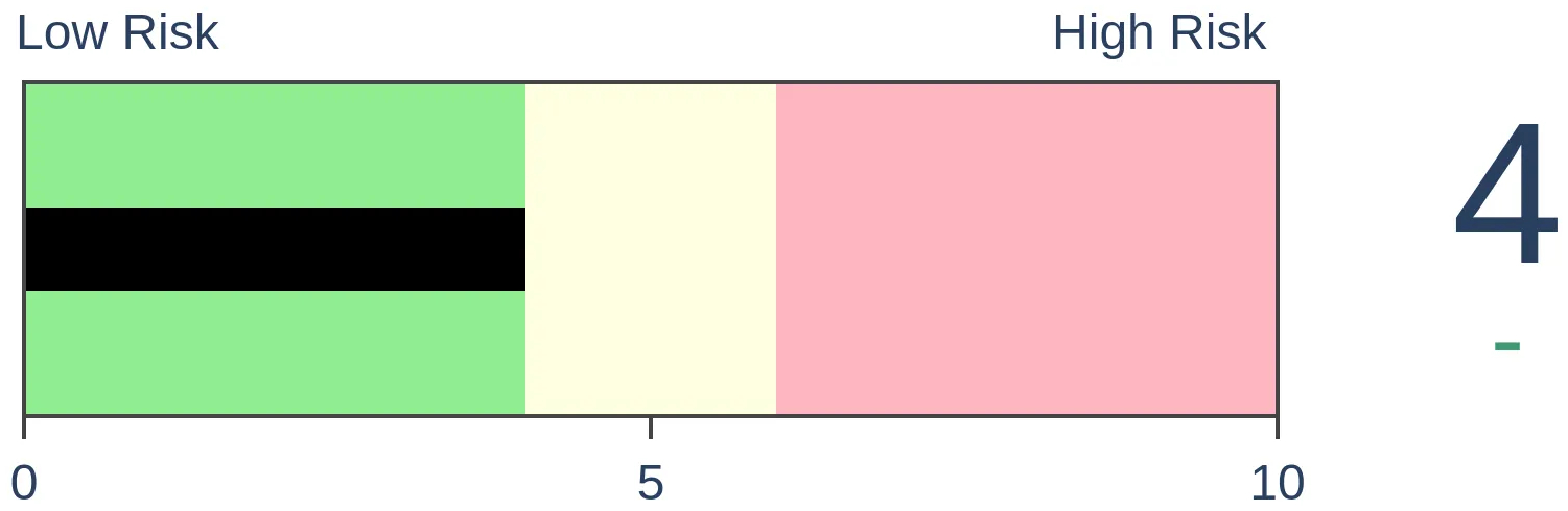
Stocks Medium-Term
|
|
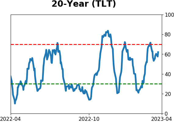
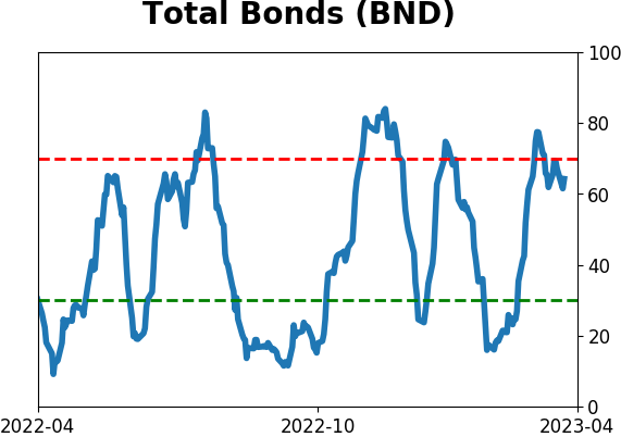
Bonds

|
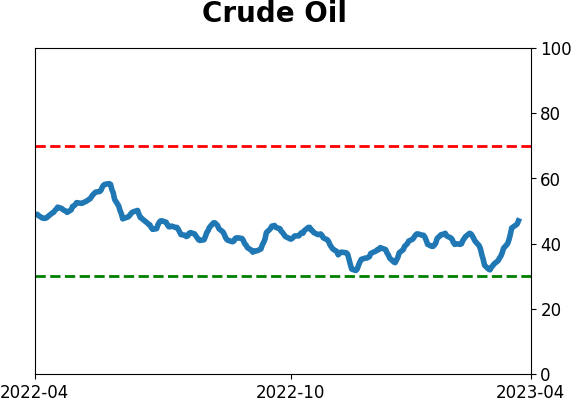
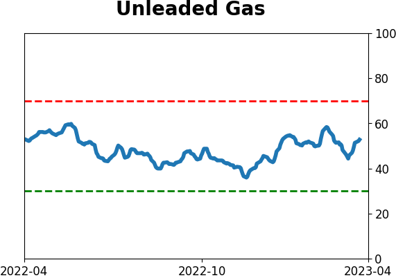
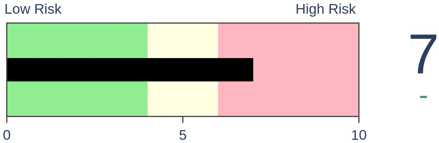
Crude Oil
|
|
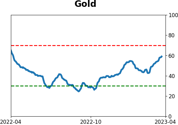
Gold
|
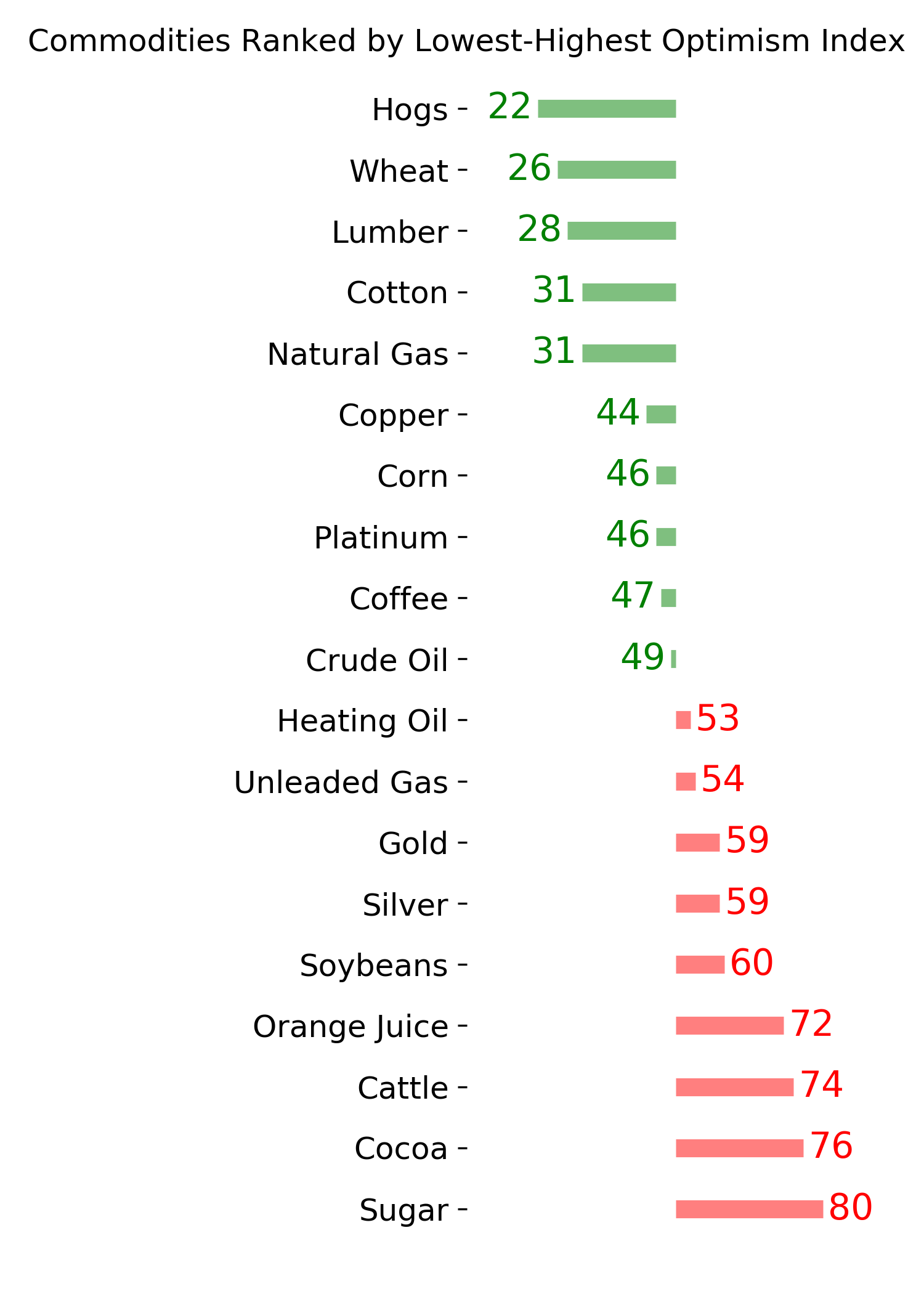
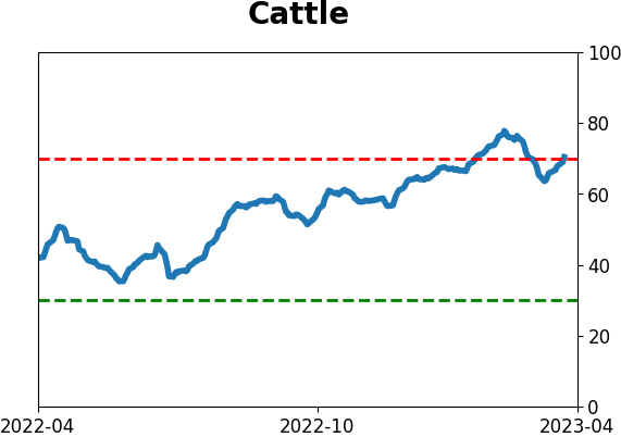
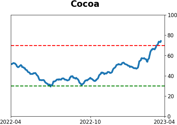
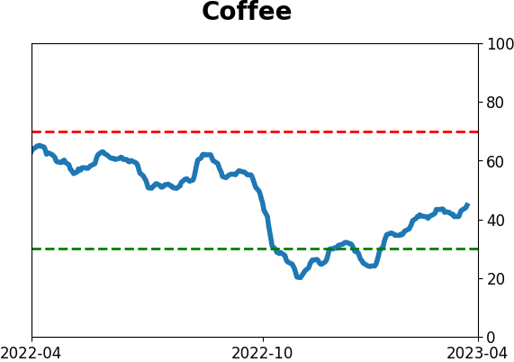
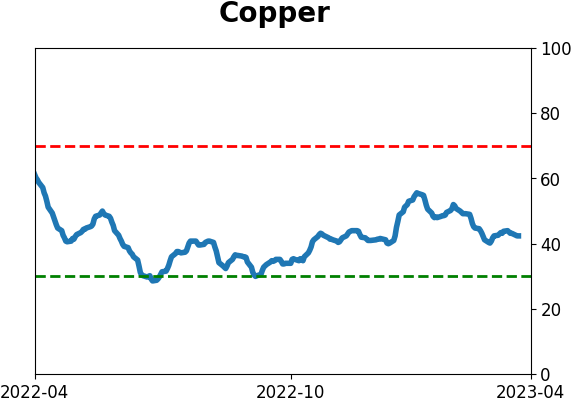
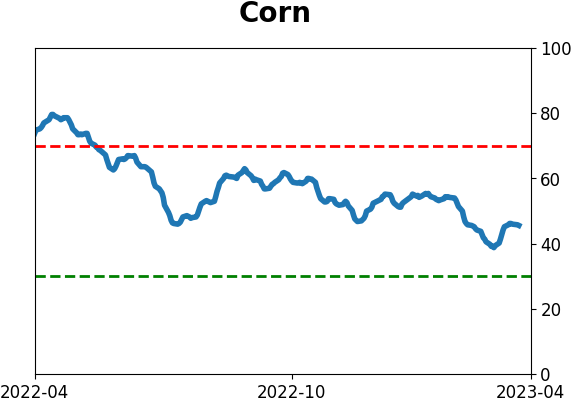
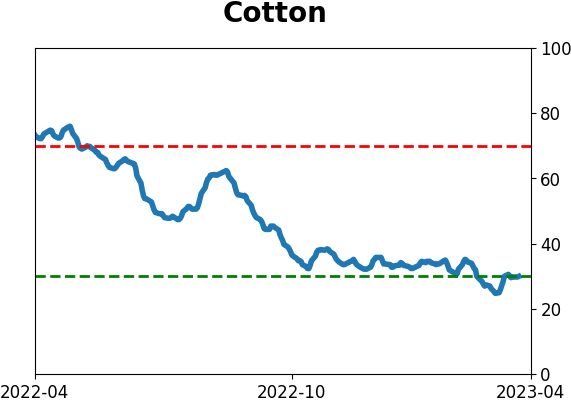
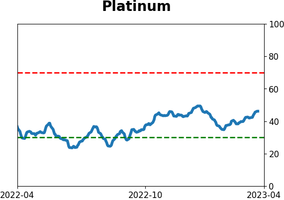
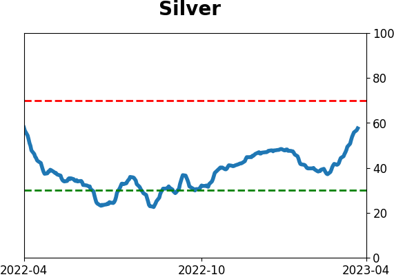
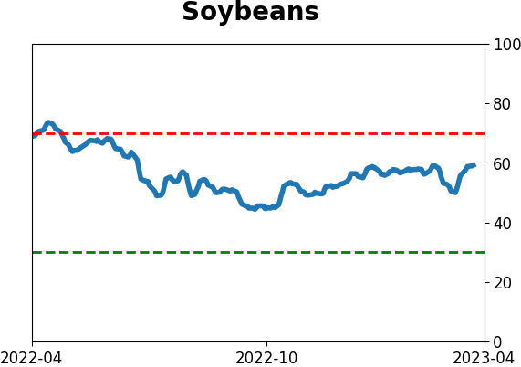
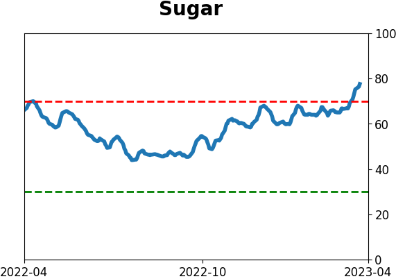
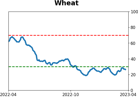
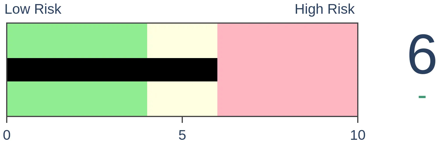
Agriculture

|
|
Research
By Jason Goepfert
BOTTOM LINE
Due to a rally in stocks and a decline in bonds, the Equity Risk Premium has cratered. This is the amount of the S&P 500 earnings yield versus the 10-year Treasury yield. Historically, the premium is still relatively high, and even new lows in the premium have not preceded consistently negative returns for stocks.
FORECAST / TIMEFRAME
None
|
Key points:
- The Equity Risk Premium has declined to one of the lowest levels in over a decade
- This suggests that investors in stocks are willing to tolerate a small cushion relative to bonds
- Lows in the premium are considered negative for stocks, but historically it has not been consistent
Investors don't have much cushion left (?)
Equity investors are willing to absorb the least buffer relative to bonds since right before the global financial crisis. The Wall Street Journal recently jumped on that scary data point that has been rebounding around in recent weeks.
The reward for owning stocks over bonds hasn't been this slim since before the 2008 financial crisis.
The equity risk premium-the gap between the S&P 500's earnings yield and that of 10-year Treasurys-sits around 1.59 percentage points, a low not seen since October 2007.
The methodologies and data sources for determining the Equity Risk Premium (ERP) vary. On the site, we use the S&P 500's earnings yield minus the yield on the 10-year Treasury. It has rebounded a bit lately but remains among the lowest levels in more than a decade. That's a drastic change from 2020 when equity investors had nearly a 6% cushion against Treasuries.
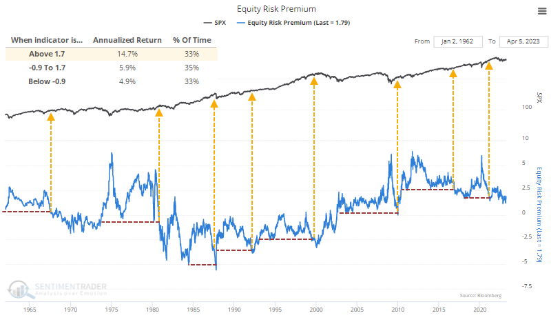
If we zoom out and look at the last 60 years, the bearish case gets a lot tougher. The premium is still more than 1.7%, and we can see from the chart below that over the past six decades, the S&P 500 returned an annualized +14.7% when the ERP was 1.7% or higher.
When the ERP broke down to new lows, highlighted by the arrows, it did precede a couple of scary episodes for stocks...but also others that preceded flat markets or even roaring rallies.
Extremes in the ERP without much change in returns
The table below shows the S&P's future returns after the ERP hit a 52-week low for the first time in at least a year. The table looks at longer time frames than we normally do.
These extremes preceded some large drawdowns over the ensuing months, and one drop greater than -20% over the next year. But that ignores the fact that the S&P still rose 80% of the time over that time frame, and the average maximum decline of -4.5% was dwarfed by the average maximum advance of more than +13%.
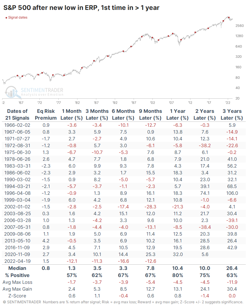
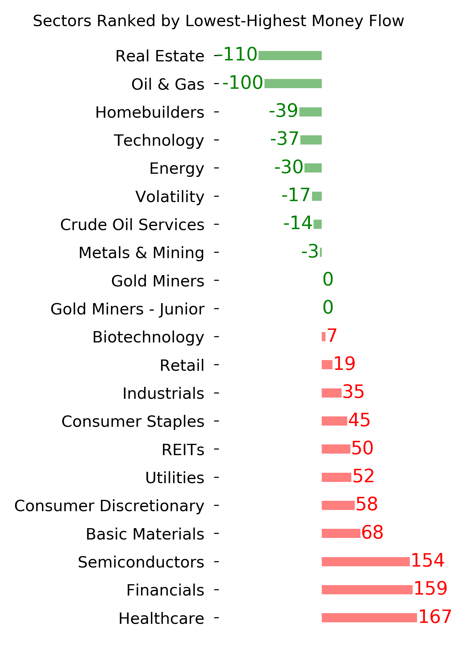
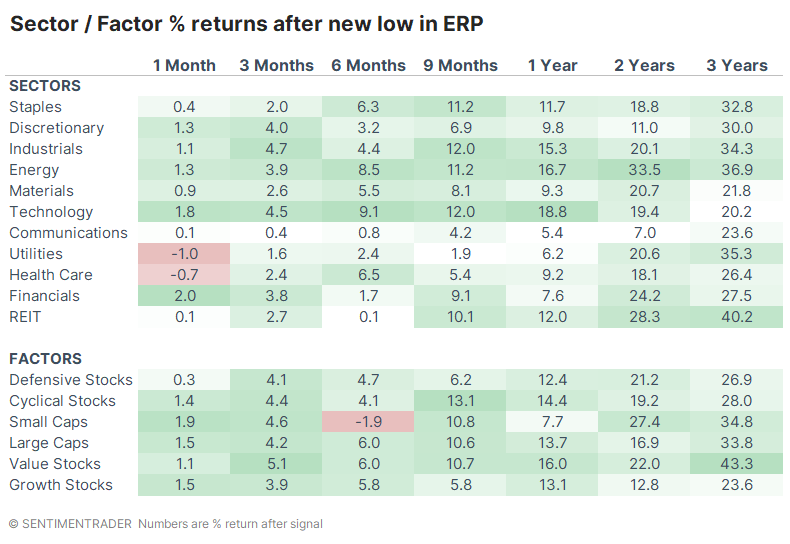
There was spotty performance among sectors and factors. Technology showed the most consistently strong returns up to a year later, while Communications and Utilities often struggled. Over the next two to three years, Energy, Utilities, and Real Estate showed some of the best returns. Over the next three years, Value stocks showed the largest average return out of any sector or factor.
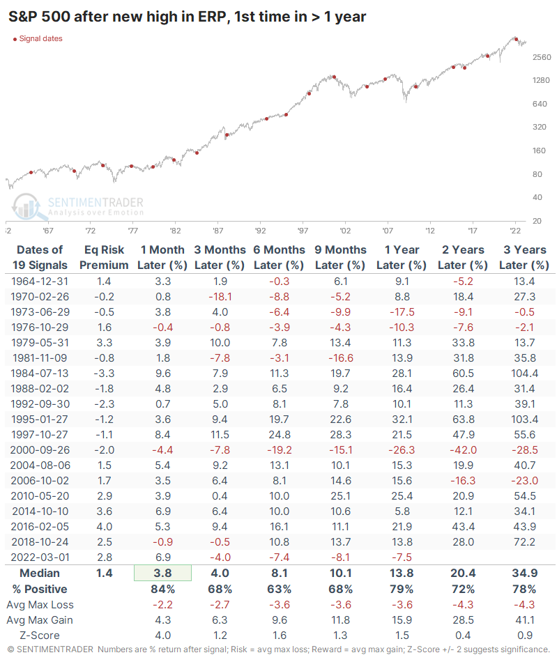
Let's look at the opposite scenario when the ERP reached its highest point in at least a year. If the ERP truly has consistent value, then the S&P's returns should be vastly superior to those times when the ERP fell to a new low.
And the returns were better, just not by much. After new highs in the ERP, the S&P rallied more consistently (barely), by a larger median amount (barely), with less risk (barely) and more reward. Not a strong case.
What the research tells us...
There are few rules when it comes to markets, but one of the unshakable ones is that we can always count on macro analysts and mainstream media to focus on the negatives. They will jump at the chance to highlight any possible risk, which can be useful at times as long as we can separate hysteria from reliable warning signs. The decline in the buffer equity investors are willing to accept in stocks over bonds is an increasing worry, but historically we're not even down to the long-term average yet.
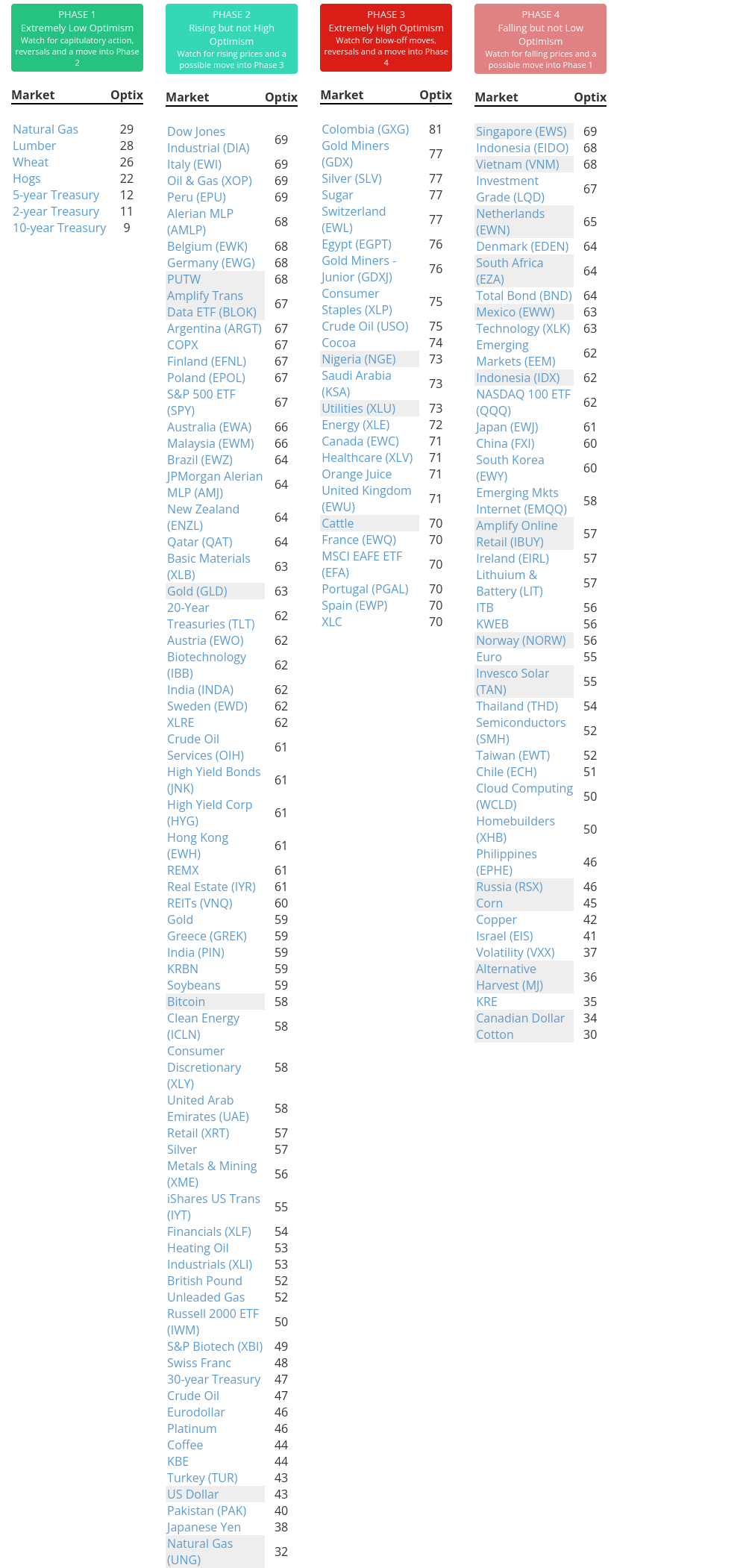
Indicators at Extremes
Phase Table
Ranks
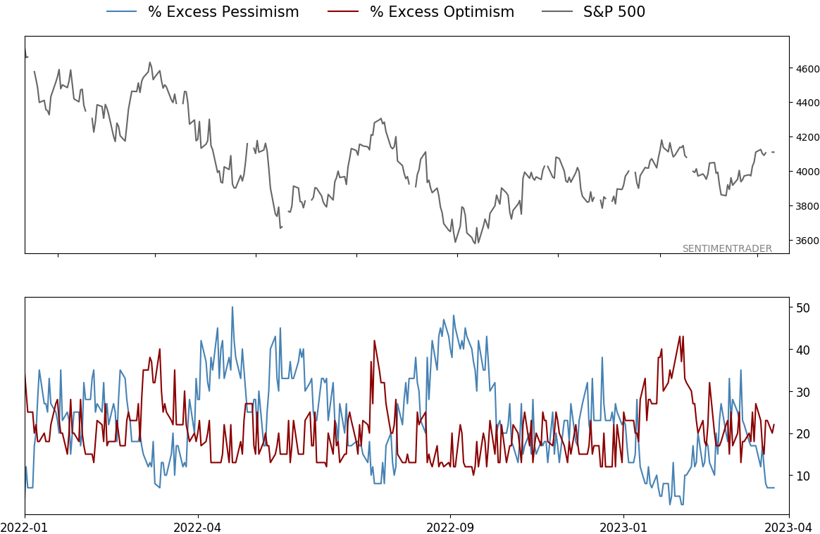
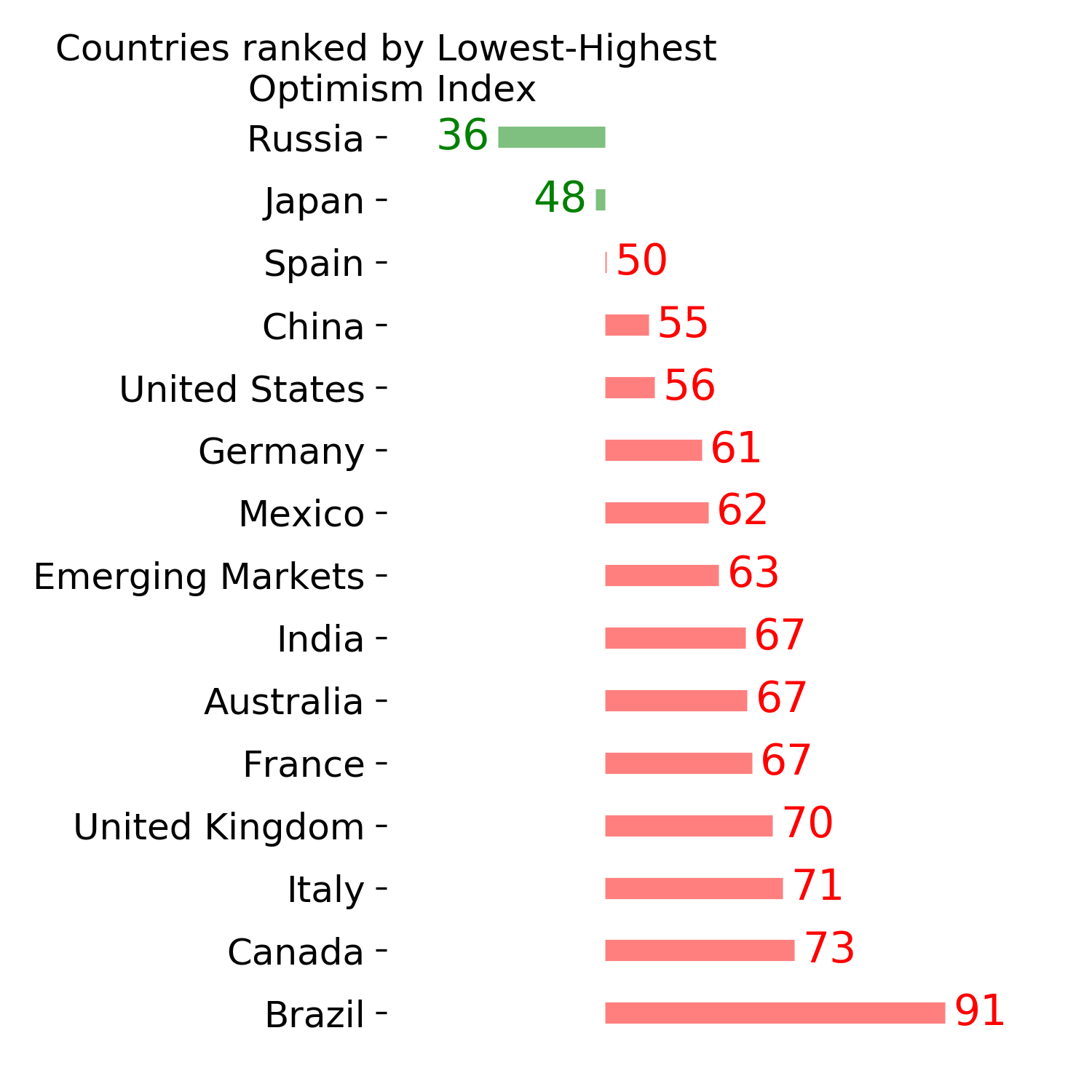
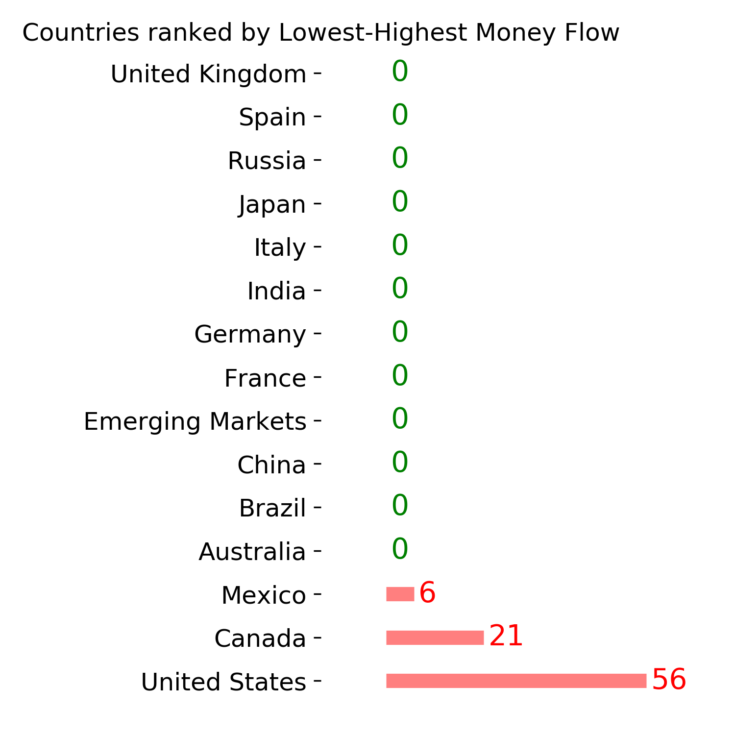
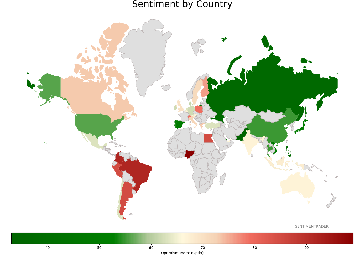
Sentiment Around The World
Optimism Index Thumbnails
|
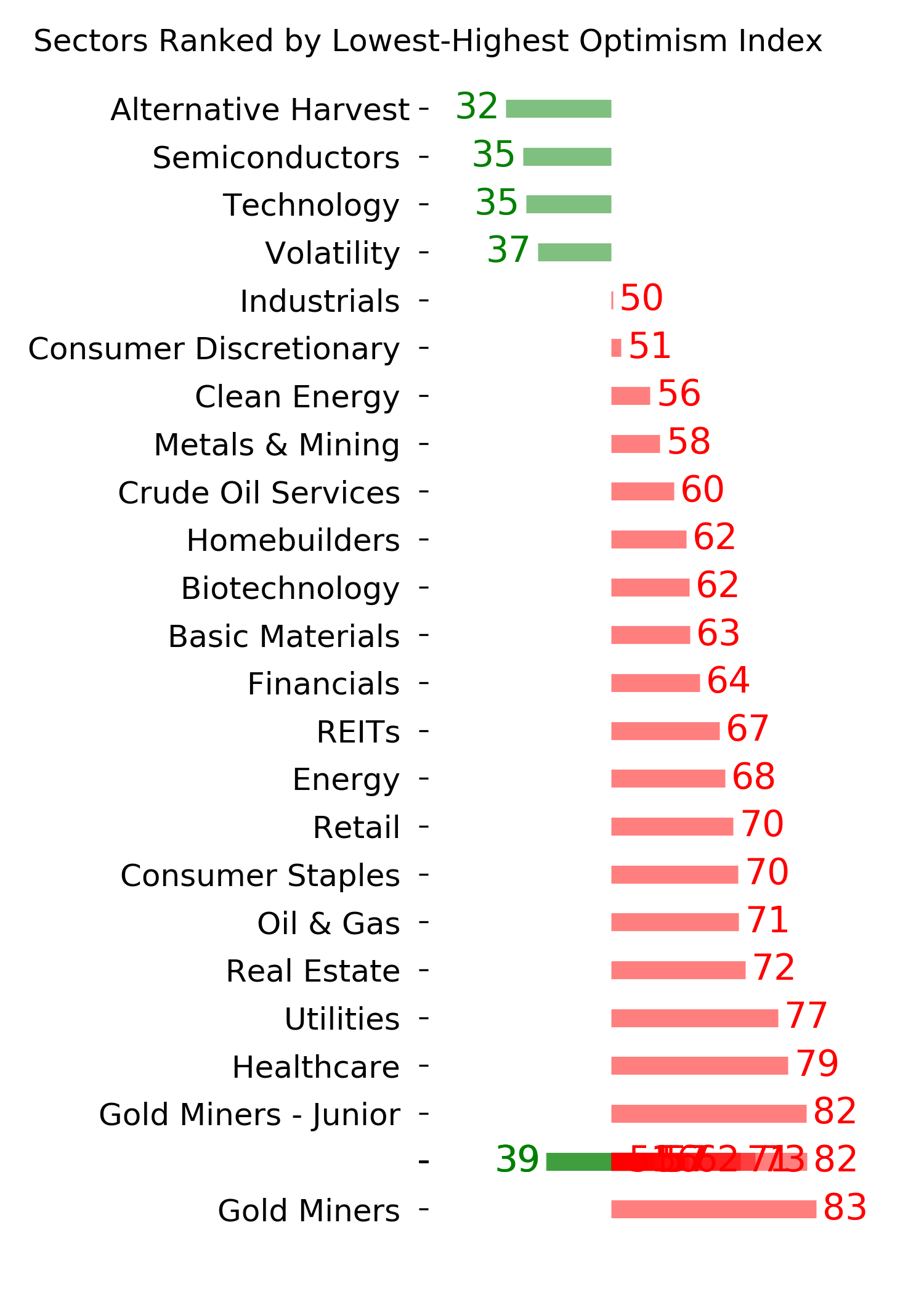
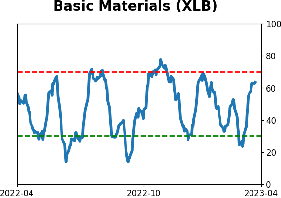
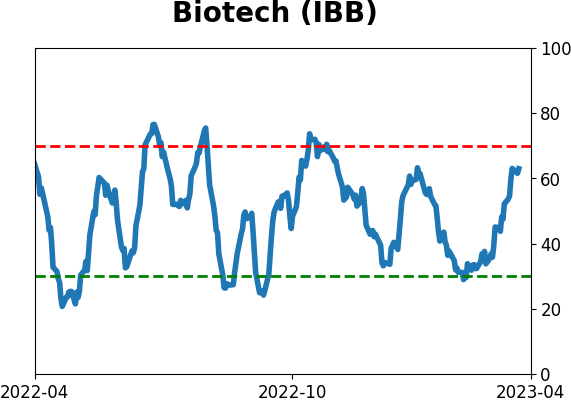
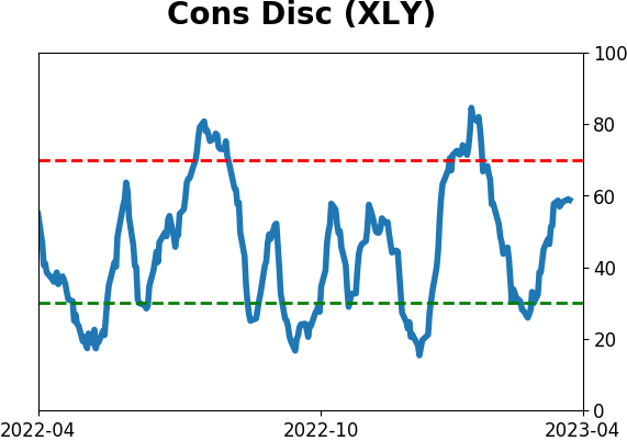
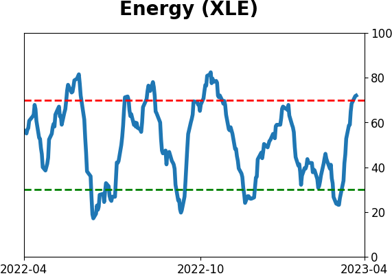
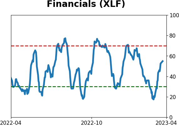
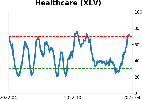
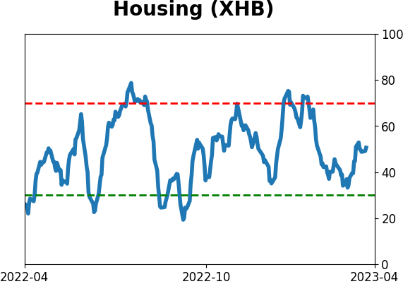
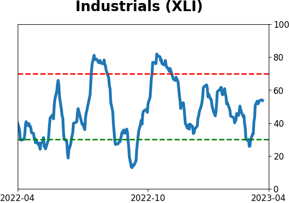
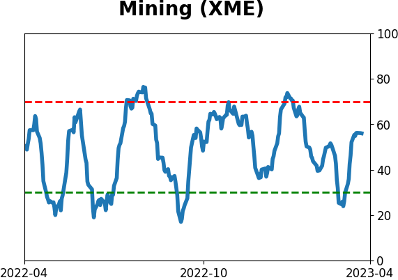
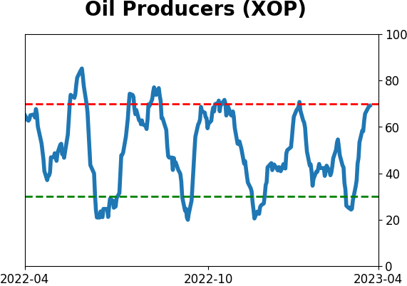
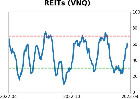
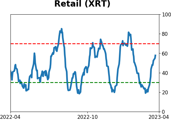
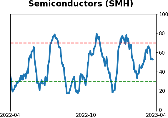
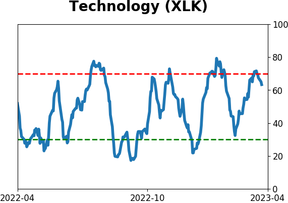
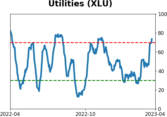
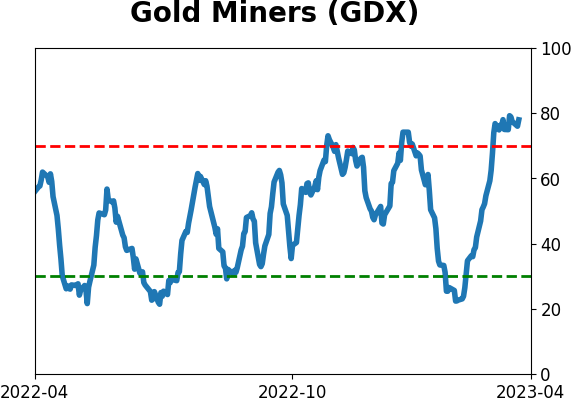
Sector ETF's - 10-Day Moving Average
|
|
|
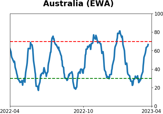
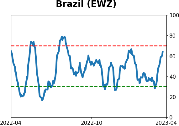
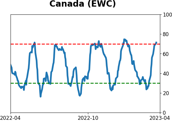
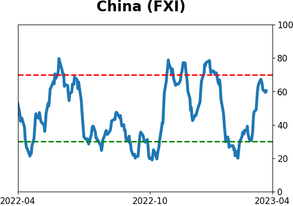
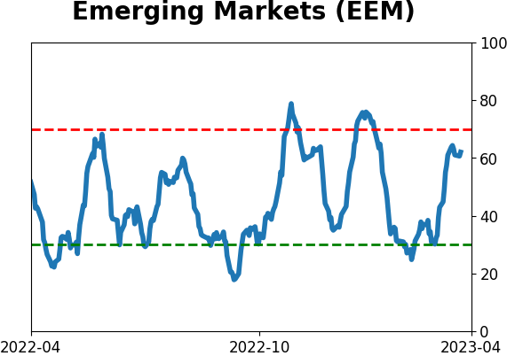
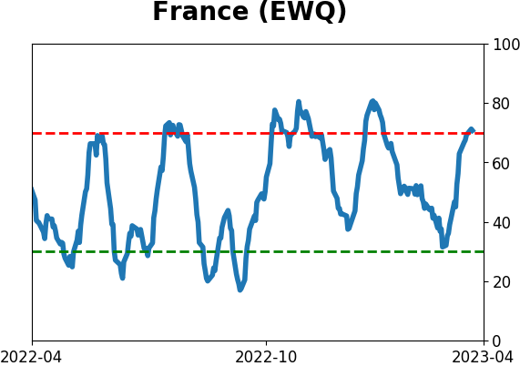
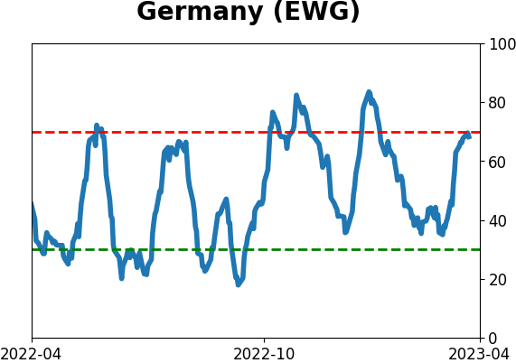
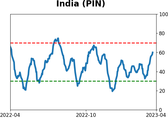
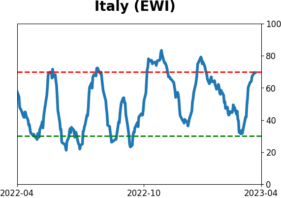
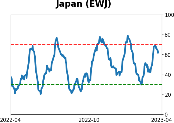
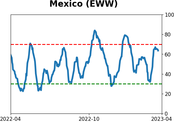
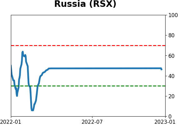
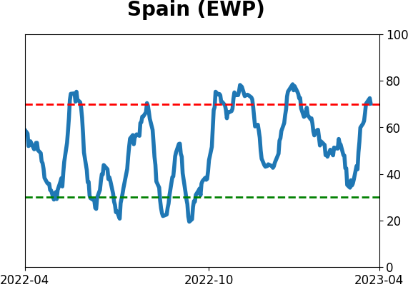
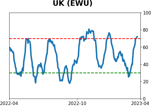
Country ETF's - 10-Day Moving Average
|
|
|
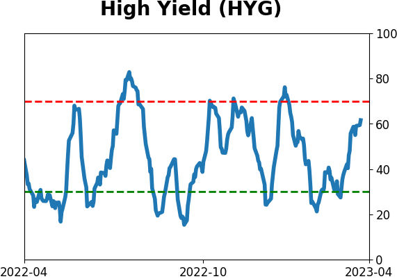
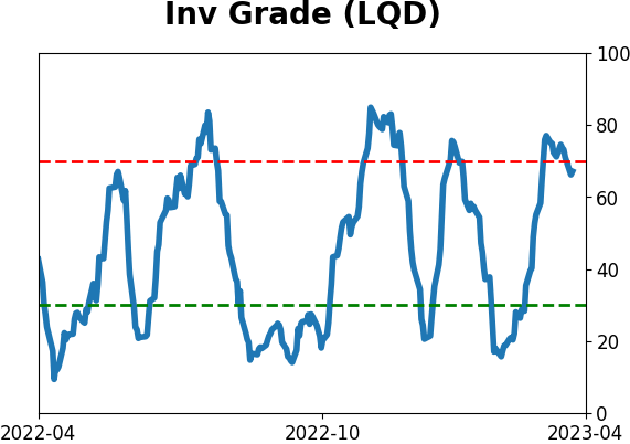
Bond ETF's - 10-Day Moving Average
|
|
|
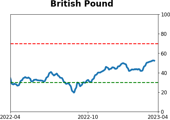
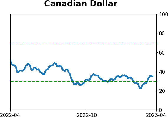
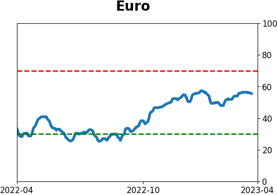
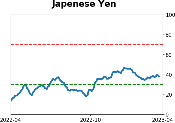
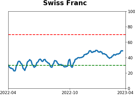
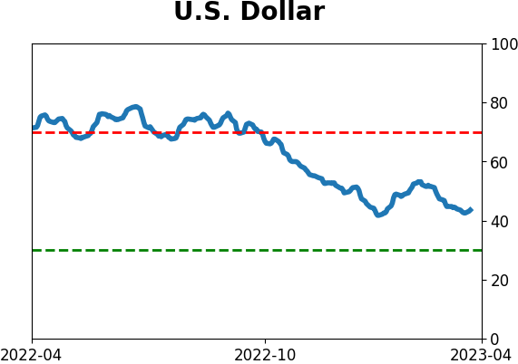
Currency ETF's - 5-Day Moving Average
|
|
|
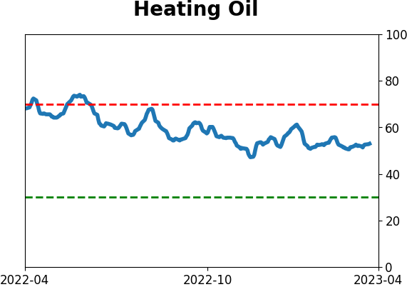
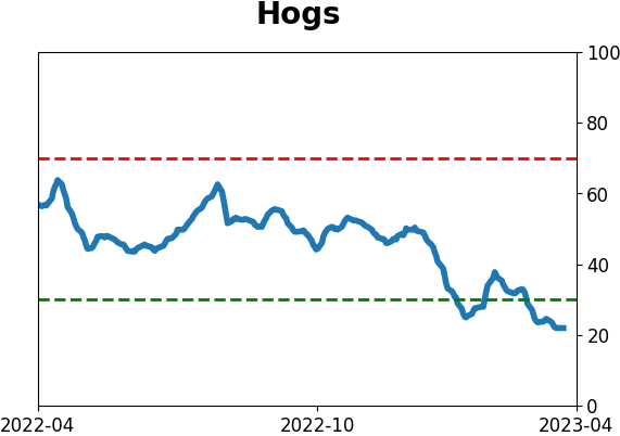
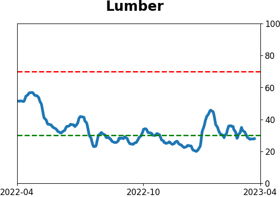
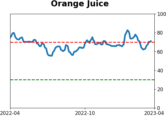
Commodity ETF's - 5-Day Moving Average
|
|