Daily Report : TradingEdge Weekly for Mar 10 - Bull market analogs, depressed consumers, struggling commodities

| View/Print a PDF version of this Report |
Headlines
|
TradingEdge Weekly for Mar 10 - Bull market analogs, depressed consumers, struggling commodities: This week, we saw that the potential new bull market reached its 95th day, and compare it versus other nascent bull markets. A simple trend-following strategy is still on a buy signal. Consumers are a lot more pessimistic than economic data suggests they should be. Commodities are struggling, especially wheat. |
Smart / Dumb Money Confidence
|
|
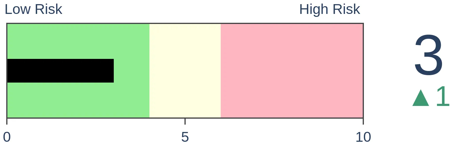
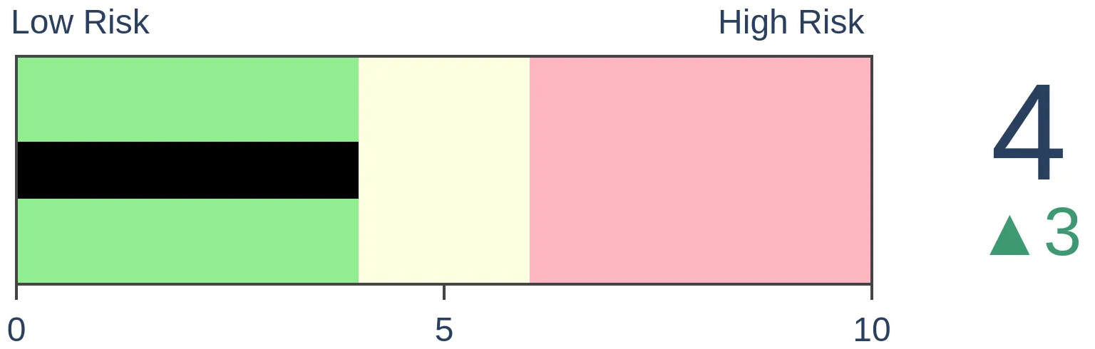
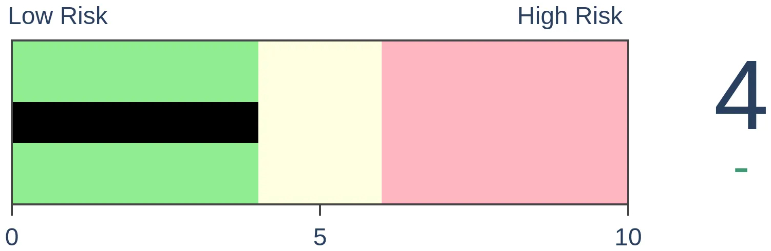
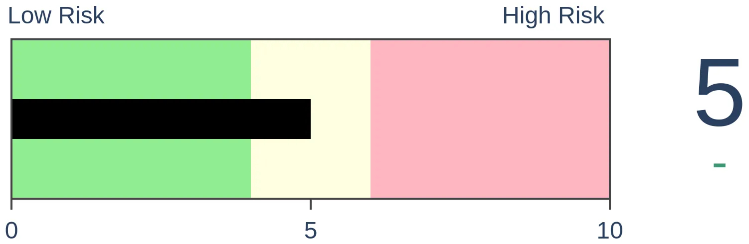
Risk Levels
|

|
|

Research
TradingEdge Weekly for Mar 10 - Bull market analogs, depressed consumers, struggling commoditiesBy Jason GoepfertBOTTOM LINEThis week, we saw that the potential new bull market reached its 95th day, and compare it versus other nascent bull markets. A simple trend-following strategy is still on a buy signal. Consumers are a lot more pessimistic than economic data suggests they should be. Commodities are struggling, especially wheat. FORECAST / TIMEFRAME |
Key points:
- This bull market is just like...
- A simple trend-following methodology with good consistency is still on a buy signal
- Consumers are a lot more pessimistic than economic data suggest they should be
- Using temporary employment figures as a stock market indicator
- Relative trends show that commodities are struggling versus stocks
- Among them, wheat prices have suffered and investors have turned their backs
- Highlighting an options trade in natural gas
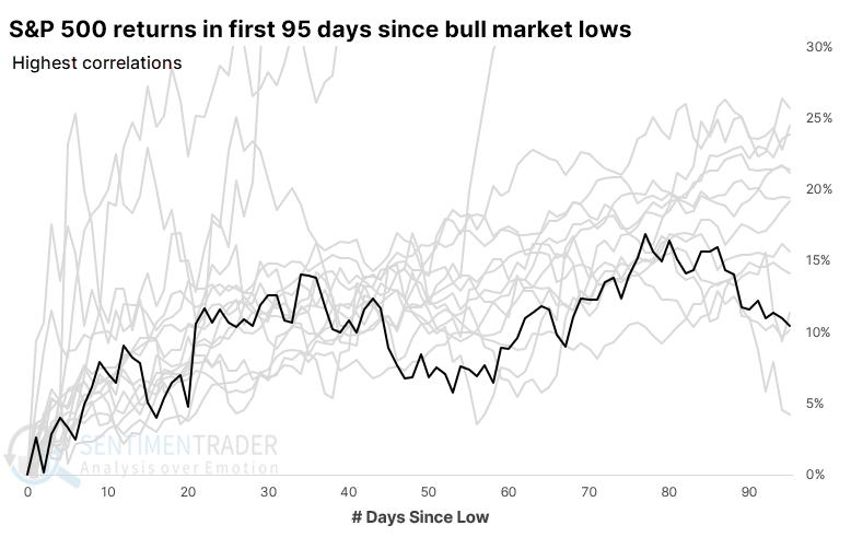
Highly-correlated bull markets
Last week, we reached the 95th day of the new bull market, making the large assumption that it is, indeed, a bull market. Whenever a rally (or decline) lasts a while, a popular topic revolves around the idea, "Hey, this one is just like..."
We can use bull and bear market dates defined by Ned Davis Research to compare the price path during this stretch against all other nascent bull markets since 1928. By doing that, we can look at the highest- and lowest-correlated bull markets to see where the current one fits in and what the future returns looked like after similar behavior.
The chart below shows the current bull market in black versus the 15 highest-correlated ones dating back to 1928. A few gigantic winners skewed the chart, so we cut the vertical scale cut off at 30%.
What's most important is what it meant for future returns. The table below shows S&P returns after the first 95 days of the most highly-correlated bull markets. Those returns were good, especially over the next six months, with all positive returns.
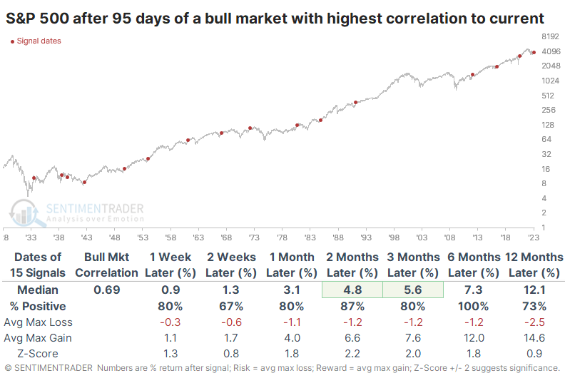
The ratio of maximum gains to maximum losses was especially impressive. Even over the next year, the maximum loss tended to be very small, particularly if we excluded the 1930s. After the 1930s, there was no drawdown of more than -6.1% at any point within the following year. If we filter the table to focus on modern markets since 1950, then returns were pristine. Any losses across any time frame were minimal.
As usual, it can be helpful to look at the counter-examples. After the first 95 days of the least-correlated bull markets, the S&P's returns were less consistently positive, incurred the most significant losses, and suffered more risk than the highest-correlated bull markets.
A simple trend-following strategy
The possibility of an emergent bull market would be greatly amplified if the trend can remain positive. Jay outlined a simple trend-following methodology that has performed well over the decades and is still currently on a buy signal.
We will keep it as simple as possible.
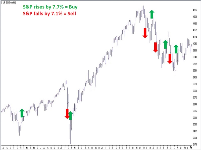
- A new bullish trend begins when the S&P 500 closes +7.7% or more above its most recent low weekly close
- A new bearish trend begins when the S&P 500 closes -7.1% or more below its most recent high weekly close
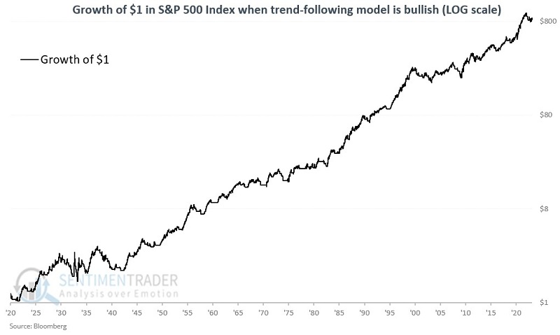
We started our test on 1920-01-02. Since then, there have been 115 completed buy and sell signals in just over 103 years. The chart below (courtesy of AIQ TradingExpert) displays the signals on a weekly S&P 500 chart since 2018.
From 1920 into 2023, during buy signals, the S&P 500 gained +84,408%, versus +42,893% for a buy-and-hold approach. During sell signals, the S&P 500 lost a cumulative -49.4%. So statistically, the strategy theoretically outperformed buy-and-hold by almost 2-to-1. The chart below displays the cumulative performance during buy signals on a logarithmic scale.
In contrast, the chart below displays the cumulative performance during sell signals.
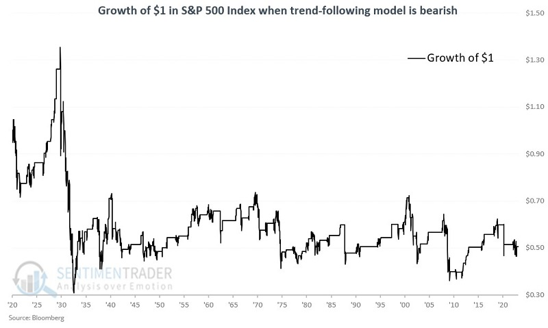
Nevertheless, with any trading or investment strategy, there are potential pitfalls. For example, this particular strategy experienced a great many whipsaws, whereby it either called for selling at a loss or buying back in at a higher price from the S&P 500 level at the time of the previous sell signal. Many investors find it challenging to keep taking new trades after a series of such whipsaws.
Out of 115 buy signals, only 45% showed a gain, but the average gain was four times greater than the average loss. There were 25 gains greater than +20% but no losses greater than -20%. A winning percentage of less than 50% is not uncommon for trend-following strategies but many investors are not wired to deal with a majority of trades ending in a loss.
Ironically, the sell signals ended with a gain for the S&P 500 fully 63% of the time - a much higher Win Rate than the buy signals. However, the average gain was only +6.4%, and seven sell signals witnessed an over 20% loss. The bottom line is that the primary edge to this strategy is the ability to miss a significant portion of large declines.
The table below displays results on a decade-by-decade basis.
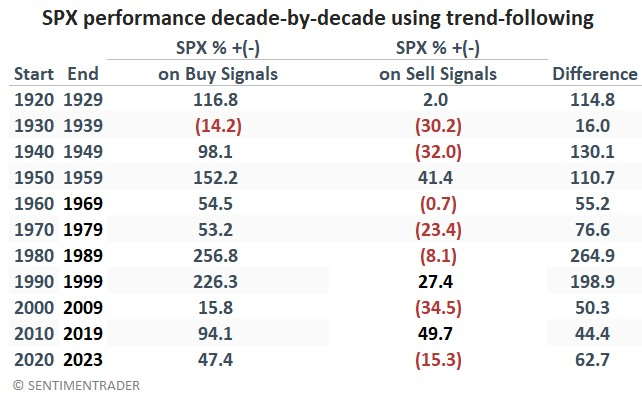
The good news is that the only decade that saw the buy signals generate a net loss was the 1930s. Likewise, the S&P 500 performed better during the buy signals than during the signals in every single decade. That demonstrates good reliability.
The most recent signal was a buy signal on October 28, with the S&P 500 at 3,901.06. The highest weekly close since then was 4,136.48. If that high is not exceeded, a sell signal will occur the next time the S&P 500 closes a week at or below 3,842.79.
Consumers are more pessimistic than economic data suggests they should be
Consumers are a lot more pessimistic than they have any right to be. At least, that's the theory when looking at the latest batch of soft versus hard economic releases.
When "soft" economic data, like consumer surveys, beat economists' expectations, while "hard" economic data, like retail sales, labor market conditions, housing performance, etc., disappoint, then this indicator will rise. Conversely, when this indicator is very negative, then it means that consumers have become more pessimistic than real economic data suggests they should be.
The chart below shows that the most recent update pushed soft releases well below those of hard releases. Over the past decade, this has coincided with the trough of market declines and double-digit annualized forward returns in the S&P 500.
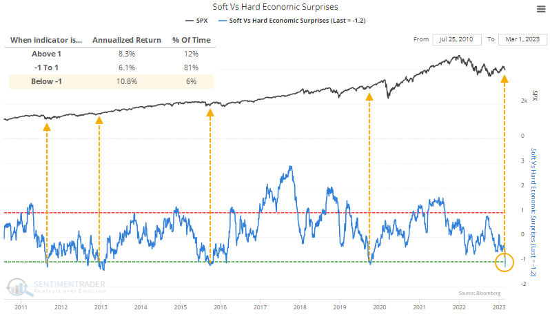
Before the last decade, it gave some false signals. It was below -1 for much of 2000 and early 2001 as stocks tumbled. And it fell below -1 briefly in July 2008 before a modest rally and then the complete breakdown into the teeth of the financial crisis.
After the spread fell below -1 for the first time in years, the S&P's returns were good. Of course, we must discount any potential conclusion because of the minuscule sample size. So, for what it's worth, the S&P sported a positive return each time over the next three months and didn't suffer any consistent losses up to a year later.
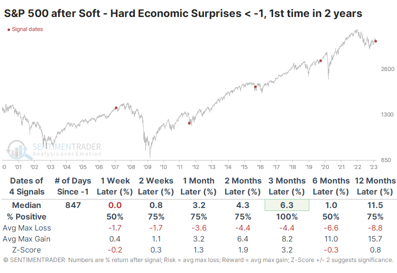
Among other indexes and assets, the Dow Industrials and Nasdaq showed very good returns over the next three months, while the small-cap Russell 2000 sported a negative return after three of the four signals six months later. Treasury note prices dipped in the intermediate term but rose strongly afterward. Gold and commodities, in general, struggled over the next two to three months.
Using temp employment as a stock market indicator
Temporary employees are the easiest to hire and fire, so it tends to trend early in the business cycle. Jay noted that changes in the number of temporary employees appear to be a useful "canary in the coal mine" economic indicator and is also helpful as a stock market indicator.
The chart below displays the number of individuals working as temporary employees in the latest survey of employers. To determine the trend of the data, Jay applied a 10-month exponential moving average (EMA).
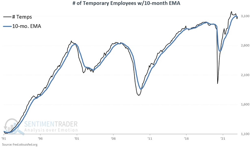
The TEMPS indicator is simple and calculated at each month's end as follows:
- If # Temporary employees > 10-month EMA, then the TEMPS indicator is rated as favorable
- If # Temporary employees < 10-month EMA, then the TEMPS indicator is rated as unfavorable
Note that the black line in the chart above is presently below the blue line in the chart above. As a result, the TEMPS indicator is currently rated as unfavorable.
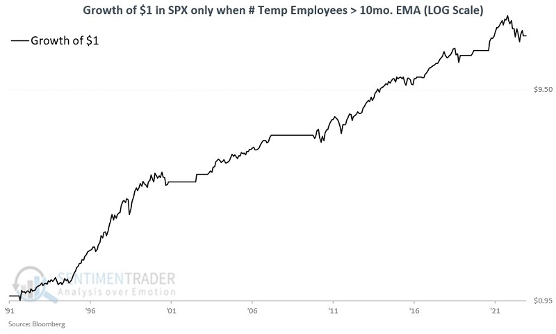
Jay showed in-depth data suggesting that the trend in temp employment is a useful guide to future economic data. Forecasting the economy is interesting in an academic and business sense. However, as investors, our primary interest is in making money. So let's look at TEMPS as a stock market indicator.
The log scale chart below displays the growth of $1 in the S&P 500 Index only when TEMPS has been favorable since 1991. The cumulative growth during favorable periods since 1991 is +1,612%.
Conversely, the chart below displays the growth of $1 in the S&P 500 Index only when TEMPS is unfavorable. The cumulative decline during unfavorable periods since 1991 is (-38.2%).
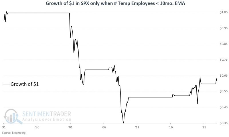
While TEMPS is not intended to be used as an automatic trading system, its current unfavorable status is either a temporary blip - OR it counts as a cautionary "canary in the coal mine" alert to consumers and investors.
Relative trends show that commodities have been struggling
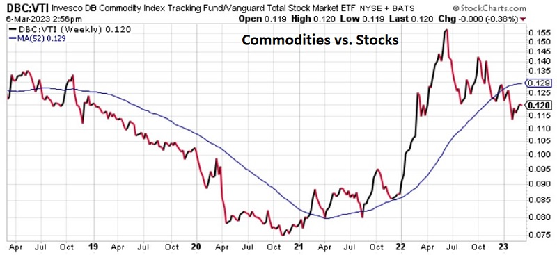
There are no permanent relationships in the financial markets. Alert investors often gain an advantage by monitoring key relationships, and Jay looked at more than a dozen crucial market relationships to help highlight areas of strength and weakness.
The black and red line (courtesy Stockcharts) displays the weekly relative performance trend, so a rising line means that the first security listed in the comparison is outperforming and vice versa. Each chart also shows a 52-week simple moving average in blue.
Among many other relationships, Jay pointed out that commodities are in a defined downtrend relative to stocks, using DBC vs. VTI (Invesco DB Commodity Tracking Fund vs. Vanguard Total Stock Market ETF). Commodities had a terrific run into mid-2022. But once inflation peaked, commodities backed off significantly while stocks have staged a rally since October.
The relative strength line has dropped back below the 52-week MA, thus favoring stocks over commodities. However, the 52-week MA has yet to roll over. As long as stock indexes remain above their 200-day average and inflation continues to cool off, there is not much of a catalyst to favor commodities.
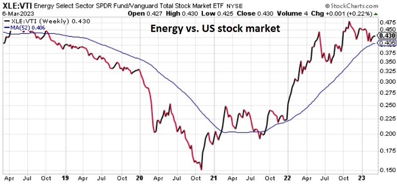
Within the commodity complex, energy is still doing relatively well. The trend of XLE vs. VTI (Energy Select Sector SPDR Fund vs. Vanguard Total Stock Market ETF) remains higher. After years of severe underperformance and a severe decline into late 2020, traditional Energy (Oil & Gas) was the undisputed leader into late 2022.
In recent months the RS line has backed off of its highs. There is always a lot of chatter that the leading sector is about to flame out. Nevertheless, as long as the RS line holds above a rising 52-week MA, the trend remains positive for energy.
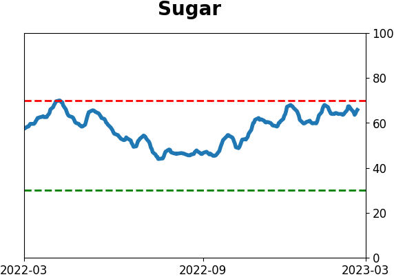
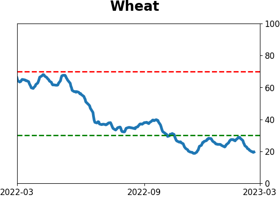
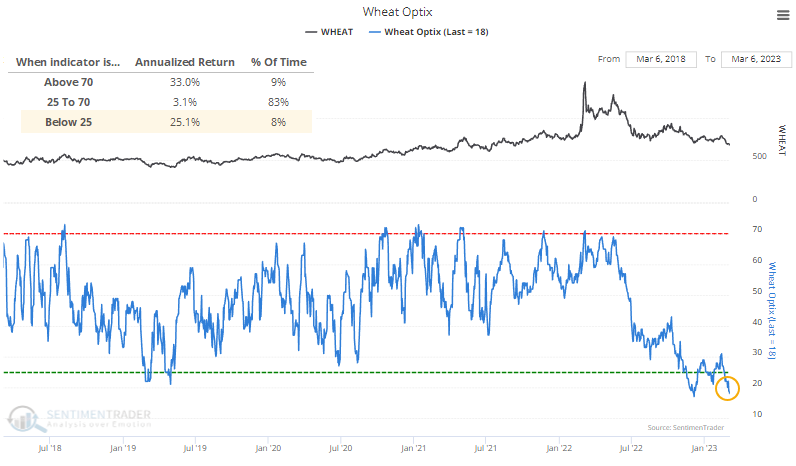
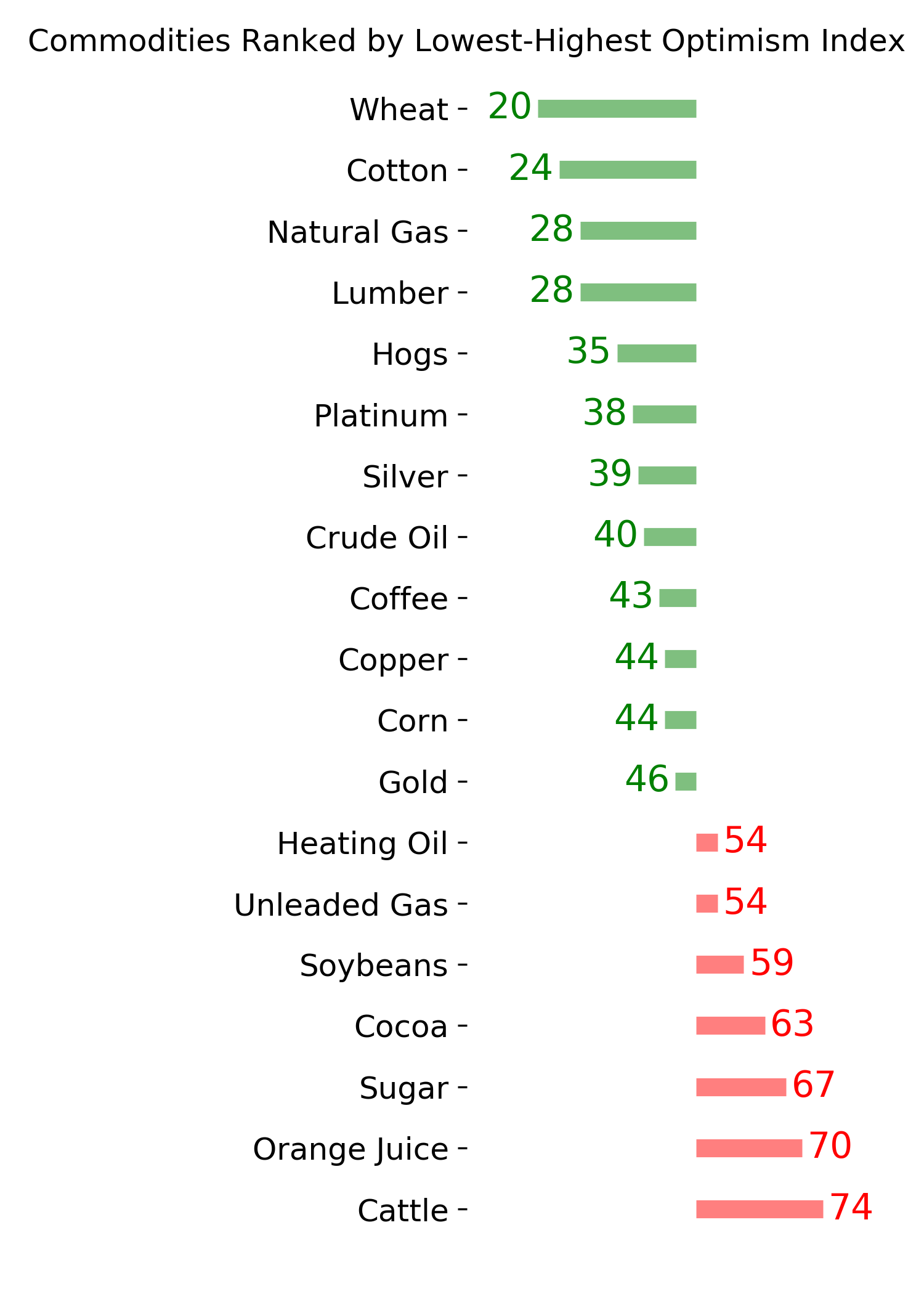
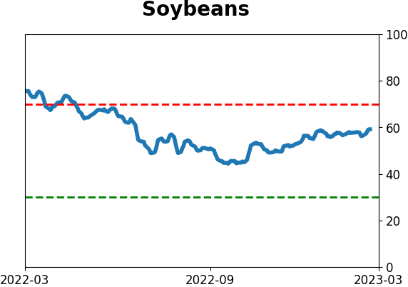
Wheat prices have plunged, and investors are pessimistic
Investors have been giving up on wheat, with surveys showing low optimism and speculators placing increasing bets on the short side. That has pushed its Optimism Index below 20, the 2nd-lowest reading in the past five years and in the bottom 1% of readings since 1991.
Like many commodities, wheat has frequent boom and bust cycles. Its worst returns tend to occur in the mushy middle, with very low and very high sentiment readings tending to precede the best returns.
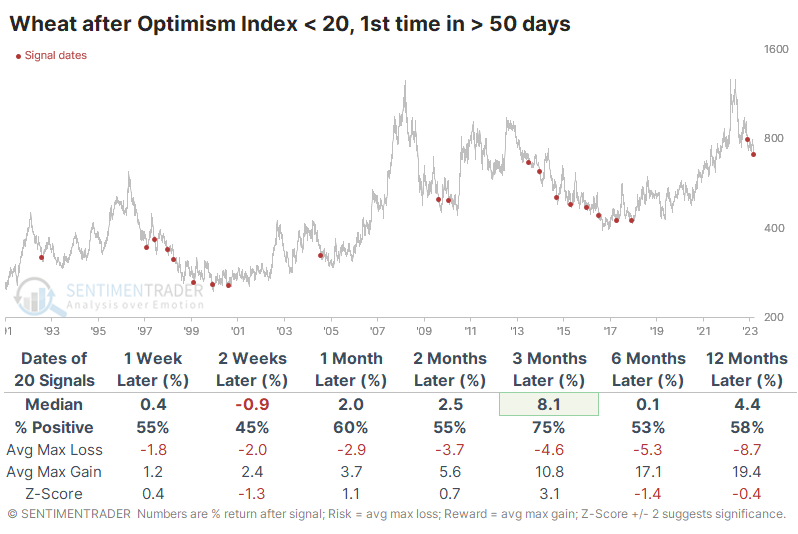
The table below shows wheat's forward returns when the Optimism Index dips below 20 for the first time in at least 50 days. Even though many of these were triggered during multi-year bear markets, the contract sported a decent tendency to rebound over the next three months. One concern is that the last signal also preceded the worst three-month return, raising the potential that some more significant shift has occurred.
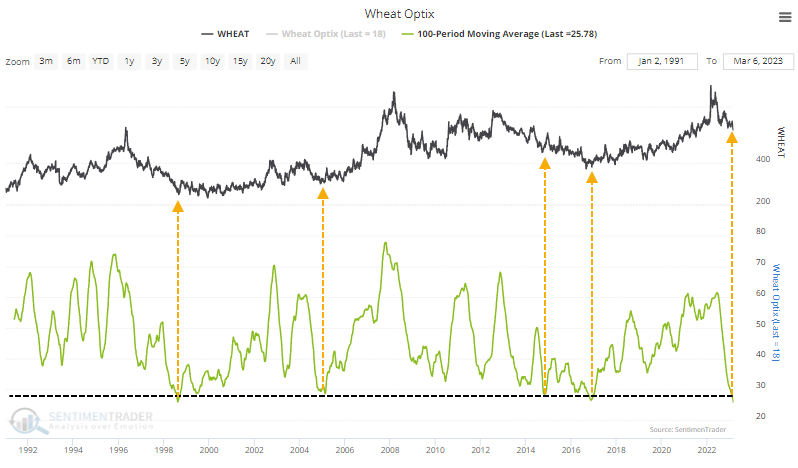
One potential tailwind is that sentiment has been depressed for a while. The 100-day moving average of the Optimism Index just dropped below 26, the lowest reading in history. After other stretches of extremely low sentiment, the declines tended to moderate at worst.
According to Bloomberg calculations, among a broad group of popular U.S.-based ETFs, the DBA fund has the highest correlation to wheat prices. This excludes the more obvious WEAT fund, which can sometimes be thinly traded.
According to the Backtest Engine, when wheat's Optimism Index has dropped below 20, the DBA fund sported a positive return over the next two months 80% of the time. That's not terrible, given that a downtrend dominated most of the study period.
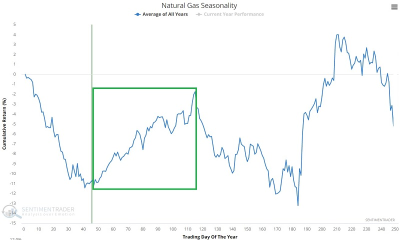
An options trade in natural gas
Recently, Dean and Jay highlighted potentially favorable signs for natural gas. Jay showed an example trade using options on ticker SWM as a proxy for natural gas. This week, he noted an example trade on an ETF intended to track natural gas directly.
The chart below displays the annual seasonal trend for natural gas futures. With natural gas now moving into the heart of one of the most favorable times of the year, we will focus on an example trade using options on ticker UNG, while using care to minimize the potentially harmful effect of wide bid/ask spreads.
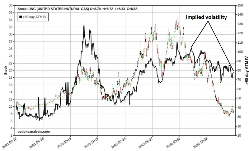
The chart below shows UNG price action and the history of implied volatility (black line). IV is presently somewhere in the middle of the historical range and could move either way. Since we are looking for a long premium bullish trade, we need to be concerned about minimizing the negative effects if IV declines after a trade is entered.
The favorable seasonal period extends into early June. So we will look at June 2023 UNG options. The strategy we will consider is referred to as a bull call spread and involves the following:
- Buy the UNG June 2023 10-strike price call @ $0.88
- Sell the UNG June 2023 15-strike price call @ $0.15
The red line in the right-hand side of the chart below displays the expected P/L as of 2023-03-08 at each price for UNG between $3 and $18 a share. A closer look at the risk curves below reveals that below roughly $12 a share for UNG, time decay works against us (the lines shift lower as time goes by). Above roughly $12 a share for UNG, time decay works for us (the lines shift higher as time goes by).
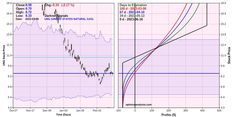
The options have 100 days left until expiration, so there is plenty of time for UNG to work its way higher. The cost to enter the trade, and the maximum risk, is $73 for a 1-lot. A delta of 31.84 means this position is roughly equivalent to holding 32 shares of UNG.
The break-even price of $10.73 a share means UNG must rally at some point to generate a profit, and the maximum profit potential is +$473 if UNG is above $15 a share at the June expiration.
The bull call strategy allows us to sell a relatively expensive call option (the 15-strike price call) to help us pay for the long call (the 10-strike price call). Note also that we chose options with relatively small bid/ask spreads and then placed a limit order to buy and sell at the midpoint of each. By doing so specifically, the fact that UNG bid/ask spreads in general are relatively wide is moot.
The example trade highlighted above qualifies as a purely speculative position. If UNG fails to rally in the months ahead, this position is guaranteed to lose money. That is why position sizing is crucially important.
About TradingEdge Weekly...
The goal of TradingEdge Weekly is to summarize some of the research published to SentimenTrader over the past week. Sometimes there is a lot to digest, and this summary highlights the highest conviction or most compelling ideas we discussed. This is NOT the published research; rather, it pulls out some of the most relevant parts. It includes links to the published research for convenience, and if you don't subscribe to those products, it will present the options for access.
Indicators at Extremes
|
|
|
Phase Table
|
|
|
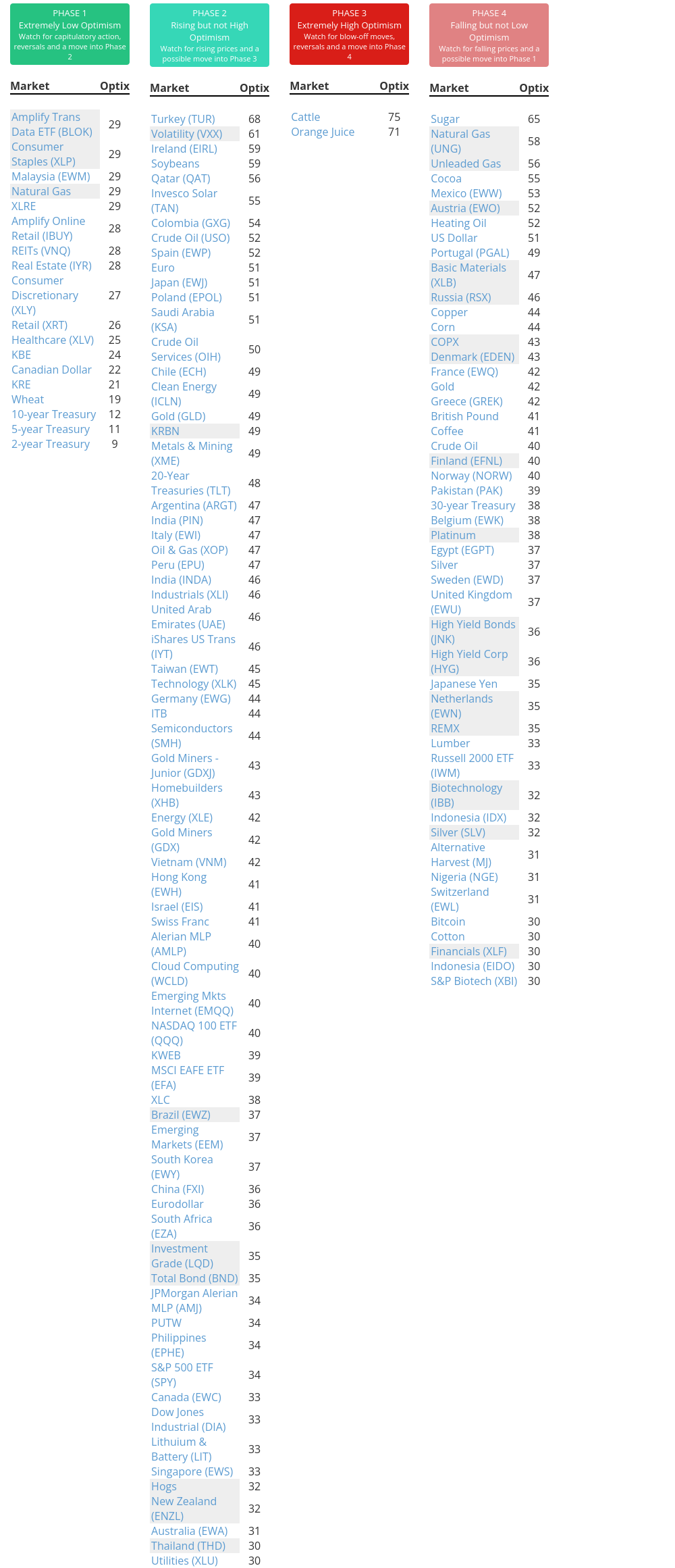
Ranks
|
|
|
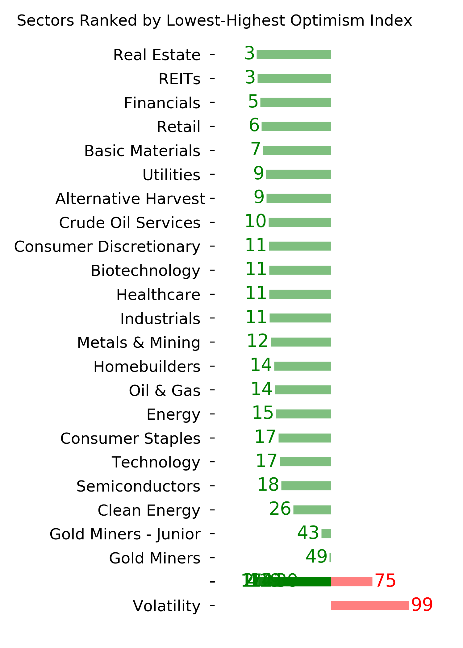
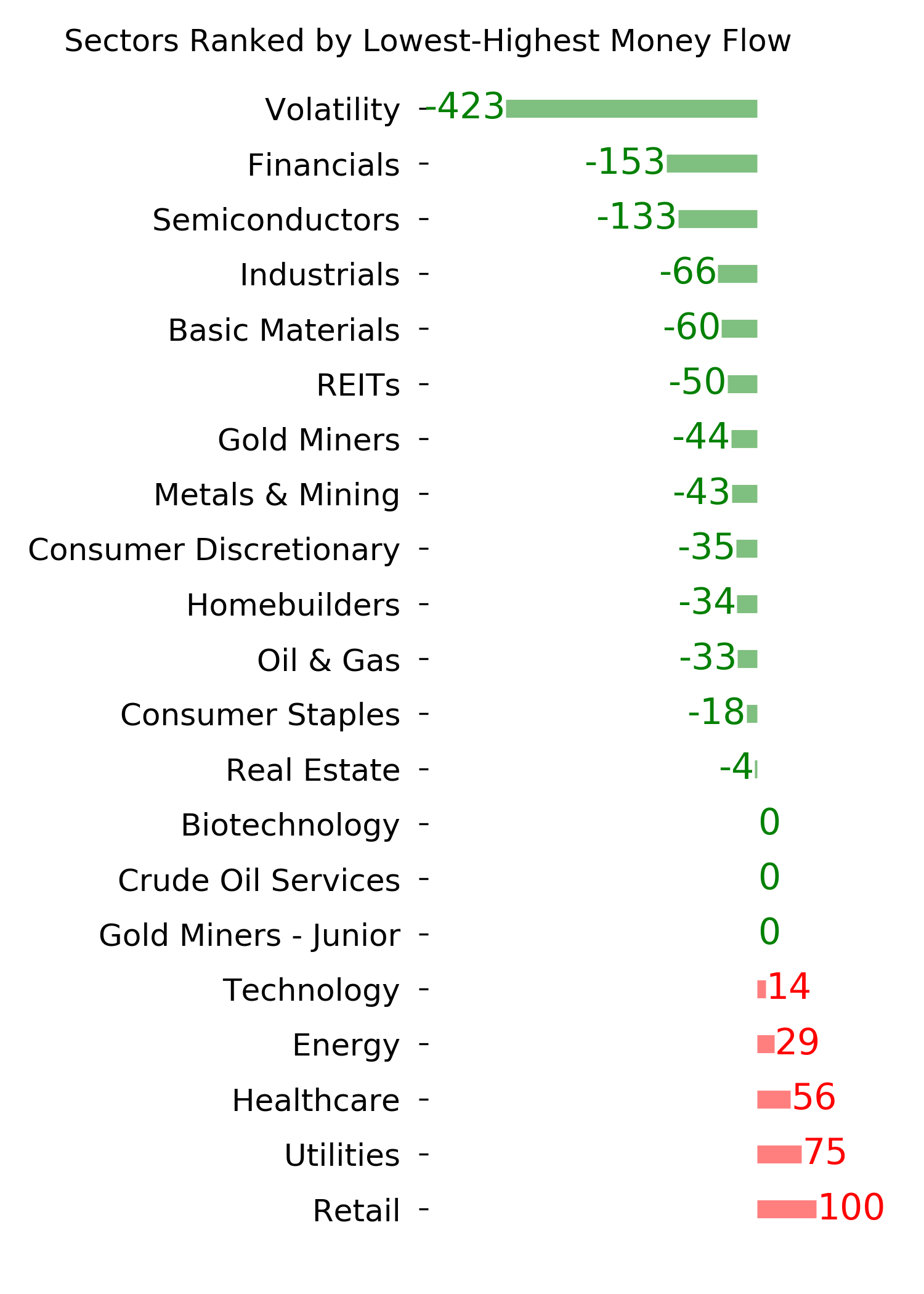
|
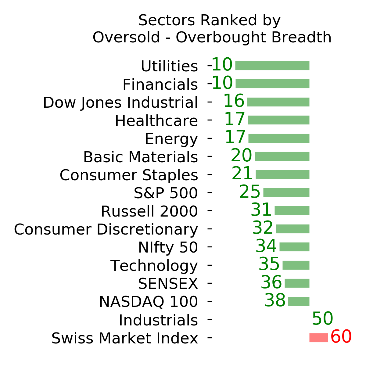
|
|
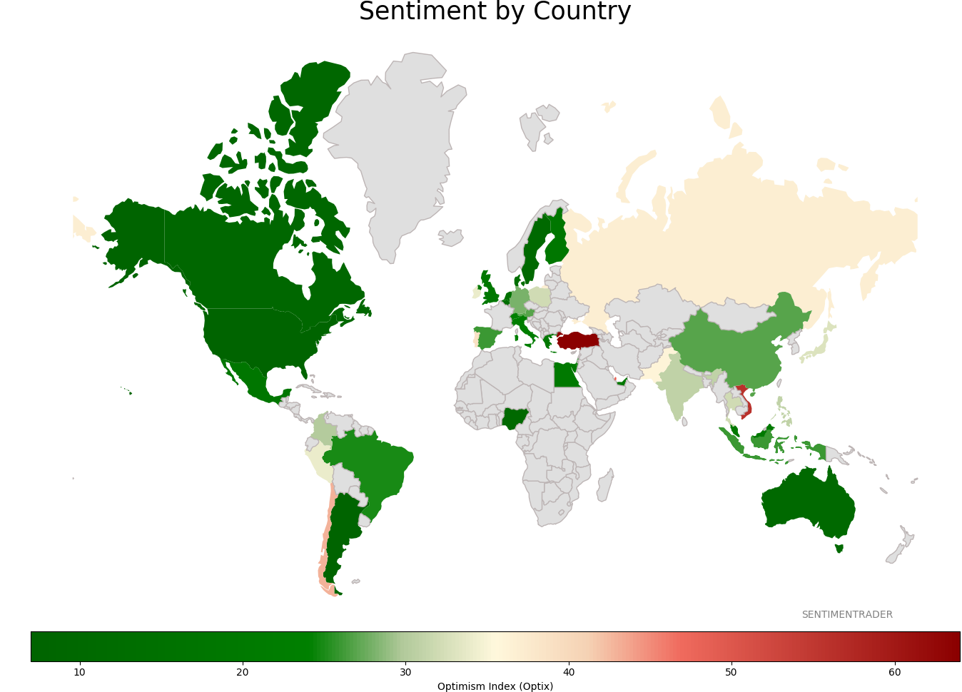
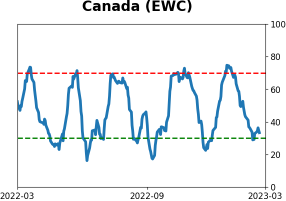
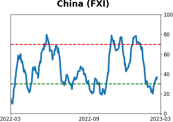
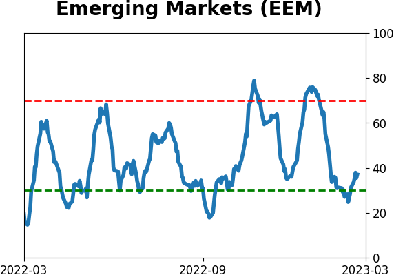
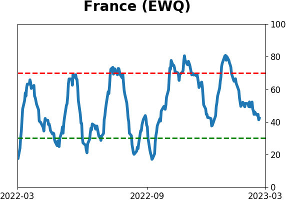
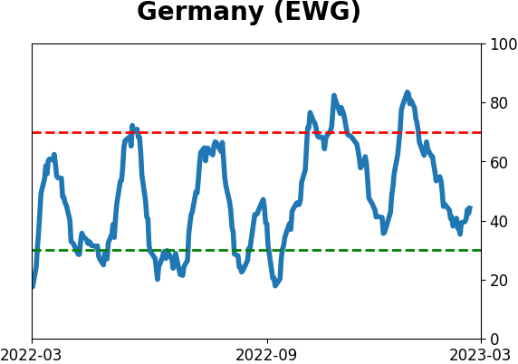
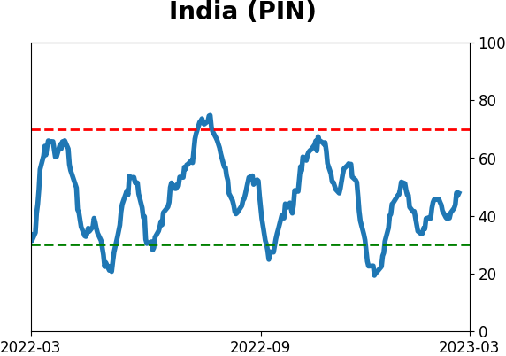
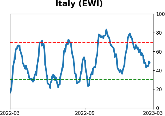
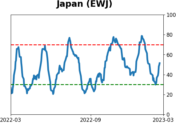
Sentiment Around The World
|
|
|
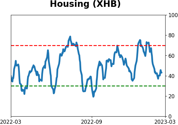
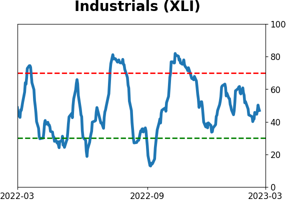
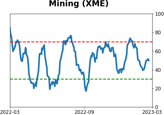
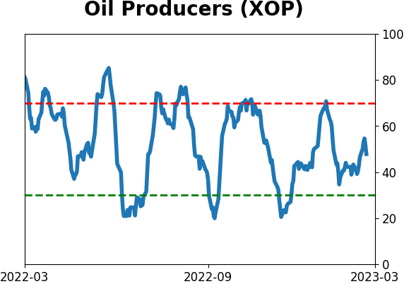
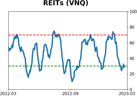
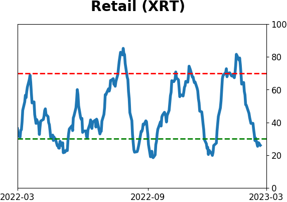
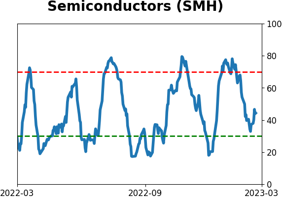
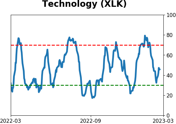
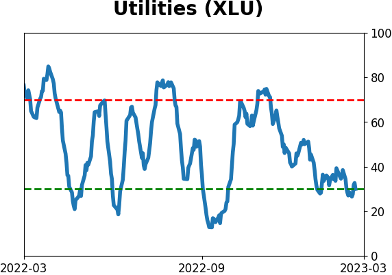
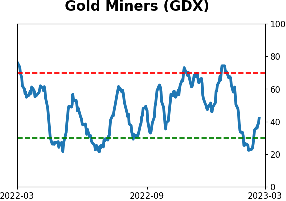
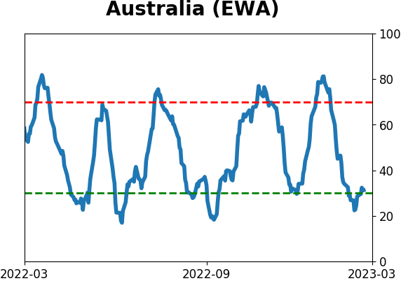
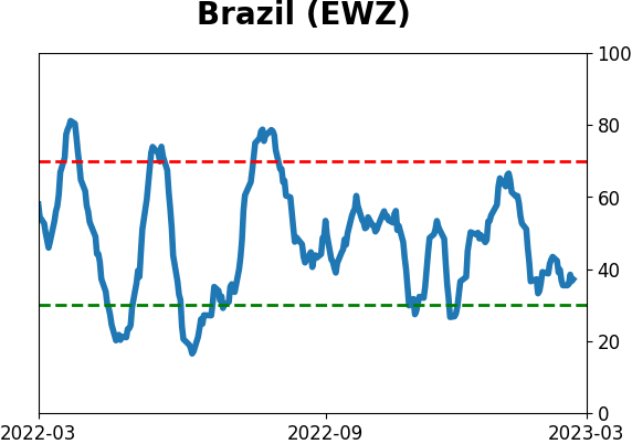
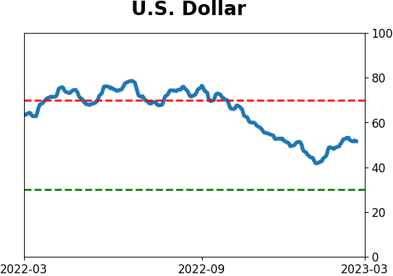
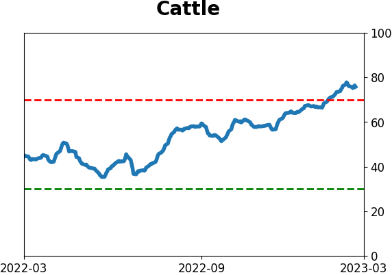
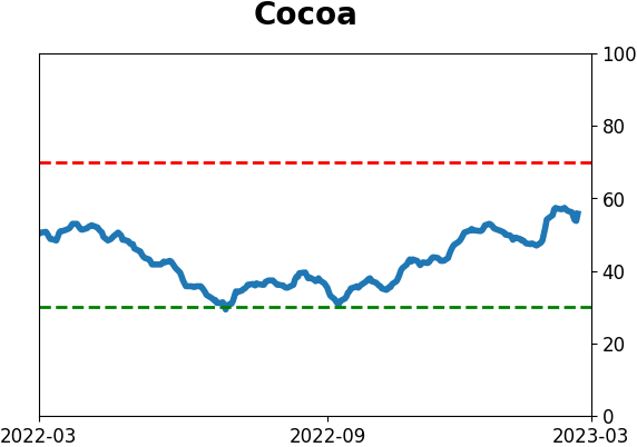
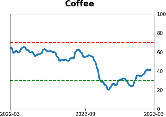
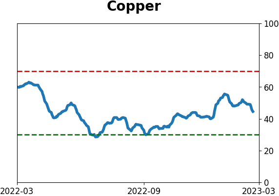
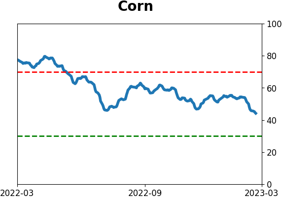
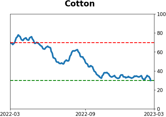
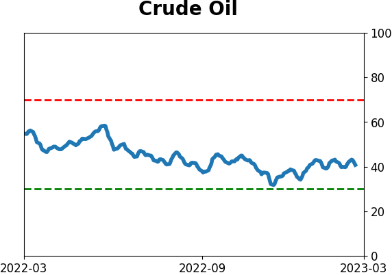
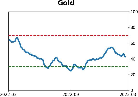
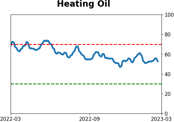
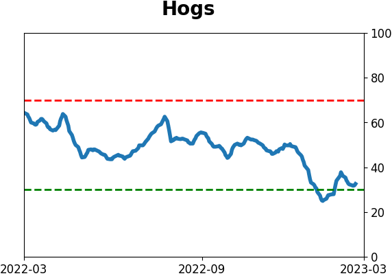
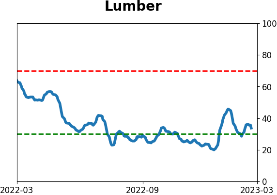
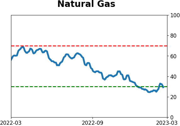
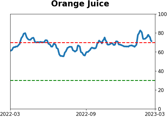
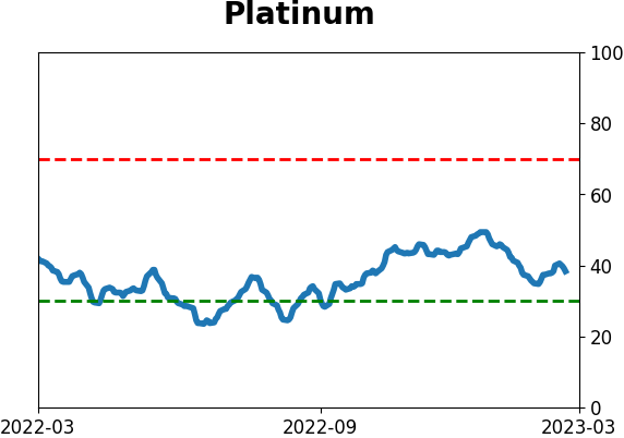
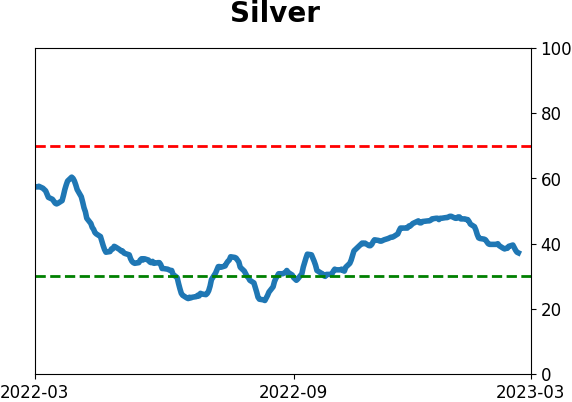
Optimism Index Thumbnails
|
|
|
|
|
|
|
|
|
|
|
|
|
|

|
|
|
|
|
|
|