Daily Report : TradingEdge Weekly for Feb 23 - Breakouts in broad indexes, butterfly spreads, defensive insiders

| View/Print a PDF version of this Report |
Headlines
|
TradingEdge Weekly for Feb 23 - Breakouts in broad indexes, butterfly spreads, defensive insiders: This week, we saw that the most venerable U.S. stock indexes have enjoyed a historically rabid start to the year, with more than 10 record closes. Even the broad NYSE Composite managed a fresh record, and the equal-weight S&P hit a 2-year high. Economic data is mixed, but one piece of "negative" news has actually led to better-than-average returns. Coca looks like a blow-off. |
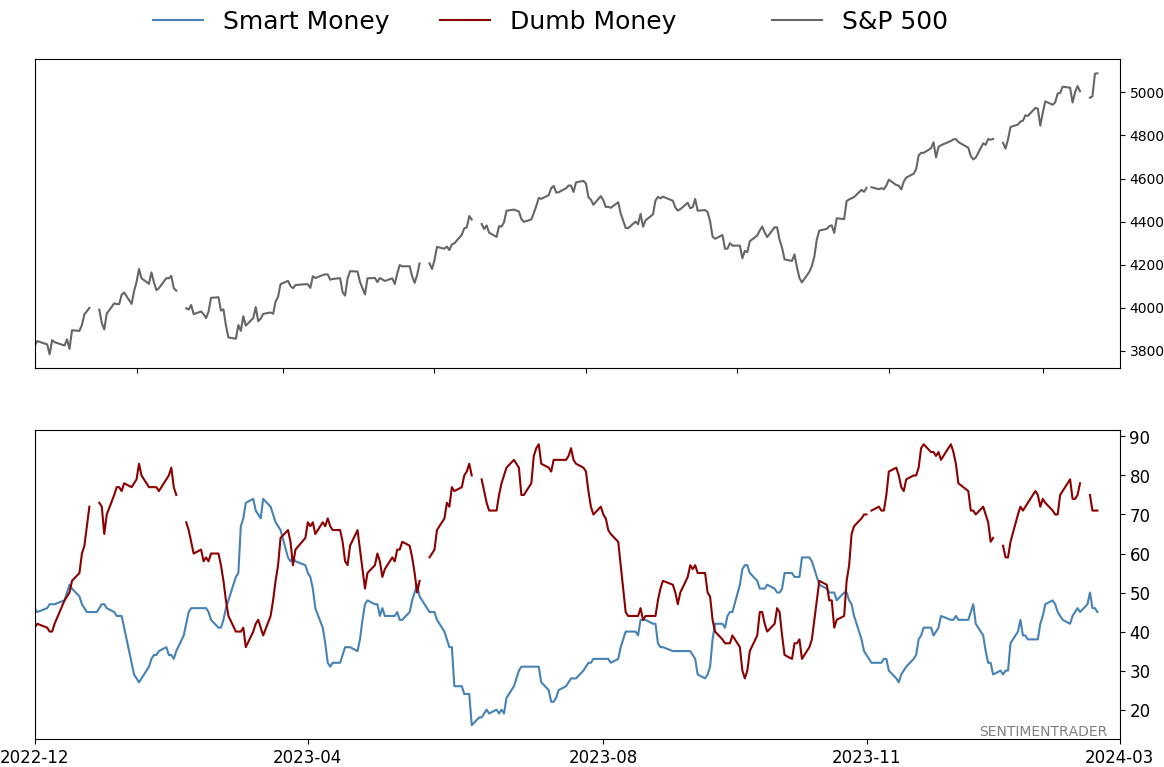
Smart / Dumb Money Confidence
|
|
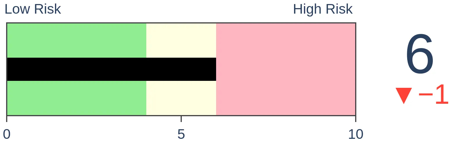
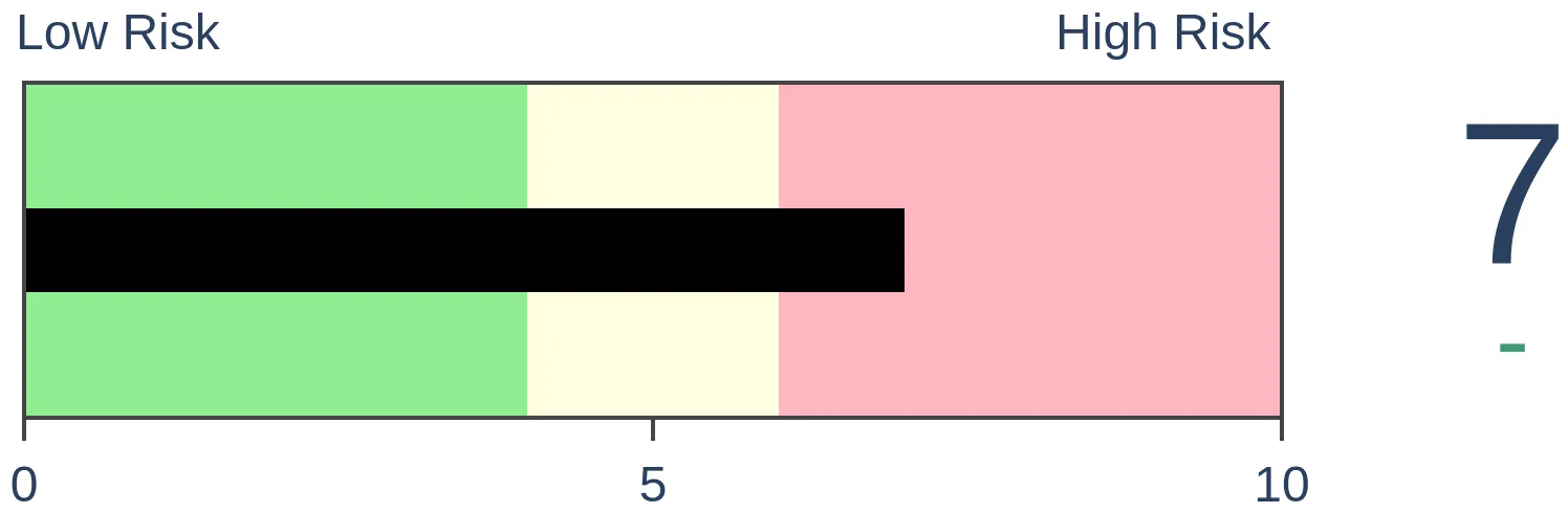
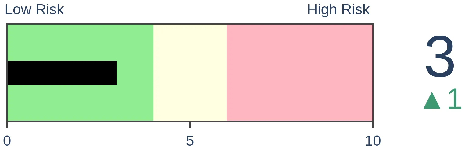
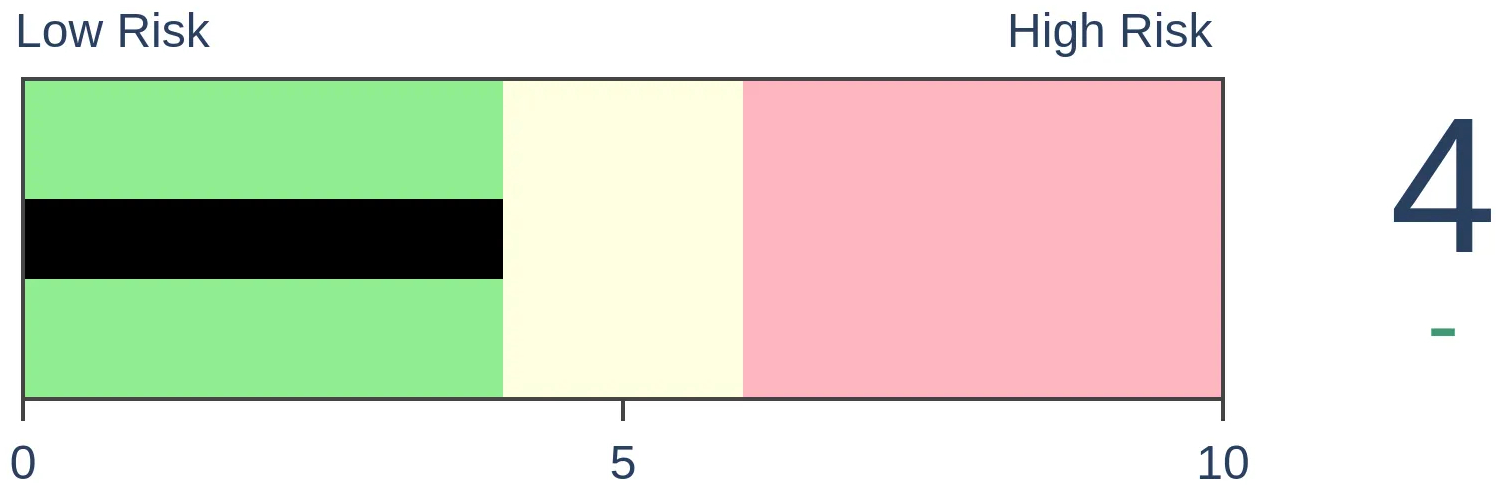
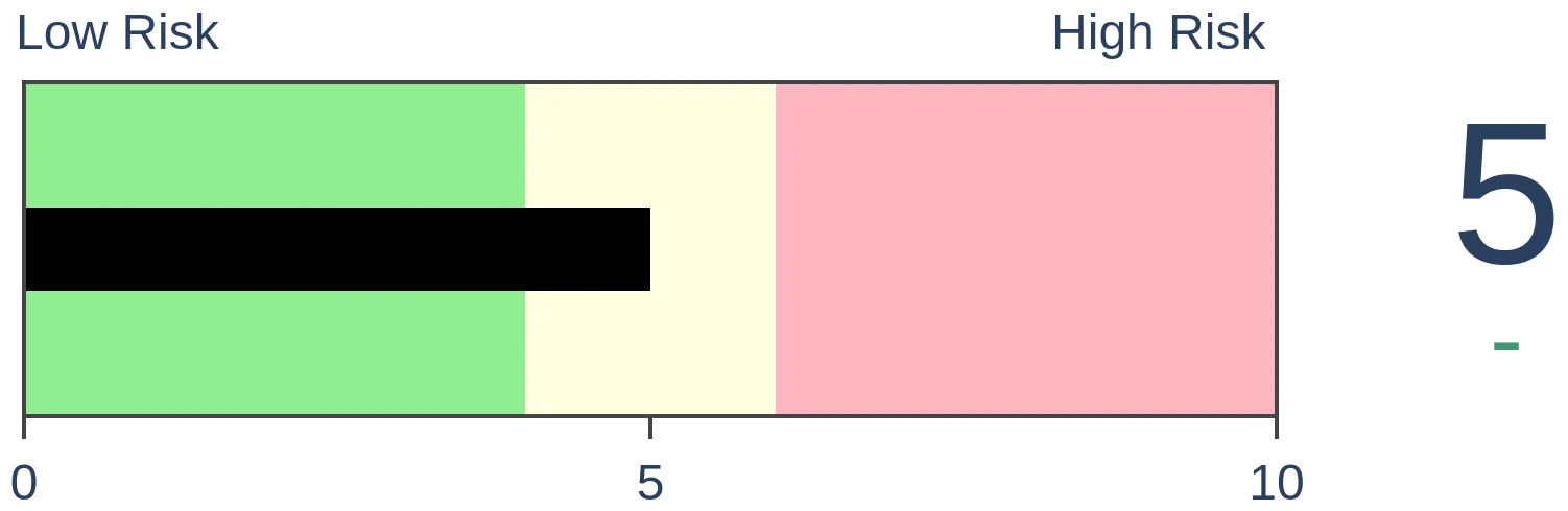
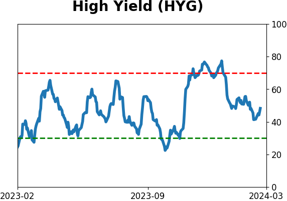
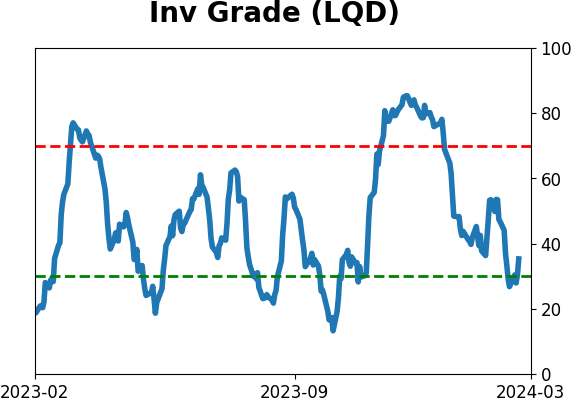
Risk Levels
|
|

|
Research
TradingEdge Weekly for Feb 23 - Breakouts in broad indexes, butterfly spreads, defensive insidersBy Jason GoepfertBOTTOM LINEThis week, we saw that the most venerable U.S. stock indexes have enjoyed a historically rabid start to the year, with more than 10 record closes. Even the broad NYSE Composite managed a fresh record, and the equal-weight S&P hit a 2-year high. Economic data is mixed, but one piece of "negative" news has actually led to better-than-average returns. Coca looks like a blow-off. FORECAST / TIMEFRAME |
Key points:
- It's been a rabid start to the year for the S&P 500 and Dow Industrials
- The average stock has broken out
- The NYSE Composite Index hit a record high, ending its 5th-longest streak without one
- For those worried about a potential pullback, a butterfly spread provides an option to hedge
- A decline in real gross domestic income hasn't quite been the sign of doom that bears would hope
- Smart money corporate insiders keep buying (and not selling) shares in defensive stocks
- Cocoa is showing signs of a blow-off top
A rabid start to the year
This year started about as well as any bull could have hoped. Not even two months into the new year, a couple of the most widely-watched indexes in the world have set record highs about once every three days.
After setting at least ten records within the first 33 trading days, the S&P struggled over the next couple of months. Part of the weakness is due to seasonality. The seasonal tendency for the SPY fund over the past 30 years has been to peak right about now and generally decline over the next month or so.
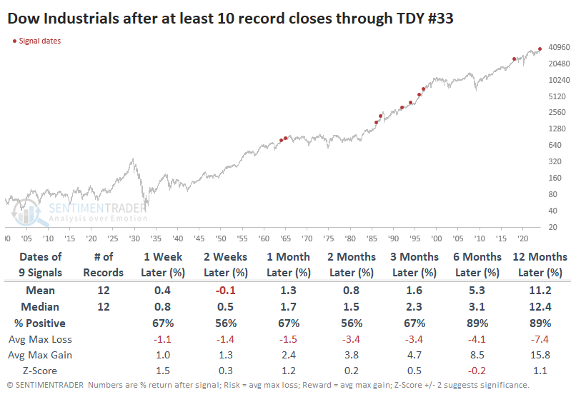
The Dow Industrials has a longer history, but 2024 has seen a robust start even for that index. It has recorded some of the most record highs this far into a year for any year since 1900 and the most since 1997.
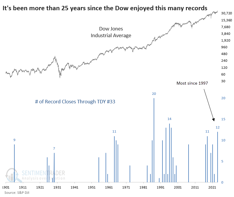
For the Dow, this high momentum has held up better than the S&P 500. One caveat there, though, is that the past four signals have all preceded a negative return for the Dow over the next two months. But, again, its 6-12 month returns tended to be quite good.
We see the same pattern in the Dow that we did for the S&P, in that medium-term returns were better after years when there were no record highs during the first 33 sessions. But 6-12 month returns tended to be significantly worse.
The average stock breaks out
The S&P 500 equal-weighted index closed at a 2-year high after failing to do so for more than two years. Dean showed that similar conclusions to a multi-year high drought preceded a 100% win rate for the index over the subsequent year.
While the world's most benchmarked index recorded its 12th all-time high since the start of the year on Thursday, driven by excitement from Nvidia's earnings, very few market participants commented on the new 2-year high in the equal-weighted S&P 500 index, which remains only 1.77% below its all-time high.
The index, which allocates an equal weighting to each component, broke its streak of 546 sessions without a multi-year high, ending the 5th longest drought in history.
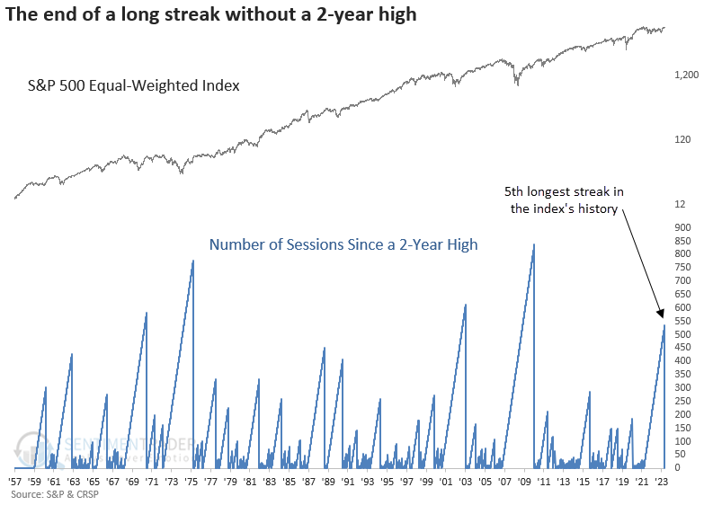
After a prolonged period without reaching a new multi-year high, the equal-weighted S&P 500 tends to sustain its positive momentum after achieving this milestone. Although recent signals suggest some near-term weakness, the damage was minimal. A year later, the index was higher every time.
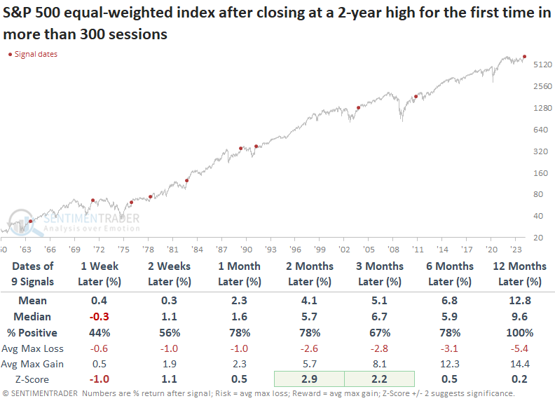
The equal-weighted index and sectors show slightly more favorable returns over the subsequent year. However, most signals occurred after a recession-driven bear market, which is not the case now. So, the historical tendency of the equal-weighted index to outperform the cap-weighted version in this early cycle phase may not be an appropriate analog.
A new record in an old index
In recent weeks, we've been seeing an increasing number of signs of a split market.
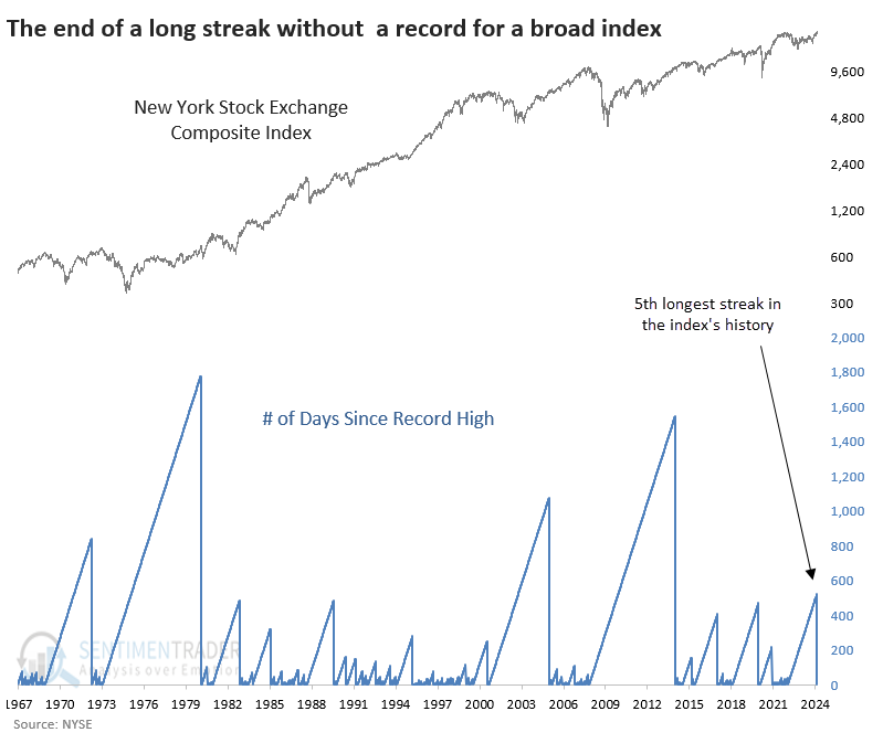
Some of those concerns have been alleviated in recent sessions. One of the best examples of this is a record-high close in the New York Stock Exchange Composite Index. While larger stocks can also drive this index higher, it has a vast constituency and is a decent reflection of "the U.S. stock market."
In that regard, the move to a new high is notable because it's the first one in more than two years, ending the 5th-longest streak without a record close in its history.
After it ended a streak of at least a year without a record high, the Composite's medium-term returns weren't anything special. It suffered a negative mean return up to three months later, though by a year later, it was higher after nine of the ten signals.
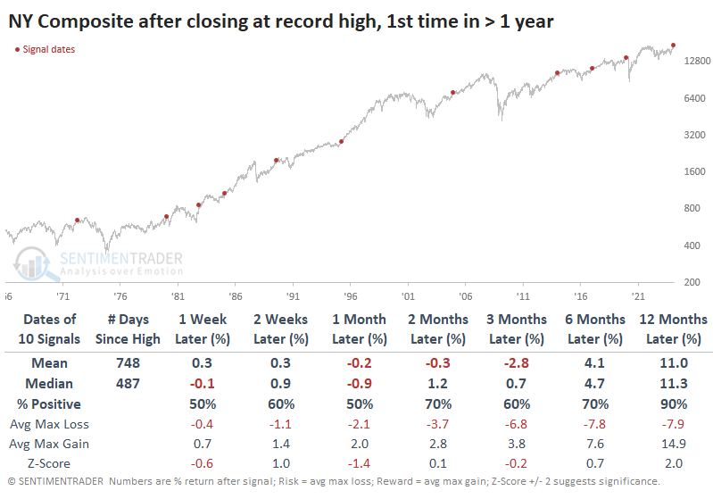
For the more widely benchmarked S&P 500, these record closes in the NY Composite led to similarly mediocre medium-term returns. Up to three months later, the S&P's median return was essentially flat, and its median maximum decline was nearly 50% larger than its median maximum loss. Over the next year, however, the S&P sported a gain every time, well above a random one-year return.
Among sectors and factors, the best and most consistent returns include a couple of defensive sectors - utilities and health care. The latter's median return was a robust +24.5% over the following year.
An option for trading any potential S&P 500 weakness
The S&P 500 has enjoyed a terrific run since the October 2023 low but is now entering an unfavorable seasonal period. Jay showed an option strategy known as the out-of-the-money butterfly spread that offers speculators a way to play the short side and longer-term investors the opportunity to hedge.
The out-of-the-money butterfly Spread (hereafter referred to as an OTM butterfly) involves buying a put option at one strike price, selling two puts at a lower strike price, and buying one more put at an even lower strike price. Typically, the distance between the strike price will be uniform. Also, a "standard" butterfly spread is entered in a 1x2x1 ratio (long one higher strike price put, short two lower strike price puts, and long one even low strike priced put). An OTM butterfly involves puts that are all "out-of-the-money," i.e., the strike prices of all put options involved are below the stock's current price when the trade is entered.
Let's assume a speculative trader anticipates that SPY will decline over the next four weeks but does not expect a crash - just a standard pullback of 1 to 2 standard deviations. Based on this outlook, our example trade is entered as follows:
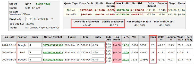
- Buy 4 SPY Mar 15, 2024, 500 strike price puts @ $6.54
- Sell 8 SPY Mars15 2024, 475 strike price puts @ $1.28
- Buy 4 SPY Mar 15 2024 450 strike price puts @ $0.48
The particulars for this position appear below (all subsequent screenshots are courtesy of Optionsanalysis.com). To enter a 4x8x4 position costs $1,780.
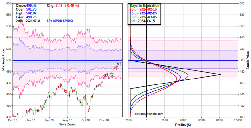
Things to note:
- The cost to enter the position - and the maximum risk - is $1,780. This loss would occur if the position were held until expiration and SPY shares were either above the upper strike price of $500 or below the lower strike price of $450
- The position starts with a "Delta" of -111.96 and a "Gamma" of 3.348. This means that at the outset, the trade is roughly equivalent to holding short 112 shares of SPY (without the unlimited risk associated with holding a short position in the shares). If SPY gains $1 in price, the position Delta will increase by 3.348 and vice versa
- The breakeven prices basis SPY shares are $454.45 and $495.55 (with SPY between these two prices, the position should be expected to show a gain. Outside of this range, losses will likely accrue)
The speculator is hoping for a decline in the price of SPY shares in the next four weeks. A sizeable percentage profit can accrue as long as SPY experiences an orderly decline.
Jay also looked at the spread as a way to hedge an existing SPY position and what impact that would have under various scenarios. In another piece, he followed up on some hedging strategies from last week after NVDA's blowout earnings report.
Gross domestic income is dropping
Real Gross Domestic Income (RGDI) is a broad measure of economic activity. Jay noted that the 12-month change in RGDI fell to negative in the most recent quarter, eliciting howls of gloom and doom on social media.
Real Gross Domestic Income (RGDI) measures the income earned and the costs incurred in producing gross domestic product. This data series is reported quarterly with a good deal of lag. For example, the results for Q3 of 2023 were reported on 2023-12-21.
The chart below looks at the 12-month percentage rate-of-change in the indicator. Note that the latest 12-month change is negative.
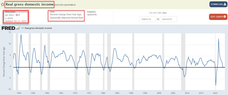
The chart above recently made the rounds in such a manner, with the presenters highlighting that declines into negative territory have "always occurred around recessions," which technically is true - Queue the scary music! The latest reading reported in December 2023 represents the 13th decline below zero in the 12-month change for Real Gross Domestic Income.
So, should we panic? As always, we report, you decide.
For our test, we examine results at the end of each quarter, regardless of when the data was actually reported. For example, the latest negative RGDI reading was reported on 2023-12-21. However, we evaluate results starting at the end of the quarter, i.e., on 2023-12-31.
At the end of each quarter, we measured the S&P 500 performance 3, 6, 9, 12, 18, and 24 months later.
Let's look at stock market performance only following those quarters when Real Gross Domestic Income was negative over the last 12 months. Below, we display S&P 500 returns after every quarter, and then those when the change in RGDI is negative.
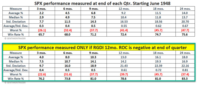
The bottom line: The implication that a 12-month decline in Real Gross Domestic Income is a sign of impending doom is inaccurate. That said, it is also not 100% false. Signals in 1961, 1980, 2002, and 2007-08 saw the S&P 500 lower 12 months later.
For the sake of argument, let's attempt to create a rudimentary trading system using the data above. Our rules are:
- An alert occurs when the 12-month change for RGDI goes negative
- An actual signal occurs when the latest quarter 12-month change reverses higher at the end of a subsequent quarter
- When a signal occurs, we will hold the S&P 500 Index for 12 months
A couple of notes:
- Once an alert occurs, we must then wait at least three months for a reversal (although it can take longer if the subsequent quarterly values keep getting worse for a while)
- If the 12-month change once again dips lower after a signal, the original signal and 12-month holding period remain in effect (i.e., the basic strategy has no built-in stop loss provision)
- The S&P 500 holding period can be extended for 12 more months if the 12-month change once again reverses higher within 12 months of an original signal
The table below displays the dates of the signals generated by the abovementioned rules and subsequent 12-month performance for the S&P 500 Index.
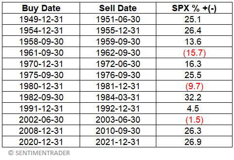
The bottom line is not exactly precision market timing but also not the harbinger of doom it is made out to be. Also, it's not a bad example of "making lemonade out of lemons."
Corporate insiders in defensive stocks keep buying shares
Jay showed that there has been some notable action among corporate insiders in specific sectors. The bad news is that the sectors in question are the ones that most investors think of as defensive.
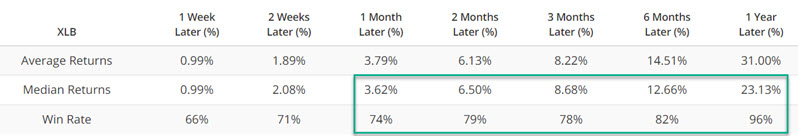
The Materials Select Sector SPDR Fund (ticker XLB) tracks the S&P 500 Materials Sector Index. The chart below highlights those dates when the Corporate Insider Buy/Sell Ratio - XLB indicator was above 0.35. Its returns from 1-12 months later were robust.
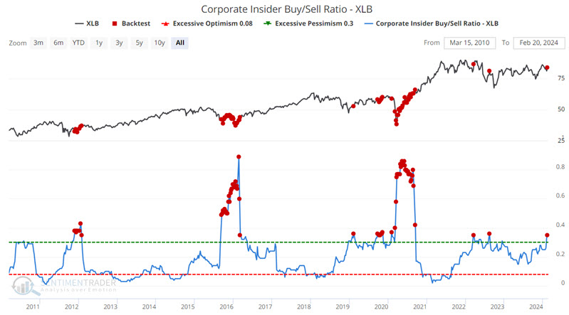
Jay showed similar behavior among Consumer Staples stocks, with a lack of selling the driving force. An absence of insider selling suggests that - while insiders may not be piling in anticipating an imminent rally - they are seemingly not terribly concerned in the aggregate about downside risk.
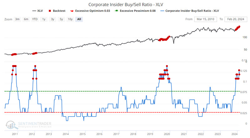
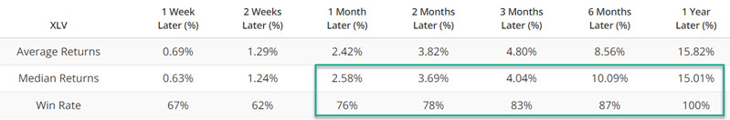
The Health Care Select Sector SPDR Fund (ticker XLV) tracks the S&P 500 Health Care Sector Index. The Corporate Insider Buy/Sell Ratio - XLP indicator has experienced a significant spike in recent months, accompanied by a breakout to all-time highs for the ETF itself.
The Utilities Select Sector SPDR Fund (ticker XLU) tracks the S&P 500 Utilities Sector Index. Utilities are generally considered the most defensive sector among the major S&P 500 sectors. Utilities have also been the worst-performing sector in 2024 and have traded sideways for roughly four and a half years.
However, utility sector corporate insiders are apparently seeing something very different.The Corporate Insider Buy/Sell Ratio - XLU indicator is just below the highest reading recorded in this particular Bloomberg database. Does this guarantee higher utility stock prices directly ahead? Not necessarily. But the bottom line is that, on the whole, utility executives are more bullish now than they have been at any time in the last 14 years.
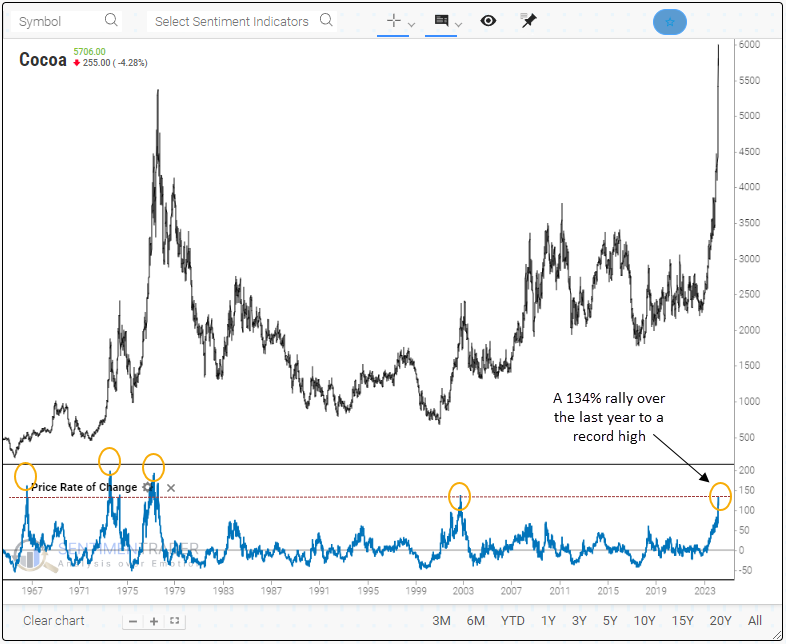
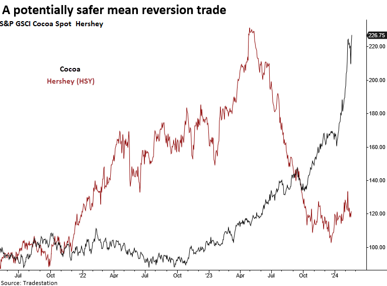
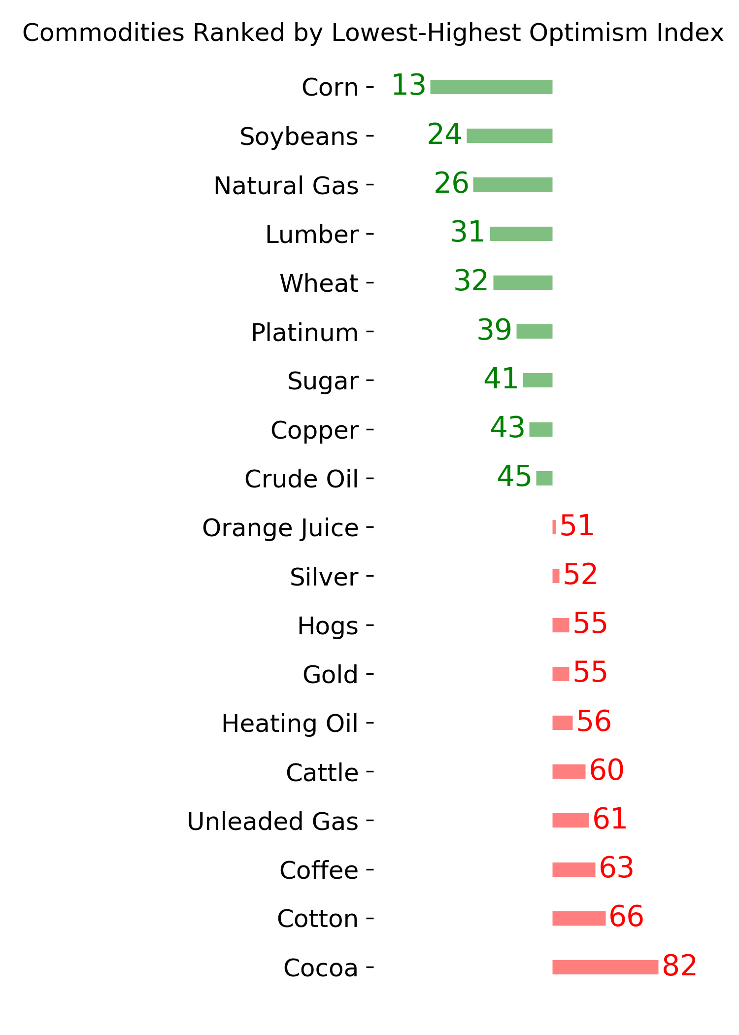
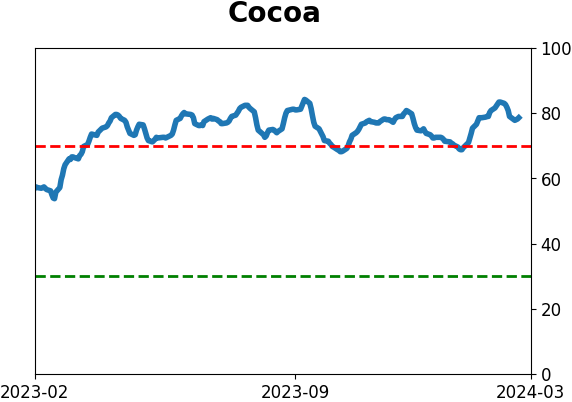
A potential blow-off in cocoa
Cocoa prices surged a little more than 134% over the last year, reaching the highest level in history. Dean noted that similar price behavior over several time frames suggests an impending reversal lower for the commodity.
According to the Financial Times, the 134% rise in cocoa prices to a record high in the last year was initially driven by poor harvest yields and further exacerbated by massive speculation by traders. The dramatic ascent witnessed over the past year has only been paralleled on four previous occasions in history.
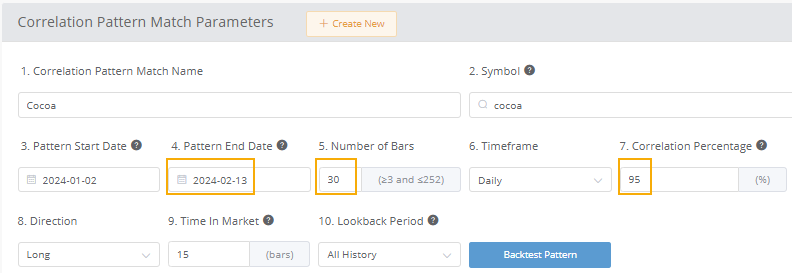
Using the new SentimenTrader Correlation Pattern Match tool, Dean compared price behavior over the previous 30, 63, 126, and 252 sessions using a correlation percentage of 95% for each period.
Here's an example of the parameters for the 30-day/bar correlation study.
A 30-day correlation of 95% found 81 other periods since 1961 that matched the previous 30 sessions. Several of those instances occurred within the context of the parabolic rise over the last year, leading to short-term corrections.
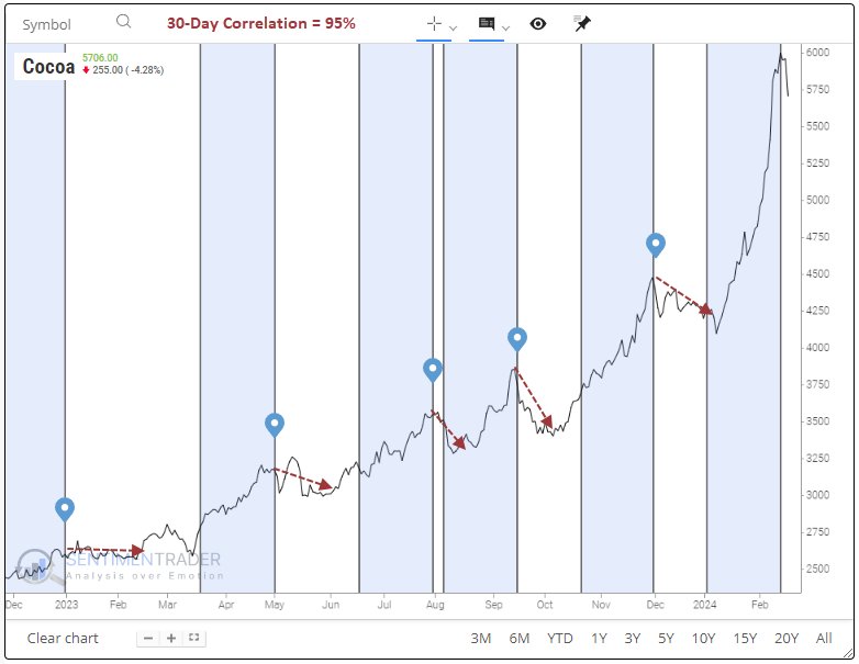
In instances where cocoa prices surged over a 30-session period, similar to now, it's common to observe a downside reversal in the near term, especially over the subsequent two weeks, which shows a 28% win rate. Even when examining longer time horizons, the outlook remains bleak.
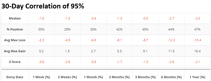
Dean also looked at 3-, 6-, and 12-month correlations and tested how cocoa performed after the time periods with the closest match to recent activity. All showed consistently negative returns in the contract in the weeks and months following. Also, a seasonality chart for cocoa suggests the commodity is on the verge of entering a soft patch, with two out of the next three months exhibiting negative returns.
Unfortunately, the absence of a cocoa ETF poses a challenge for traders. An alternative choice might be to play a long position in a company like Hershey, which has been in a severe downtrend since last May as the price of cocoa exploded higher.
About TradingEdge Weekly...
The goal of TradingEdge Weekly is to summarize some of the research published to SentimenTrader over the past week. Sometimes there is a lot to digest, and this summary highlights the highest conviction or most compelling ideas we discussed. This is NOT the published research; rather, it pulls out some of the most relevant parts. It includes links to the published research for convenience, and if you don't subscribe to those products, it will present the options for access.
Indicators at Extremes
|
|
|
Phase Table
|
|
|
Ranks
|
|
|
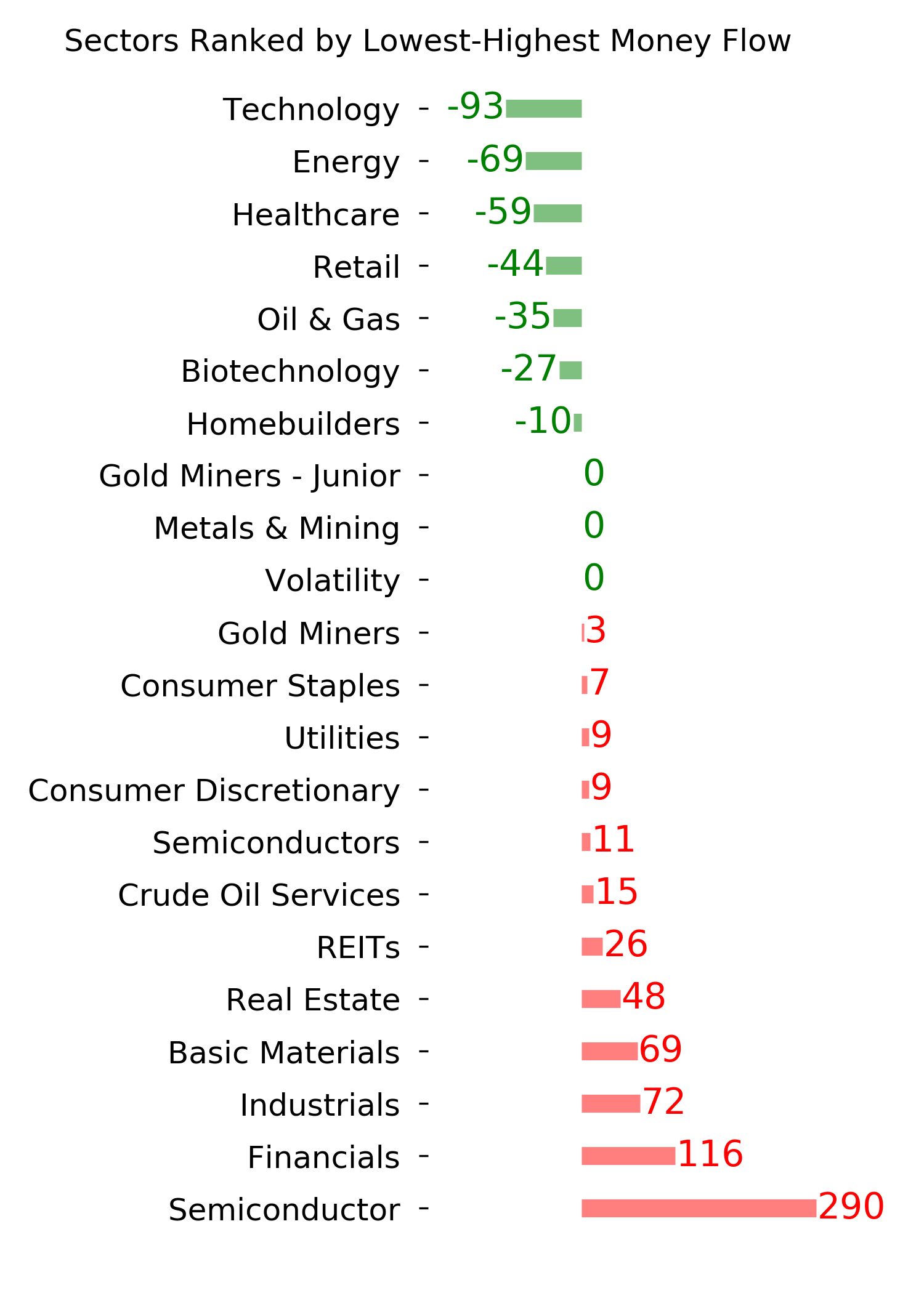
|
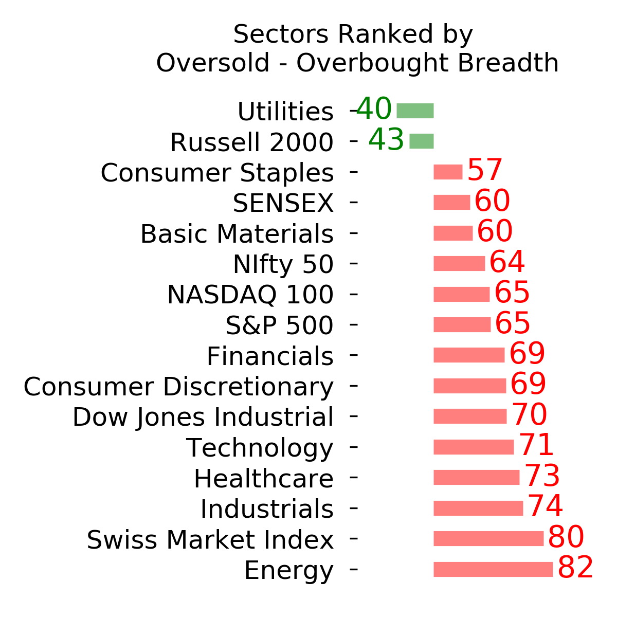
|
|
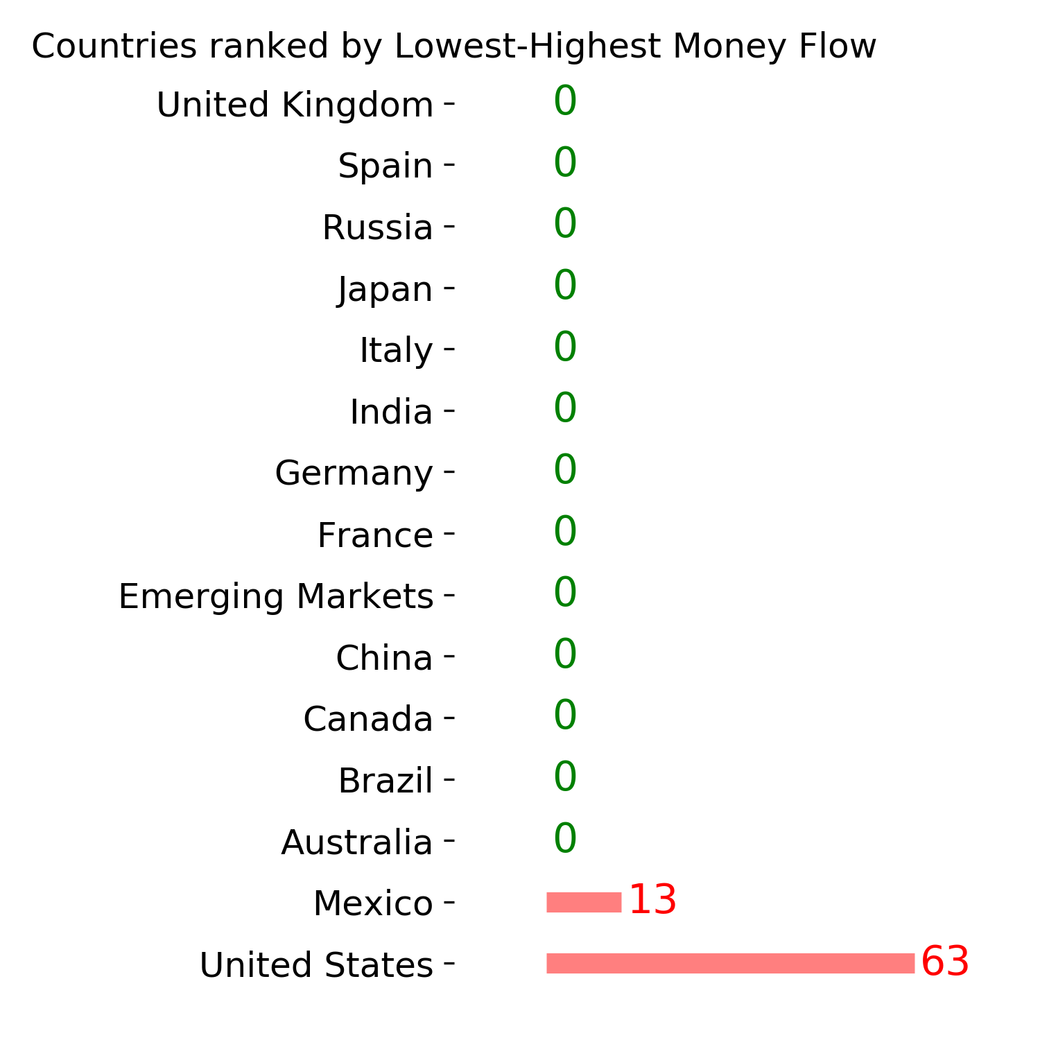
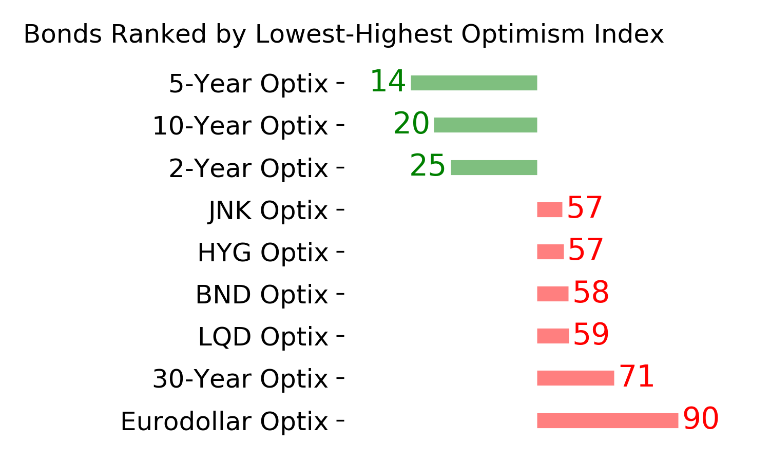
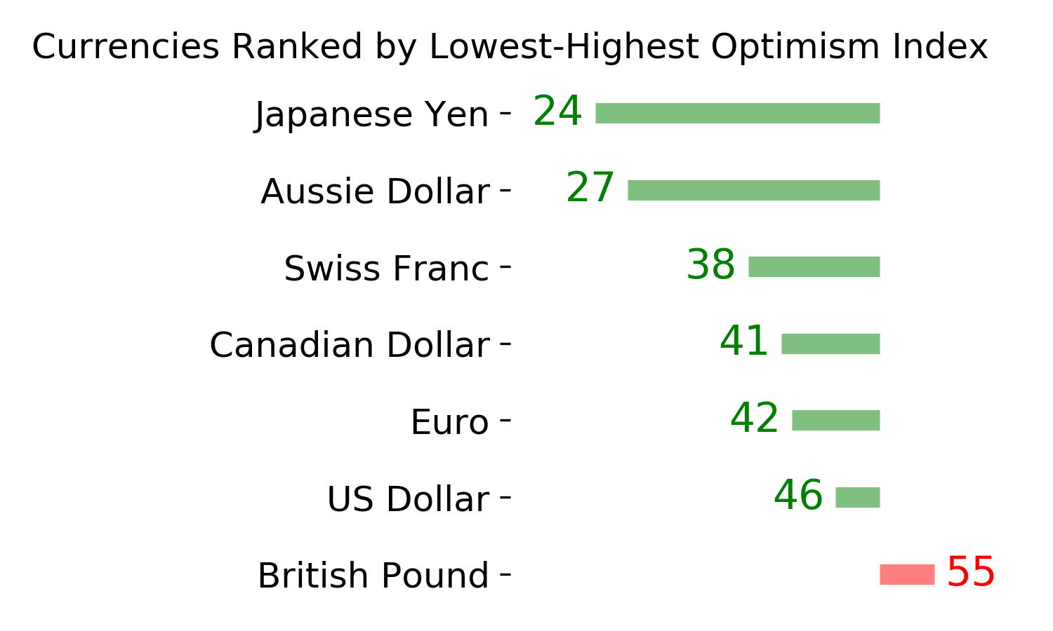
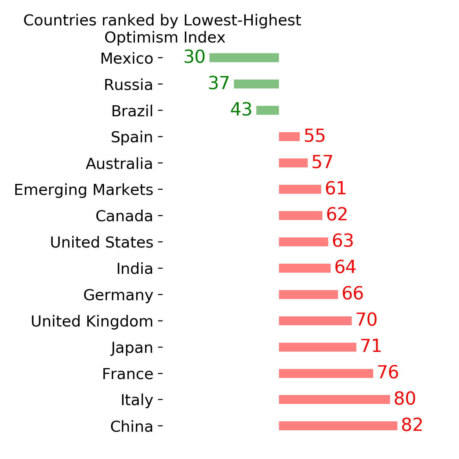
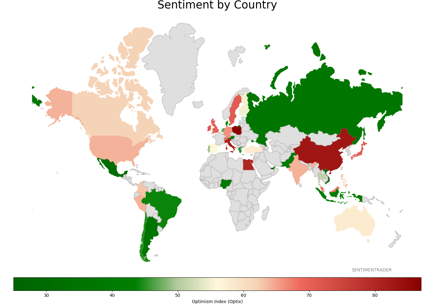
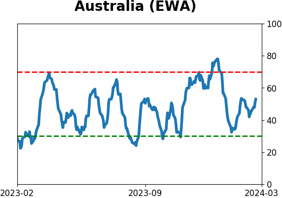
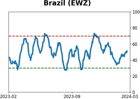
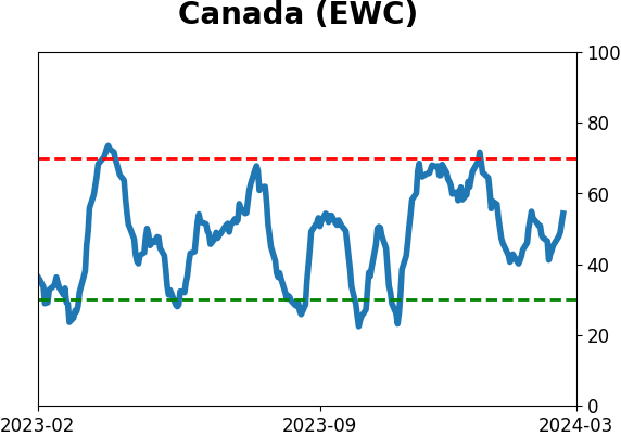
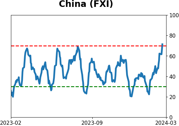
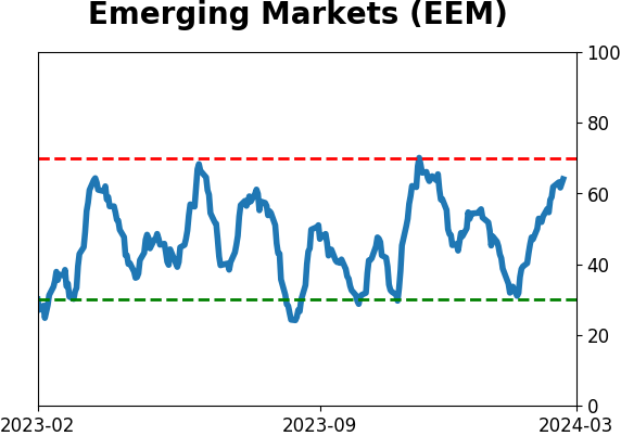
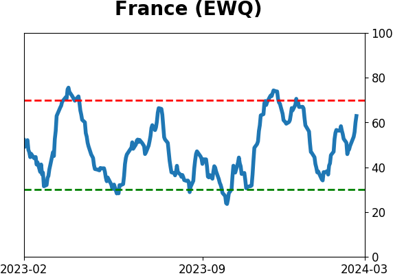
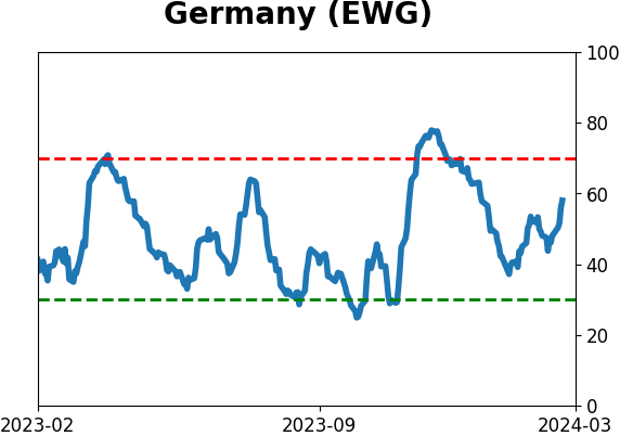
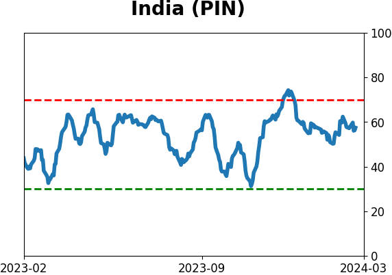
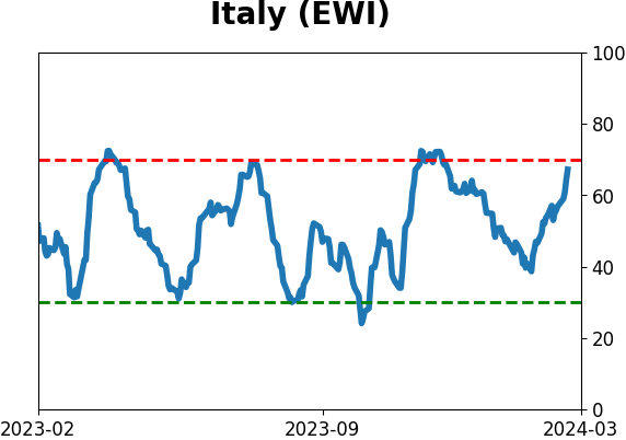
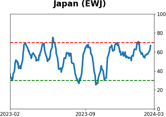
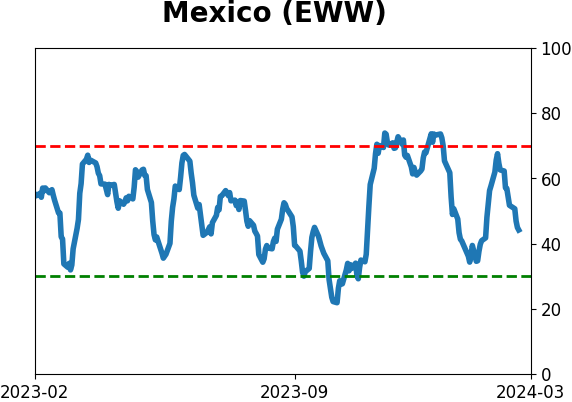
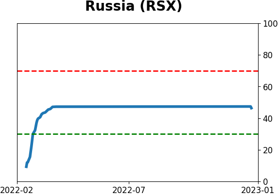
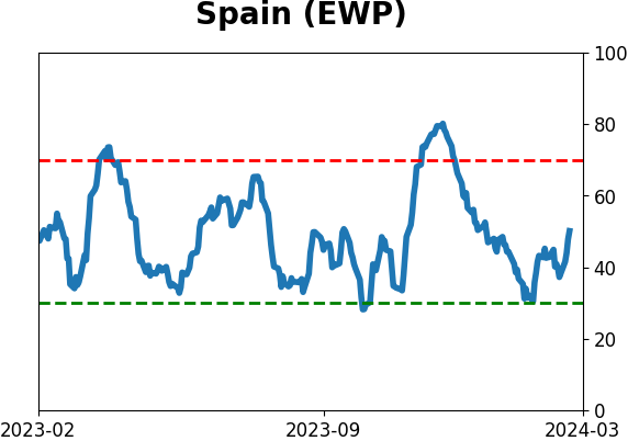
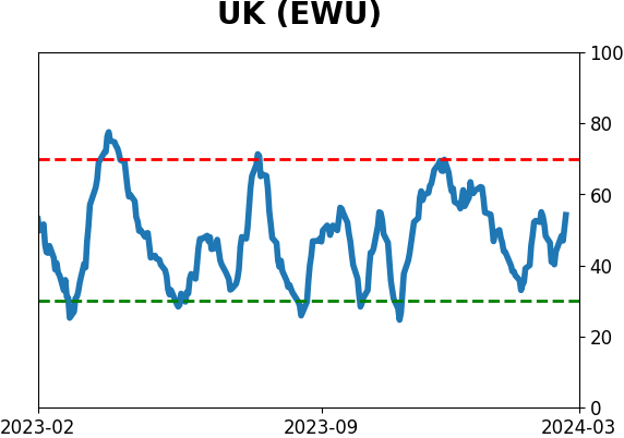
Sentiment Around The World
|
|
|
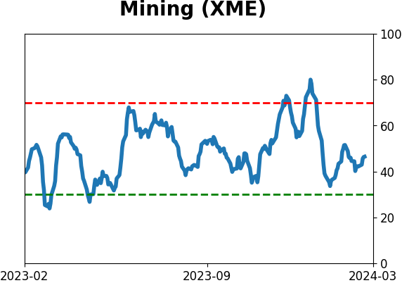
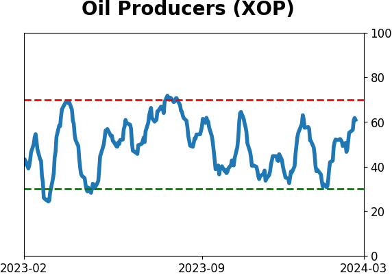
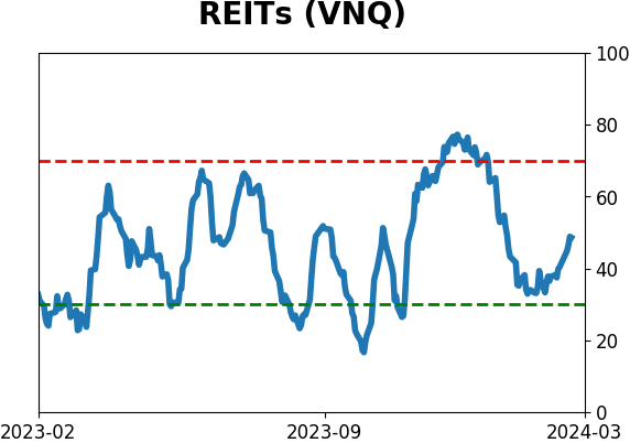
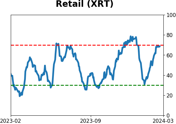
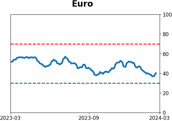
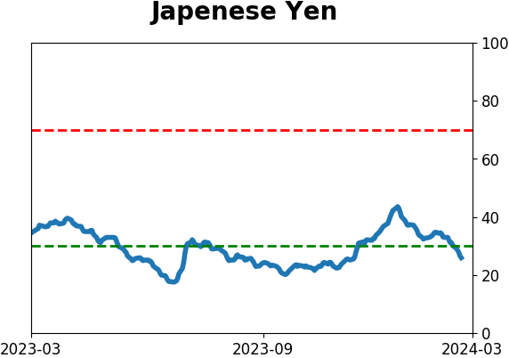
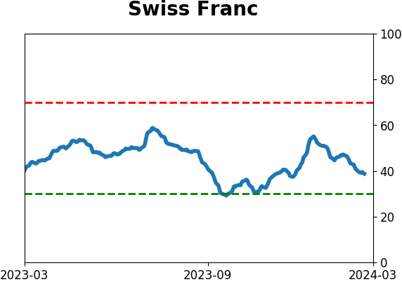
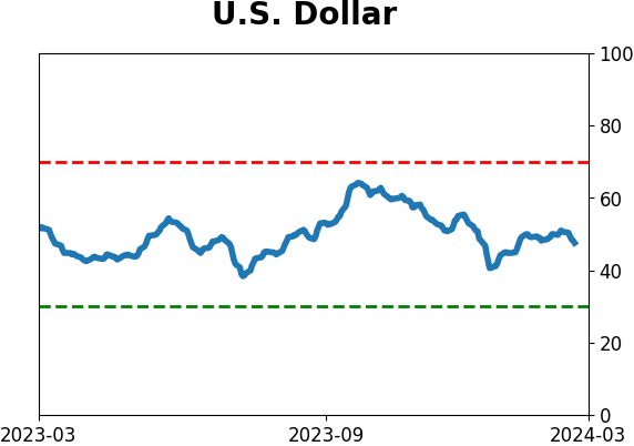
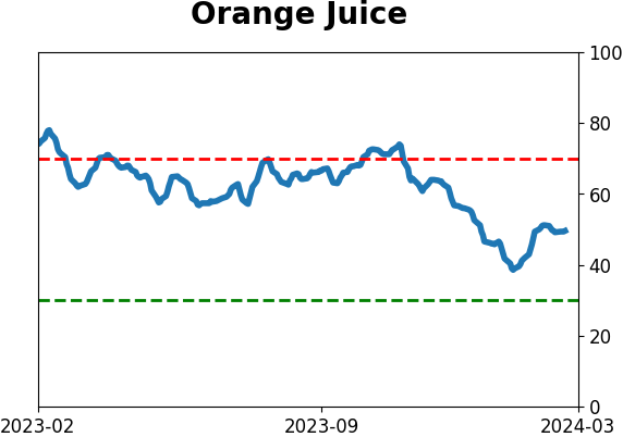
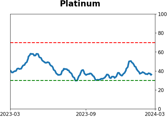
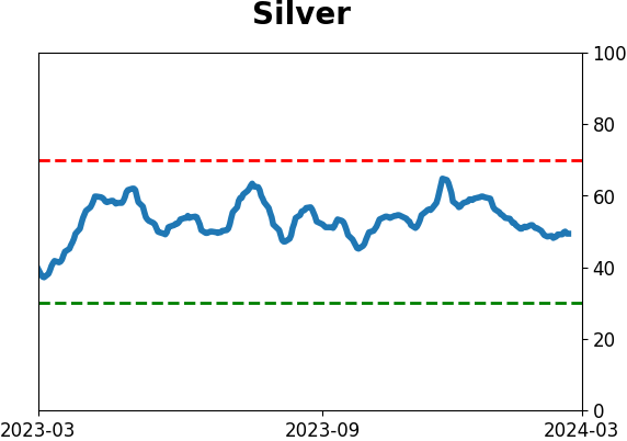
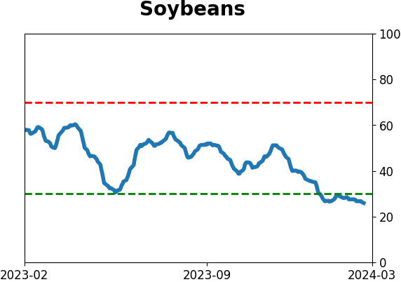
Optimism Index Thumbnails
|
|
|
|
|
|
|
|
|
|
|
|
|
|
|
|
|
|
|
|
|