Headlines
|
|
Bending the curve:
The 2-year / 10-year Treasury yield curve has become the steepest in 5 years with the recent move in bonds. Opinions vary on the meaning, but the recent record has been negative for stocks (especially tech stocks) while good for gold.
Bottom Line:
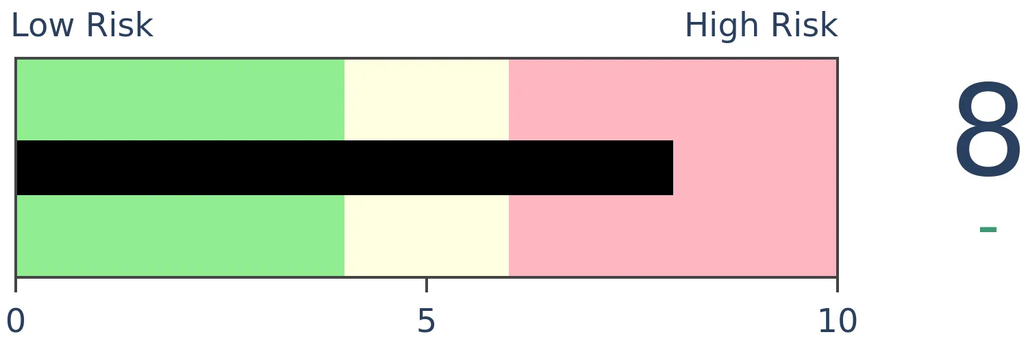
See the Outlook & Allocations page for more details on these summaries STOCKS: Weak sell
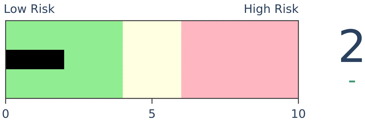
We're in an extremely speculative environment that is enough to become defensive, especially with recent cracks showing in what had been pristine breadth conditions. The spike in fear from a couple of weeks ago has dissipated and likely not enough to offset the negatives over a medium-term time frame. BONDS: Weak buy
Various parts of the market have been hit in recent weeks, with mild oversold conditions. The Bond Optimism Index is now about as low as it gets during healthy bond market environments. GOLD: Weak buy
A dollar trying to rebound from a severe short position has weighed on gold and miners. The types of signals they've given in recent weeks, within the context of their recent surge, have usually resulted in higher prices over a medium- to long-term time frame.
|
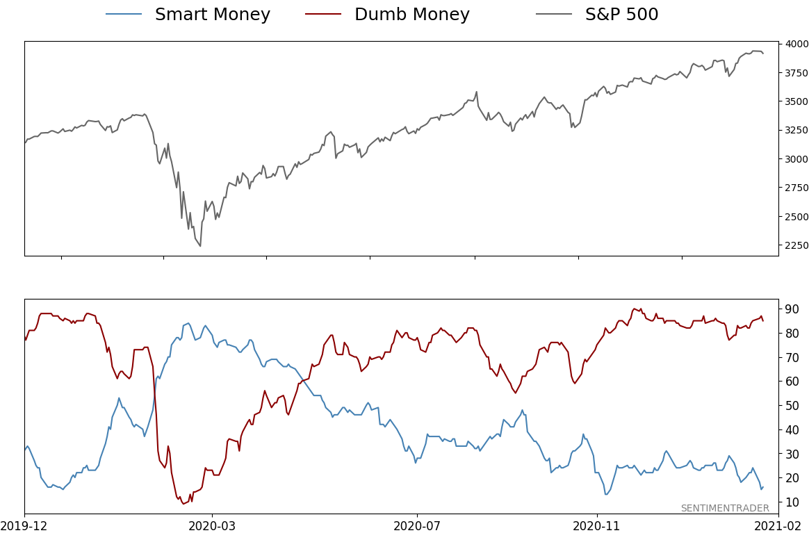
Smart / Dumb Money Confidence
|
Smart Money Confidence: 16%
Dumb Money Confidence: 85%
|
|
Risk Levels
Stocks Short-Term
|
Stocks Medium-Term
|
|
Bonds

|
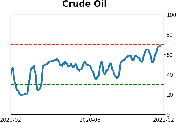
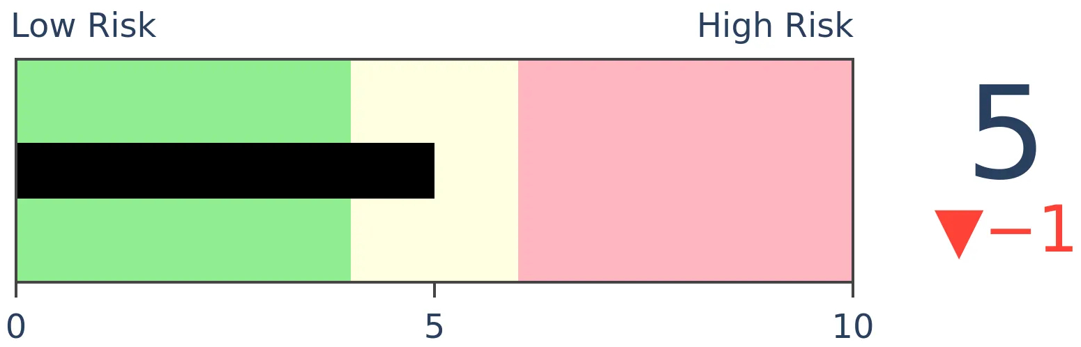
Crude Oil
|
|
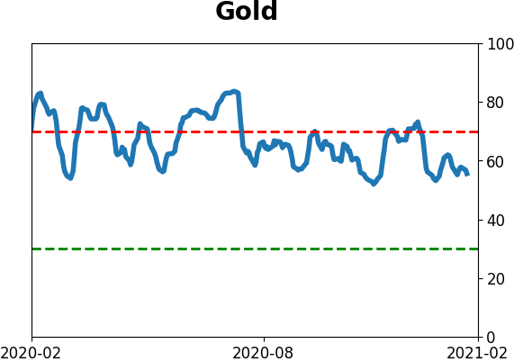
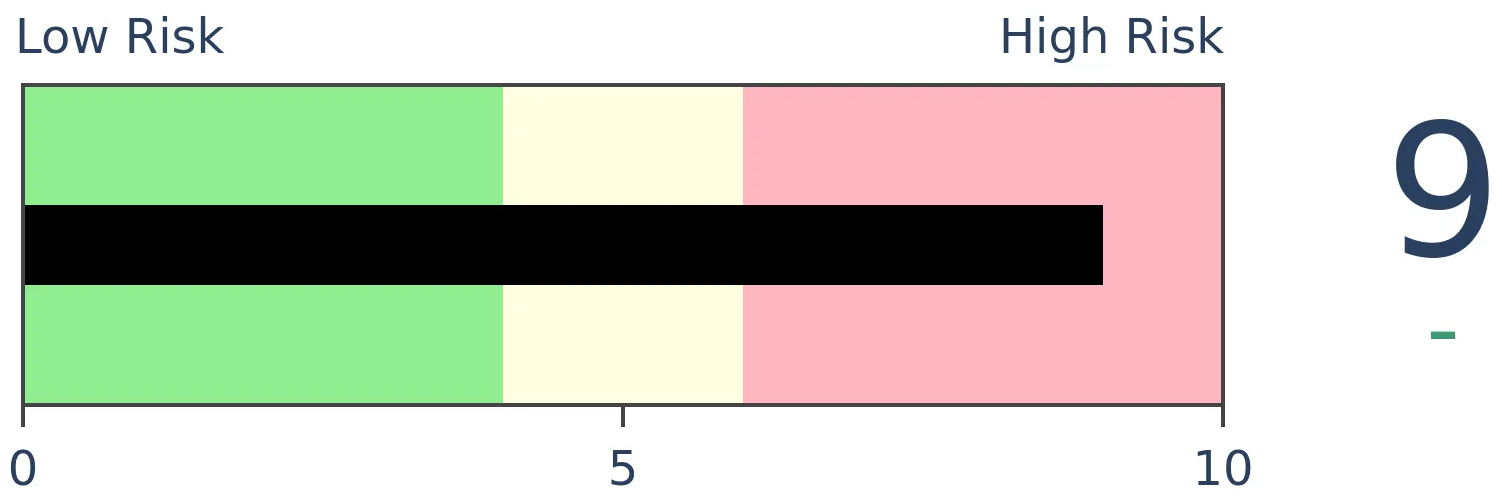
Gold
|
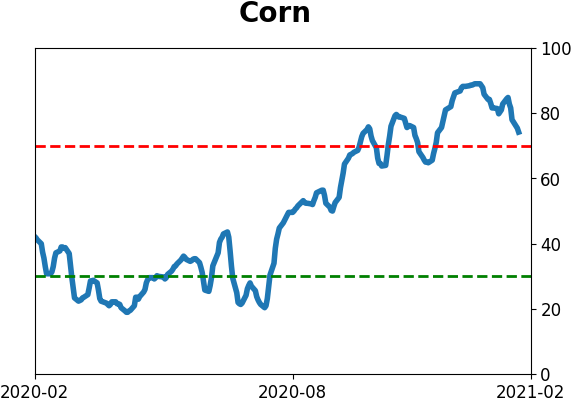
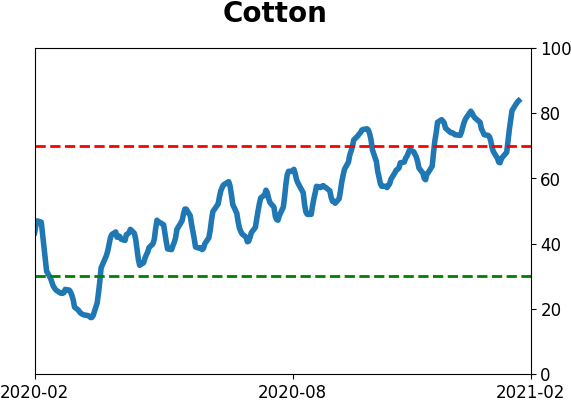
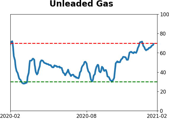
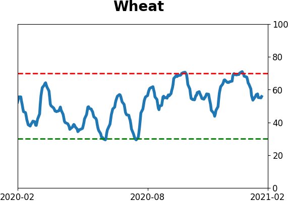
Agriculture

|
|
Research
BOTTOM LINE
The 2-year / 10-year Treasury yield curve has become the steepest in 5 years with the recent move in bonds. Opinions vary on the meaning, but the recent record has been negative for stocks (especially tech stocks) while good for gold.
FORECAST / TIMEFRAME
None
|
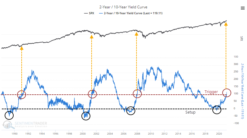
The U.S. Treasury market has seen some stiff selling pressure in recent days, on the heels of stiff selling in recent months. As a result, the benchmark 2-year / 10-year yield curve is the steepest in almost 5 years.
Whether this is a good thing or a bad thing depends upon whom you ask. Bulls will say it's a sign of recovery and good for financials, the bedrock of any sustainable rally. Bears will say it's the first prick in the TINA bubble that will clobber tech stocks, which have been powering most of the gains.
Opinions are a dime a dozen, so let's just objectively look at prior instances and see how things shook out.
There is no definitive date when the Federal Reserve explicitly began targeting the Fed Funds rate but academic literature seems to point to anywhere from 1982 to late 1987. So we'll go from there.
With the yield curve, we'll use a setup and a trigger. The setup is when it drops toward or below 0, with the trigger being when it rises to its current level over 110 basis points.
On a chart, it looks pretty ugly for the S&P 500. The numbers don't look especially great, either.
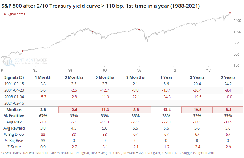
The Risk/Reward Table shows more of the former and less of the latter, though in '91 it didn't lead to any large decline, so there's that.
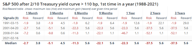
Among major assets, stocks were the worst performer. Gold held up best - over the next 2 years, its average drawdown was -10.4% versus an average maximum gain of +41.4%.
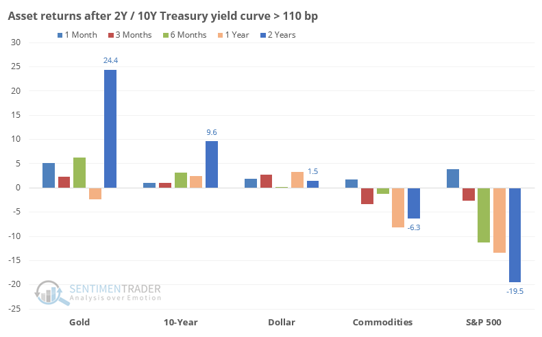
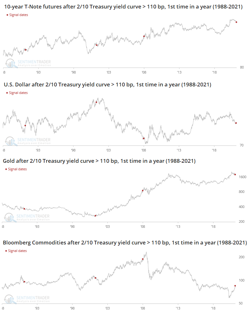
Sometimes it's easier to see it on a chart, so the four other assets are shown below.
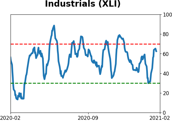
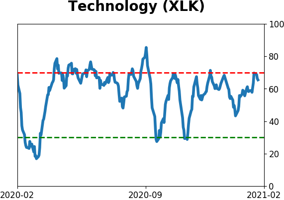
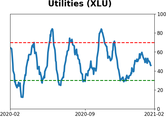
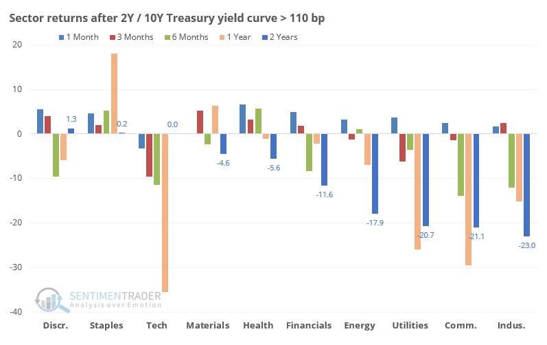
Among sectors, Staples held up the best across most time frames, while Tech, Utilities, Communications, and Industrials tended to fare the worst. Technology was the only sector to show losses over the next 3, 6, and 9 months after all 3 signals, averaging -9.6%, -11.5%, and -18.7%, respectively. Its average one-year return was -35.6% but by 2 years later had recovered to breakeven. Note that these are using total return, including dividends.
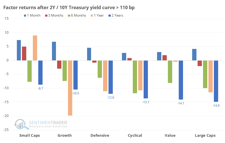
A look at factors shows mostly consistent negative returns. Small-caps were the least consistent losers, while large-caps were the most consistent losers.
With a small sample size and some disagreement among them, it's hard to put too much weight on this move in the yield curve. It's tempting to just look at the last two signals and conclude that it's a major negative, but markets just aren't that easy. We would put it more on the negative side of the ledger than the positive one, especially for technology stocks, but it's not compelling enough to include it as a major factor.
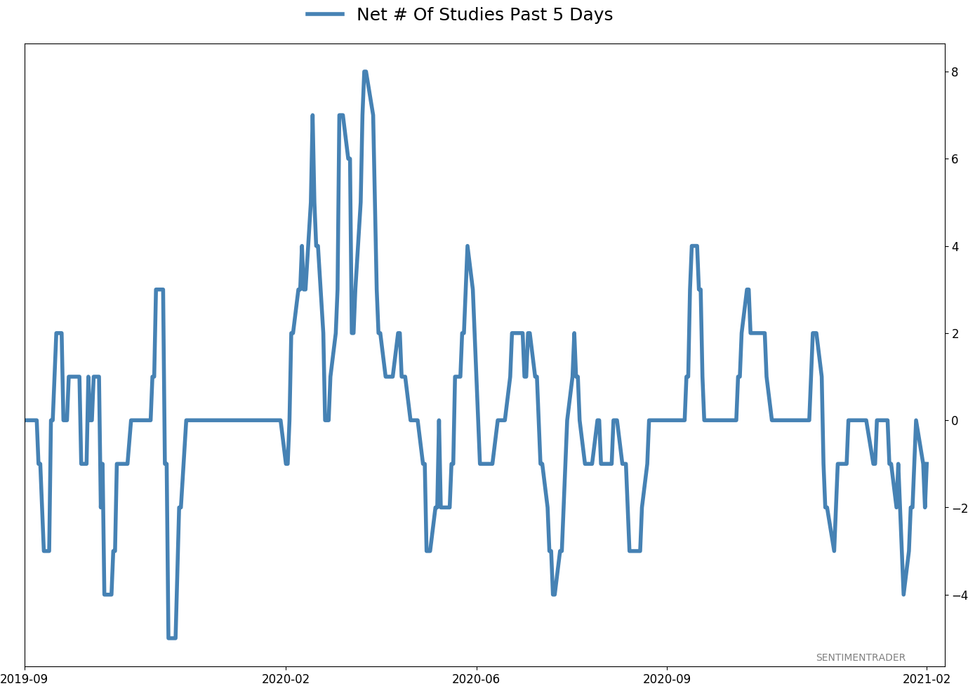
Active Studies
| Time Frame | Bullish | Bearish | | Short-Term | 0 | 0 | | Medium-Term | 2 | 8 | | Long-Term | 16 | 3 |
|
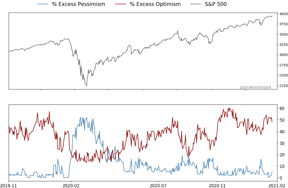
Indicators at Extremes
% Showing Pessimism: 5%
Bullish for Stocks
VIX
|
|
Portfolio
| Position | Description | Weight % | Added / Reduced | Date | | Stocks | RSP | 4.9 | Reduced 4% | 2021-02-09 | | Bonds | 30.0% BND, 8.8% SCHP | 38.8 | Added 15.1% | 2021-02-18 | | Commodities | GCC | 2.3 | Reduced 2.1%
| 2020-09-04 | | Precious Metals | GDX | 9.0 | Added 0.1% | 2021-02-18 | | Special Situations | 7.3% XLE, 4.8% PSCE | 12.1 | Reduced 5.6% | 2021-02-18 | | Cash | | 32.8 | | |
|
Updates (Changes made today are underlined)
With a market that has seen the kinds of broad participation and big breath thrusts like we did in the fall, it's hard to become too negative. Those kinds of conditions have consistently preceded higher returns over the next 6-12 months. It's the interim that's more of an issue. Even conditions like that haven't prevented some shorter-term pullbacks. And when we combine an environment where speculation is rampant and recent days have seen an increase in cracks under the surface of the indexes, it's enough to become more defensive over a short- to medium-term time frame. We still don't have much confirmation from the price action in the indexes, so those who are more conservative would likely wait before increasing cash levels. I've decreased risk exposure a bit more, mainly in terms of energy stocks and the ANGL fund, while adding more to the broader bond market. RETURN YTD: 5.2% 2020: 8.1%, 2019: 12.6%, 2018: 0.6%, 2017: 3.8%, 2016: 17.1%, 2015: 9.2%, 2014: 14.5%, 2013: 2.2%, 2012: 10.8%, 2011: 16.5%, 2010: 15.3%, 2009: 23.9%, 2008: 16.2%, 2007: 7.8%
|
|
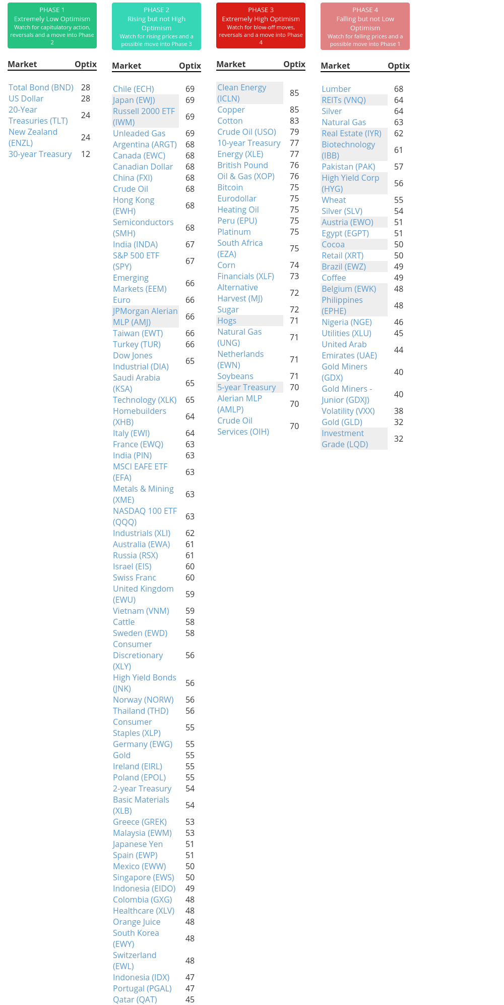
Phase Table
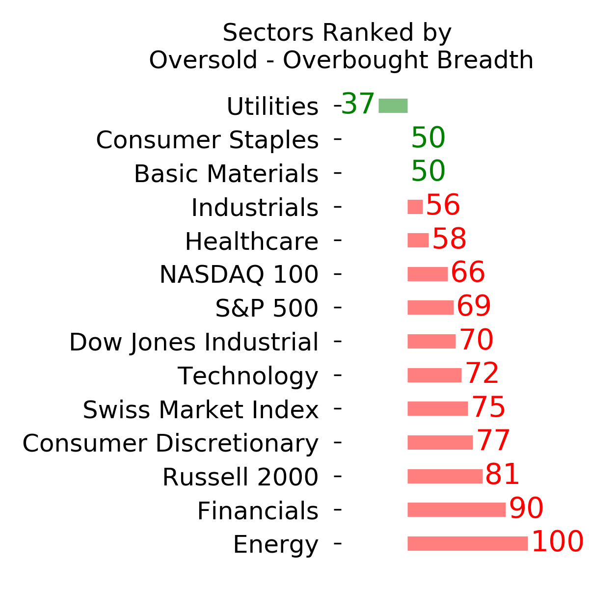
Ranks
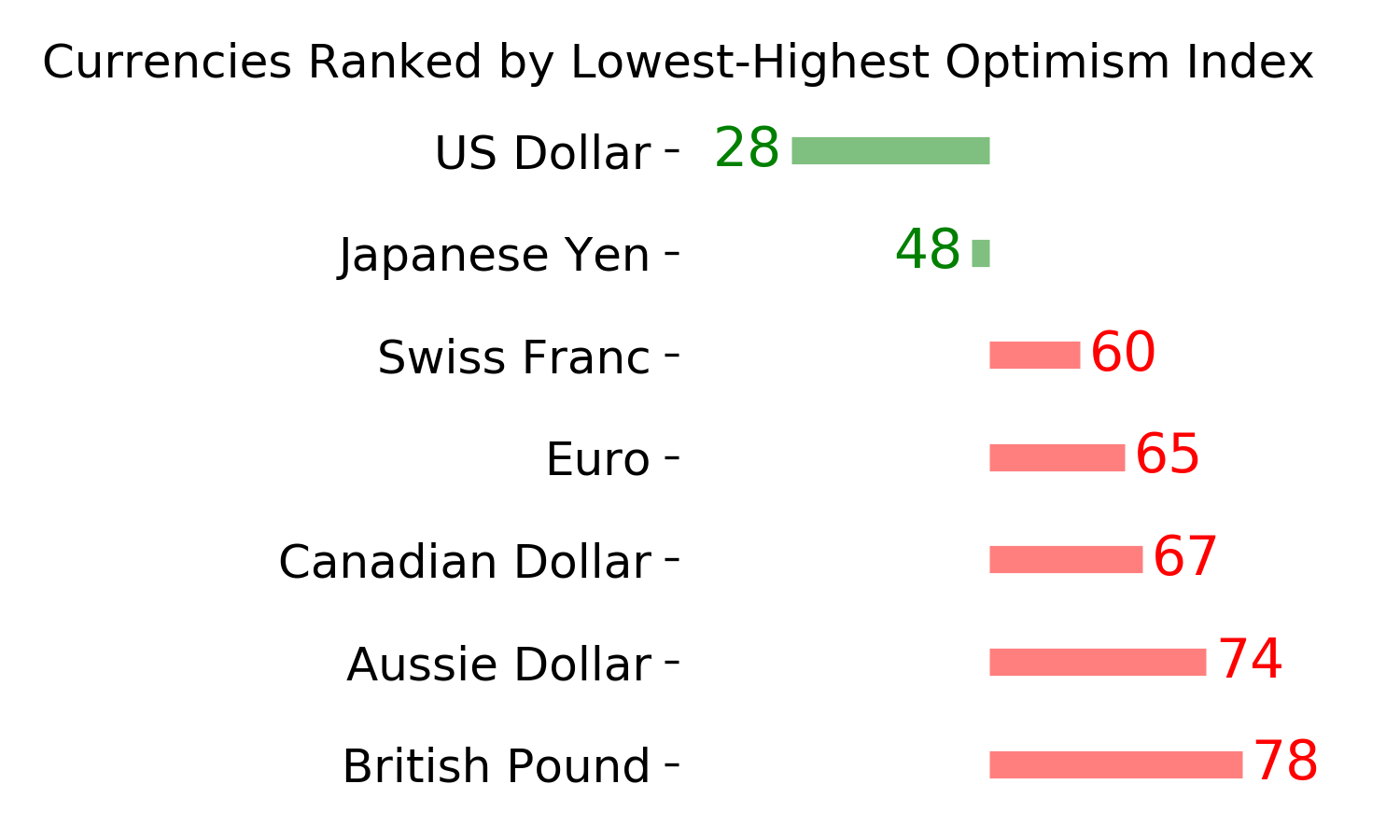
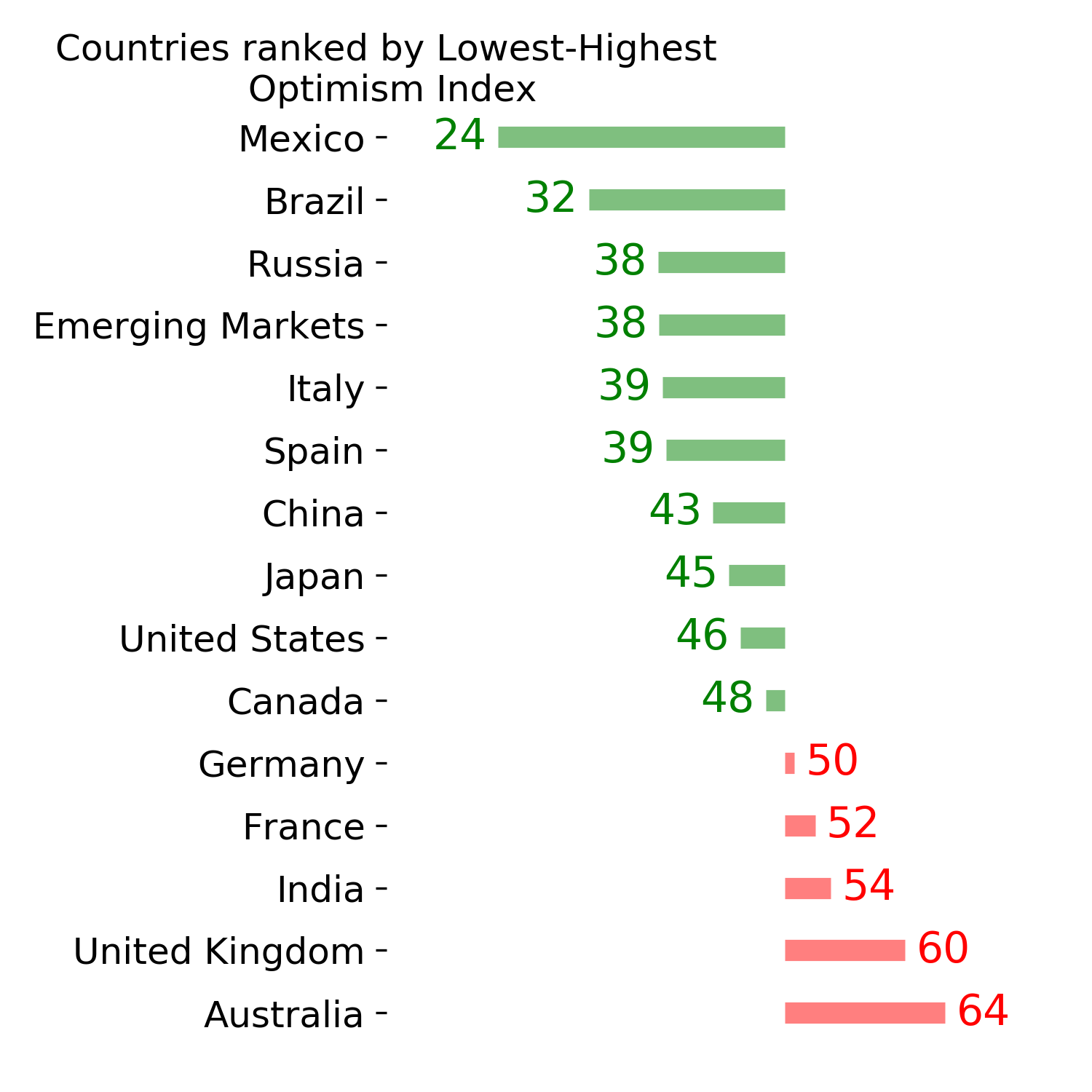
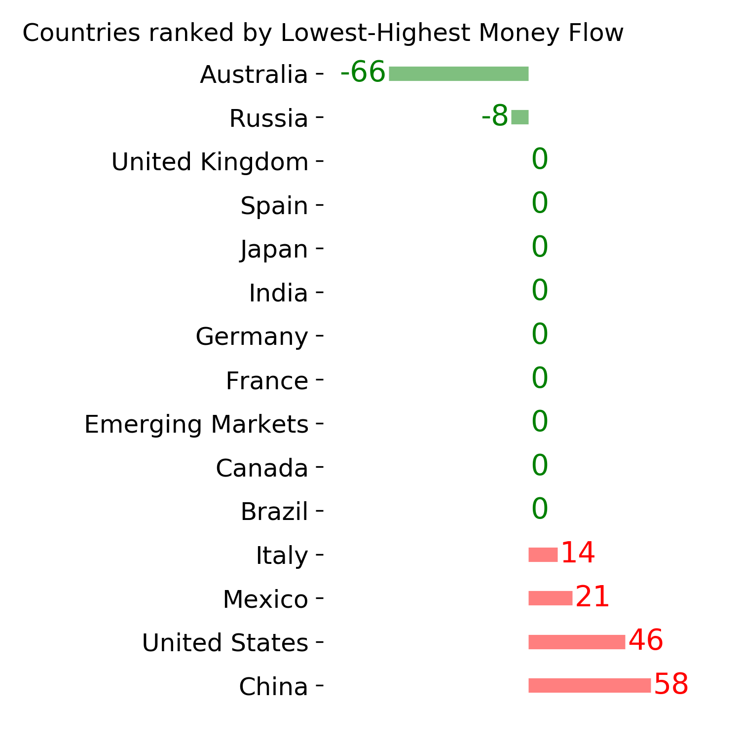
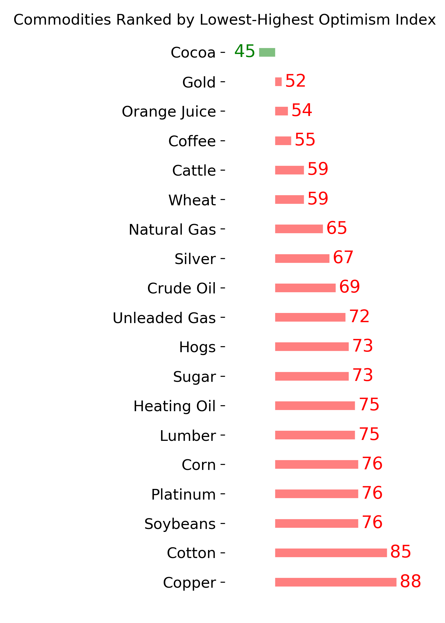
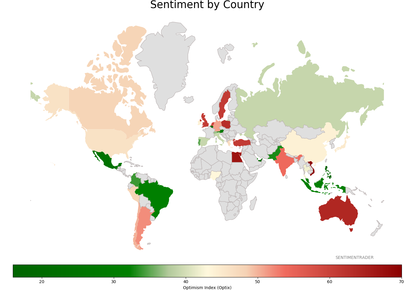
Sentiment Around The World
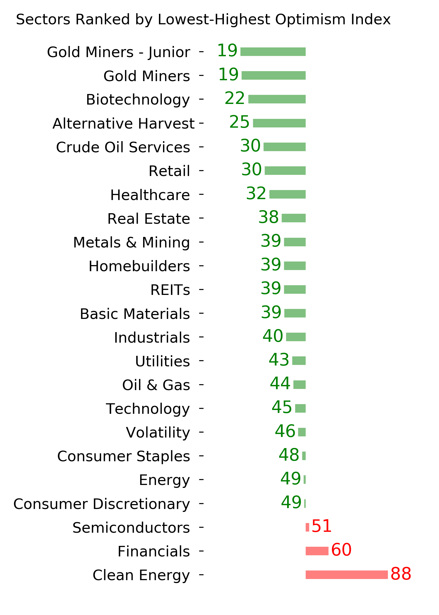
Optimism Index Thumbnails
|
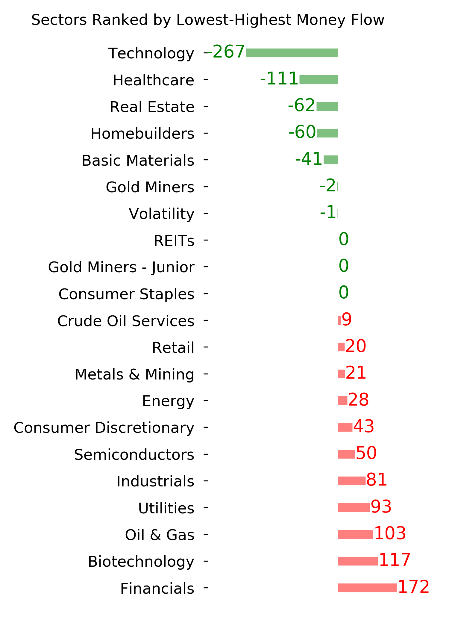
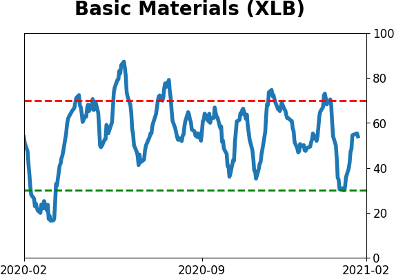
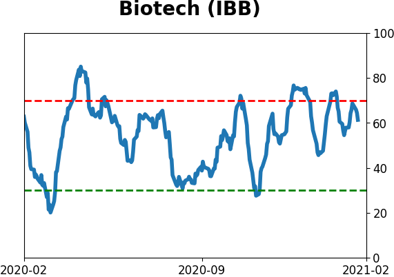
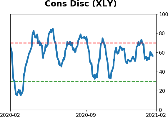
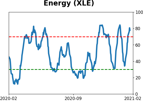
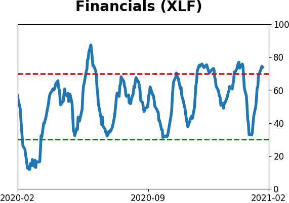
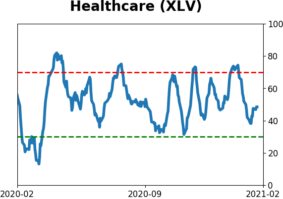
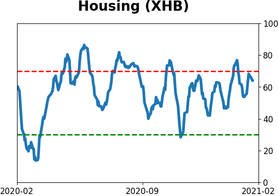
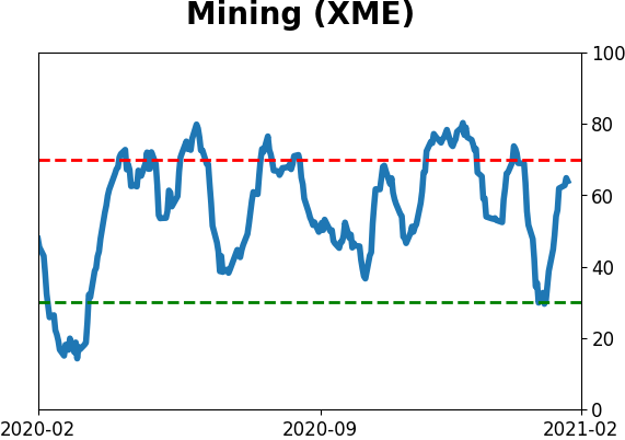
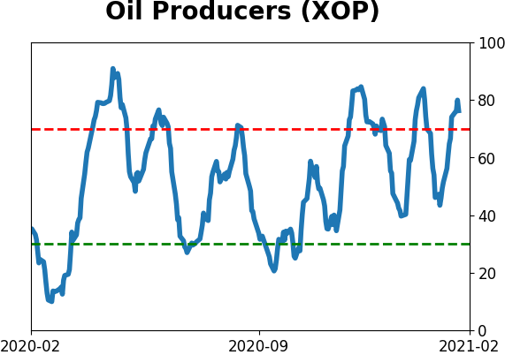
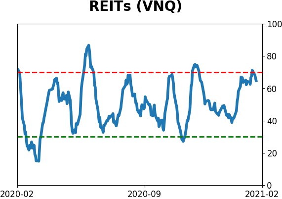
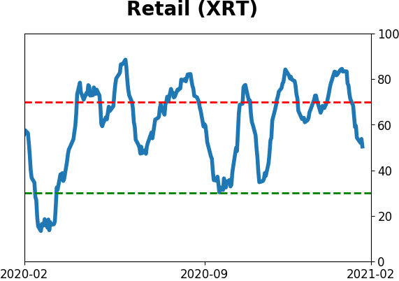
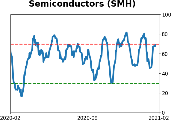
Sector ETF's - 10-Day Moving Average
|
|
|
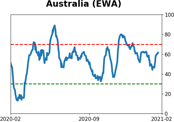
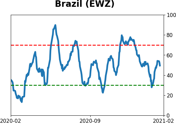
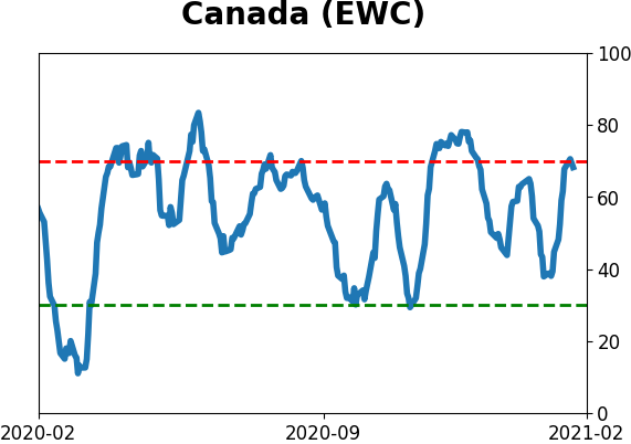
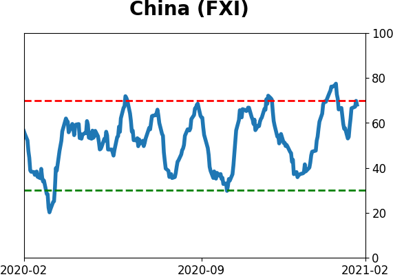
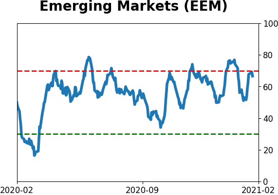
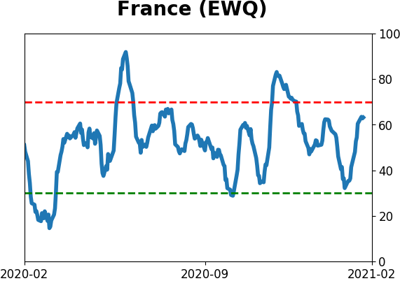
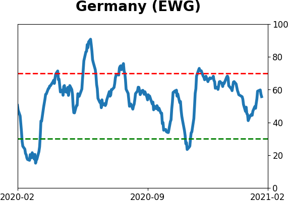
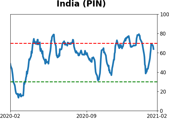
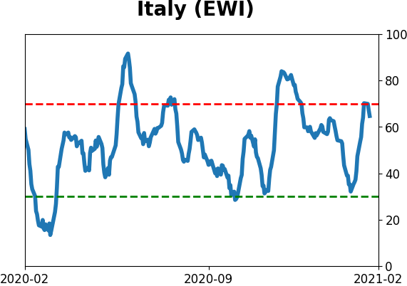
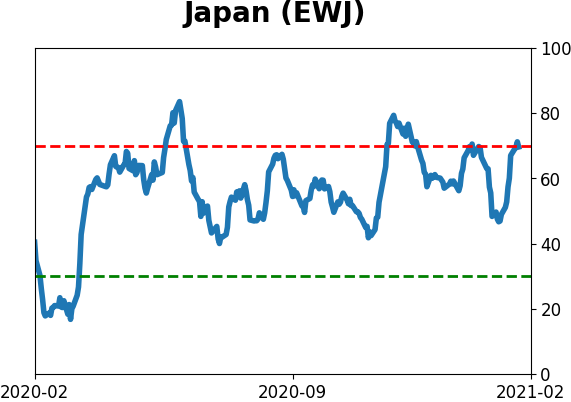
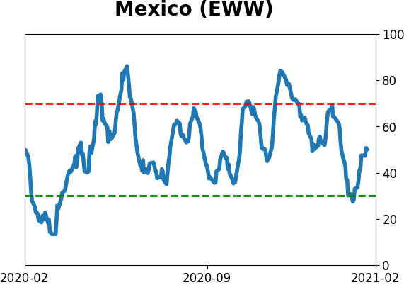
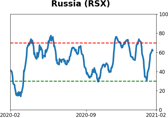
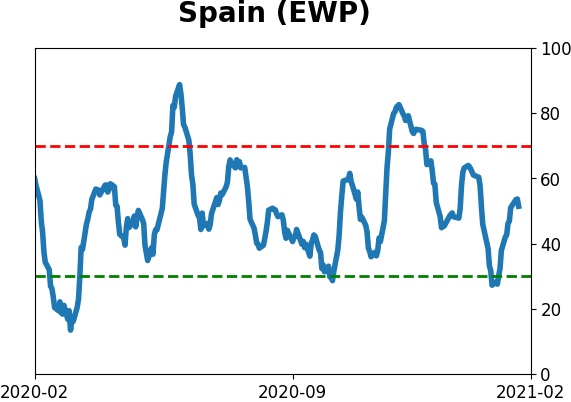
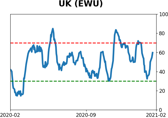
Country ETF's - 10-Day Moving Average
|
|
|
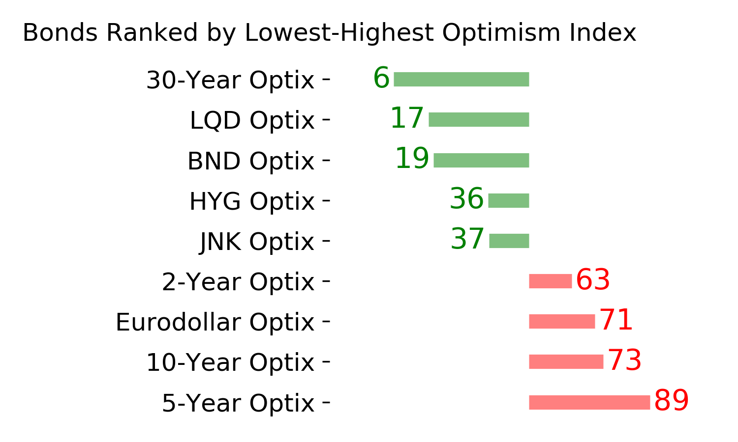
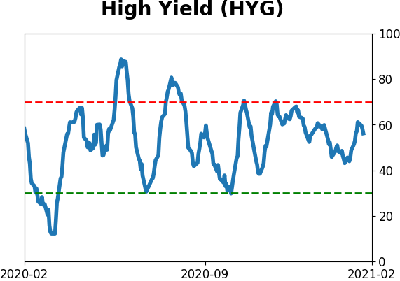
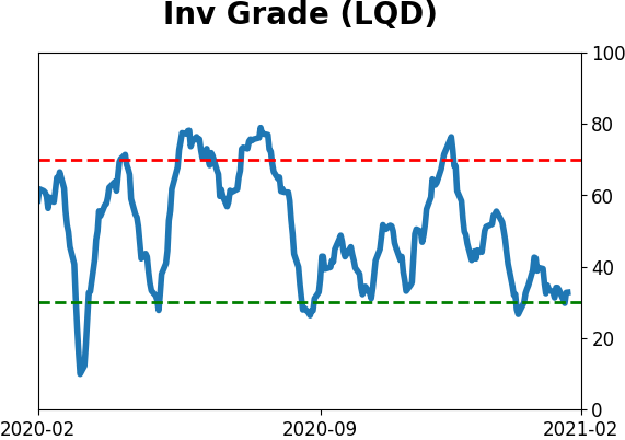
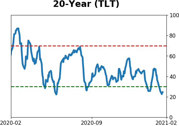
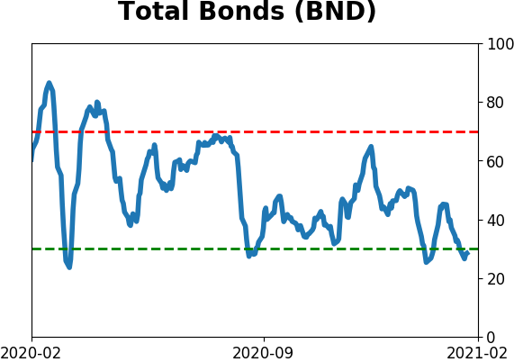
Bond ETF's - 10-Day Moving Average
|
|
|
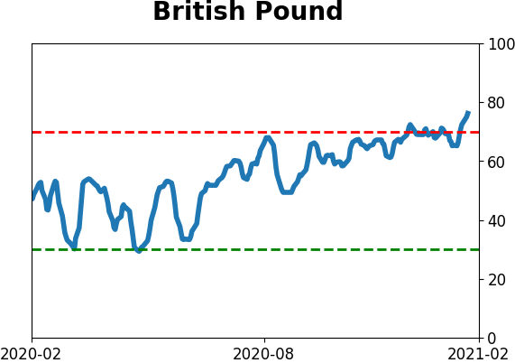
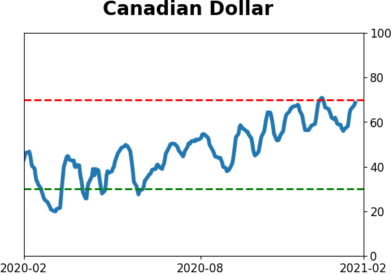
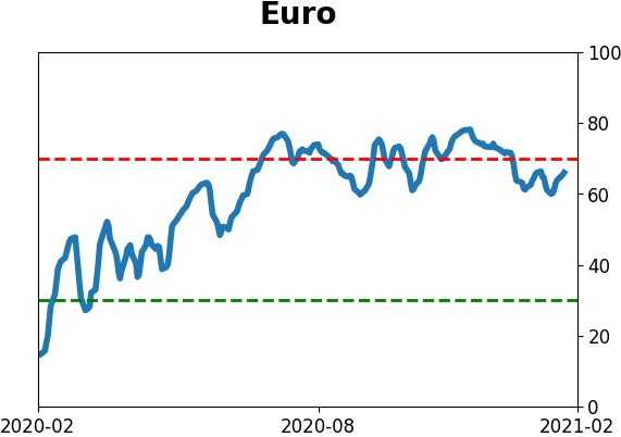
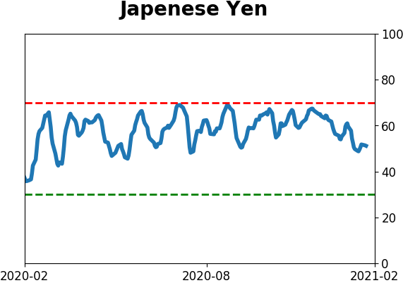
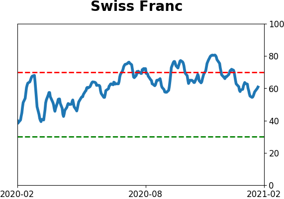
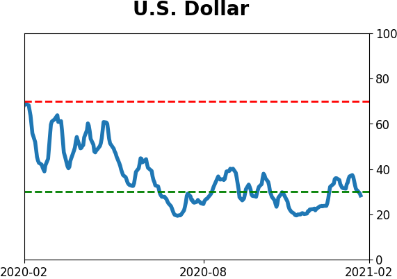
Currency ETF's - 5-Day Moving Average
|
|
|
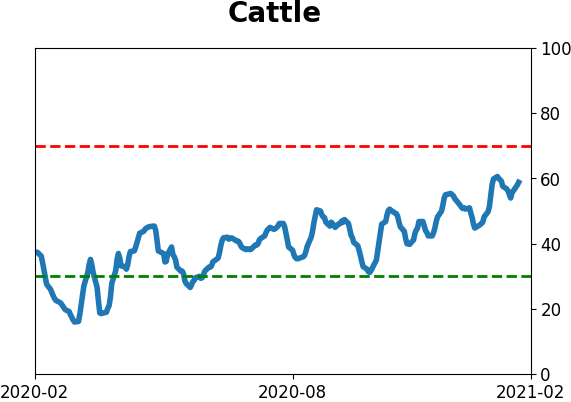
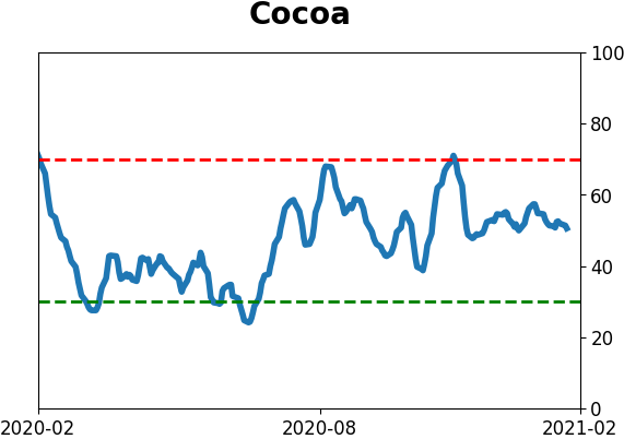
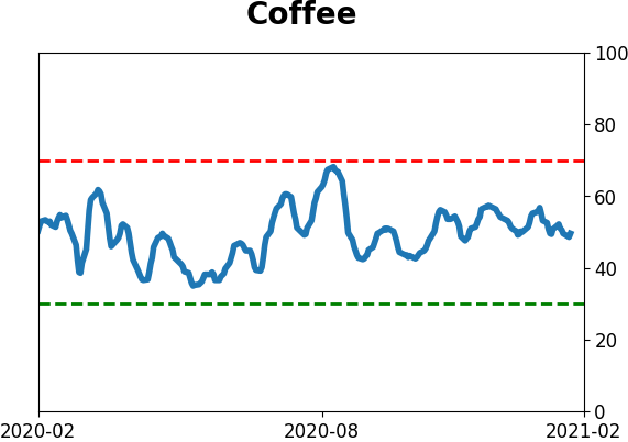
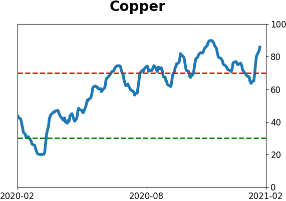
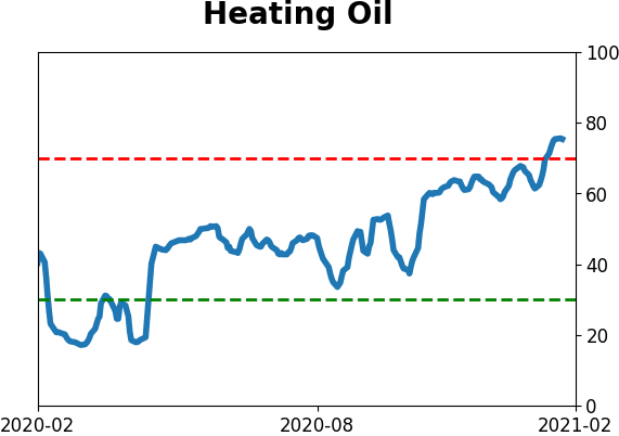
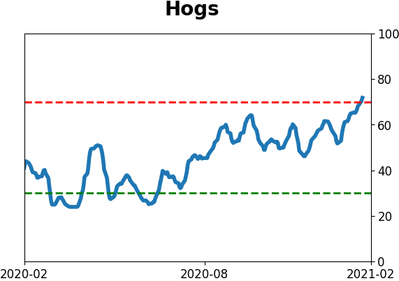
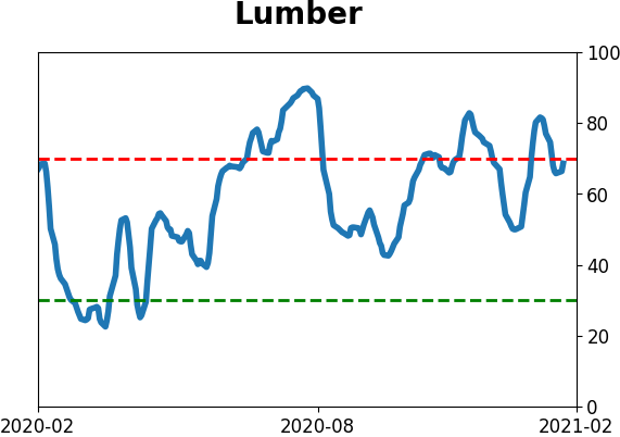
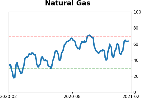
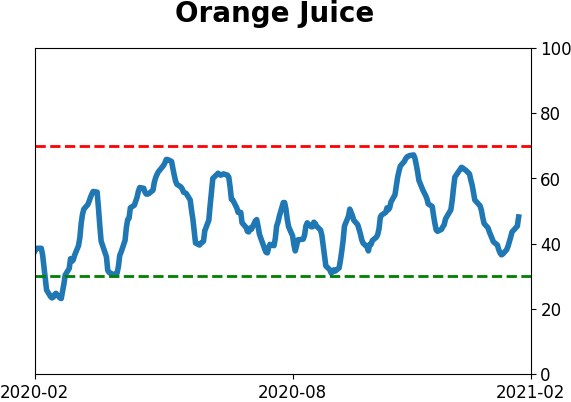
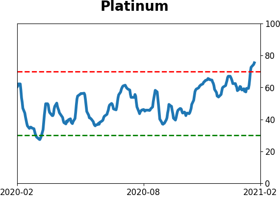
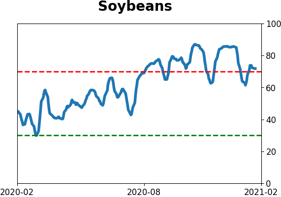
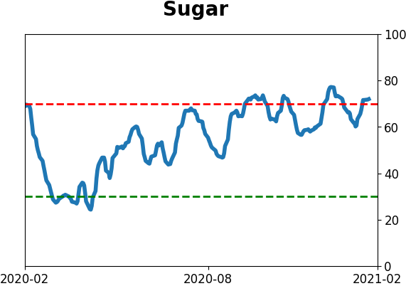
Commodity ETF's - 5-Day Moving Average
|
|