
Correction correlations are not encouraging

Key points:
- After an initial pop from investors who bought the S&P 500's correction, prices have retraced
- A couple of weeks ago, we saw that "bad" corrections tended to see a failed initial rebound
- The most correlated reactions following an initial correction have ushered in mostly negative precedents
A mostly failed correction rebound
A couple of weeks ago, we looked at S&P 500 corrections (-10% declines from a high) and possible paths going forward. The S&P has been on the "good" path for most of the past two weeks. Now...not so much, especially after quickly losing its reclaimed 200-day moving average.
The selloff over the past few days isn't encouraging. As we noted in the prior research, the "good" precedents tended to see only very limited give-back after an initial push of a correction low. The current one has given back nearly all the initial rebound gains (or all of them if this morning's losses hold).
We can go back to 1928 and look at every time the S&P corrected 10% from a multi-year high and then at how it performed in the following weeks. Then, we'll find the paths most correlated to how the index performed since March 13th, when it fell into correction territory.
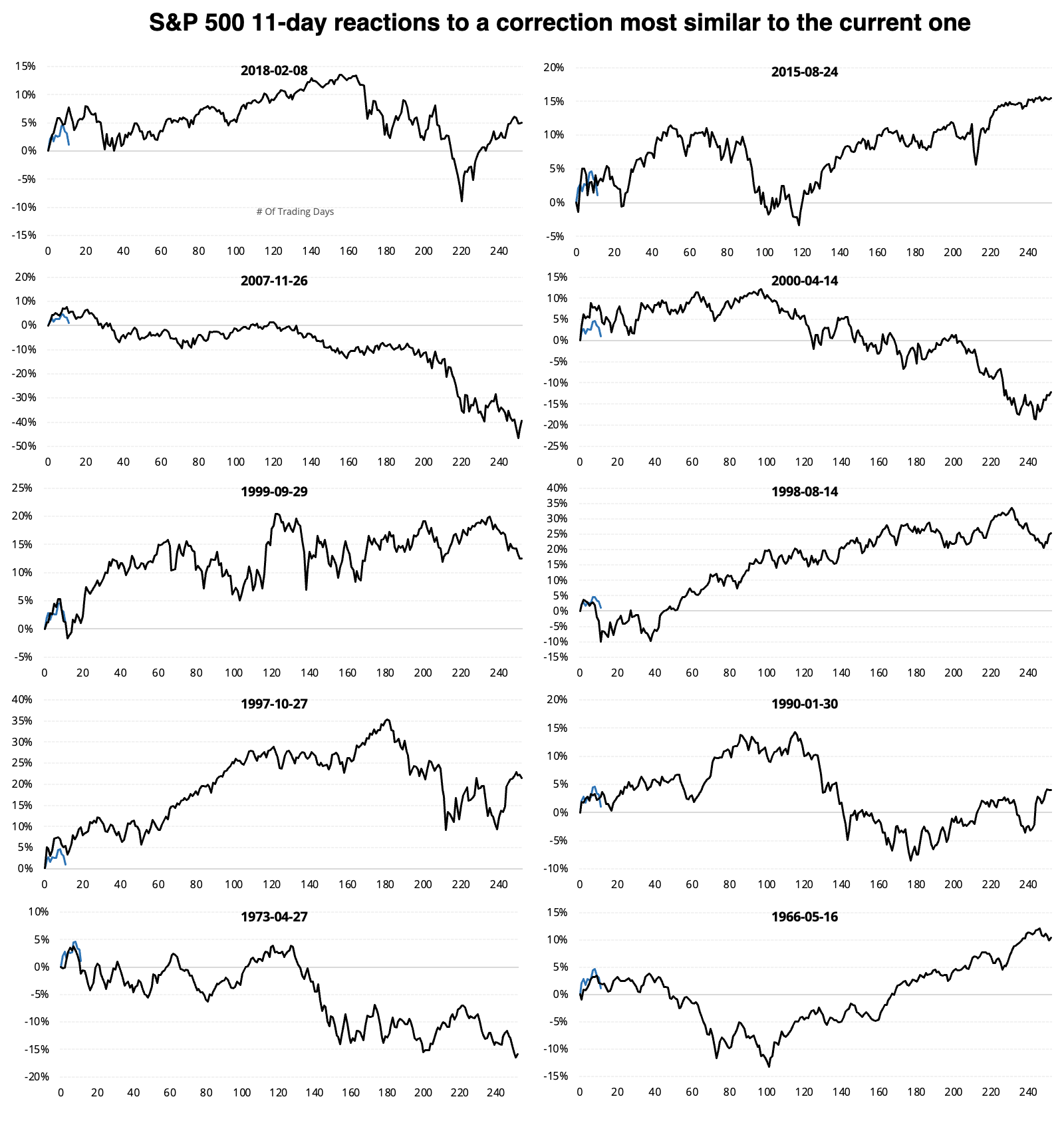
The chart below shows the 15 corrections with the highest correlation to the past 11 sessions and their price paths going forward.
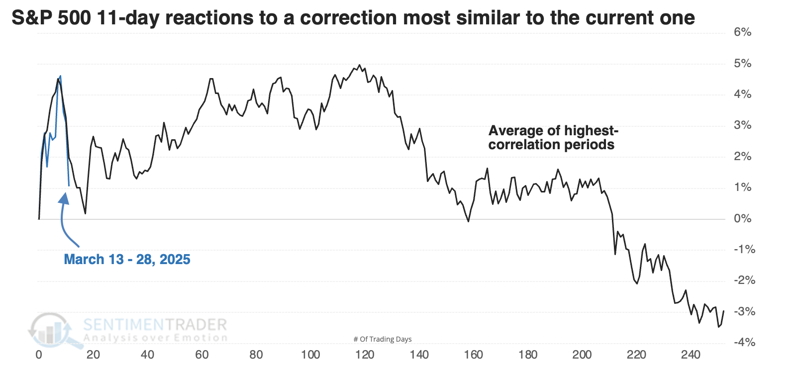
The most recent instances are shown below, and they're not all that encouraging. Unfortunately, both 2007 and 2000 show up among them.
Returns were not great
The table below looks at S&P 500 returns following the 11-day reactions most similar to the past couple of weeks.
In 1955, then again during the ending phase of the internet bubble, the S&P did just fine, recovering well from its initial disappointing rebound. The signal from 2015 meandered for a while and returned only a little over +2% during the next six months, but at least it didn't result in a significant loss. But the others were not good.
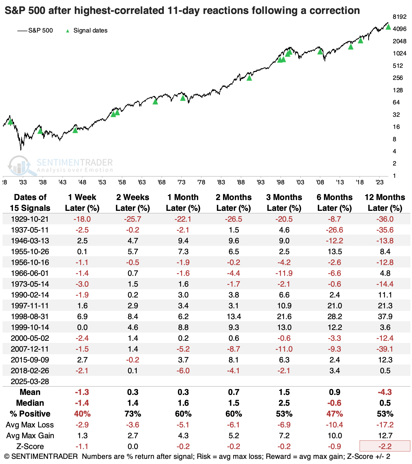
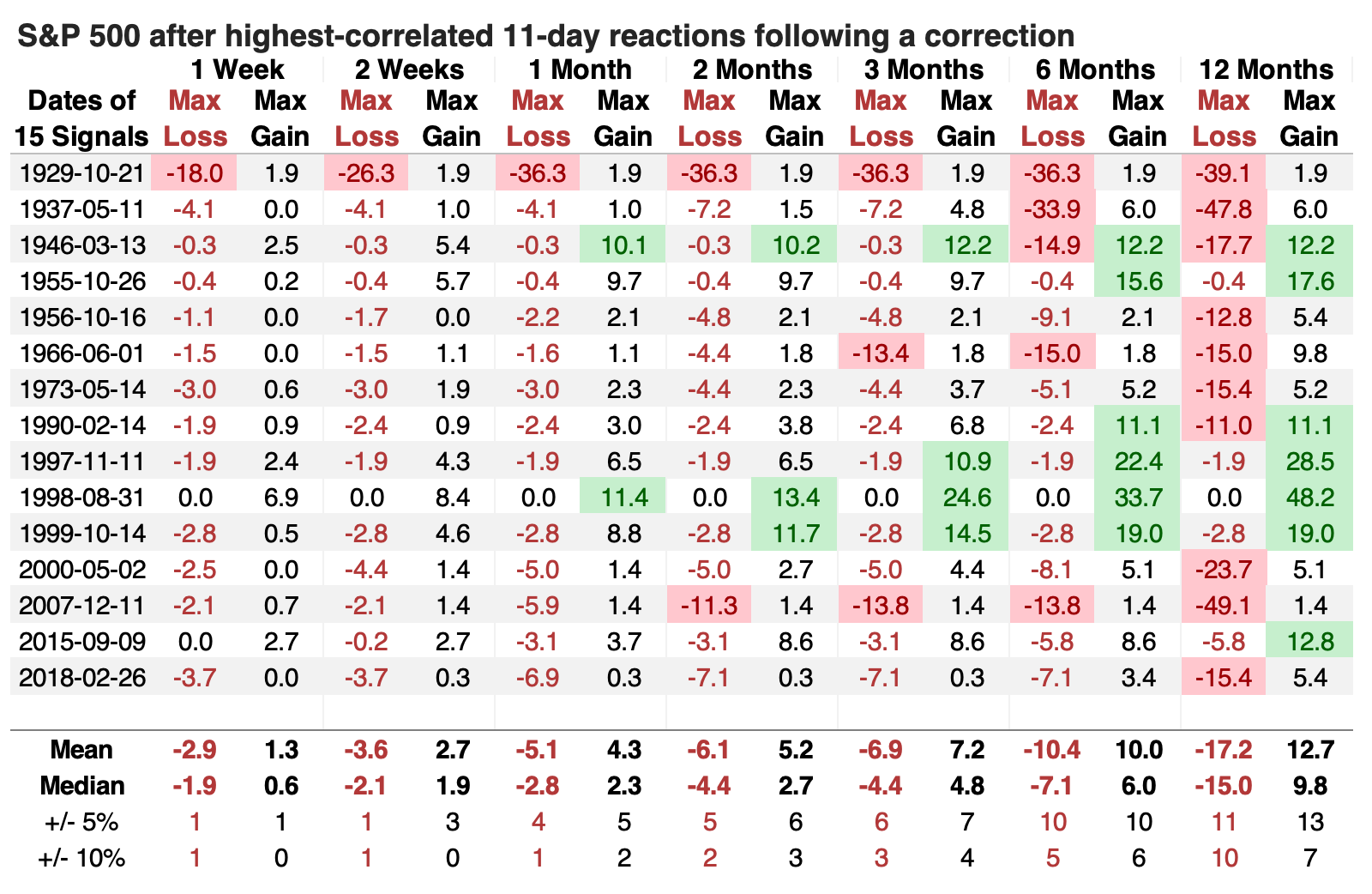
The table of maximum gains and losses across time frames shows a lot of red over the following year, with a median drawdown of -15%, significantly larger than the median drawup (maximum gain) of around +10%. There were ten losses of at least -10% compared to seven gains of +10% or more.
Counterexamples were mostly positive
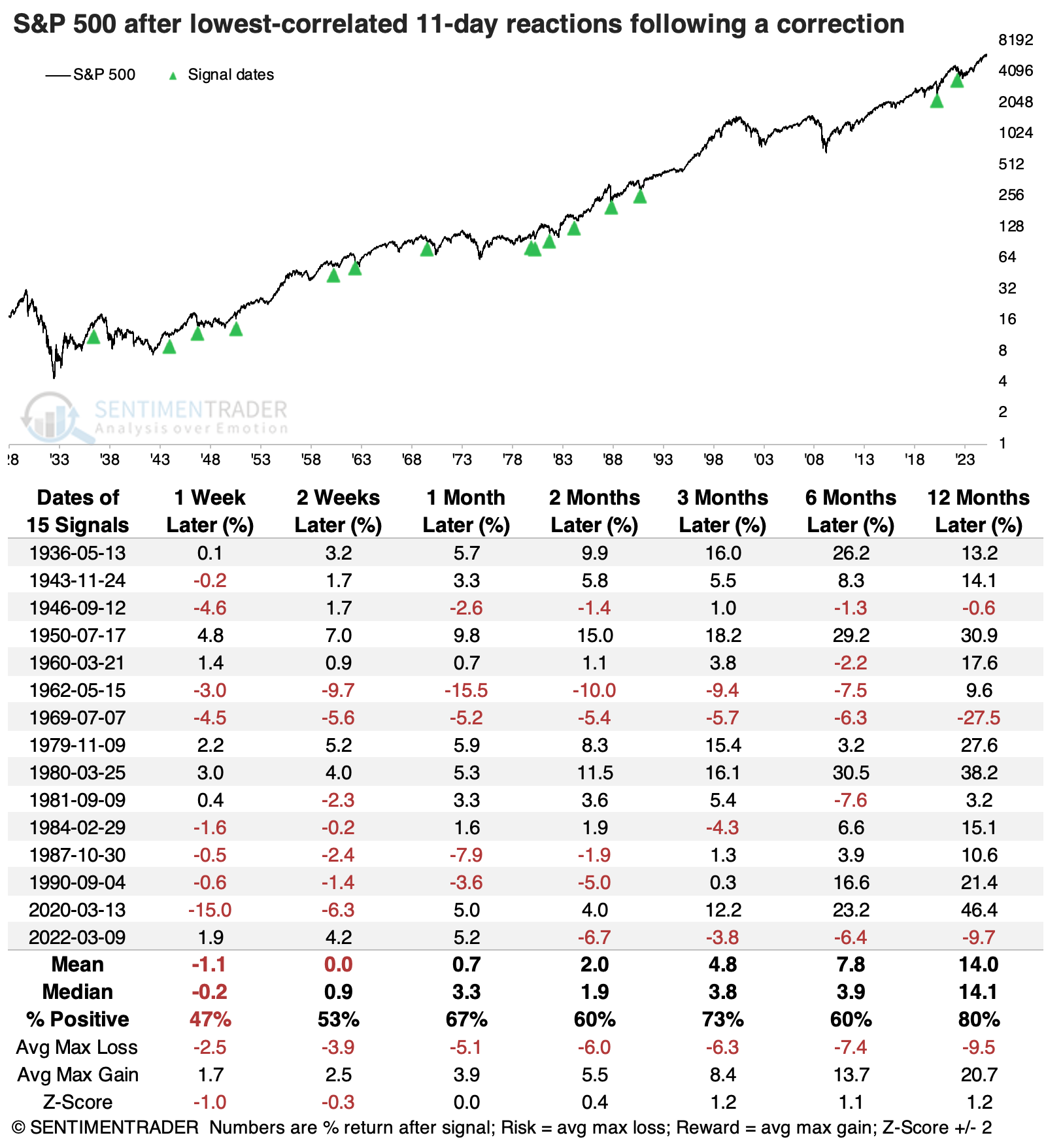
We like to look at counterexamples, so below is an aggregate of the 15 corrections in which the initial 11-day reaction from correction territory was the least like the past two weeks.
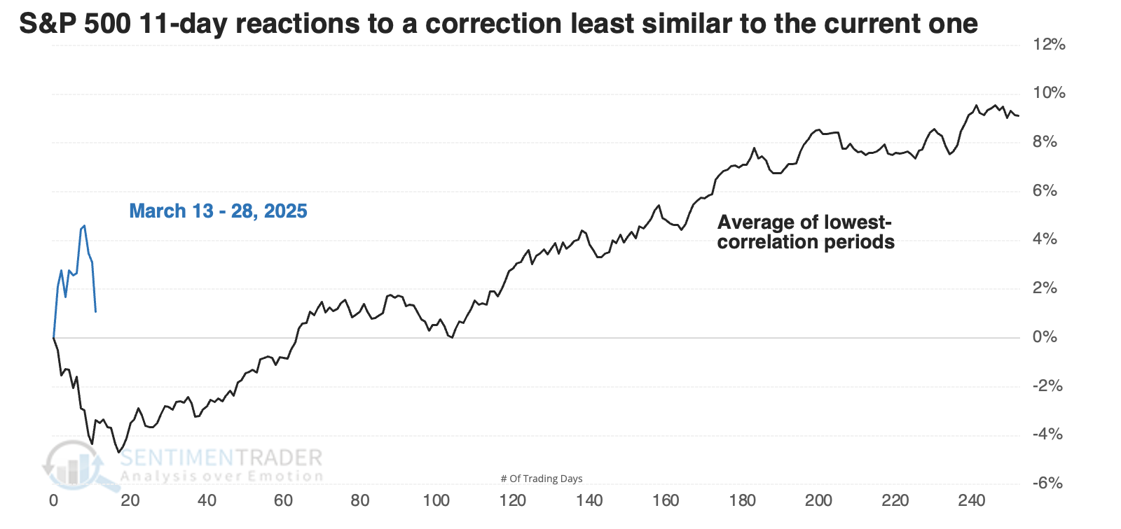
The S&P 500's returns following these signals were much better. Over the following year, it suffered only one large loss, one moderate loss, and one tiny one. Its median return was impressive, with a more than 2-to-1 reward-to-risk. Pretty much everything was better after these reactions than after the highest-correlated signals.
What the research tells us...
In the initial research, where we looked at possible paths for the S&P 500 following an initial move into correction territory, we noted that the best predictor of its longer-term returns would be how investors treated the initial fall. If buyers flooded in and the index didn't suffer much in terms of give-back from an initial rebound, then it would bode well for the months ahead.
That's not what we've seen. The past few sessions have been discouraging, and the S&P has given back almost all of its gains. Risk appetite is poor, which is much more closely aligned with larger risk-off environments that have persisted for months or longer. The most correlated reactions to the past couple of weeks have seen poor returns, consistency, and risk/reward profiles. Unless things change in a hurry, it suggests investors are facing higher-than-average risk.