
Component Correlation still flashing green in several key industries

Key points
- Component correlation measures the degree to which the stocks in an industry group are trading in a similar manner
- High correlation tends to presage price strength, and vice versa
- A number of key industries have been - and continue - to show favorable readings
Understanding component correlation
Our various component correlation indicators show the correlation among index members, representing a given sector in most cases. During times of panic, investors tend to buy or sell "everything" together, no matter their individual merits, so correlation rises. The higher it goes, the more we see group-think, which tends to happen at times of extreme pessimism and is thus usually a positive for stocks in the future. When conditions are calm, and investors become complacent, they trade stocks on their own merits, and correlation drops. That tends to lead to below-average returns for the sector going forward.
Below we look at the historical - and most recent - action in component correlation within four key market sectors. As with many indicators, there is not necessarily "one best way" to use each. To highlight this, we look first at performance for each sector, following all readings above a given level. Then we limit the results to a maximum of one signal every six months.
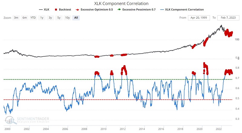
Technology
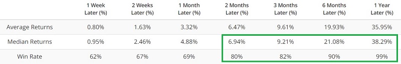
The chart and table below highlight the performance of the Technology Select Sector SPDR Fund ETF (ticker XLK) following those days when the XLK Component Correlation was above 0.75.
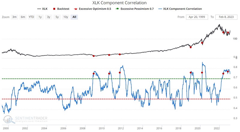
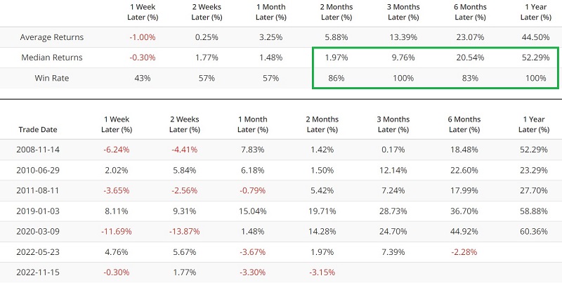
The chart and table below exclude all signals that occur within six months of a previous signal.
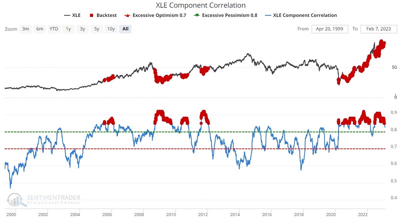
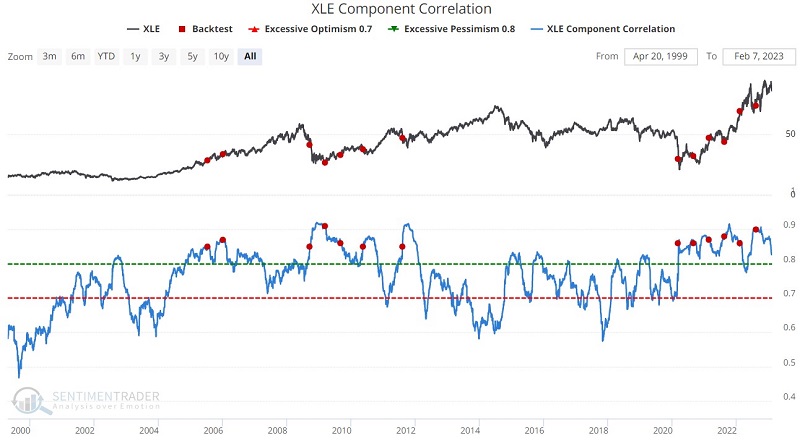
Energy
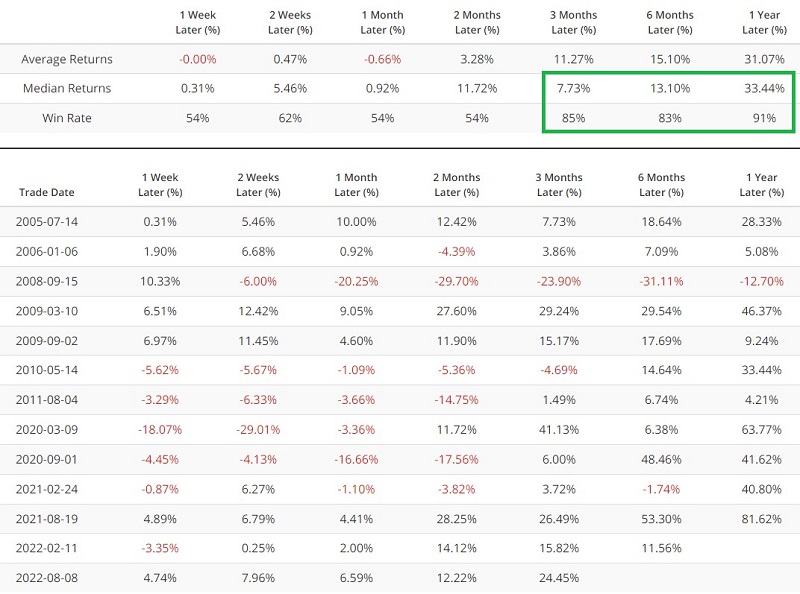
The chart and table below highlight the performance of the Energy Select Sector SPDR Fund ETF (ticker XLE) following those days when the XLE Component Correlation was above 0.85.
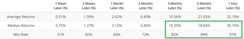
The chart and table below exclude all signals that occur within six months of a previous signal.
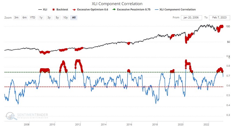
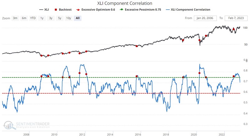
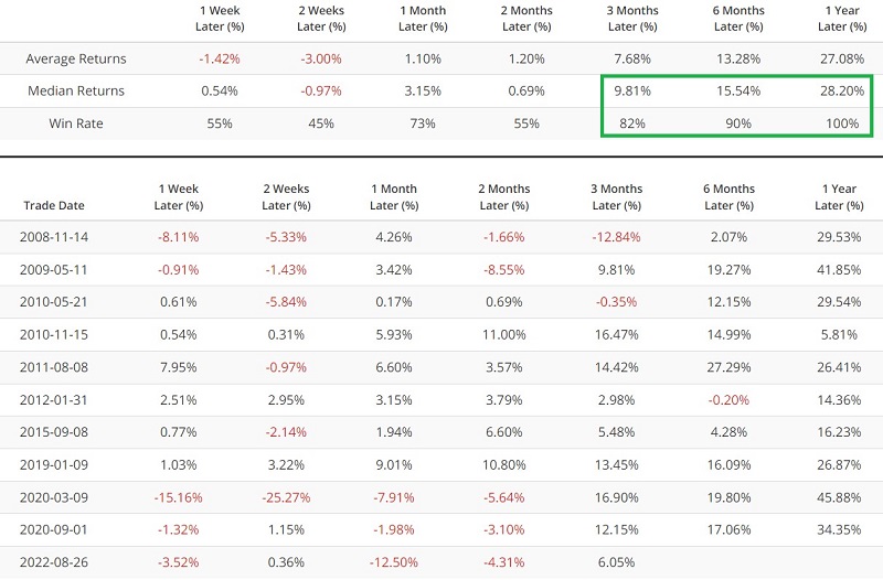
Industrials
The chart and table below highlight the performance of the Industrial Select Sector SPDR Fund ETF (ticker XLI) following those days when the XLE Component Correlation was above 0.75.
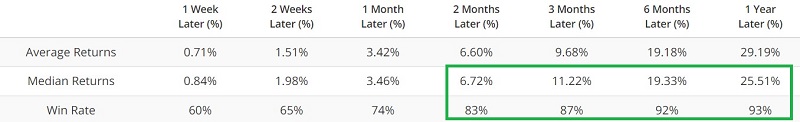
The chart and table below exclude all signals that occur within six months of a previous signal.
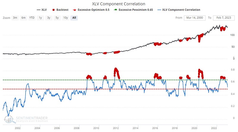
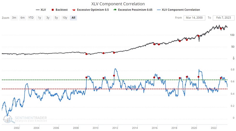
Health Care
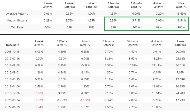
The chart and table below highlight the performance of the Health Care Select Sector SPDR Fund ETF (ticker XLV) following those days when the XLV Component Correlation was above 0.68.
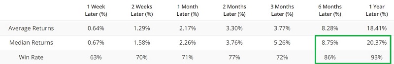
The chart and table below exclude all signals that occur within six months of a previous signal.
What the research tells us…
Historically, high component correlation readings have tended to presage new or continued strength within a given sector. If history proves an accurate guide this time, investors might expect the recent rally to follow through in the months ahead. History also suggests that the four sectors highlighted above may be decent investment candidates.