
Another economic indicator flashes yellow

Key points
- Employment trends can foreshadow economic trends
- Economic recession is a primary driver of bear markets
- A key employment indicator has flashed a new warning sign
- This is not an automatic "sell" signal for stocks but does serve as a warning
Continued unemployment insurance claims are on the rise
Continued claims, also referred to as insured unemployment, are the number of people who have already filed an initial claim and have experienced a week of unemployment and then filed a continued claim to claim benefits for that week of unemployment. We like to look at the 4-week average as updated each week here on the St. Louis Federal Reserve website. The chart from that site is highlighted below.
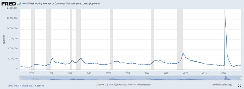
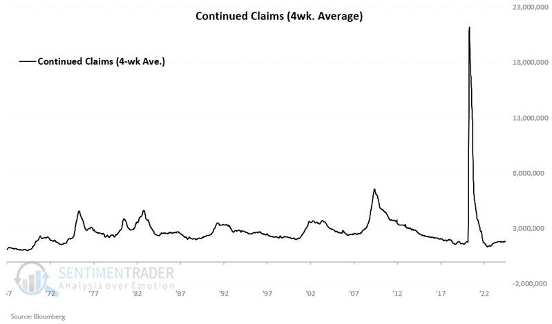
The critical thing to note in the chart above is how consistently rising trends in continued claims (blue line) precede or accompany economic recessions (gray periods). Let's take a closer look at Continued Claims. The chart below is our own version of the chart above. Note that the massive COVID-19-related spike in 2020 was essentially "off the charts" relative to previous increases.
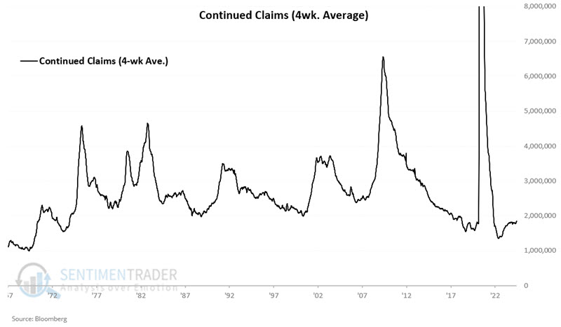
In the chart below, we "zoom in" and cut off the peak of the 2020 spike to get a better perspective on the roller coaster nature of this data series.
The chart below adds a 78-week exponential moving average (blue line) to the data series. This attempts to designate the long-term trend as "rising" or "falling."
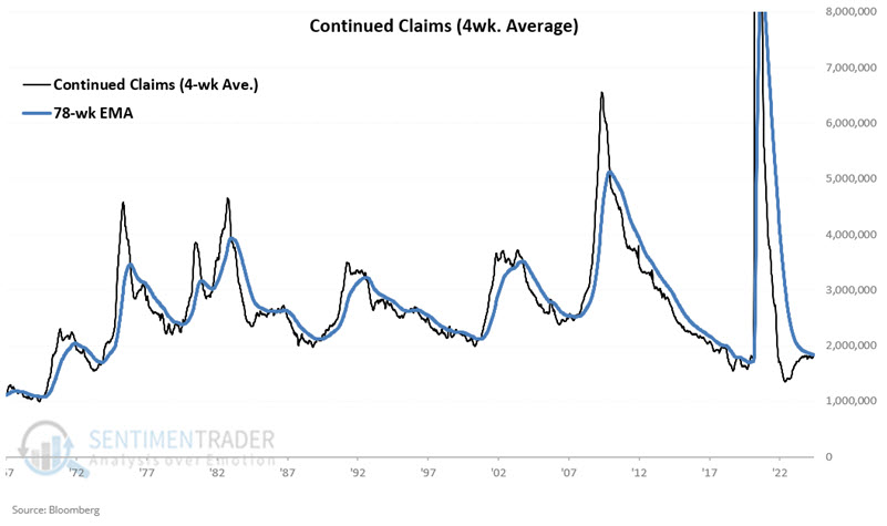
When the black line is below the blue line, we designate this data series as "falling" (which - in theory - should be favorable for stocks) as it indicates a lower threat of economic recession.
Conversely, when the black line is above the blue line, we designate this data series as "rising" (which - in theory - should be less favorable for stocks) as it indicates a higher threat of economic recession.
The chart below "zooms in" on the last 25 years of data.
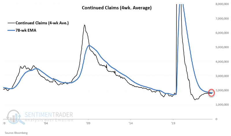
The sharp uptrends starting in 2000, 2007, and 2019 all presaged significant stock market declines. Also, note at the far right in the chart above that the most recent data reported has pushed the 4-week average of Continued Claims back above its 78-week EMA.
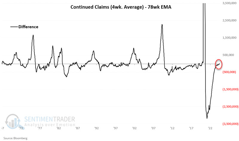
The chart below also reflects this change in trend as it displays the difference between the 4-week average for Continued Claims minus the 78-week EMA. Readings above 0 reflect a rising trend and vice versa.
So, given what followed the 2000, 2007, and 2019 uptrends, is it time for stock market investors to panic? As it turns out, the answer appears to be "Perhaps, but not necessarily." Let's take a closer look at stock market results based on the trend of this version of the Continued Claims indicator.
Continued Claims versus the S&P 500 Index
Employment trends are only one of many factors that can influence stock market performance. As a result, this indicator is not intended to be used as a "trading system," i.e., generating automatic buy and sell signals. The information gleaned from this indicator is merely the "weight of the evidence."
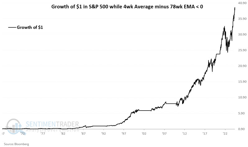
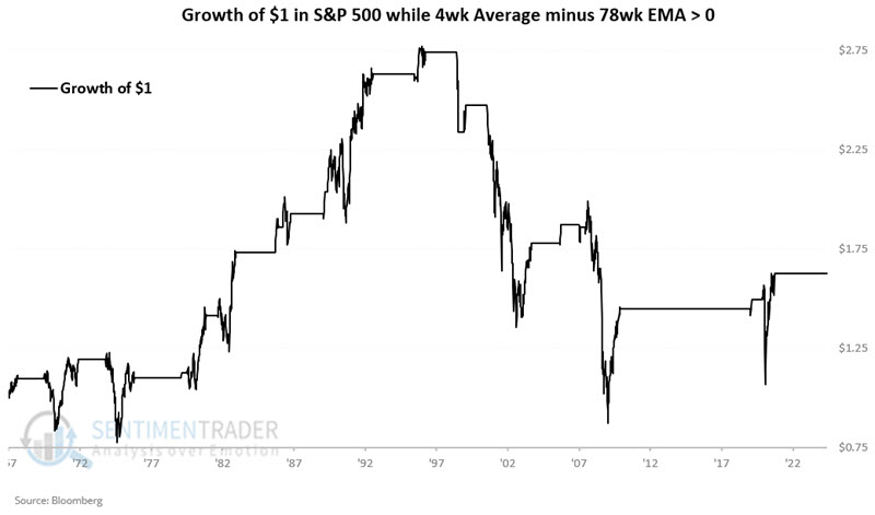
The chart below displays the hypothetical growth of $1 invested in the S&P 500 Index only during those periods when the 4-week average of Continued Claims is in a downtrend (i.e., below its 78-week EMA) since 1967-02-24. The cumulative hypothetical gain is +3,770%.
The chart below displays the same data as the chart above but on a logarithmic scale to better highlight percentage moves.
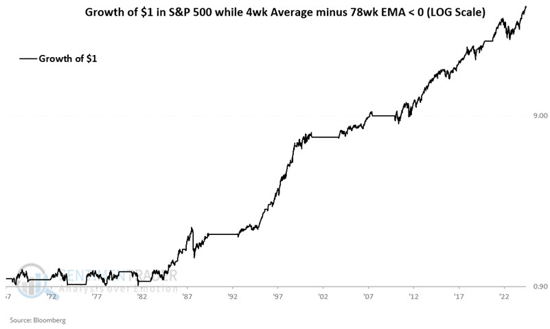
Note that this indicator was not very useful as a bull market indicator into the mid-1980s but has been quite consistently useful ever since.
And what about when the indicator was unfavorable, i.e., in an uptrend? The chart below displays the hypothetical growth of $1 invested in the S&P 500 Index only during periods when the 4-week average of Continued Claims has been in an uptrend (i.e., above its 78-week EMA) since 1967-02-24.
And herein lies "the rub." Overall performance is markedly less favorable (+63% versus +3,770%), but technically, the stock market gained ground overall. Hence, we view this indicator as weight of the evidence and not as a trading system. The proper way to look at the recent crossover into an uptrend is that a favorable factor has been removed from the equation, and not necessarily that the market is "doomed" to fall simply because continued claims have picked up.
Testing Continued Claims as a system
To illustrate the relative merits of paying attention to this indicator, let's analyze results in a trading system fashion anyway. The table below displays the periods when the 4-week average of Continued Claims was below its 78-week EMA and the performance of the S&P 500 Index during those times.
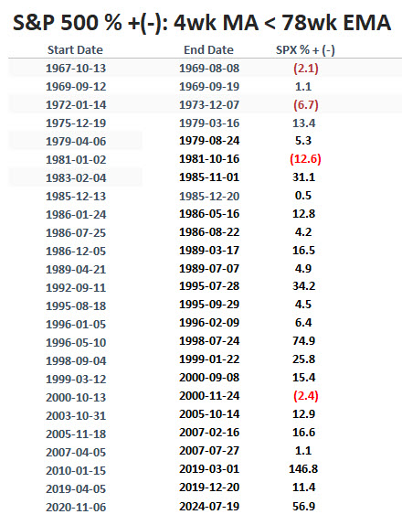
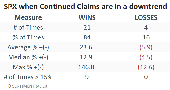
Note that 21 periods showed a gain, and only 4 showed a loss (84% Win Rate). This suggests that favorable readings lend weight to the bullish case for stocks. The table below summarizes S&P 500 performance during favorable periods.
The table below displays the periods when the 4-week average of Continued Claims was above its 78-week EMA and the performance of the S&P 500 Index during those times.
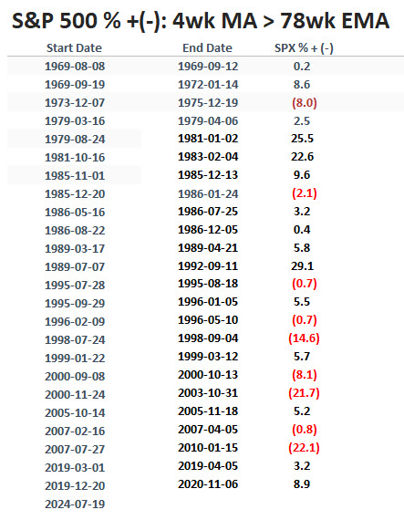
Note that 15 periods showed a gain, and only 9 showed a loss (63% Win Rate). This suggests that unfavorable readings (such as the new one that just occurred) should not be relied upon as an automatic sell signal for stocks. However, it does alert us to the potential for a less favorable environment for stocks. The table below summarizes S&P 500 performance during unfavorable periods.

What the research tells us…
The level of - and trend in - unemployment has a direct impact on the trend of the overall economy. The trend of the overall economy has a direct effect on stock prices. However, even the economy's trend is only one of many factors that affect stock prices. So, the latest uptick in continued unemployment claims is an unfavorable factor for stock prices. It is not, however, a reason to panic. The best analogy may be the difference between a tornado watch and a tornado warning. A rising trend in unemployment claims is essentially a "tornado watch" level event for stocks. You need to pay attention and be alert for the potential for things to worsen, but it is not necessarily time to head for the basement.