
About that inverted yield curve...

Key points
- The 10-year treasury yield minus the 2-year treasury yield curve has been inverted for 17 months
- This has triggered an endless stream of warnings from pundits
- While an inverted yield curve signals something abnormal in the economy, the track record as a bearish warning sign is decidedly mixed
An inverted yield curve warns of something abnormal in the economy or financial markets
The definition of the "yield curve" is the difference between interest rates at various maturities. For example, a simple yield curve could be drawn by plotting the current yield on a 30-year Treasury bond, a 10-year treasury note, a 5-year treasury note, and a 3-month T-bill. In a "normal" environment, we expect yields to be highest at the long end and lowest at the short end. However, this is not always the case due to imbalances or abnormal circumstances in the financial markets and/or the overall economy.
There are many ways to measure the yield curve. Among others are the 10-year minus 2-year, the 10-year minus 3-month T-bill, the 10-year minus the Fed Funds Rate, the 30-year minus any or all of the above, etc. Another approach involves looking at the percentage of individual yield curves inverted at a given time.
We will examine the 10-year treasury yield minus the 2-year treasury yield at the end of each week. The chart below (Courtesy of FRED) displays this spread.
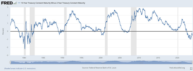
Two things to note are 1) That the spread sometimes goes negative, and 2) the gray vertical areas in the chart highlight economic recessions.
Few things create a chorus of impending gloom and doom as thoroughly as an inverted yield curve. And an inverted yield curve should not be ignored or lightly dismissed. That said, there is good news and bad news.
First, the Bad News: An inverted yield curve serves as a warning sign that something is not right. Secondly, a close look at the chart above reveals that each inversion has ultimately been followed by an economic recession of some degree at some point in the future (though the lead time from initial inversion to actual recession has been as much as two years).
The Good News: The stock market is influenced by many factors.
This piece will focus solely on stock market performance following yield curve inversions and un-inversions.
S&P 500 performance following initial inversion
Note that the 10-2 yield curve fell negative in July 2022 and has remained inverted ever since. Typically, when the yield curve narrows, approaches zero, and falls negative, a monumental number of negative pieces and comments get written - almost in Pavlovian "the sky is falling" fashion. Is all the gloom and doom warranted? Consider the data below and decide for yourself.
The table below displays the date of each week when the 10-2 yield curve closed negative after being positive the week before and the performance of the S&P 500 Index over the next 12 months (including overlapping signals).
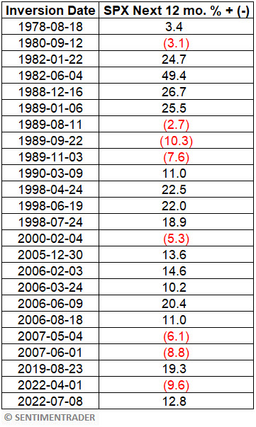
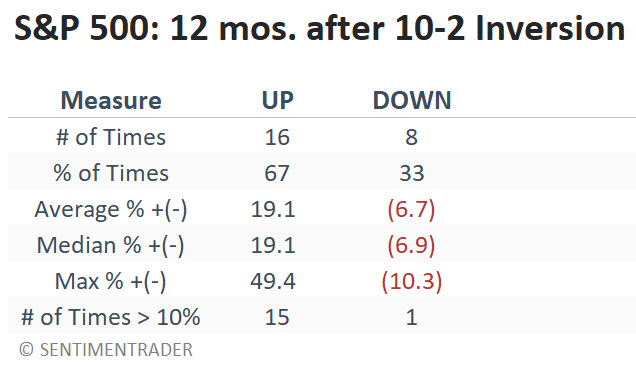
The results in the table above are neither uniformly bullish nor uniformly bearish - although overall, they skew to the positive side. The "The Sky is Falling" narrative is not borne out. The table below summarizes the results from the table above.
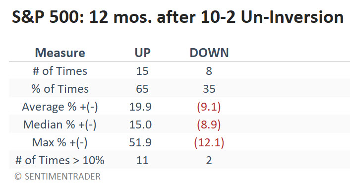
S&P 500 performance following initial "un-inversion"
OK, maybe the pundits get a little carried away when the yield curve first inverts. But "just you wait - when the curve un-inverts (i.e., once again turns positive), then the trouble will start." To make this case, yield curve bears will point to 2000 and 2007 un-inversions that were indeed followed by significant and extended bear markets. However, this amounts to some degree of recency bias and possibly a bit of cherry-picking.
The table below displays the date of each week when the 10-2 yield curve closed positive after being negative the week before and the performance of the S&P 500 Index over the next 12 months (including overlapping signals).
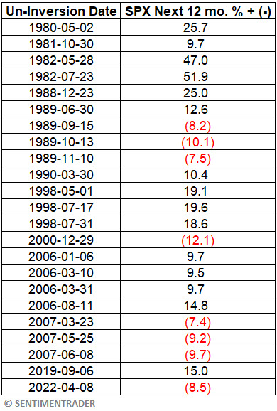
Once again, the results in the table above are neither uniformly bullish nor uniformly bearish - although they do skew to the positive side.
1989, 2000, 2007, and 2022 un-inversions correctly presaged lower stock prices. So, are the bearish pundits correct? Only if we ignore the other signals that saw stock prices rise in the 12 months following a return to positive territory for the 10-2 yield curve. The table below summarizes the results from the table above.
What the research tells us…
So, have we "debunked" the notion that an inverted yield curve provides a warning sign? Not really, because sometimes it does. So, let's be clear about the Implications. The message here IS NOT that investors should ignore the state of the yield either now or at any time in the future. The real point is understanding that the yield curve is only one factor that may affect the stock market. The yield curve can convey potentially important information as part of a "weight of the evidence" approach. However, it appears to leave much to be desired as a standalone trading model. Too many investors who put much weight on the yield curve as a stock market indicator missed out on the rally in the last 14 months.
Jay's Trading Maxim #115: One key to long-term investment success is to avoid self-inflicted wounds (i.e., if you shoot yourself in the foot, it's hard to take the next step).