
A worry that isn't really

Key points:
- The S&P 500 has held below its widely watched 200-day moving average for more than 30 sessions
- This is the longest stretch below average in years, suggesting a dangerous market
- However, most cycles from new highs to 30 days below average soon recovered
Below average, and holding
A common refrain among technicians is that the longer an index (or stock, or market) holds below the widely watched 200-day moving average, the more dangerous the conditions. A long drag below that average tends to dispirit investors; they get twitchy trigger fingers, which can lead to panic and crashes.
That's supposed to be a concern now since the S&P 500 has held below its average for more than 30 sessions.
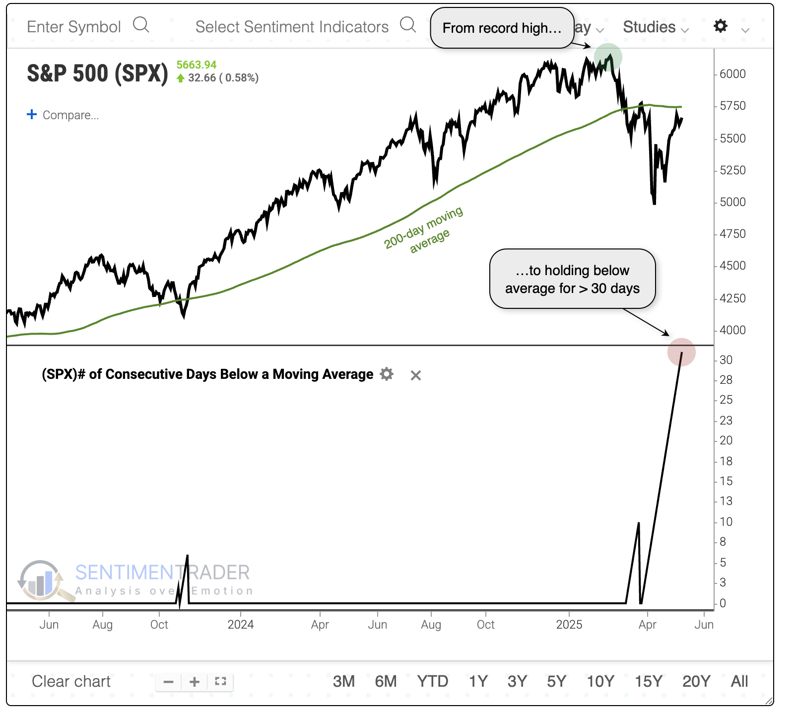
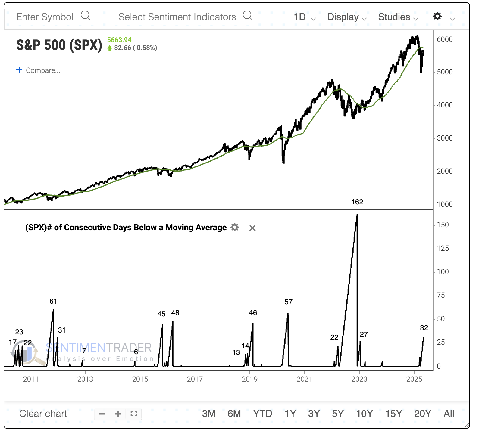
Since the global financial crisis, it has held below its average for longer stretches, but not by much, except for the 2022 bear market. With Monday's reaction to tariff news, the streak may end soon, anyway.
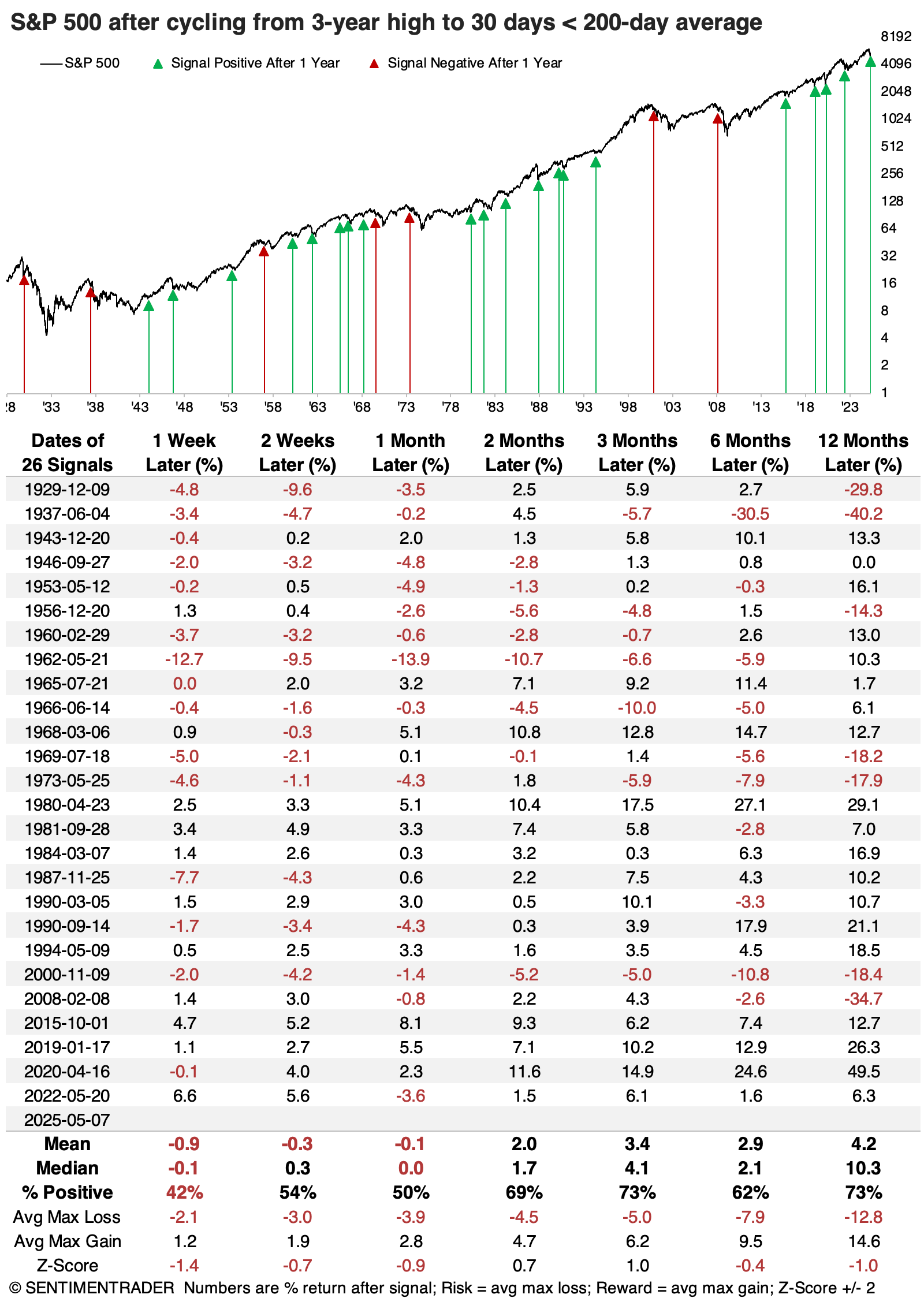
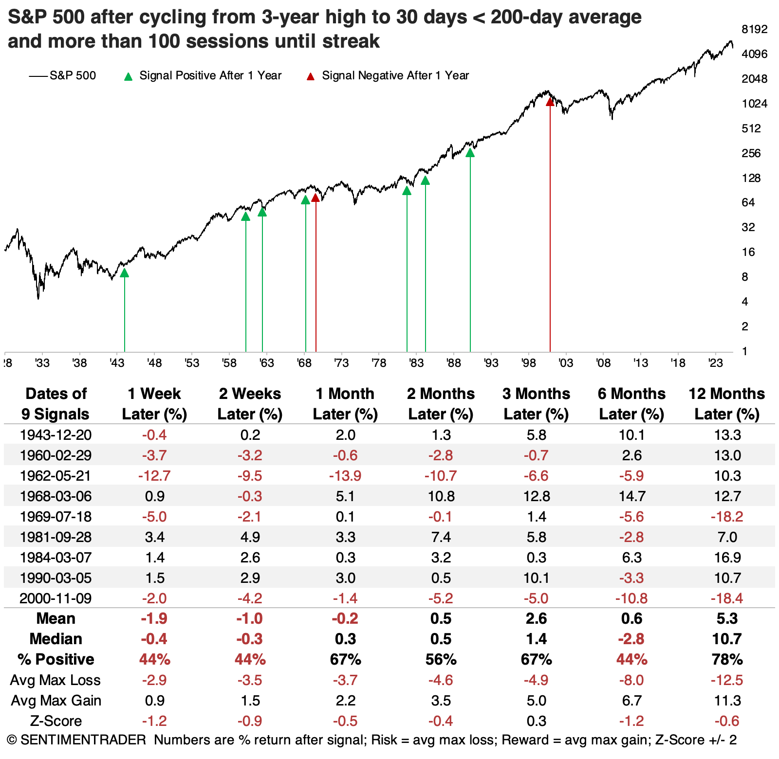
The table below shows the S&P 500's returns following each time it cycled from at least a 3-year high to holding at least 30 sessions below its 200-day moving average.
You'll notice some red arrows on the chart just before some awful bear markets, most notably 2000 and 2008. A handful of times, the S&P experienced tough times after these signals, with double-digit losses over the following year. But most of the time, of course, that did not happen. Even though its average return and risk/reward weren't impressive over any time frame, they were mostly positive from two months and beyond.
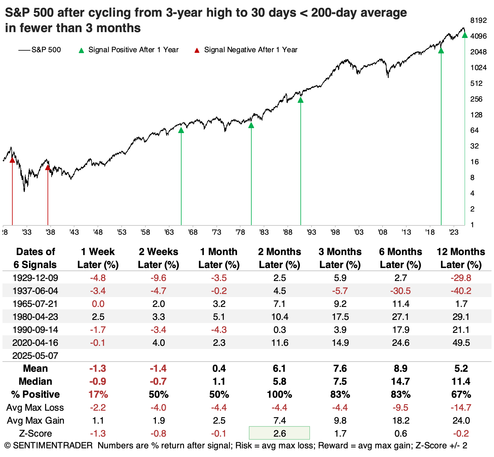
The table below focuses on the quickest cycles, when the index took fewer than three months for its cycle. These reflect somewhat protracted downtrends soon after peaking. While the sample size is limited, each rallied over the following two months. The last three instances preceded double-digit gains over the following year.
When the sample size is small, we like to look at counter-examples, so the next table shows the opposite condition - when it took the longest to cycle from a high to a protracted downtrend. These are more stretched-out peaks, and returns were worse than after the quicker cycles. Four of the last five signals showed losses six months later.
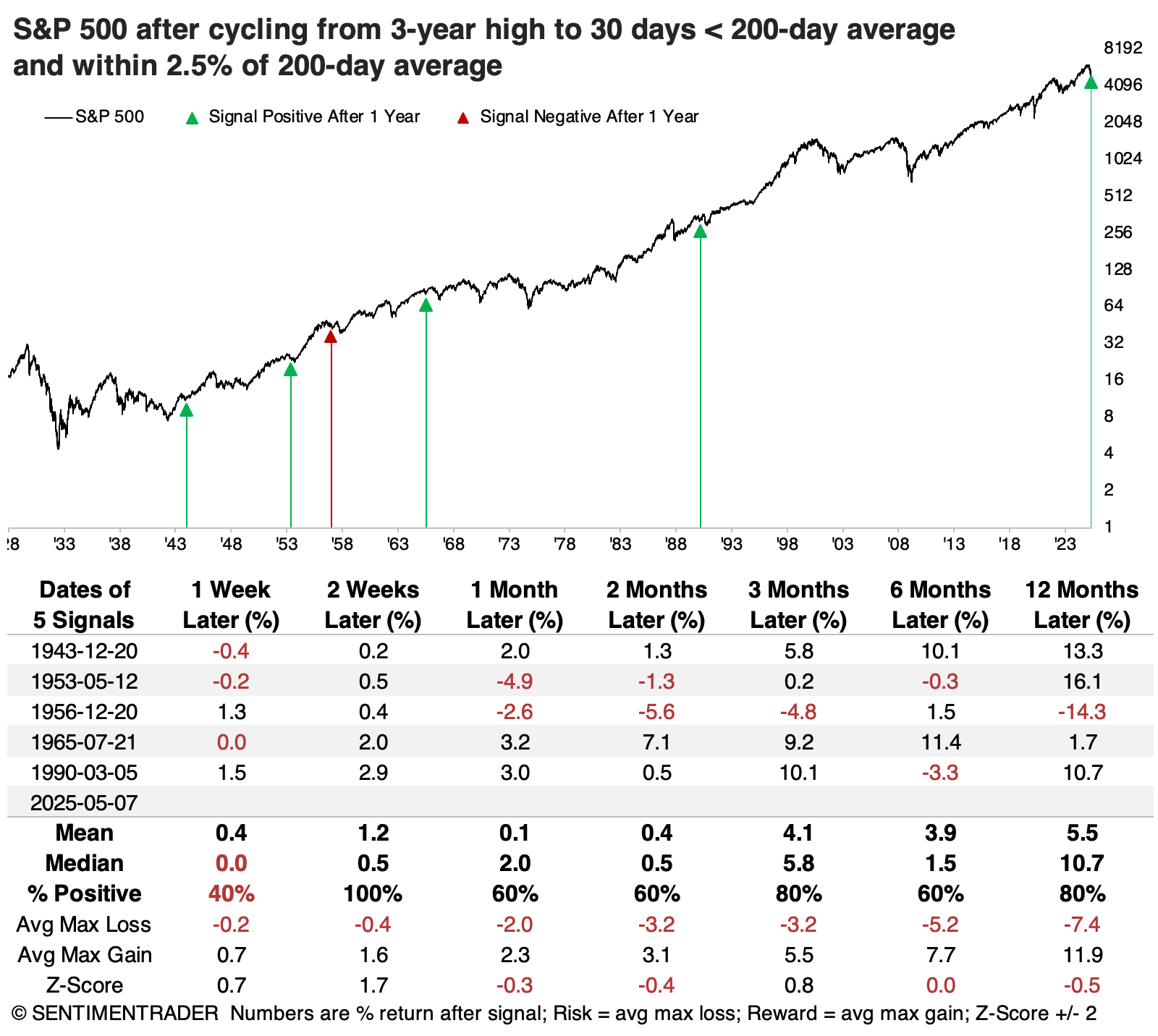
Not far from average
It's also rare to see the S&P 500 hold more than 30 days below its 200-day average, while still being relatively close to it. In other words, its decline below average hasn't been that severe at the 30-day mark.
The table below shows the few other times that's happened, and returns were mostly decent following them.
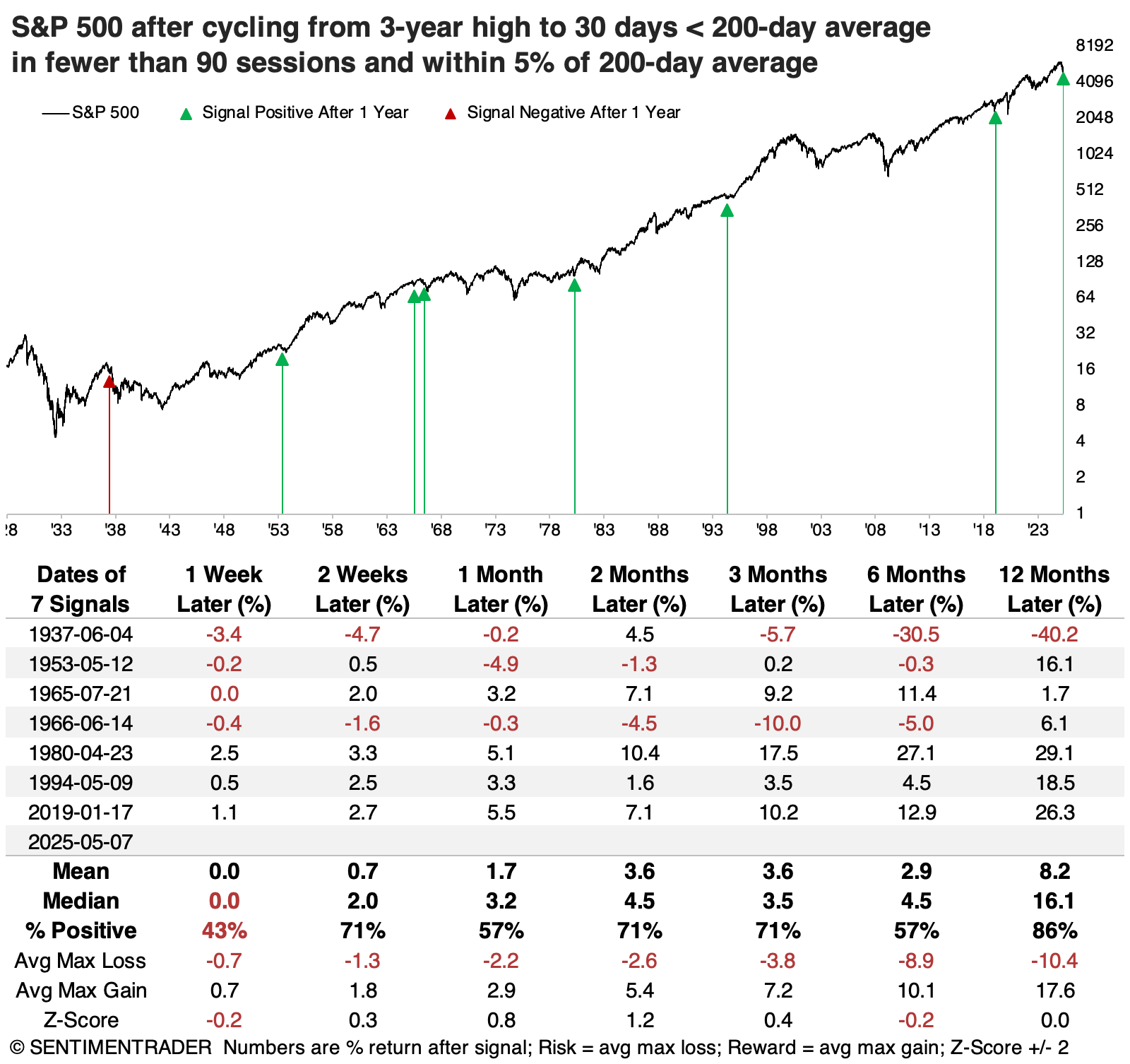
To get as much context as possible, the last table shows times when the S&P took fewer than 90 days to cycle from a high to holding more than 30 days below its 200-day average, and was within 5% of its average at the 30-day mark. Again, returns were mostly good in the months ahead, with only two losing more than -10% within the year, and five gaining more than +10%.
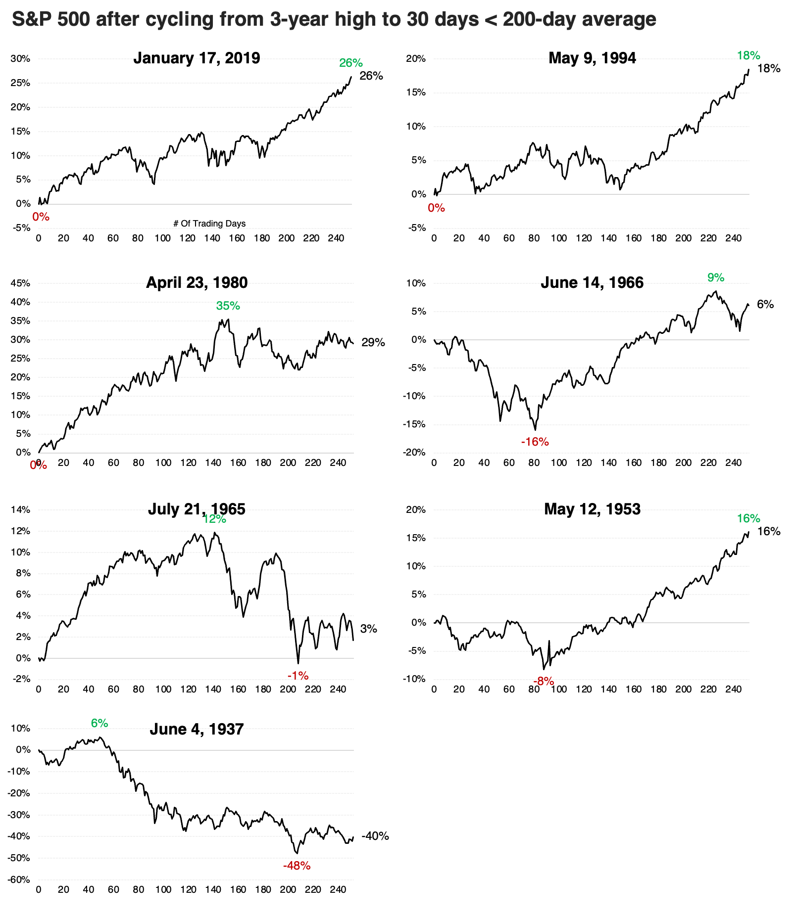
The thumbnail charts below show the S&P's path following these signals. There was an outright failure in 1937, and two hefty drawdowns over the next four months in 1953 and 1966. The others were mostly up-and-to-the-right.
What the research tells us...
Most of technical analysis is bunk. And most market cliches may have a shred of truth buried in them, but again, mostly bunk. The idea that we're more likely to crash, or suffer a protracted bear market, simply because the most followed index in the world hasn't yet made it above its most widely-watched technical indicator, also is mostly bunk.
Yes, several bear markets followed conditions like this, but mostly not. The S&P 500 performed just fine following similar conditions. A decent heuristic we've seen lately is that if stocks lose a further 3%-5% following these patterns, something rotten is more likely to occur. The worst conditions tend to see near-immediate failures after such conditions, so that will be something to watch in the weeks ahead.