
A walk-through my daily routine on Sentimentrader.com

Key Points
- The Sentimentrader website offers a plethora of tools for analyzing market trends and highlighting trading and investment opportunities
- There is, however, no "one best way" to use the site, as different individuals have different preferences, styles, and objectives
- Nevertheless, the steps highlighted below offer a great starting point for basic market analysis
- This information is intended to provide an overview of key market information (trend, sentiment, areas of strength)
- On the website, there are many more tools for analyzing stock indexes, individual stocks, bonds, commodities, crypto, and ETFs
- For the sake of brevity, the steps below will primarily focus on the stock market
Market Status
The first question is, "What is the market trend?" While we all would like to be able to "predict" the future, answering the question, "What is the trend right now?" can be extremely useful in keeping you on the right side of the market most of the time. So, let's highlight some tools for answering this question.
Typing "Aggregate Signal Model" in the Explore box and selecting the indicator will bring up the chart below.
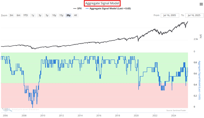
The Aggregate Signal Model is a high-level look at the state of the stock market. In its most basic form, a reading above 0.45 suggests that the long-term trend for stocks is favorable, and a reading below 0.45 is considered unfavorable. There are other possibilities. For example, using a cross above 0.55 as a bullish trigger and a cross below 0.21 as a bearish trigger turns this indicator into a very long-term model.
Next, let's consider the intermediate-term market trend. Typing "Risk On/Risk Off Indicator" in the Explore box and selecting the indicator will bring up the chart below.
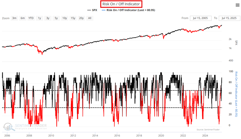
The Risk On/Risk Off indicator is a more sensitive measure of the state of the stock market. In its most basic form, a cross above 67 suggests the market's intermediate-term trend is favorable. A cross below 0.35 suggests the market's intermediate-term trend is unfavorable.
Investors will typically want to be most aggressive when the Aggregate Signal Model and Risk On/Risk Off Indicator are favorable. When the Aggregate Signal Model is favorable but the Risk On/Risk Off Indicator is unfavorable, the market may be considered to be in a "correction." And when BOTH are unfavorable, investors are advised to "play some defense."
Now let's look at the short-term trend.
Selecting "Spotlights | Market Environment Composite" from the main menu will bring up the chart below.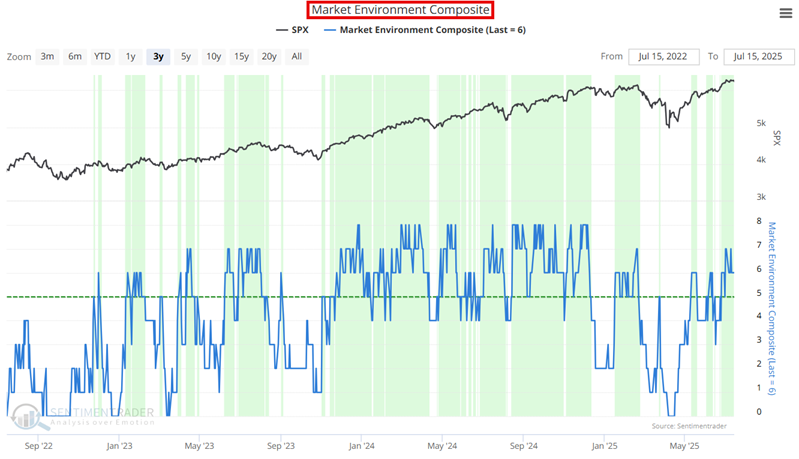
The Market Environment Composite indicator is a highly sensitive measure of the very short-term trend in the overall stock market (and will change directions frequently). Readings above 5 suggest a favorable short-term trend, readings below 5 suggest an unfavorable short-term trend, and a reading of 5 is neutral. A short-term trader will want to press the long side of the market when the model is above 5, and the short side when it is below 5. Longer-term investors will generally be best served by ignoring the Market Environment Composite and sticking to the other longer-term models above.
By this point, you will have a pretty clear idea of the market's state. However, another step to help you"look ahead" can be executed by selecting "Spotlights | Tactical Composite Trend Model" from the main menu. Dean Christians developed this suite of models, which aims to give traders and investors key signals around identifiable market turning points.
Users are encouraged to familiarize themselves with the various models included. However, for now, the Composite Risk Warning Model is highlighted in the red box in the chart below.
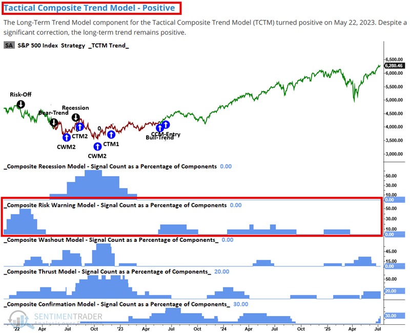
In as few words as possible, a Composite Risk Warning Model reading of 0 strongly suggests that downside risk is limited (though, of course, not guaranteed). A zero reading will generally occur either a) near the end of a bear market (see the May 2022 into May 2023 period in the chart above, where the S&P 500 was forming a bottom), or b) during an established uptrend. A zero reading within a market uptrend represents a time when traders should aggressively play the long side of the market. Conversely, the higher the Composite Risk Warning Model reading, the greater the risk of a correction/bear market.
Assessing the state of Sentiment
Identifying, riding, and avoiding fighting the major long-term, intermediate, and short-term market trends is paramount to trading and investment success. At the same time, we (obviously) place high importance on sentiment. Generally, sentiment tends to be "right in the middle, but wrong at the extremes." We have developed and offer a wide array of sentiment indicators. We will highlight a small sampling of these here.
To get a "sense" of overall market sentiment, select "Tools | Optix Heatmap" from the main menu. A table similar to the one shown below will appear.
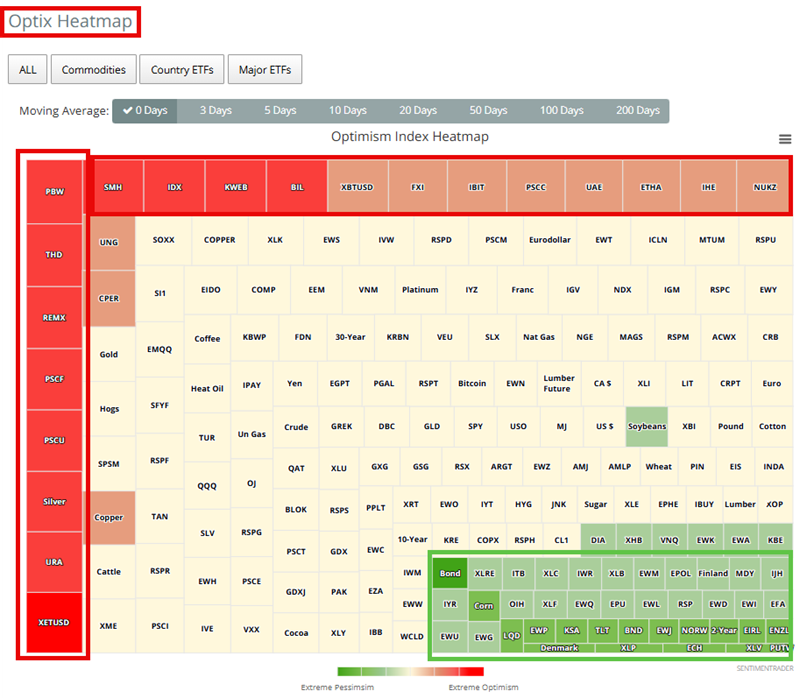
Tickers highlighted in red are those with high Optix readings (i.e., a great deal of optimism regarding that security). Tickers highlighted in green are those with low Optix readings (i.e., a great deal of pessimism). Generally speaking, high and low Optix readings are considered contrary signals. That said, a red or green value in and of itself does not necessarily constitute an actionable buy or sell signal. It merely alerts us to the development of an extreme reading.
The first question in viewing the table is, "Does Red or Green dominate the landscape?" Very often, the answer is "No," as roughly an equal number of red and green highlights appear. However, one of the two colors may sometimes overwhelm the other. This usually highlights an impending market bottom (green) or a time when a significant advance is about to slow significantly or reverse (red). Traders of individual stocks and/or ETFs may consider examining the potential for a contrary play in one or more highlighted tickers.
Now let's consider some more objective sources of sentiment information. Let's look first at our Sentiment Cycle Composite indicator. Typing "Sentiment Cycle Composite" in the Explore box and selecting the indicator will bring up the chart below.
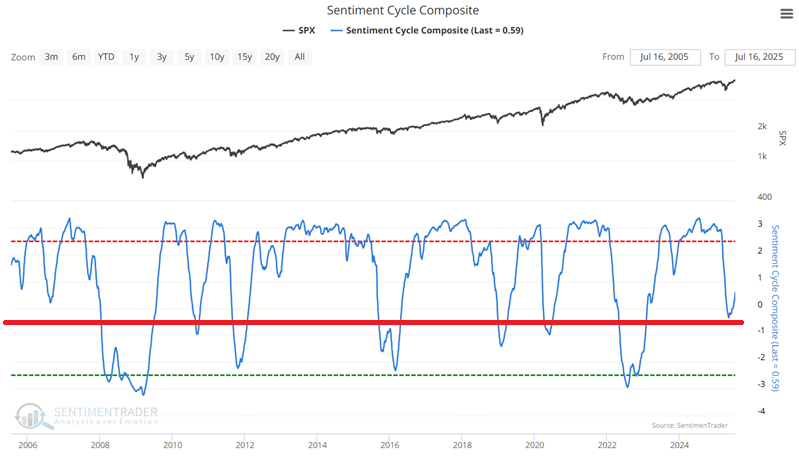
The most straightforward use for this note is to note whether the last cross of the -0.60 level was up or down. The indicator can be considered bullish until it crosses below -0.60. Once it crosses below -0.60, it can be regarded as bearish until it crosses back above -0.60.
Typing "Panic/Euphoria Model" in the Explore box and selecting the indicator will bring up the chart below.
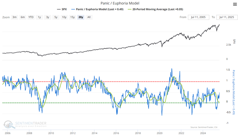
The chart above also adds a 20-week moving average. There are many ways to use this indicator. For this note, a cross above zero by the 20-week average typically generates a reliable buy signal for stocks and stock indexes. The further the raw indicator drops below zero, the greater the likelihood of an imminent upside reversal in stock prices. High readings should NOT be viewed as "sell" signals (as market tops often take time to form). However, note that a high reading from this indicator invariably precedes major long-term bear markets. Without a high Panic/Euphoria Model reading, a market decline should be viewed as a buying opportunity (note the lack of any readings before the April 2025 selloff).
Looking for trading opportunities using Seasonality
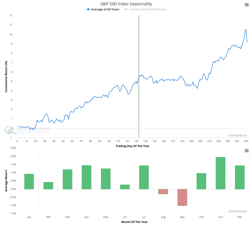
If you read my notes, you know that I sometimes rely on seasonality to find trading ideas. In as few words as possible, when price and seasonality agree (i.e., when price is in an established uptrend and seasonality is favorable, or vice versa), that can be an excellent time to trade in the direction of that trend. Some of the charts I consider often are shown below.
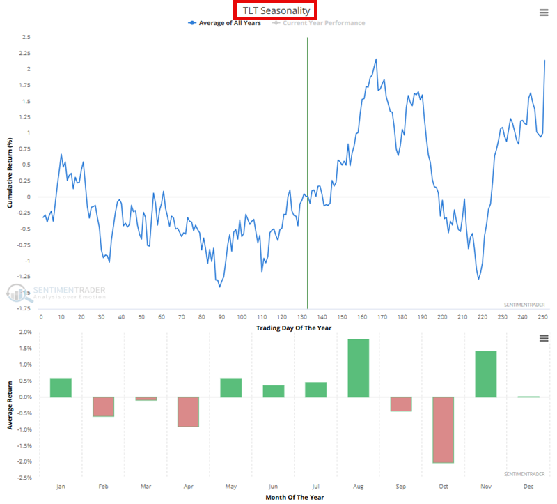
Gold:
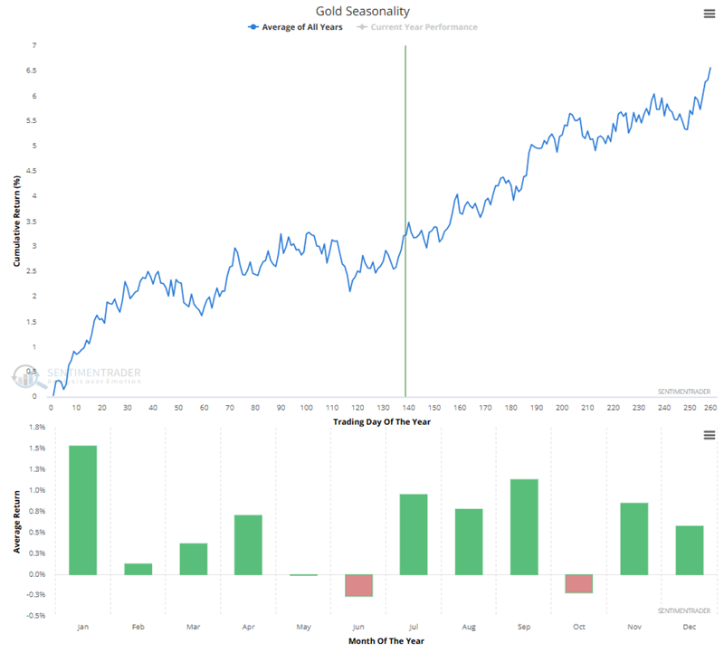
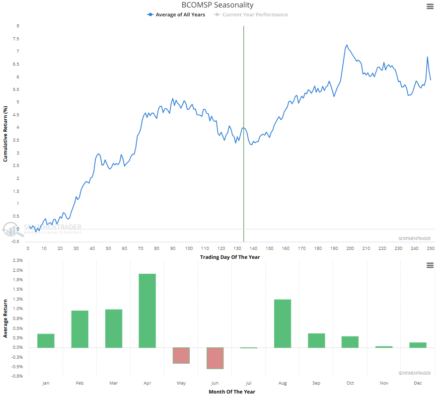
The goal in looking at these charts is to identify periods when a given index, security, or market has shown a strong tendency to advance (or decline) consistently. Once you find a favorable or unfavorable seasonal period, then consider your own trend analysis. If seasonality and price action agree, consider trading in the direction of that trend.
Quickly identifying strong (and/or weak) Sectors and Stocks
Fortunes have been made by investors who focus on "the strongest stocks in the strongest sectors." Our website contains many tools to help you identify these opportunities. Selecting "Indicators | S&P 500 Sector Trend Scores Summary" from the main menu brings up the table below. In the screenshot below, I have clicked on the heading "Trend & Rel Score >=8" to sort from highest to lowest. In this example, we find Technology, Discretionary, and Communication Services as the three "strongest" sectors.
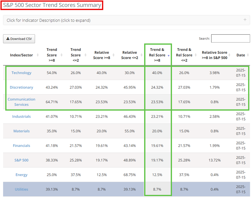
By clicking once on any sector name in the table above, the table below will appear, which lists all the constituent stocks for that sector index. In the table below, I click on the heading "Trend Score" to rank the stocks in that sector from highest to lowest Trend Score.
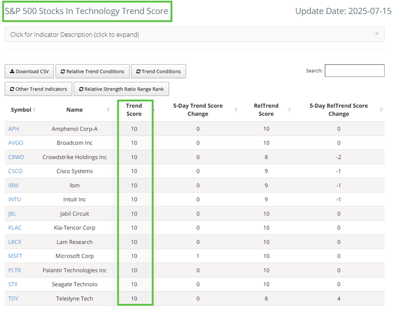
What does this accomplish? With just a few mouse clicks, we have identified the "strongest stocks in the strongest sectors." Are these stocks guaranteed to continue to perform well? Unfortunately, no. However, numerous studies and books have highlighted the potential benefits of focusing on stocks that are performing well in a sector that is performing well (William O'Neil popularized this approach in his book "How to Make Money in Stocks").
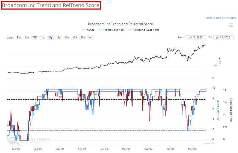
The chart below shows the price action for Broadcom (AVGO), the second stock listed in the table above. The price action appears as a black line in the top clip, and Trend Score (blue line) and Relative Trend Score (red line) appear in the bottom clip.
A note on our Strategies page
Our "Strategies" section offers guidance to those inclined to trade index ETFs rather than individual stocks. Selecting "Tools | Strategies" from the main menu brings up the screen below.
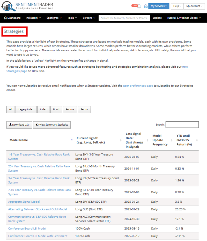
Each model has its own relative pros and cons, and investors are encouraged to examine them more closely. Sometimes, a trader may decide to trade the model as is; in other cases, a pre-programmed strategy can be a starting point for your system development. For now, let's highlight two strategies (no inference is made that these two are better or worse than the others; they simply appeal to me personally).
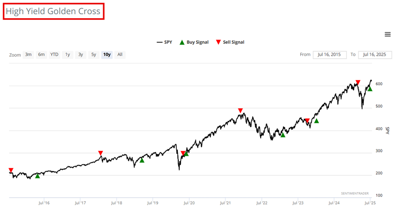
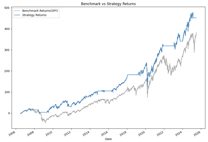
This model turns bullish for stocks when the High-Yield AD 50/200 day line turns positive (i.e., the 50-day MA crosses above the 200-day MA) and vice versa. The chart below highlights recent buy and sell signals versus the ticker SPY.
The chart below shows the hypothetical equity curve from trading the system (blue line) versus a buy-and-hold approach (grey line). The attraction here for me is that the strategy sidestepped a lot of bear market decline periods (2008-09, 2015-16, 2018, 2022) while still outperforming buy-and-hold overall. This has an appeal to a risk-averse investor.
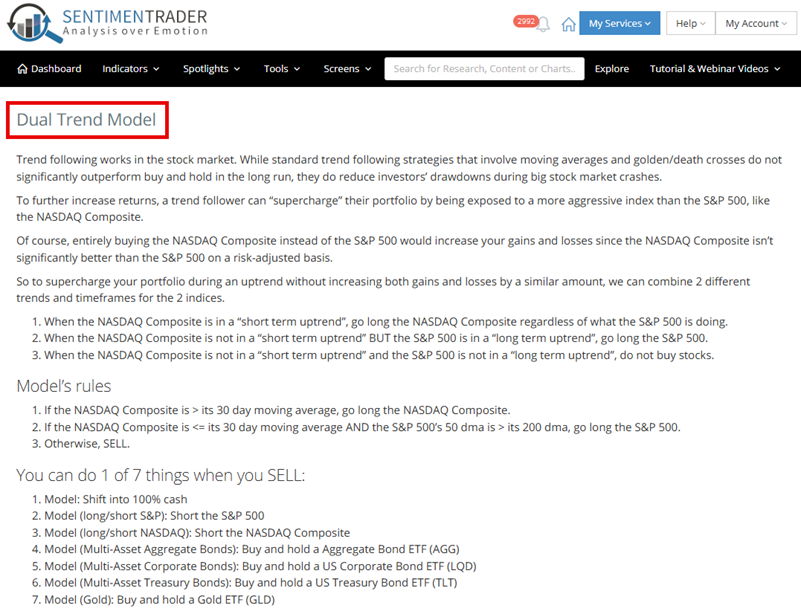
This model has rules that can be reviewed in the screenshot below or on the website. It can hold the Nasdaq Composite (though most traders would likely substitute the Nasdaq 100 Index by trading something like ticker QQQ), the S&P 500 (using an index fund or ETF such as ticker SPY), or can be out of stocks completely, in cash, or some other security such as bonds or gold.
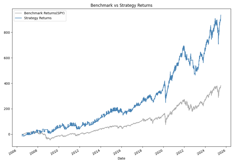
The chart below shows the hypothetical equity curve from trading the system (blue line) versus a buy-and-hold approach (grey line). The strategy's significant outperformance relative to buy-and-hold attracts me. However, I'd like to point out that the model results can be very volatile and that significant drawdowns may occur occasionally.
What the Research tells us...
The guide above should in no way, shape, or form be considered to be a "comprehensive" guide to all of the tools on our website. Many more tools, indicators, models, and strategies can be accessed and utilized. The purpose here is to provide an overview of some of the things that I look at regularly and that help form my own opinion regarding market direction and where to allocate capital.