
A quiet potential clue from high-yield bonds

Key points
- Not every indicator acts as a trading system - most merely add weight to the bullish or bearish case; this is especially true for indicators that give signals only infrequently
- Many markets have settled into a trading range from which they will eventually break out
- Because the high-yield bond market is tied closely to economic activity, it can act as a valuable barometer for many of these currently range-bound markets
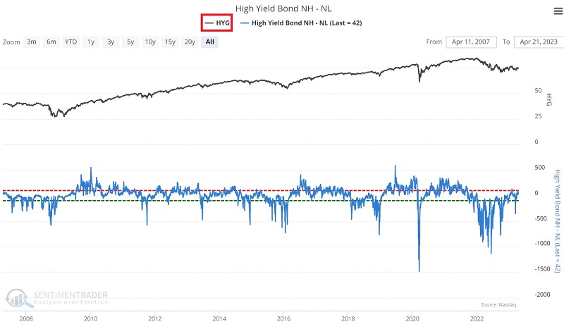
High-Yield Bond NH-NL 200-day average
This indicator shows the net number of high-yield bonds that set a 52-week high minus those that set a 52-week low on the day, per FINRA TRACE. It can be used as an overbought/oversold indicator, especially when plotted with a 10- or 20-day moving average. The chart below displays the iShares iBoxx $ High Yield Corporate Bond ETF (ticker HYG) and the High-Yield Bond NH-NL indicator.
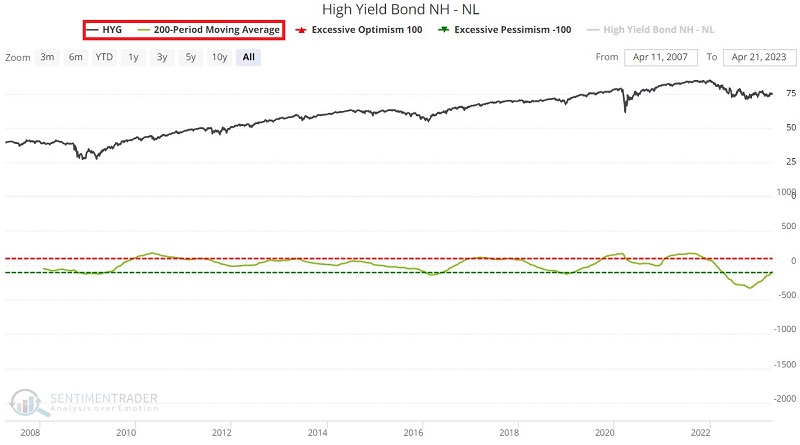
This indicator has also shown value as a longer-term trend reversal confirmation type of indicator. The chart below displays HYG and a 200-day moving average of New Highs - New Lows.
A cross above -100 by the 200-day moving average can confirm a reversal
The chart below displays with a "red dot" those dates when the 200-day moving average of the High-Yield Bond NH-NL indicator crossed above -100, and the table summarizes subsequent HYG performance.
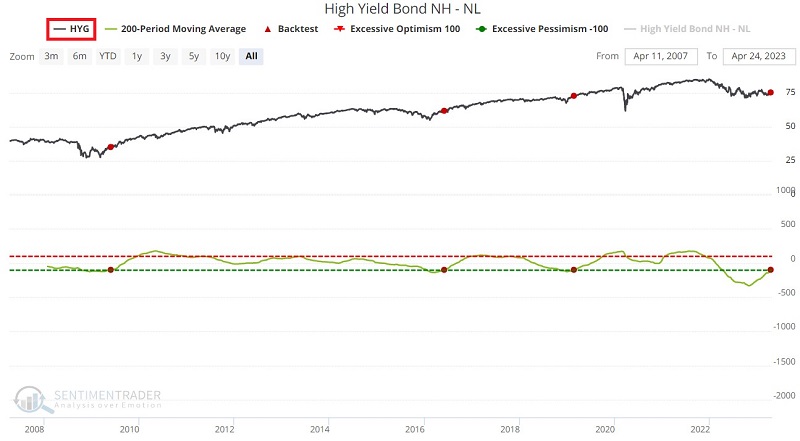
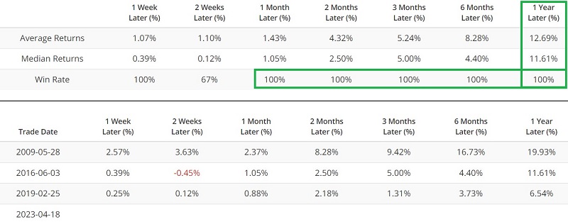
The good news is that historical performance has been decidedly bullish following previous signals. The obvious potential problems here are a) an exceedingly small sample size and b) all the signals that occurred during a significantly bullish period (Post 2008 GFC). The most recent signal occurred on 2023-04-18. So, does this mean that "happy days are here again" for high-yield bonds? Not necessarily. But it does tell us that things should improve. It will also tell us something important if things do not improve in the not-too-distant future.
The other interesting thing to note is that many other markets also appear to dance to the tune of the high-yield bond market.
Stock market performance (SPY)
The chart below displays with a "red dot" those dates when the 200-day moving average of the High-Yield Bond NH-NL indicator crossed above -100, and the table summarizes subsequent SPDR S&P 500 ETF Trust (SPY) performance.
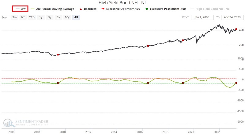
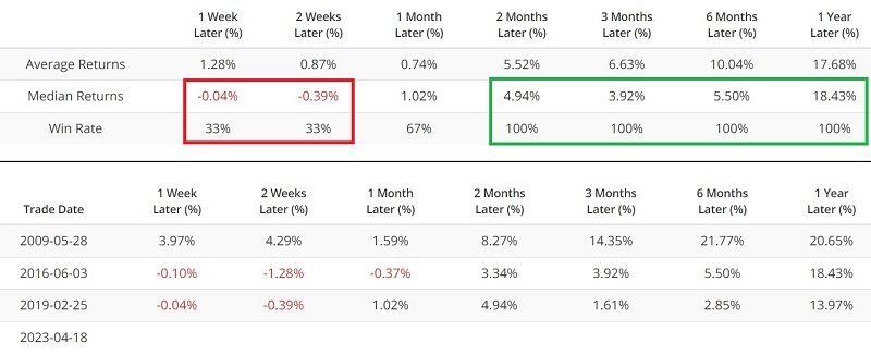
Performance during the first two weeks after a signal has been weak, but two months and out has been favorable. Over the past five years, tickers HYG and SPY have fluctuated with a roughly 76% correlation.
Bond market performance (BND)
The chart below displays those dates with a "red dot" when the 200-day moving average of the High-Yield Bond NH-NL indicator crossed above -100. The table summarizes subsequent Vanguard Total Bond Market Index Fund ETF (BND) performance.
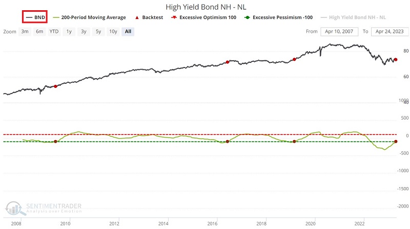
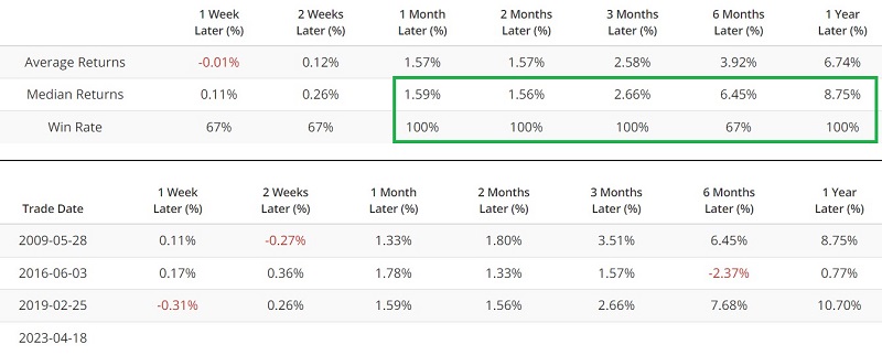
Like high-yield bonds and stocks, the broader bond market has also shown favorable results following the admittedly limited number of previous signals. Over the past five years, tickers HYG and SPY have fluctuated with a roughly 28% correlation.
Gold market performance (GLD)
The chart below displays with a "red dot" those dates when the 200-day moving average of the High-Yield Bond NH-NL indicator crossed above -100, and the table summarizes subsequent SPDR Gold Trust (GLD) performance.
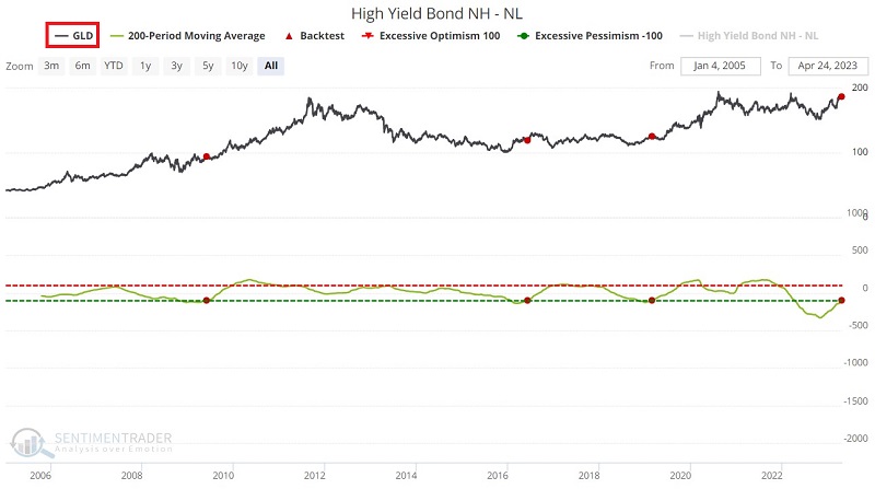
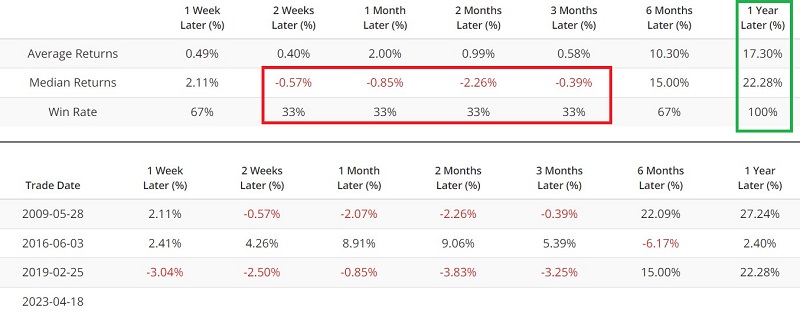
Gold has had an interesting response following previous High-Yield Bond NH-NL signals. Results during the first three months after a signal were weak, but six and twelve months were quite positive. Over the past five years, tickers HYG and GLD have fluctuated with only a roughly 15% correlation.
US Dollar performance
The chart below displays with a "red dot" those dates when the 200-day moving average of the High-Yield Bond NH-NL indicator crossed above -100, and the table summarizes subsequent US Dollar performance.
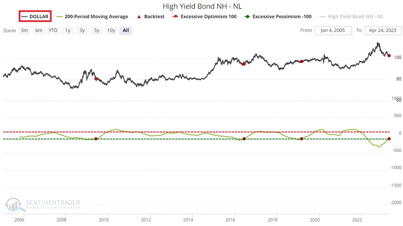
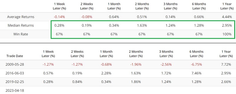
The Invesco DB US Dollar Index Bullish Fund (ticker UUP) tracks the US Dollar. Over the past five years, tickers HYG and UUP have had a solid inverse relationship (-35% correlation). Likewise, gold and the dollar (GLD and UUP) have had a -41% correlation over the last five years. Thus, the primarily favorable results for the US Dollar following the signals above are somewhat surprising - and perhaps a testament to the influence the high-yield bond market wields across the financial markets.
What the research tells us…
Repeating: The small sample size of previous signals means we should be cautious about drawing concrete conclusions. That said, few markets are tied as closely to the economy as high-yield bonds (a sharp downturn in the economy invariably leads to a higher default rate among high-yield bonds). Thus, they are often a helpful bellwether.
Many other economic indicators (yield curves, housing starts, leading economic indicators, etc.) point in the other direction. So it may also be a mistake to read too much into the recent "under the surface" improvement in the high-yield bond market. For now, however, the high-yield bond market acts as a favorable contrary indicator. If correct, the markets highlighted above should collectively show some strength soon. It may serve as a clear warning of more trouble ahead if they do not.