
A plunge in the VIX Index (and what it typically means for stocks)

Key points
- A sharp "spike" in the VIX Index is a sign of elevated fear in the stock market
- Additionally, a short, sharp plunge from a peak in the index has often preceded higher stock prices
- The recent plunge in the VIX Index was the largest on record
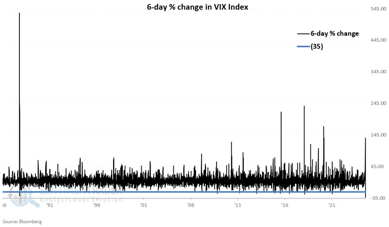
The VIX plunged rapidly from a peak
The VIX measures the implied volatility (i.e., estimated future volatility) of near-term at-the-money SPX (S&P 500) index options. If the SPX moves significantly, new strike prices are used to calculate the VIX. Since options prices are skewed and implied volatility changes with the strikes, the VIX will typically rise when the market drops and fall when the market rises. This is not always the case, but the correlation is clear.
The standard interpretation of VIX movements is that the VIX will rise when fear or uncertainty occurs since there will be a greater demand for put options. Conversely, when the market is rising, traders typically become complacent, and the VIX will fall as the demand for put options decreases.
NOTE: The VIX Index first existed in 1990. Starting in 1990, we used actual calculated VIX Index values for testing purposes. Before 1990, we used synthetic values based on historical option data.
For this test, we will consider the VIX Index's six-day percentage rate of change. Specifically, we will look for rare occasions when the index declined by -35% or more over six trading days. In other words, we want to see a peak in VIX and a sharp decline over the next six trading days. Note that out of over 9,700 trading days, only 25 meet the -35% decline in six days criteria.
The chart below displays all six-day rate-of-change readings with the -35% level (horizontal blue line) noted below.
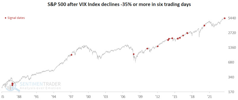
The chart below highlights all dates when the VIX declined -35% or more in six days.
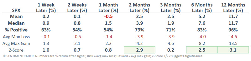
The table below summarizes the S&P 500 Index performance following the dates highlighted in the chart above.
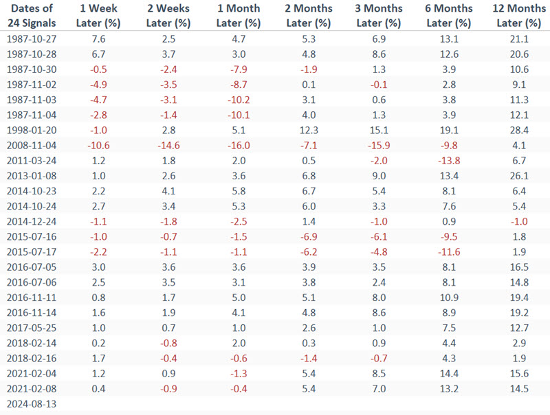
The table below displays the S&P 500 Index performance on a signal-by-signal basis.
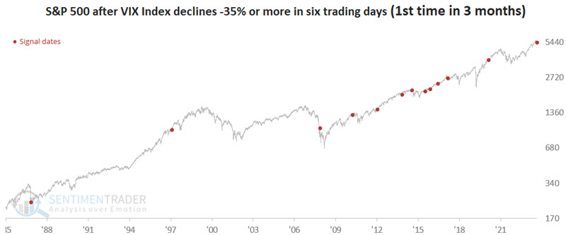
The results above include several overlapping signals. So, let's look only at signals that are the first in three months. The chart below highlights all dates when the VIX declined -35% or more in six days for the first time in three months.
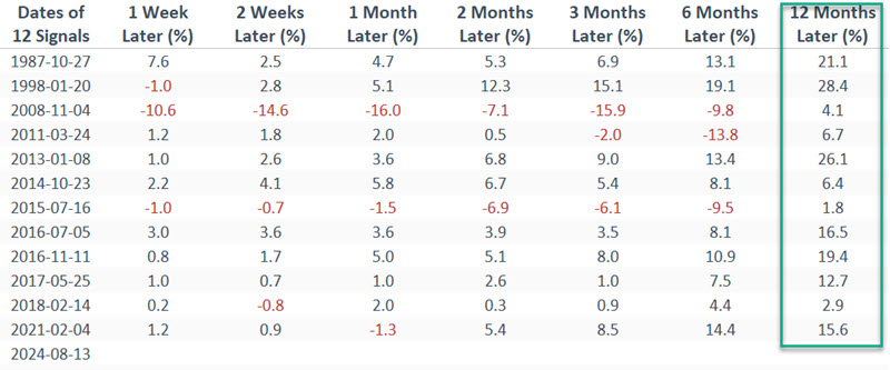
The tables below summarize the S&P 500 Index performance following the dates highlighted in the chart above and display the S&P 500 Index performance on a signal-by-signal basis.
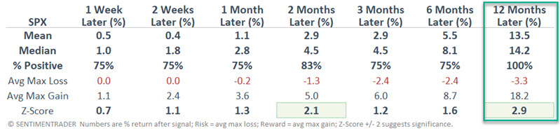
The implications of the results above are in the eye of the beholder, but note the high 12-month win rates (96% for all signals and 100% for those that are the first new signal in three months). The median 12-month SPX return for all signals is a decent +11.7% and a robust +14.2% for the first new signal in three months.
Applying a systematic approach
We are not recommending that this method be used as a trading system as described momentarily. However, it is helpful to understand the potential usefulness of the indicator if we apply specific trading rules. So, let's do the following:
- If the VIX Index declines -35% over six trading days, we will buy and hold the S&P 500 for 252 trading days (roughly one year)
- If a new signal occurs within that year, we will extend the holding period for another 252 trading days
- We will sell the S&P 500 Index 252 trading days after the last -35% trading signal
The chart below displays the hypothetical growth of $1 invested in the S&P 500 only, as described above, from 1986-01-02 through 2024-08-13.
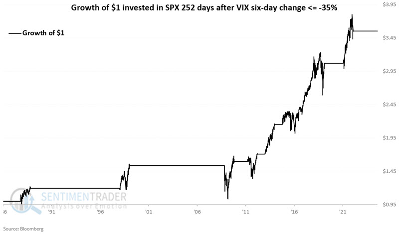
Note that this "strategy" (such as it is) was long the S&P 500 continuously from 2014-10-23 through 2019-02-20 due to the overlapping nature of the signals.
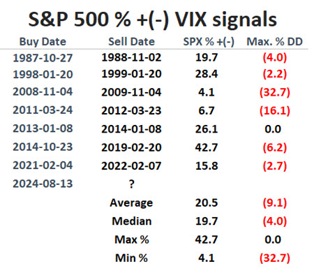
The table below shows the hypothetical "trades" generated.
- The first column shows the dates of the initial signal
- The second column shows the date 252 trading days after the most recent signal
- The third column shows the net % gain/loss for the S&P 500 between the dates highlighted
- The fourth column shows the largest percentage drawdown from the entry price an investor would have had to sit through.
Note that the 2008 signal was followed by the final plunge during the Great Financial Crisis (-32.7%), and the 2011 signal was followed by a decline of -16.1%. In both cases, the market worked its way back into positive territory. All other signals experienced more manageable drawdowns of 0.0% to -6.2%.
What the research tells us…
There are no sure things in the stock market. That said, spikes in the VIX Index typically mark extremes in investor fear, and extremes in investor fear tend to be followed by higher stock prices. The recent spike and reversal guarantee nothing but do lend favorable weight to the bullish side of the weight of the evidence ledger for stocks in the year ahead.