
A new tool for measuring sector trend strength

Key points
- Dean Christian recently added a bevy of his trend-following tools to the website
- One related indicator based on his work is the Sector Trend Score (Average) indicator
- This note offers a look at one way to use this indicator to identify significant buying opportunities for a given sector
The Sector Trend Score (Average) indicator
The Sector Trend Score (Average) indicator measures the conviction-weighted breadth of positive trends across a given sector (represented by stocks within an ETF that tracks that sector index). It functions by calculating a weighted sum: for each Trend Score from 10 down to 0, the percentage of stocks within the sector achieving that score is multiplied by the score value itself. These eleven products are divided by 110 to arrive at the final Sector Trend Score (Average). This indicator is designed to gauge bullish trends' overall strength and pervasiveness within that sector's universe. A higher Sector Trend Score (Average) suggests a stronger and more widespread positive trend across a significant portion of the sector's stocks. In comparison, a lower score indicates weaker or less prevalent bullish trends.
Calculation Formula:
Score = [Σ (Pi × i)] / 110
Where:
Pi = Percentage of stocks in the sector with a Trend Score of i.
i = The Trend Score level (from 0 to 10).
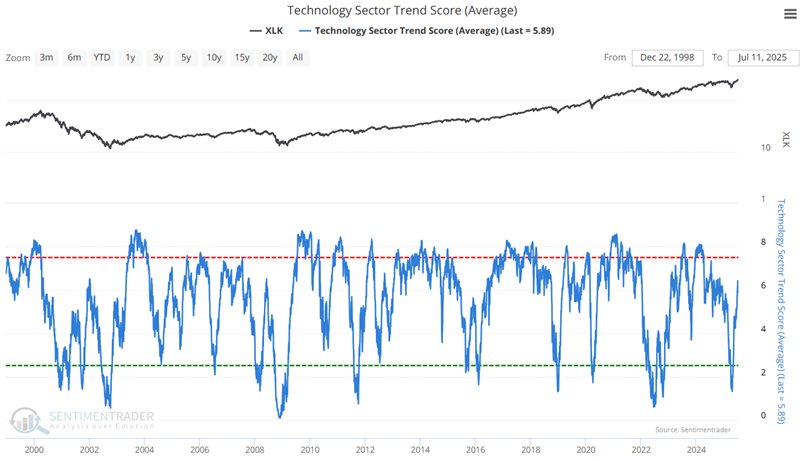
The chart below displays the Technology Sector Trend Score (Average) versus ticker XLK.
Using Sector Trend Score (Average) as an oversold indicator
One line of research I examined was to test sector performance after a deeply oversold reading. For this test, I look at sector performance following any days when the TSA for that sector was at 1.1 or lower (including overlapping signals). The results are compelling. Let's take them one at a time.
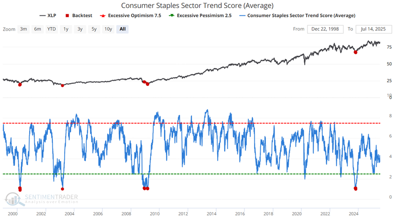
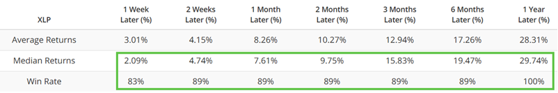
The chart and table below highlight the performance for ticker XLP when the Consumer Staples Sector Trend Score (Average) was below 1.1.
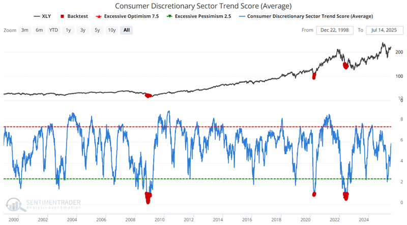
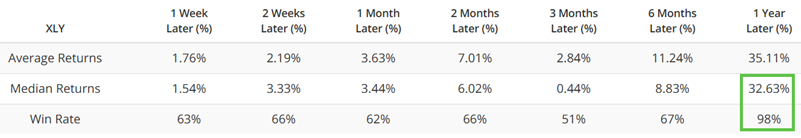
The chart and table below highlight the performance for ticker XLY when the Consumer Discretionary Sector Trend Score (Average) was below 1.1.
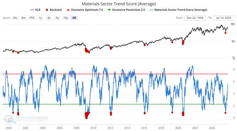
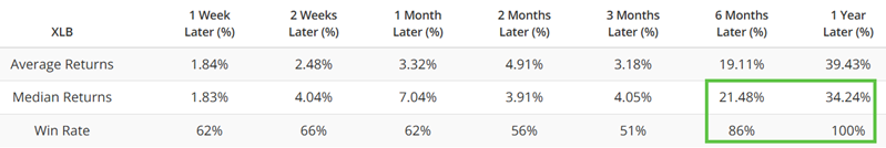
The chart and table below highlight the performance for ticker XLB when the Materials Sector Trend Score (Average) was below 1.1.
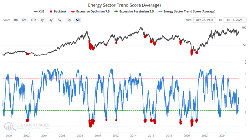
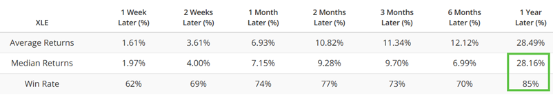
The chart and table below highlight the performance for ticker XLE when the Energy Sector Trend Score (Average) was below 1.1.
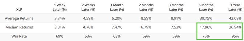
The chart and table below highlight the performance for ticker XLF when the Financial Sector Trend Score (Average) was below 1.1.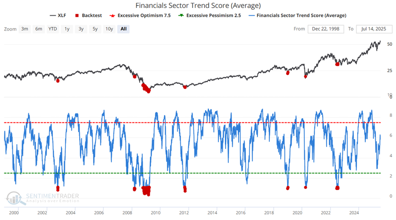
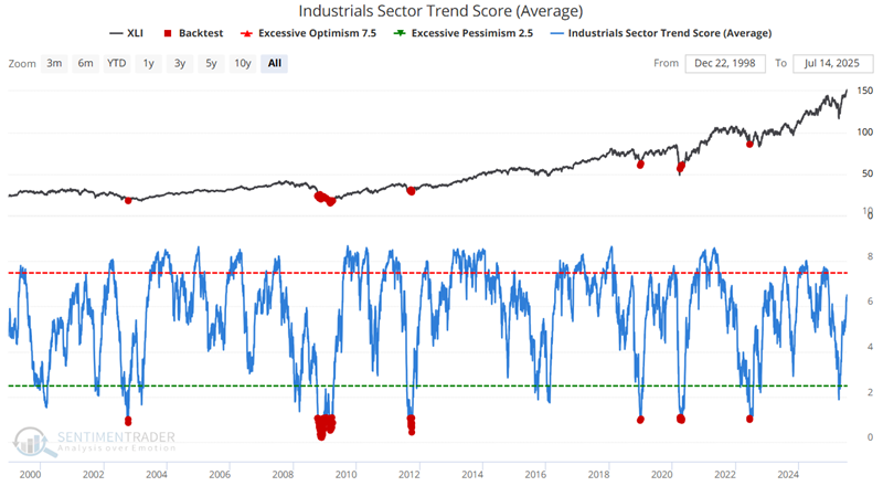
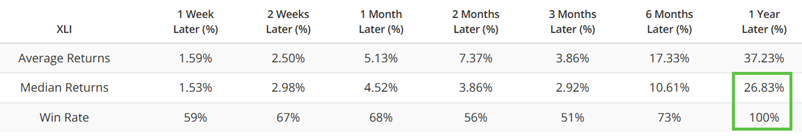
The chart and table below highlight the performance for ticker XLI when the Industrials Sector Trend Score (Average) was below 1.1.
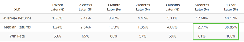
The chart and table below highlight the performance for ticker XLK when the Technology Sector Trend Score (Average) was below 1.1.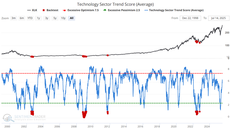
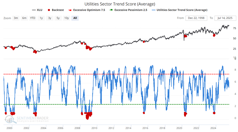
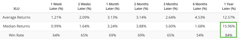
The chart and table below highlight the performance for ticker XLU when the Utilities Sector Trend Score (Average) was below 1.1.
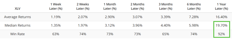
The chart and table below highlight the performance for ticker XLV when the Health Care Sector Trend Score (Average) was below 1.1.
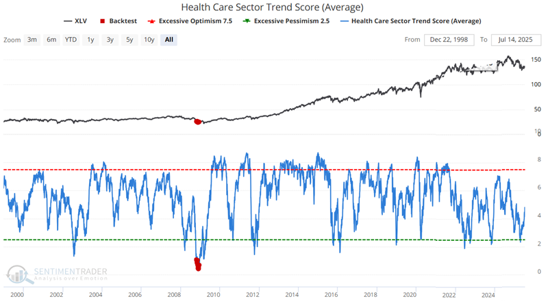
Health Care was somewhat unique in that there was only one period when the Trend Score (Average) dropped below 1.1. What happens if we loosen the requirement?
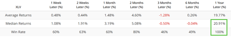
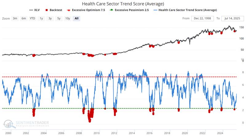
The chart and table below highlight the performance for ticker XLV when the Health Care Sector Trend Score (Average) was below 2.5.
What the research tells us…
The bad news regarding the abovementioned signals is that they do not occur often. As a result, an investor cannot simply sit in cash and wait for the next signal. Likewise, any given signal can appear "too soon," i.e., into the teeth of a significant bear market decline that has yet to run its course entirely. With those caveats in mind, however, it is helpful to know when the Trend Score (Average) for one of the highlighted sectors has fallen to an extremely low level. History suggests that investors with at least a one-year timeframe can look at a reading below 1.1 as a sign that a decent buying opportunity is at hand.