
A look at the key relative trends heading into 2023

Key points
- There are no permanent relationships in the financial markets
- No security, sector, index, or commodity ever has a permanent edge over another
- Alert investors often gain an advantage by monitoring key relationships
- Here, we look at the status of crucial market relationships to help highlight areas of strength and weakness
What relative strength charts can tell us
All charts below are weekly relative strength charts courtesy of Stockcharts. In other words, these charts do not show the actual price action of a single security. Instead, they compare the relative price performance of two different securities.
The black and red line displays the weekly relative performance trend, so a rising line means that the first security listed in the comparison outperforms and vice versa. Each chart also shows a 52-week simple moving average in blue.
If the relative strength line is above the blue moving average line and/or the moving average line is rising, it's more confirmation that the first security is outperforming.
Please note that I do not use these charts' actions to generate automatic buy or sell signals. I use them strictly as a starting point in finding securities exhibiting significant strength (or weakness). The primary goal is to find opportunities to trade with the trend in a more robust security.
- A relative strength line making a new high above a rising 52-week moving average suggests further investigation for a buying opportunity in the first security listed.
- A relative strength line making a new low below a falling 52-week moving average suggests further investigation for a buying opportunity in the second security listed.
Stocks vs. Bonds
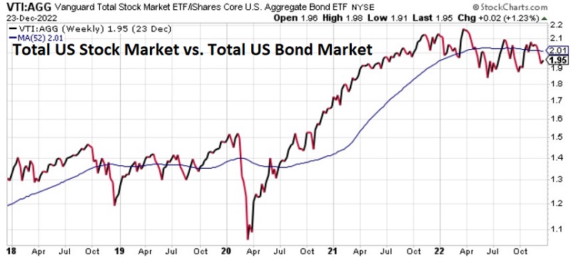
Comparing: VTI vs. AGG (Vanguard Total Stock Market ETF vs. iShares Core U.S. Aggregate Bond ETF)
Recent Action: A pretty clear sign of the extent of continued weakness in stocks…
Current trend: ...is that the RS line is below the 52-week MA (stocks underperforming bonds), even though bonds have had their worst year in decades. The critical question: Will this turn into a waterfall decline, ala 2008, or a shorter-term affair that ultimately results in a buying opportunity for stocks, ala 2018 and 2020?
Commodities versus U.S. Stocks
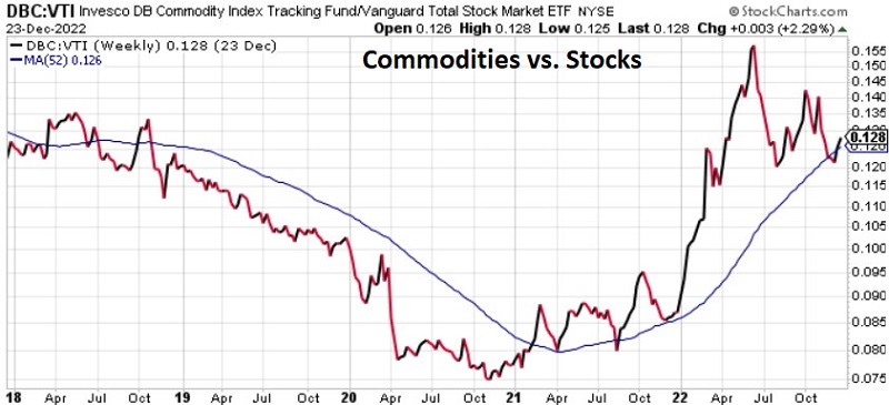
Comparing: DBC vs. VTI (Invesco DB Commodity Tracking Fund vs. Vanguard Total Stock Market ETF)
Recent Action: While comparing other asset classes to US stocks, let's look at commodities versus stocks. Commodities had a terrific run into mid-2022 and then experienced a significant pullback.
Current Trend: The RS line has popped back above the 52-week MA. It is too soon to know if this is the beginning of a new uptrend for commodities relative to stocks or just more choppy action. The extremely low-level hit by the RS line in late 2020 suggests that commodities could significantly outperform stocks in the next several years. This chart can help keep you on the right side of the trend.
Value vs. Growth
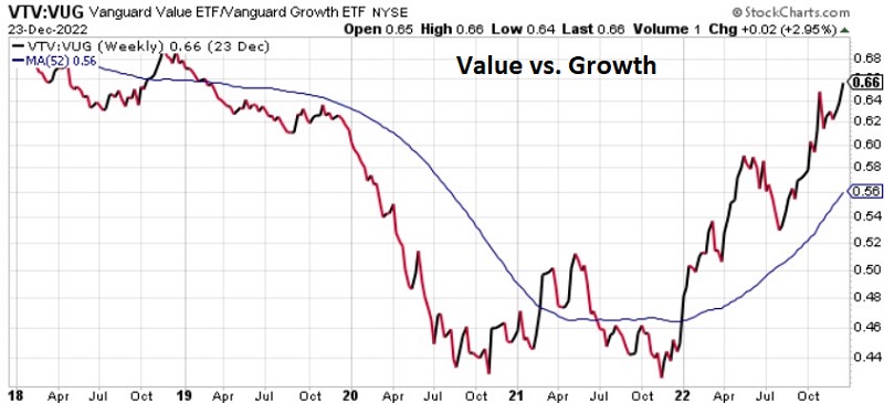
Comparing: VTV vs. VUG (Vanguard Value ETF vs. Vanguard Growth ETF)
Recent Action: While the future is unknowable, there can be little doubt regarding which factor has vastly outperformed in the last year (HINT: Value), as evidenced by the sharply rising RS lin.
Current Trend: A pullback in the RS line would not be a surprise in the near term. However, as long as the RS line is trending higher above the 52-week MA, the value factor is in charge.
Small-Cap Value vs. Large-Cap Growth
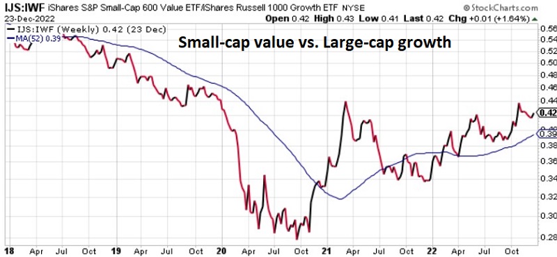
Comparing: IJS vs. IWF (iShares S&P Small-Cap 600 Value ETF vs. iShares Russell 1000 Growth ETF)
Recent Action: Now let's mix in another factor - size. This chart compares the performance of two very different types of companies - small-cap value vs. large-cap growth. The RS line bottomed in late 2020 and has twice bumped its head at the 0.44 level.
Current Trend: As long as the RS line remains above a rising 52-week MA, a "changing of the guard" (from large to small and growth to value) remains in force.
Small-Cap vs. Large-Cap
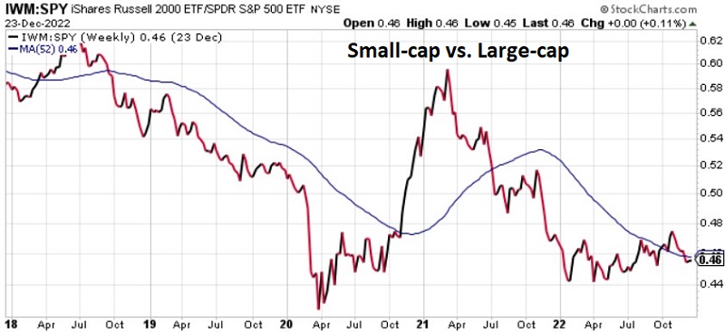
Comparing: IWM vs. SPY (iShares Russell 2000 ETF vs. SPDR S&P 500 ETF)
Recent Action: Now, let's focus solely on size. This chart compares the performance of small-cap value vs. large-cap. Small caps made a huge run relative to large caps after the Covid lows and into early 2021. Small caps then gave most of those relative gains back.
Current Trend: Small-cap vs. large-cap is an age-old debate. At the moment, neither category has a clear advantage. The RS line recently dipped back below the 52-week MA. Small caps tend to outperform late in the year into the first quarter of the following year. So far, there is no real sign of that happening. That can change quickly - which is why watching this line is essential.
Mid-Cap vs. Large-Cap
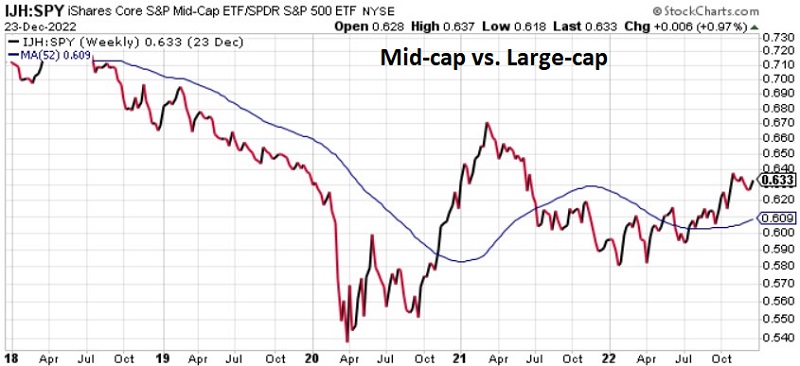
Comparing: IJH vs. SPY (iShares Core S&P Mid-Cap ETF vs. SPDR S&P 500 ETF)
Recent Action: While most focus on the battle between large-cap and small-cap, the reality is that since 1981 mid-caps have outperformed both small and large-caps (My theory is that the mid-cap space contains many formerly small-cap companies on their way to becoming large-cap companies, so that is where most of the growth occurs). So, let's take a closer look at mid-caps.
Current Trend: The RS line has been trending higher in fits and starts for most of 2022 (indicating that mid-caps have held up better than large-caps. The RS line is presently in an uptrend above a rising 52-week MA. This suggests that investors looking to jump into the market may be wise to look more closely at mid-cap stocks.
Mid-Cap vs. Small-Caps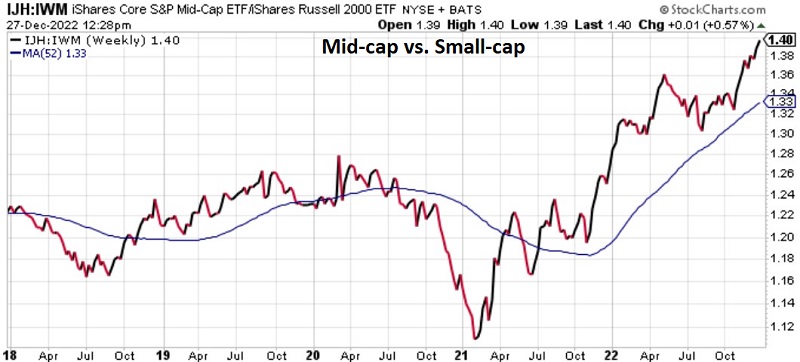 Comparing: IJH vs. IWM (iShares Core S&P Mid-Cap ETF vs. iShares Russell 2000 ETF)
Recent Action: While small-caps remain the darling of the "nonlarge cap" crowd, mid-caps have held up much better. The RS line bottomed in early 2022 and has been trending higher since (i.e., favoring mid-caps over small-caps).
Current Trend: The RS line just hit a new high and is well above the 52-week MA. While a pullback is possible, this performance tells us that mid-caps may be the place to be.
U.S. Stocks vs. International
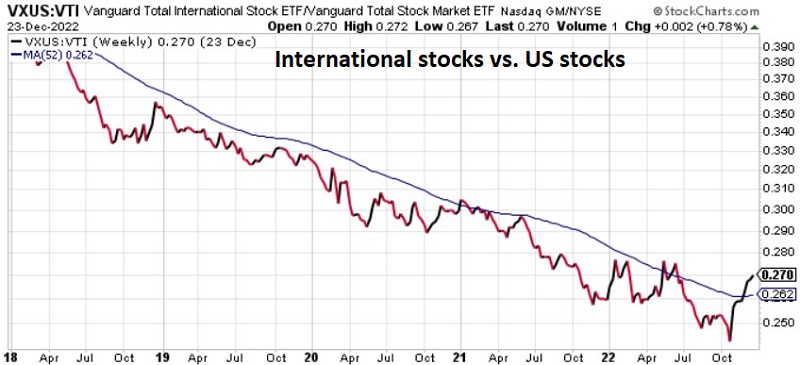
Comparing: VXUS vs. VTI (Vanguard Total International ETF vs. Vanguard Total Stock Market ETF)
Recent Action: Historically, there has been a back-and-forth that takes place between U.S. stocks in international stocks. Since roughly 2007, U.S. stocks have vastly outperformed international - to the point that there was almost no reason to hold international stocks. That trend may be in the process of changing and deserves special attention.
Current Trend: The RS line has popped strongly above the 52-week MA, and the MA has turned ever so slightly higher. There is no guarantee that this is the beginning of a significant new trend. However, after 15 years of favoring U.S. stocks, it is inevitable that, at some point, the tide will turn. This chart can help identify when that turn is happening.
Low Volatility vs. Momentum
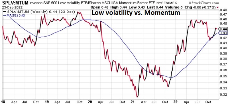
Comparing: SPLV vs. MTUM (Invesco S&P 500 Low Volatility ETF vs. iShares MSCI USA Momentum Factor ETF)
Recent Action: Defensive, low-volatility stocks tend to lead during a bear market. The relationship between low-volatility stocks and momentum stocks is one way to track the "risk on, risk off" nature of the market. The market went heavily risk on from the Covid low in 2020 into early 2021. It has been chiefly risk off ever since.
Current Trend: The RS line fell hard briefly from mid-September into early October - as risk on tried to make a run. The RS line has held above a rising 52-week MA (telling us that low-volatility stocks are currently leading). A hard break below the MA would be bullish for stocks.
Consumer Staples vs. Consumer Discretionary
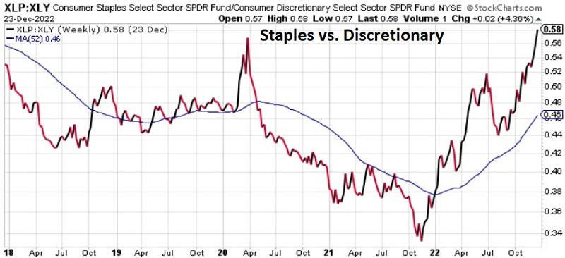
Comparing: XLP vs. XLY (Consumer Staples Select Sector SPDR Fund vs. Consumer Discretionary Sector SPDR Fund)
Recent Action: This is another "defensive versus momentum" risk on/risk off measure. In a bear market (particularly during periods of high inflation and/or higher interest rate), consumer staples tend to outperform consumer discretionary (and vice versa).
Current Trend: With the RS line streaking to new highs, there is little question that defensive stocks are currently in charge. As long as this measure is trending higher, investors remain cautious. A hard break below the MA would be bullish for stocks.
Technology vs. U.S. Stocks
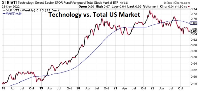
Comparing: XLK vs. VTI (Technology Select Sector SPDR Fund vs. Vanguard Total Stock Market ETF)
Recent Action: Now, let's talk "leadership." Historically, when tech is good, the market is good, and vice versa. After an extended run of significant outperformance from 2013 into 2021, tech is faltering relative to the overall market.
Current Trend: This relationship may tell us a lot about stock prospects in general. If the RS line remains below its 52-week average and starts to break down, things could get very ugly.
Energy vs. U.S. Stocks
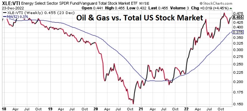
Comparing: XLE vs. VTI (Energy Select Sector SPDR Fund vs. Vanguard Total Stock Market ETF)
Recent Action: After years of severe underperformance and a severe decline into late 2020, traditional Energy (Oil & Gas) has been the undisputed leading sector ever since.
Current Trend: Many prognosticators call for a top in energy. And that is a possibility. Nevertheless, as long as the RS line holds above a rising 52-week MA, the trend remains positive for energy.
Traditional Energy vs. Clean Energy
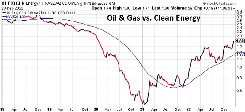
Comparing: XLE vs. QCLN (Energy Select Sector SPDR Fund vs. First Trust NASDAQ Clean Edge Green Energy Index Fund)
Recent Action: The clean energy sector was all the rage into early 2021. Since then, it's been oil & gas leading the way.
Current Trend: Nowhere is "talk of the future" more hyped than in the energy sector. Will clean energy eventually overtake and mostly replace oil and gas? Maybe. But for investors looking to make money in stocks, it is essential to recognize the trend and ride it for as long as possible. With the RS line hitting a new high above a rising 52-week MA, the trend is favoring traditional energy.
Real Estate versus US Stocks
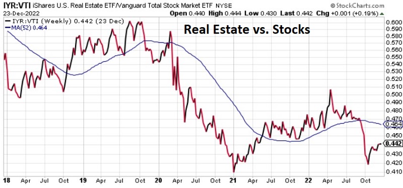
Comparing: IYR vs. VTI (iShares U.S. Real Estate ETF vs. Vanguard Total Stock Market ETF)
Recent Action: From 2007 into 2021, the real estate sector significantly underperformed the overall stock market. Following a low in early 2021 and an attempted bounce, the rally fizzled, and the RS line dropped below the 52-week MA.
Current Trend: The RS line has bounced off of its October 2022 low but remains below a declining 52-week MA. With rising interest rates and many questions regarding the housing market, real estate remains a question mark. Investors eying the real estate sector in the stock market might look for the RS line to rise back above the 52-week MA before diving in.
Base metals vs. precious metals
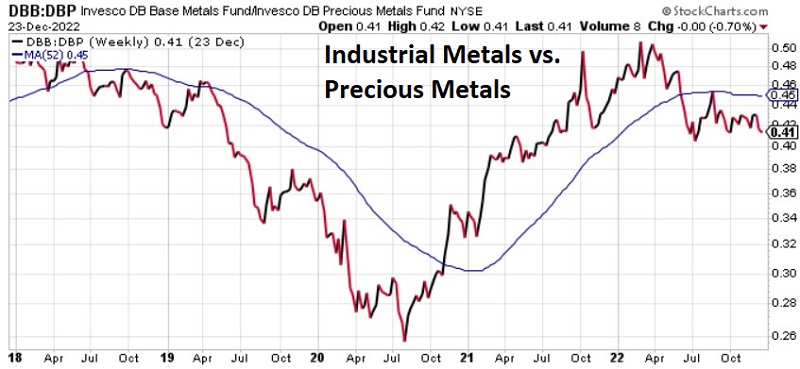
Comparing: DBB vs. DBP (Invesco DB Base Metals vs. Invesco DB Precious Metals Fund)
Recent Action: This relationship has a long history of roller-coaster-type action. After a substantial performance favoring industrial metals from mid-2020 into early 2022, the trend has again reversed.
Current Trend: Gold, silver, and platinum have been somewhat disappointing this year, given the high level of inflation. That said, they have still outperformed stocks and bonds in 2022. With the RS line back below the 52-week average, the edge has flipped back to the precious metals side and away from industrial metals.