
A curve ball from the yield curve

Key points:
- The spread between 30-year Treasury bonds to 2-year notes has steepened to the widest point in years
- Following an inversion, such a wide spread last occurred during the two largest bear markets in generations
- Historically, those were the only two negative signals, and small stocks tended to see the biggest boost
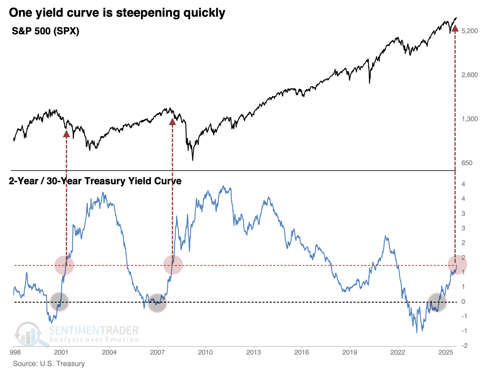
From inverted to kinda steep
There have been some notable machinations in one of the world's most liquid markets, and few seem to be paying attention.
The Wall Street Journal noted that the yield spread between the 2-year Treasury note and 30-year Treasury bond has steepened to the widest point in several years.
In Treasury markets, something of a Trump effect has begun to take hold in recent weeks. Investors expecting rate cuts have snapped up 2-year Treasurys, weighing down the yield on those notes. Those expecting higher rates over time have sold 30-year Treasurys, boosting the yield there.
This is, understandably, unnerving to some investors who have pulled up a chart of the past 25 years. The last two times this yield curve cycled from inversion to a spread of +1.25%, it coincided with the two most wicked bear markets in generations.
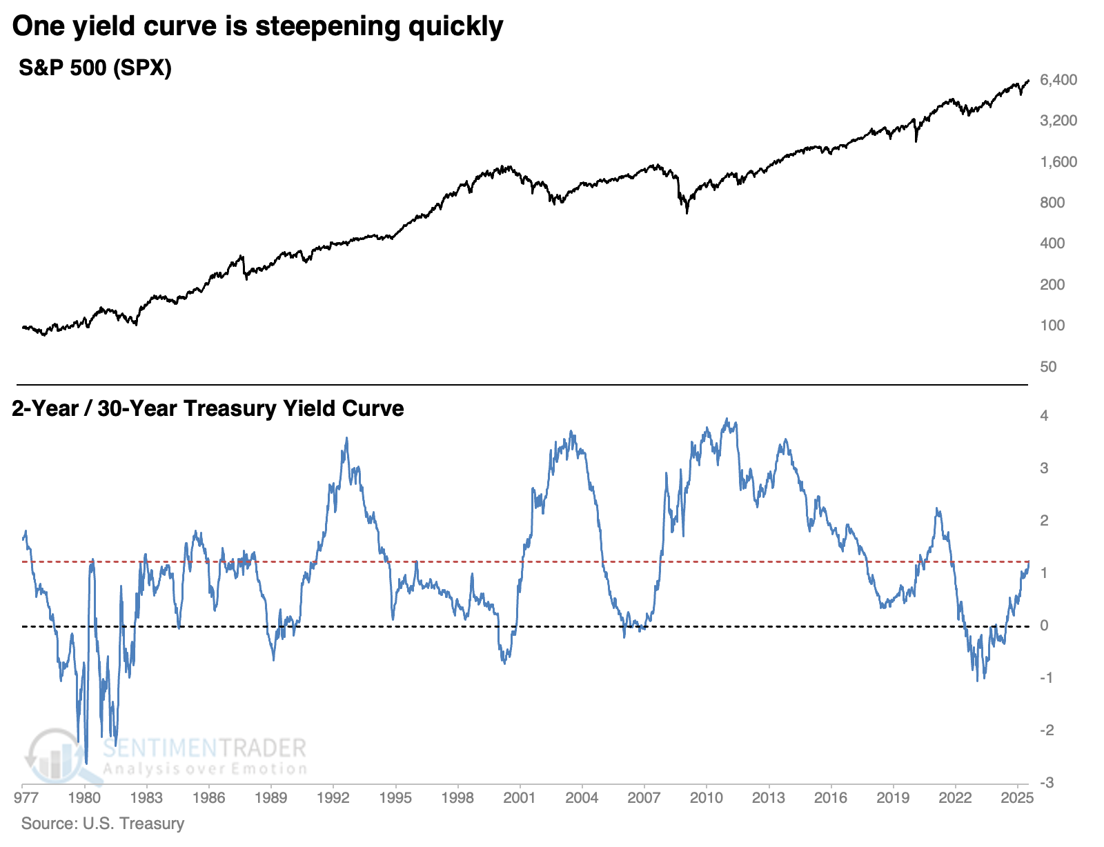
Those weren't the only two cycles in history; the Treasury has data going back nearly 50 years. Spreads were much more volatile before the 1980s, but there have been a handful of times the curve cycled as it has over the past few months.
Two bad, four good
Clearly, the last two signals were atrocious for equity investors over longer time frames. The chart below shows every similar cycle since 1977, and the S&P 500 showed gains a month after each cycle. The implications of the structure of that yield curve became apparent within a couple of months of the last two signals, and stocks started to sell off. However, those were the only two that showed negative returns.
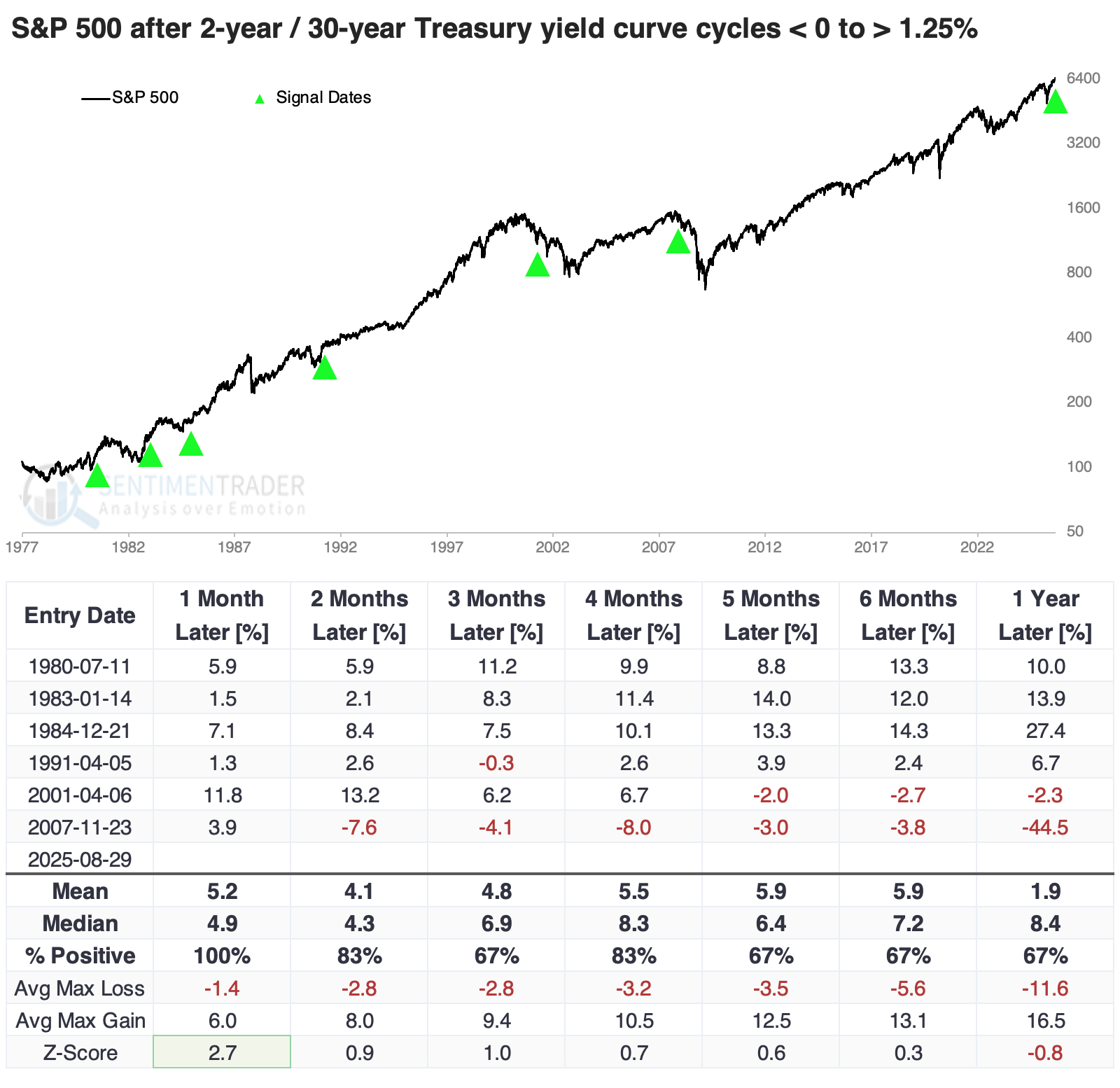
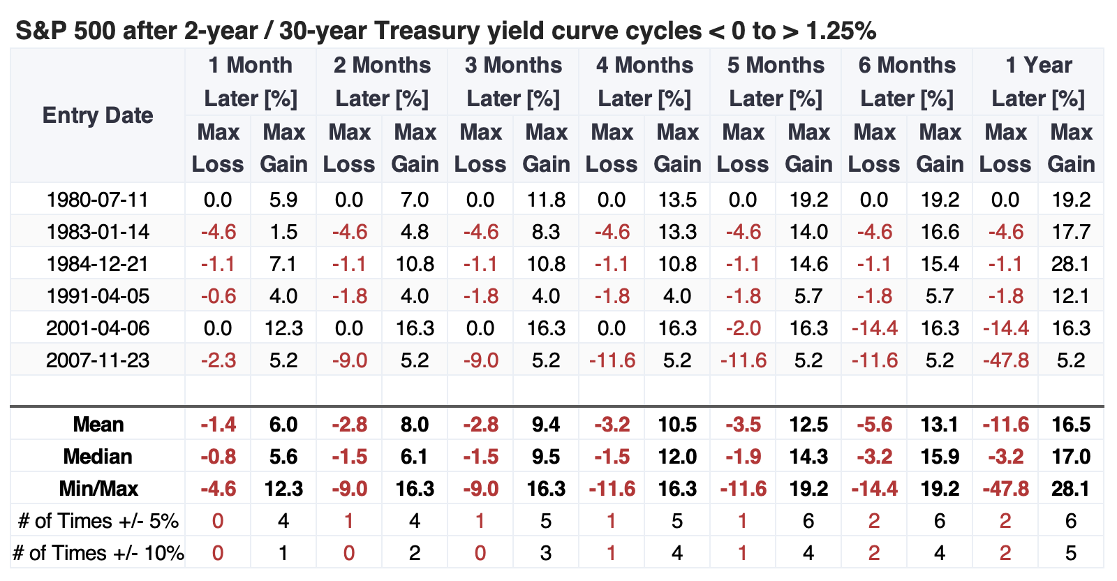
The table of maximum gains and losses across time frames shows that within the first five months, only the global financial crisis signal saw the S&P 500 decline more than 4.6%, while it rallied double-digits after four of the five other signals.
Good for small caps
The first couple of months after these signals tended to be good for returns in other major equity indices, and over the following year, the small-cap Russell 2000 outpaced the others. The dollar showed a strong tendency to rise over shorter time frames, then fade. Gold and the broader commodity complex struggled.
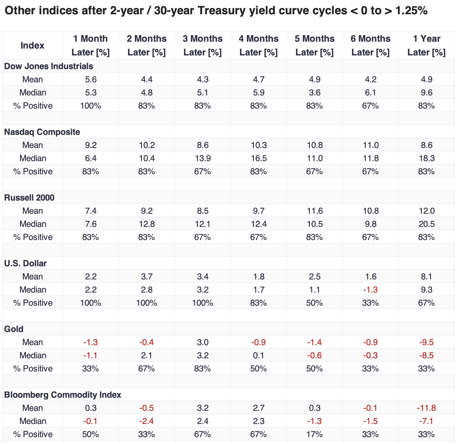
The total return on small-cap stocks exceeded +20% a year after five of the six signals, with 2007-08 being a rough exception with a loss exceeding 44%. Value stocks also shone over that time frame, with the financial crisis being the only negative.
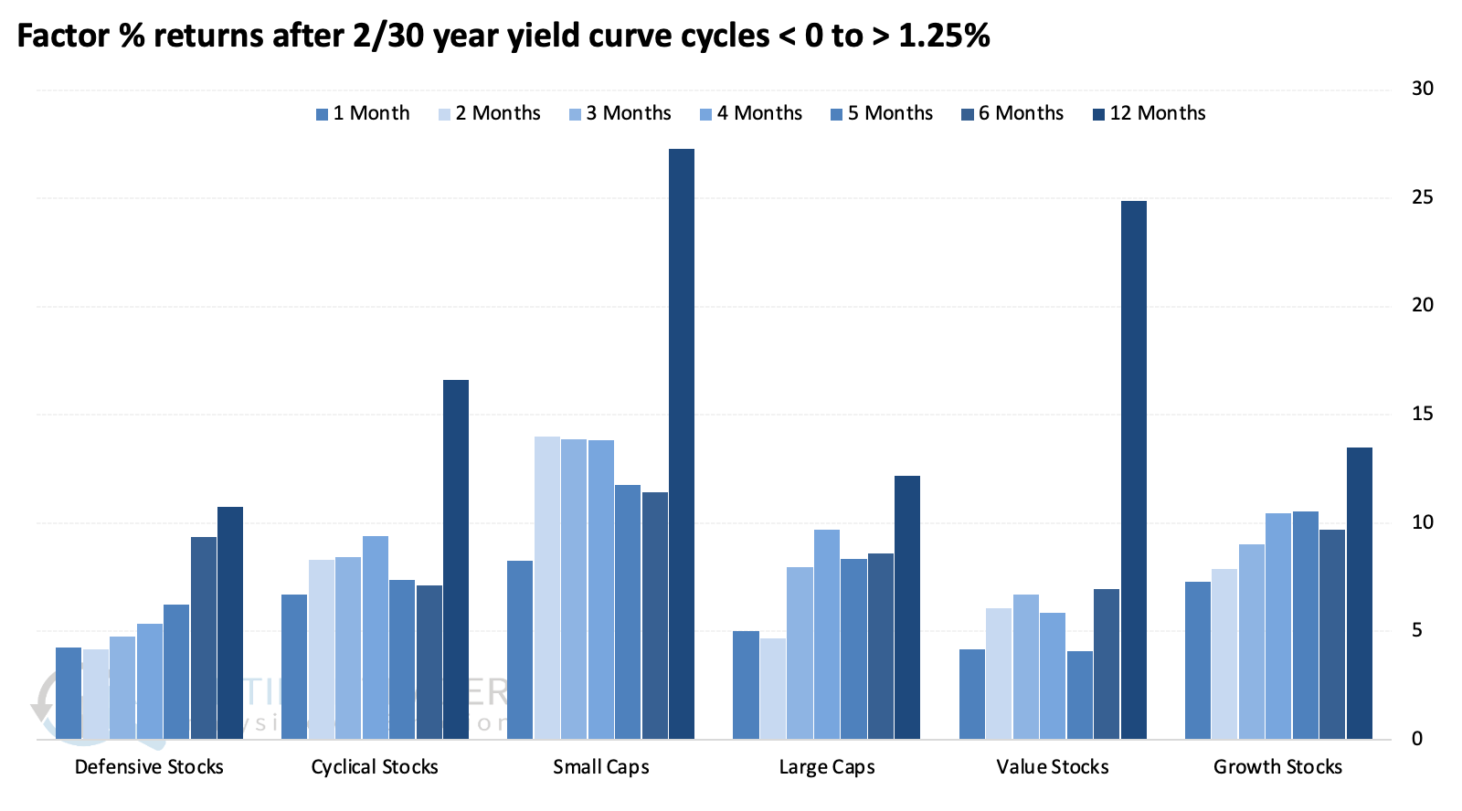
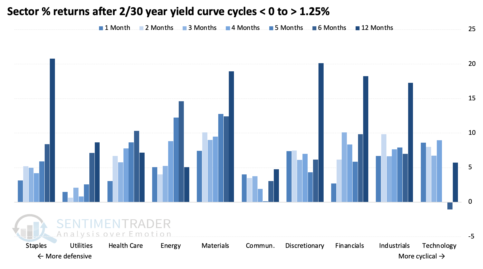
Thanks in part to their defensive nature, consumer staples enjoyed the largest median one-year return and among the most consistently positive returns across time frames. Growth stocks, particularly technology, had a rough go of it over longer time frames.
What the research tells us...
There is much debate about whether bond traders are smarter than stock market investors. Not literally, but in the context of whether one market leads the other. We've never been able to confirm that with any confidence, but there is a definite interplay between the two, though the relationship changes over time and sometimes abruptly.
Worries are growing that something unusual is happening in the Treasury market, and the stock market is mostly ignoring it. A rapidly changing Treasury yield curve can indicate something is amiss, though it's not always obvious what. There is a possibility that's what's being reflected now in the 2/10 Treasury curve, though historically, similar moves have not been an immediate worry for the stock market.