
A closer look at t-bond seasonality

Note: The original version of this piece incorrectly labeled the Direxion Daily 20+ Year Treasury Bear 3x Shares ETF and ticker TMF. The correct symbol for this 3x inverse ETF is TMV and NOT TMF.
Key Points
- Within the calendar year, long-term treasury bonds have displayed a surprisingly consistent amount of cyclicality
- On a trading basis, ticker TLT is entering a purportedly favorable period
- Caveat: In recent years, favorable seasonal periods have struggled at times to overcome the inevitable negative effect of rising interest rates
NOTE: Please view our latest webinar titled "What's New on the Website" here. This video highlights a number of indicators and strategies we've added so far in 2025, including the Sentiment Cycle Composite, PPI Stock Market Model, LEISum, TNX Range %, NYSE Titanburg, and NASDAQ Titanicburg.
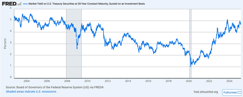
Long-term treasuries have taken a beating since rates bottomed out
In the chart below (courtesy of FRED), long-term treasury bond yields bottomed out at just under 1.00% in early 2000. Rates rose to almost 5.1% by October 2023 and have been chopping sideways ever since.
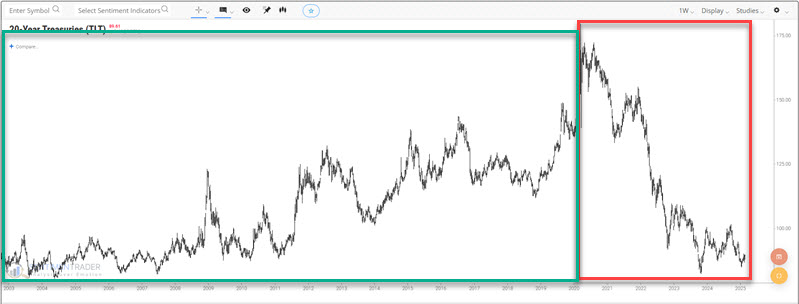
The chart below shows the price action for the iShares 20+ Year Treasury Bond ETF (ticker TLT), which tracks an index of long-term treasury bonds. Since long-term treasuries trade inversely to long-term yields, bond prices have sharply declined since interest rates bottomed in 2020. As long-term rates rose from 1% to 5%, long-term t-bonds lost over 50% of their value.
Now, let's examine the annual seasonal fluctuations that have occurred "under the surface" of these significant long-term trends.
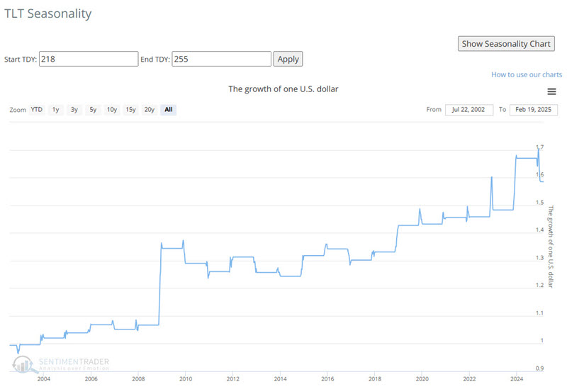
A closer look at TLT seasonality
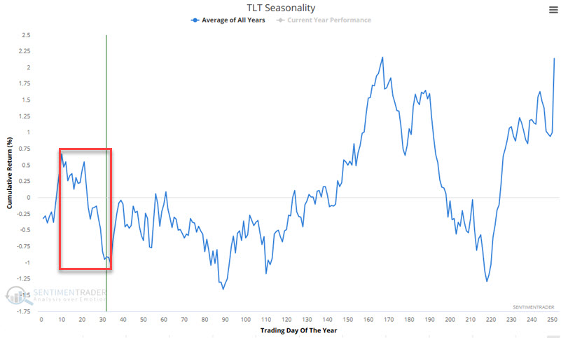
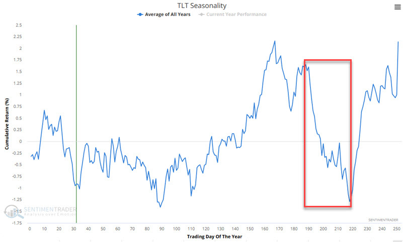
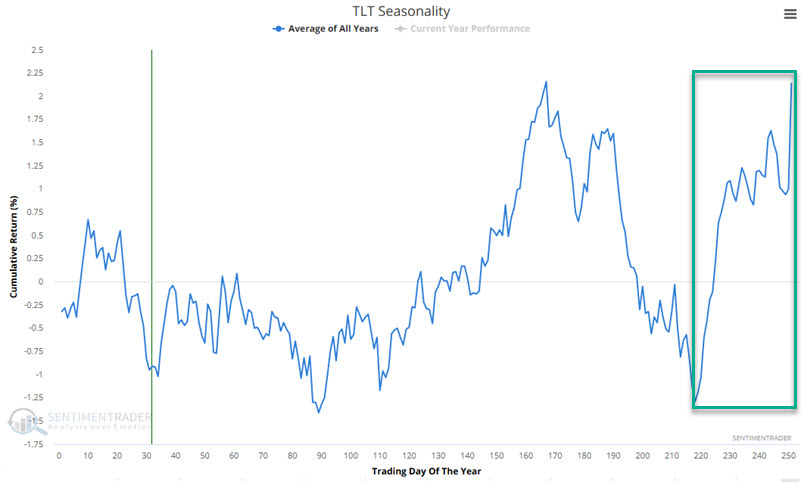
The chart below displays the annual seasonal trend for TLT. As always, this line is "backward-looking" and represents an average of past years. It should not be assumed to be a roadmap for what will happen in any given year. That said, there does appear to be some value here for traders.
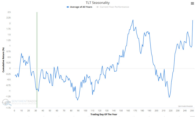
Now, let's break down the chart into typically "favorable" and "unfavorable" seasonal periods.
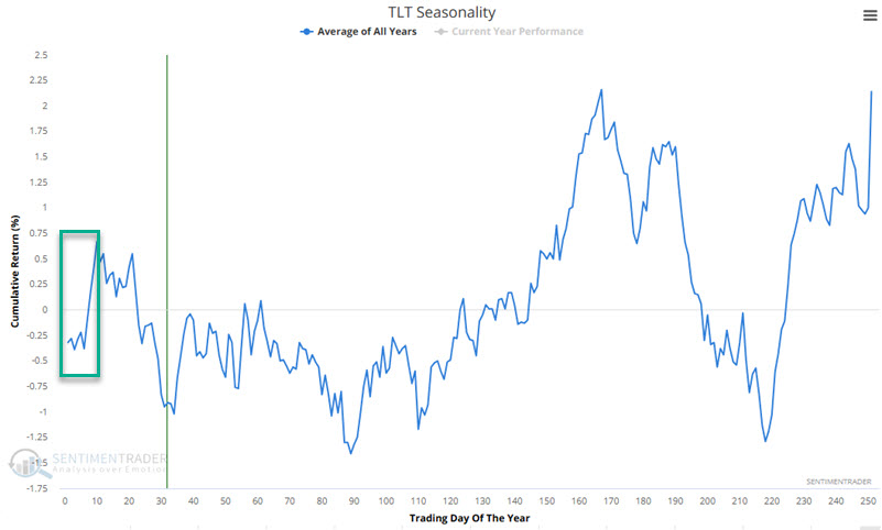
Period #1: Favorable - TDY #1 through TDY #10
The chart below highlights the period from Trading Day of the Year (TDY) #1 through TDY #10.
The table below displays the hypothetical growth of $1 invested in ticker TLT only during TDY#1 through TDY #10.
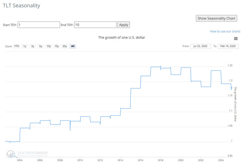
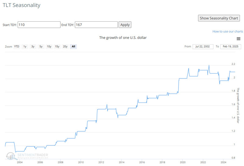
On the far right-hand side of the above chart, we see that bonds have struggled to overcome the negative effect of rising rates since 2020.
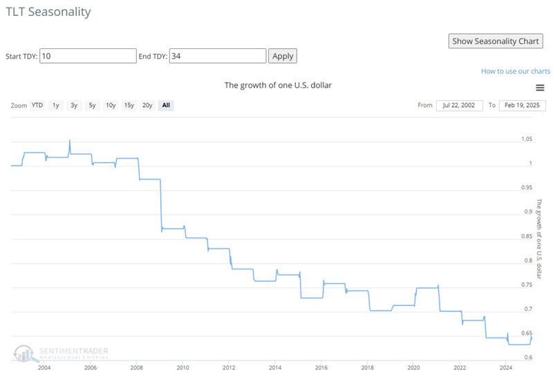
Period #2: Unfavorable - TDY #10 through #34
The chart below highlights the period from TDY #10 through TDY #34.
The table below displays the hypothetical growth of $1 invested in ticker TLT only from TDY #10 through TDY #34.
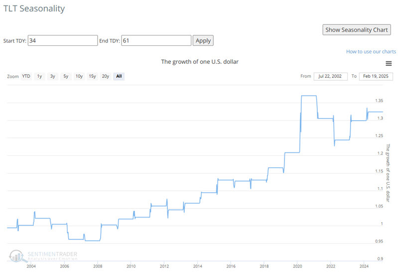
Period #3: Favorable - TDY #34 through #61
The chart below highlights the period from TDY #34 through TDY #61.
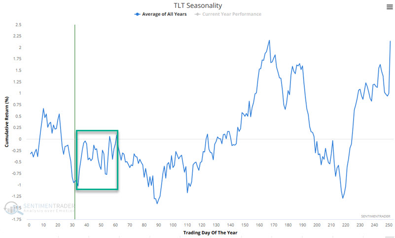
The table below displays the hypothetical growth of $1 invested in ticker TLT only from TDY #34 through TDY #61.
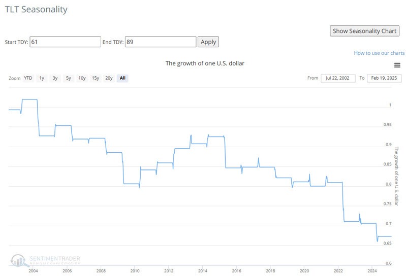
Period #4 Unfavorable - TDY #61 through TDY #89
The chart below highlights the period from TDY #61 through TDY #89.
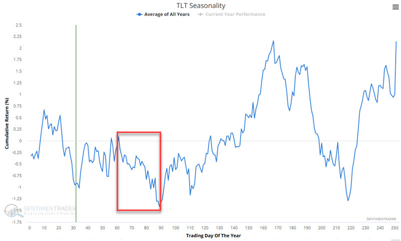
The table below displays the hypothetical growth of $1 invested in ticker TLT only from TDY #61 through TDY #89.
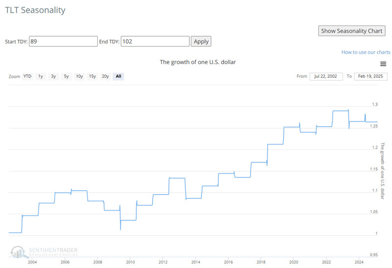
Period #5: Favorable - TDY #89 through TDY #102
The chart below highlights the period from TDY #89 through TDY #102.
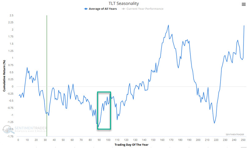
The table below displays the hypothetical growth of $1 invested in ticker TLT only from TDY #89 through TDY #102.
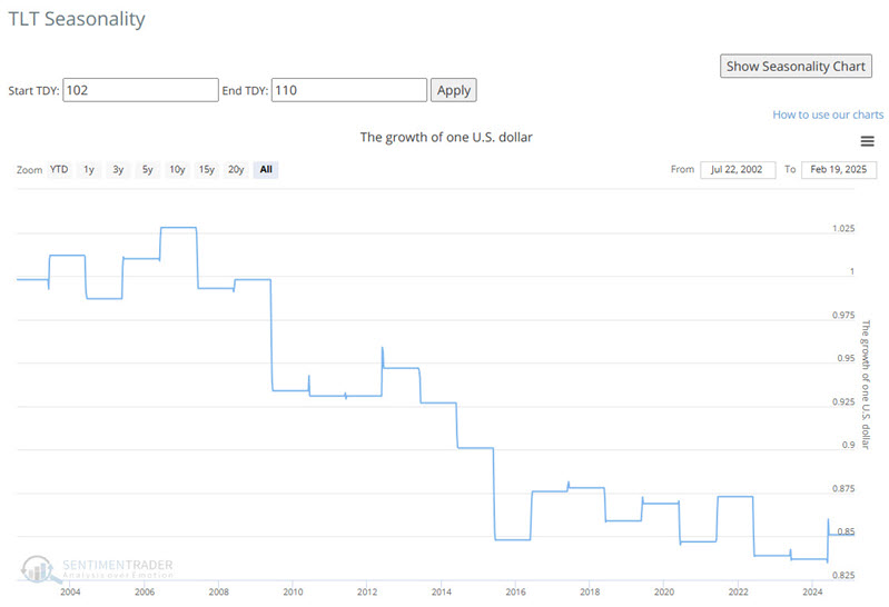
Period #6: Unfavorable - TDY #102 through TDY #110
The chart below highlights the period from TDY #102 through TDY #110.
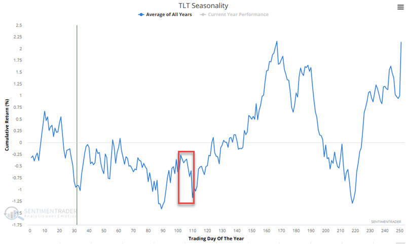
The table below displays the hypothetical growth of $1 invested in ticker TLT only from TDY #102 through TDY #110.
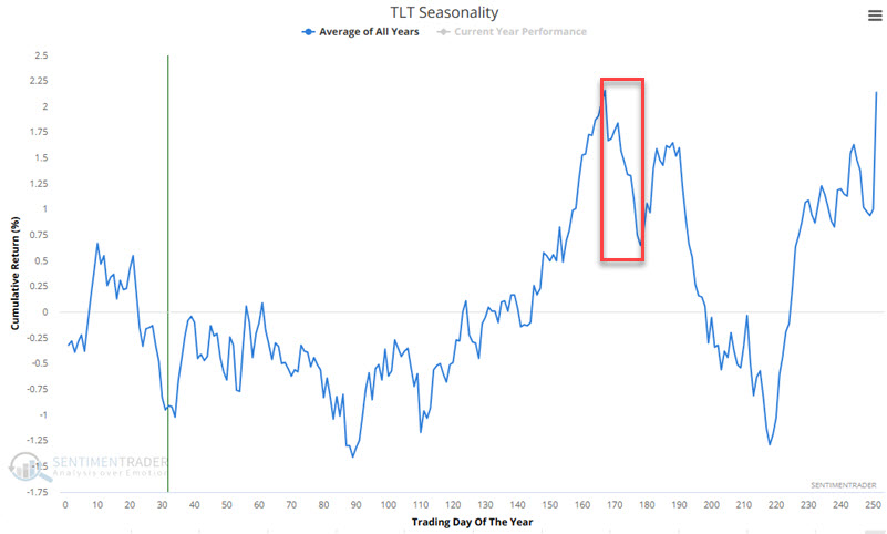
Period #7: Favorable - TDY #110 through TDY #167
The chart below highlights the period from TDY #110 through TDY #167.
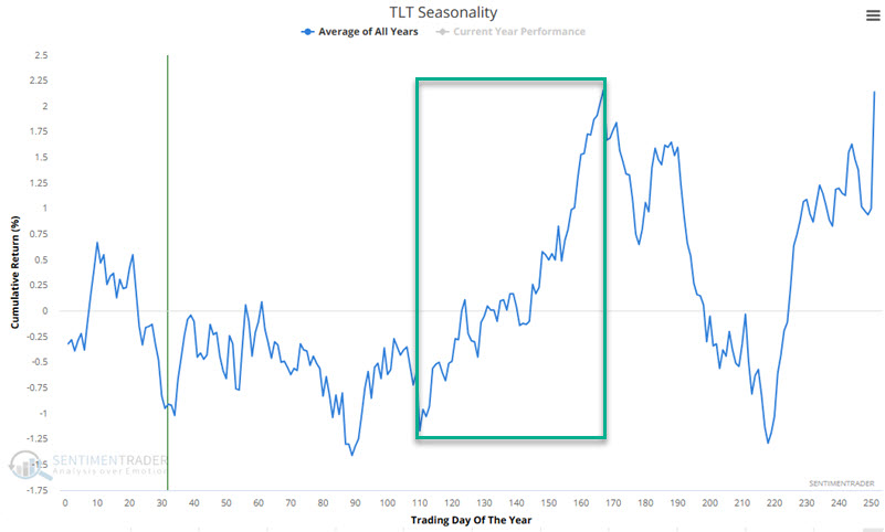
The table below displays the hypothetical growth of $1 invested in ticker TLT only from TDY #110 through TDY #167.
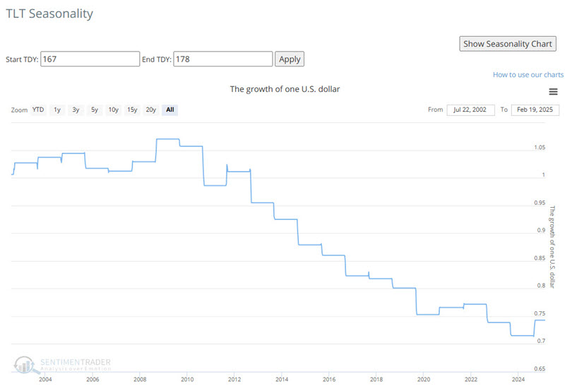
Period #8: Unfavorable - TDY #167 through TDY #178
The chart below highlights the period from TDY #167 through TDY #178.
The table below displays the hypothetical growth of $1 invested in ticker TLT only from TDY #167 through TDY #178.
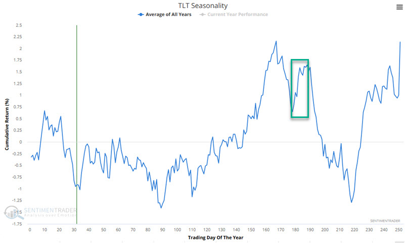
Period #9: Favorable - TDY #178 through TDY #188
The chart below highlights the period from TDY #178 through TDY #188.
The table below displays the hypothetical growth of $1 invested in ticker TLT only from TDY #178 through TDY #188.
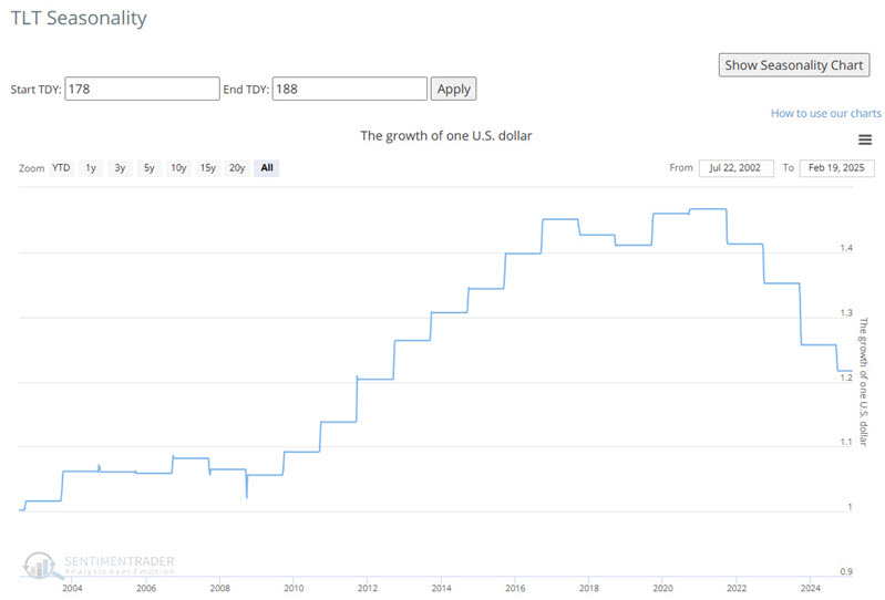
Here again, on the far right-hand side of the above chart, we see that bonds have struggled to overcome the negative effect of rising rates since 2020.
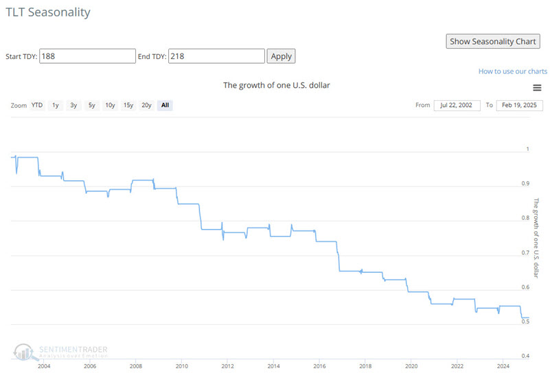
Period #10: Unfavorable - TDY #188 through TDY #218
The chart below highlights the period from TDY #188 through TDY #218.
The table below displays the hypothetical growth of $1 invested in ticker TLT only from TDY #188 through TDY #218.
Period #11: Favorable - TDY #218 through Year-End
The chart below highlights the period from TDY #218 through year-end.
The table below displays the hypothetical growth of $1 invested in ticker TLT only from TDY #218 through year-end.
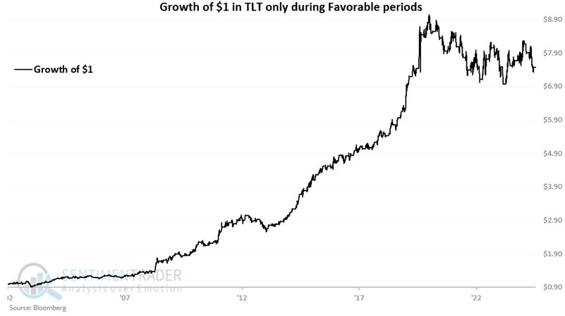
Looking only at Favorable periods
Next, let's combine all of the unfavorable periods highlighted above. For this test, we will assume that we hold ticker TLT every year only during favorable seasonal periods. The chart below displays the hypothetical growth of $1 using this approach. From 2006-06-22 through 2025-02-18, $1 grew 648% to $7.48. The bad news is that this equity curve is 17% off its peak established in 2020.
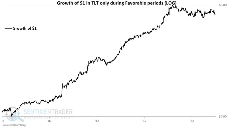
The chart below displays the same results on a logarithmic basis.
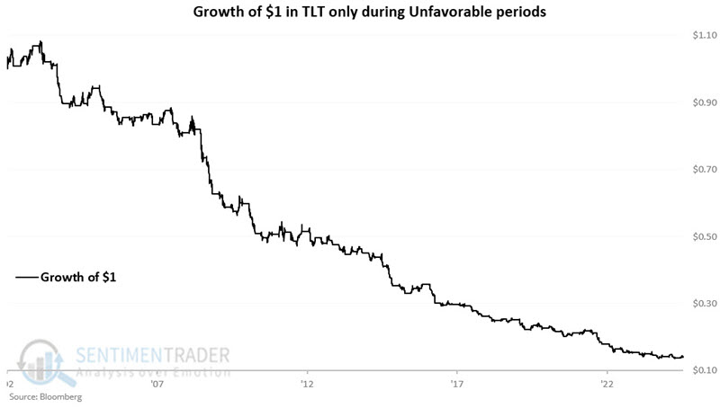
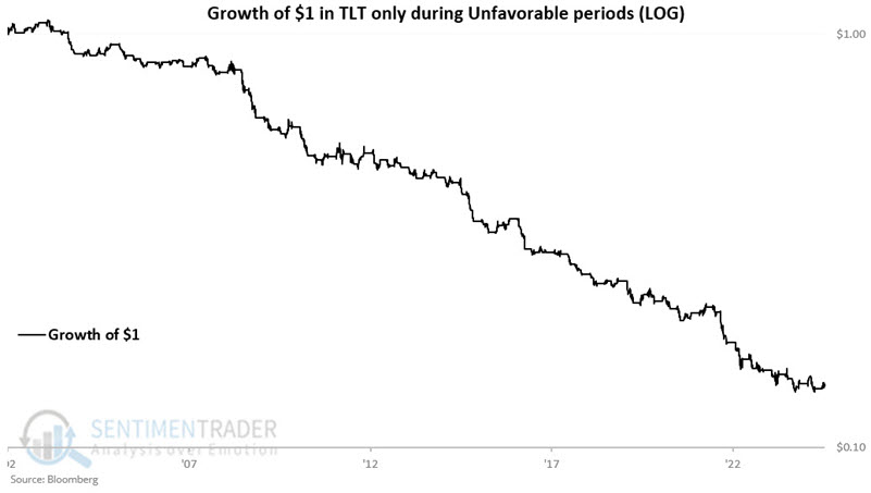
Looking only at Unfavorable periods
Next, let's combine all of the unfavorable periods highlighted above. For this test, we will assume that we hold ticker TLT every year only during unfavorable seasonal periods. The chart below displays the hypothetical growth of $1 using this approach. From 2006-06-22 through 2025-02-18, $1 shrank a stunning 86% to just $0.14. While TLT performance has been subpar since 2020 during favorable seasonal periods (-14%), results during unfavorable seasonal periods have been disastrous (-39%).
The chart below displays the same results on a logarithmic basis.
Comparing favorable, unfavorable, and buy-and-hold
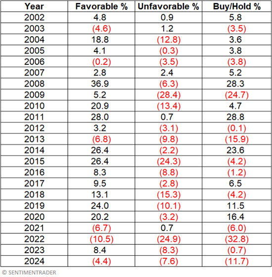
The table below displays the hypothetical annual results for holding TLT during favorable versus unfavorable periods and for a buy-and-hold approach.
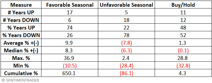
The table below summarizes the performance for each category.
The chart below displays the hypothetical cumulative growth of $1 invested in TLT only during favorable periods (black line) and the hypothetical cumulative growth of $1 invested in TLT on a buy-and-hold basis (blue line)
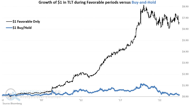
The chart below displays the growth of $1 in TLT only during favorable periods relative to $1 invested in TLT on a buy-and-hold basis.
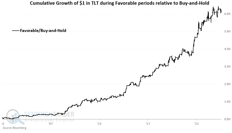
The bottom line: Avoiding long-term treasuries during unfavorable annual seasonal periods would have saved an investor a lot of money.
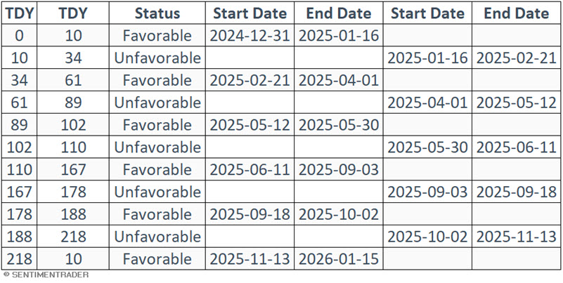
Calendar for 2025
The table below displays the dates for each favorable and unfavorable period for 2025. Note that TLT entered a favorable period at the close on 2025-02-21, which will extend through the close on 2025-04-01.
T-bond ETFs
Several ETFs track long-term bonds, including leveraged and inverse versions. The obvious choice for the long side is the iShares 20+ Year Treasury Bond ETF (ticker TLT). For a trader looking to play the short side of bonds, one non-leveraged inverse ETF is the ProShares Short 20+ Year Treasury ETF (ticker TBF).
The most heavily traded inverse long-term treasury ETF is the Direxion Daily 20+ Year Treasury Bear 3x Shares ETF (ticker TMV), which trades roughly 1.8 million daily shares. However, it is critical to note that this ETF is leveraged 3x, i.e., it is designed to offer three times the inverse daily performance for long-term treasuries. Traders must carefully consider the associated risks before investing in leveraged or inverse - and especially leveraged and inverse - funds.
What the research tells us...
Treasury bonds were bullish for the better part of four decades (1981 to 2020) and have been primarily bearish ever since. Despite this, the influence of the various favorable and unfavorable annual seasonal periods detailed above offers a potential "edge" for those willing to trade long treasury bonds.