
What the copper/gold ratio is suggesting about market potential

Key points:
- Copper has plunged to a multi-year low relative to gold, supposedly suggesting economic anxiety
- Previous declines in this ratio were a poor predictor of declines in the S&P 500, especially cyclical stocks
- Drops in the ratio had a better hit rate leading to gains in copper
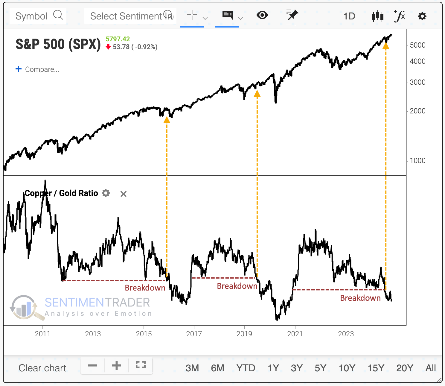
A scary (?) breakdown
Market analysts love to look at intermarket relationships - like, love, love it. I've never really understood why because they're usually not very useful. Relationships and correlations change all the time, and usually, by the time some relationship gets widely discussed, it's time for it to shift.
We're seeing more attention now on the interplay between copper and gold since it just fell to another multi-year low. The theory is that copper represents economic activity while gold reflects some sort of safe haven. If the ratio of copper to gold falls, then it means that investors are anxious about poor economics. That's the theory, anyway. Despite being widespread, it's not a very good one.
Most investors are more concerned about the potential for a ratio like this to signal a reason to sell. For most investors, that means stocks, and for most of those investors, the benchmark is the S&P 500.
The chart below shows that the last two times the copper/gold ratio broke down to a multi-year low, the S&P soared in the year(s) ahead, though the last one was interrupted by the pandemic. It would be a stretch to suggest that the plunging copper/gold ratio predicted that event.
The table below shows every signal over the past 50 years. It tells us returns in the S&P 500 after the copper/gold ratio fell to at least a 3-year low for the first time in at least one month. The next couple of weeks were weak, but that's not the time frame most would consider when looking at this ratio as an indicator. Over the medium- to long-term, the S&P's returns were just fine, with only 3 losses out of 27 attempts over the following year, and none of those losses were significant.

A breakdown of forward returns among sectors shows an interesting pattern - they got better the more cyclical the sector. The most defensive sectors, like staples and utilities, showed the smallest average returns, while cyclical sectors, like technology and industrials, showed among the largest across the most time frames.
Given the prevailing theory about the copper/gold ratio, that's not what we should expect.

Bonds and metals
The ratio between those two metals is usually just an inverse reflection of the U.S. dollar. It also tends to move with the direction of the 10-year Treasury yield, but that relationship has broken down over the past two years. It's unlike anything we've witnessed in over a decade.
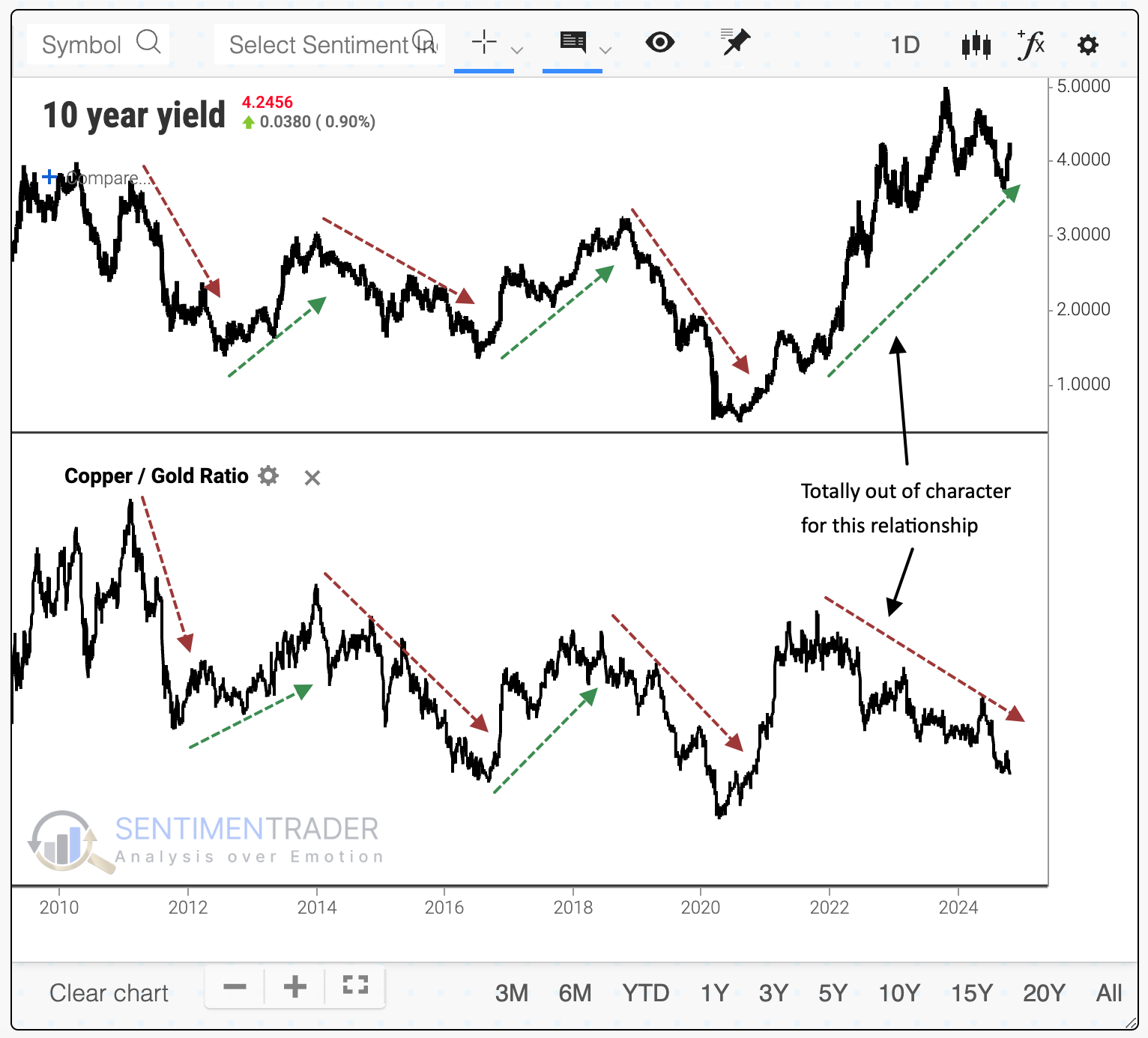
A drop in the ratio to a multi-year low didn't lead to anything particularly consistent for the 10-year yield. It tended to dip over the next couple of weeks, then rise. Over the following year, yields rose 80% of the time by an average of 94 basis points, or about 1%.

For gold, these signals didn't tell us much. The summary table below shows that gold exhibited a modest tendency to rise in the months ahead, with its best performance over the next 6-12 months, when its average returns were well above any random time.

It was a better signal for copper. Over the next three months, that metal gained 89% of the time, with a healthy reward-to-risk ratio. While consistency declined over the next year, copper still rallied about three times out of four, and its average returns and risk/reward ratio were impressive.

What the research tells us...
Markets are endlessly complex, with unclear relationships that have a nasty habit of shifting just when they become apparent. It's like trying to play chess with the pieces changing their allowed movements right after you read the rulebook. One of those pieces that investors try to play is reading intermarket relationships and applying their messages to other assets like stocks. The theories sound pretty good, and the narratives are compelling. But that's more about storytelling than data.
The recent plunge in the ratio of copper to gold is supposed to tell us that "something" is happening in the world and that something ain't good. Who knows, maybe it's true. It probably is - there's always scary, nasty stuff happening in a world of 8 billion people. But watching this particular ratio and extrapolating a decline to suggest that we should be worried about stocks (or just about anything else) has been mostly folly.