
The market environment has flipped to healthy...but precariously

Key points:
- A compilation of 8 simple metrics for the market environment has turned healthy
- Over the past 60 years, healthy environments have shown drastically better returns with much lower drawdowns
- A few bad days could tip the scale back to unhealthy, so the indicators bear watching
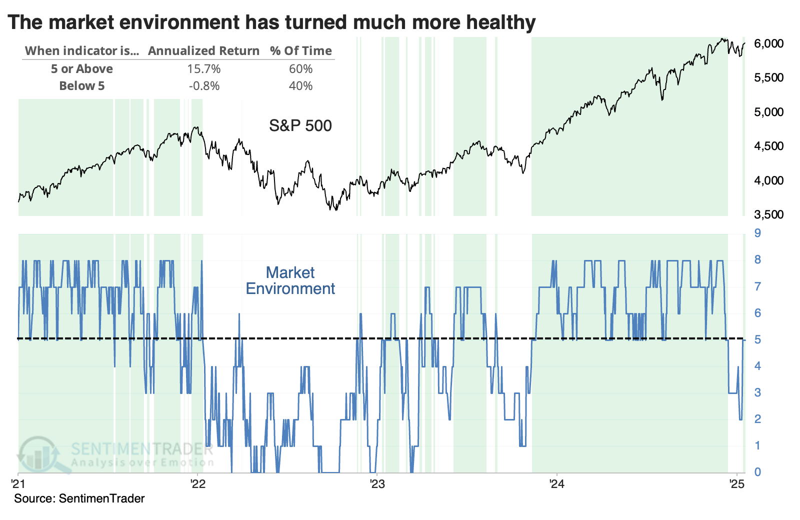
The environment is healthy again (barely)
Even as widely followed indices like the S&P 500 were climbing to new highs by the end of 2024, there were signs of weakness underlying them. Those got worse as the index faltered into mid-January, but the last week has improved things considerably.
In the Knowledge Base, we outline eight basic measures of market health that anyone can monitor. There are more complicated indicators and more sophisticated ways of paring the list, like machine learning or principal component analysis. This list is based on brute-force testing and a whole lot of experience.
With a rapid and substantial improvement in breadth, most of those measures now suggest a healthy market environment.
| Indicator | Status |
| Higher highs/lows | Unhealthy |
| Price > 200-day average | Healthy |
| Rising 200-day average | Healthy |
| > 60% of stocks above 200-day | Healthy |
| McClellan Summation > 0 | Unhealthy |
| McClellan Summation is rising | Healthy |
| NYSE New Highs > New Lows | Healthy |
| < 40% of stocks in correction | Unhealthy |
We don't use this as a timing system but rather as a general guide to help with exposure.
It has helped in recent years. For example, in the spring of 2022, the market environment was unhealthy, and we were waiting for signs that it would turn around, but they didn't materialize. In July 2022, near the depths of the bear market, we looked at how long the market environment had been unhealthy, and it was at a point where it was so bad it was good. By November of that year, green shoots were forming, and there were promising signs that it would turn positive.
It had been healthy for most of the last two years and all of 2024. This month's weakness triggered unhealthy readings in all but two metrics, but that has since recovered to five, our threshold for a healthy environment. The chart below shows that the S&P 500 has returned an annualized +15.7% when five or more metrics were healthy compared to a woeful -0.8% on all other days.
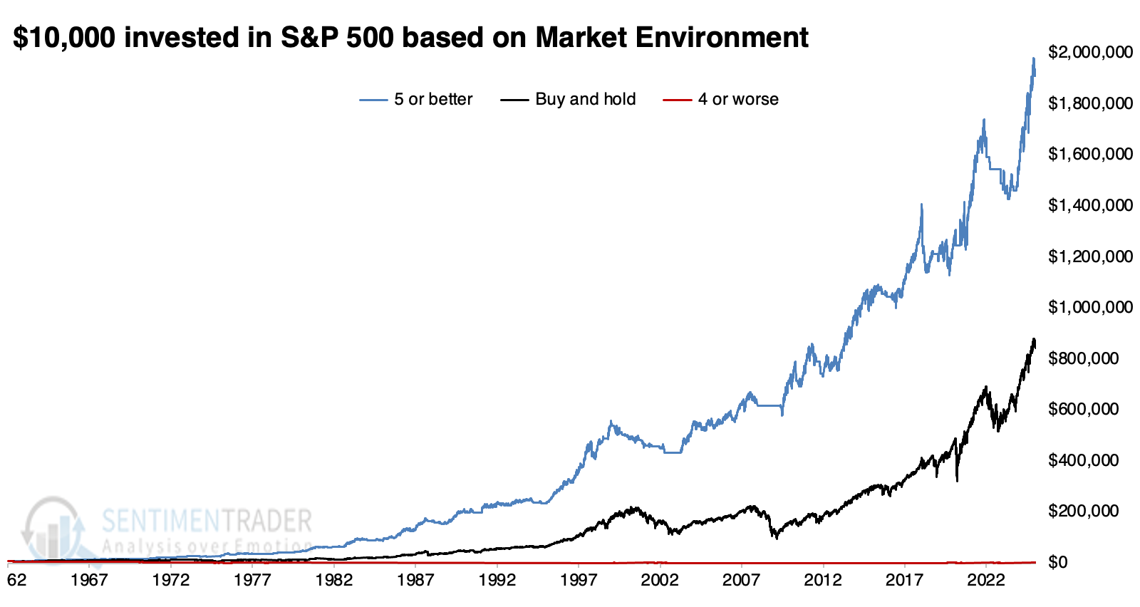
Healthy environments bring higher returns and lower drawdowns
The equity curve lines below show the drastic difference in S&P 500 returns when the environment is healthy versus all other times. When it was healthy, $10,000 in 1962 turned into $1,939,000 today. That's more than double the $873,000 for buy-and-hold. When the number of healthy market environment metrics was four or worse, $10,000 turned into $4,500, a loss of -55%.
Note that these equity curves use next-day returns, not same-day returns, which is a more realistic reflection of real-world conditions.
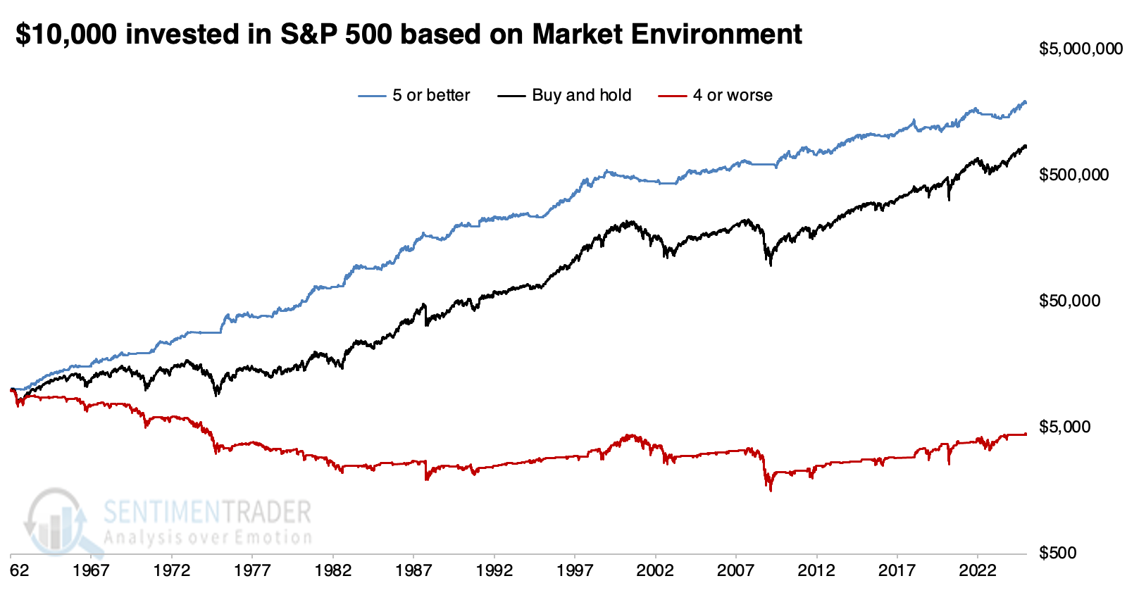
The chart below shows the same data but on a log scale, highlighting the stark contrast in the equity curve between healthy and unhealthy environments.
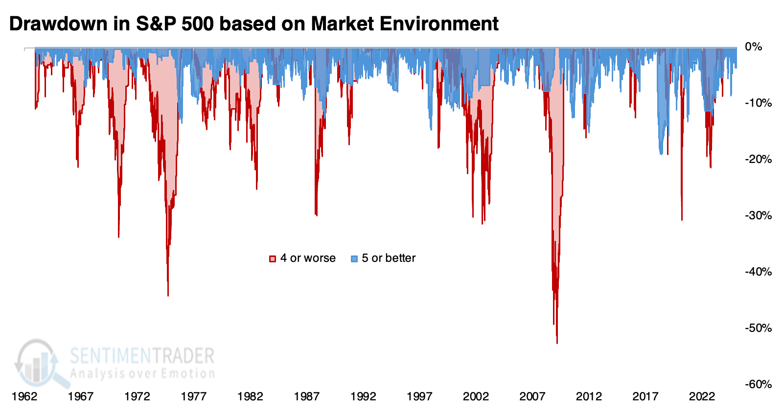
Perhaps even more drastic than the returns are the drawdowns required to witness them. The chart below shows drawdowns in the equity curve for healthy (blue) and unhealthy (red) markets. During healthy environments, the worst drawdown was -19.0% in June 2018. Outside of that, drawdowns were limited to -15% or better.
During unhealthy environments, the worst drawdown was -52.6%, and six different times, it exceeded -30% - tough times to be a long-only investor.
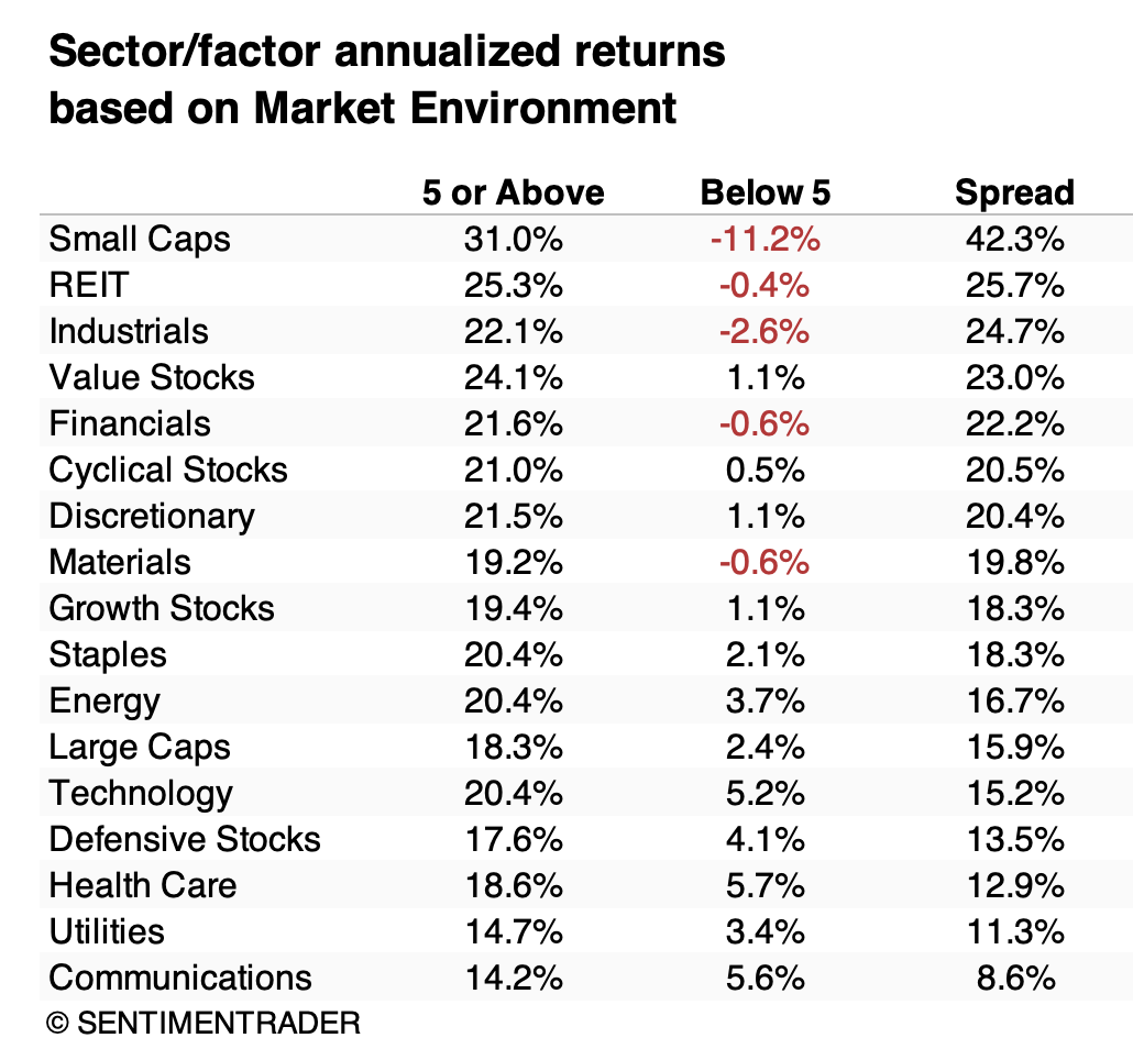
Below, we can see the annualized returns in major sectors and factors during healthy (5 or above) and unhealthy (below 5) environments. The table is sorted by the most significant differences in returns.
Small-cap stocks showed the starkest difference in outcomes based on environment. Small caps returned +31.0% when the market environment was healthy but plunged to -11.2% when unhealthy. No other sector or factor was nearly as lopsided. Those more cyclically oriented, like industrials, financials, and value stocks, also tended to see highly positive returns during healthy environments and low or negative returns during unhealthy ones.
No surprise, the most immune sectors were defensive in nature, especially health care and utilities. They did pretty well in healthy environments and tended not to lose so much in unhealthy ones.
What the research tells us...
The S&P 500 barely missed out on a record rebound on Wednesday, cycling from a 2-month low to (almost) record high in only seven sessions. The only time since 1928 it did something similar was June 24, 1998, after which it spurted about 5% higher over the next few weeks before crashing into the fall of that year thanks to overseas turmoil, primarily in Russia, China, and Brazil (hmmm...).
If it had set a new high, it would mark a healthy pattern, adding another positive checkmark in the market environment table. As it stands, the environment is still healthy but precarious. It would only take a dip in new highs versus lows on the NYSE or a handful of stocks to close back below their 200-day averages to flip those metrics to unhealthy. It doesn't pay to get too obsessed with the day-to-day gyrations but rather take a longer-term view to perhaps adjust exposure. If we can't hold a healthy environment for more than a few days, it doesn't augur well for forward returns.