
Health Care Entering the 'Dead Zone'

It is an ominous-sounding headline. From the headline, one might assume that some fundamental reason brewing will adversely affect the Health Care sector in the not-too-distant future.
In reality, all I am doing is looking at the calendar - and assessing the odds.
THE RECENT TREND
The chart below (courtesy of StockCharts.com) displays the weekly bar chart for ticker XLV (SPDR U.S. Health Care ETF) for the past two years. As you can see, since the March 2020 Covid-panic low, the Health Care sector of the stock market has marched relentlessly higher.
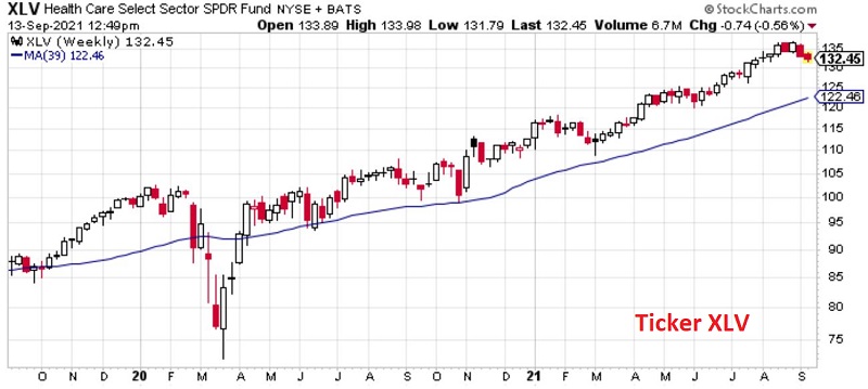
Technically, the price trend is inarguably still "Up," and price is well above its own 39-week moving average.
THE SEASONAL HISTORY
The chart below displays the Annual Seasonal Trend for ticker XLV.
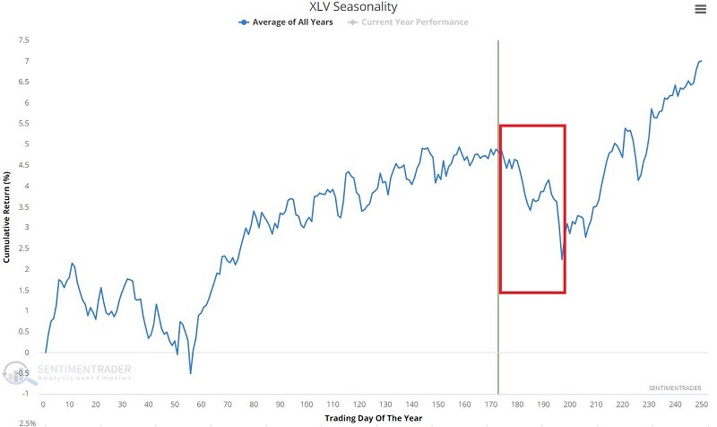
It does not take a skilled eye to note that the period extending from the close on:
- Trading Day of the Year (TDY) #174, through
- Trading Day of the Year #187
- Shows a strong tendency for weakness
So, is the Health Care sector "doomed"? Is all hope lost? Should investors unload all Health Care sector stock market investments as quickly as possible?
Not necessarily. But consider the results displayed below and decide for yourself.
THE HISTORICAL RESULTS
For testing purposes:
- We will use S&P 500 Health Care sector data, which will allow us to test back to 1953
For each calendar year:
- We will note the total return for this sector from the close on TDY #174 through the close on TDY #187
The chart below displays the yearly percentage gain or loss for the S&P 500 Health Care sector during this "Unfavorable" period.
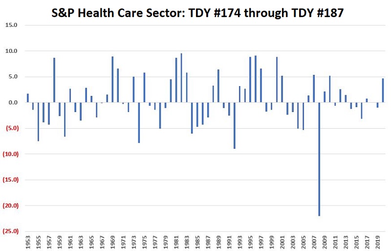
Things to note:
- # of times UP = 32
- # of times DOWN = 36
- Average UP % = +4.7%
- Average DOWN % = (-3.6%)
In essence, the question of "UP" or "DOWN" within the time period in question is essentially a coin flip (up 47% of the time, down 53% of the time).
The chart below displays the cumulative % return for the S&P 500 Health Care sector ONLY from TDY #174 through TDY #187 every year since 1953.
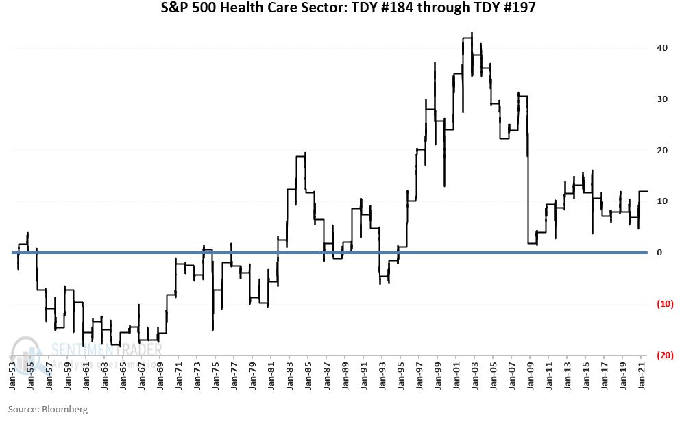
Things to note:
- The total cumulative % return since 1953 has been +11.9%
- The total cumulative % return since 1983 has been (-0.4%)
SUMMARY
The real question is not one of "market timing" or trying to gauge whether health care will perform well during our period in question "this time around."
The real question is, "is this sector worthy of allocating your capital to in the days and weeks directly ahead?
Let's talk real-world trading. If:
- You have long-term holdings in health care, and/or if you would incur large tax liabilities by selling, maybe you hold on and hope for the best
- You are looking for short-term trading opportunities; you look somewhere else for the time being