
TradingEdge for Jan 28 - More stocks cut in half, a jump in new lows, sentiment getting pessimistic

Key points:
- There was another jump in the number of stocks cut in half from their highs, especially in Health Care
- The percentage of Nasdaq stocks falling to 52-week lows is nearing a historic level
- New lows are high among high-yield bonds and rising within the S&P 500
- The poor action has caused individual investors to retreat
- That has helped trigger a pessimistic extreme in Dumb Money Confidence
- But the market environment is poor, and the Treasury Bear Flattener is not helping
So many stocks getting cut in half
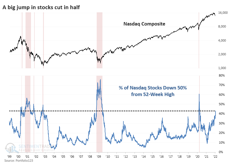
A few weeks ago, we looked at the number of stocks cut in half. It's only gotten worse.
Last Friday, 42% of stocks on the Nasdaq were down by half. That's on par with the very worst markets of the past 20 years (it has since risen to more than 44%). Since the 2008 financial crisis, only 20 days from March 12, 2020, through April 16, 2020, saw more stocks down by 50% or more from their highs.
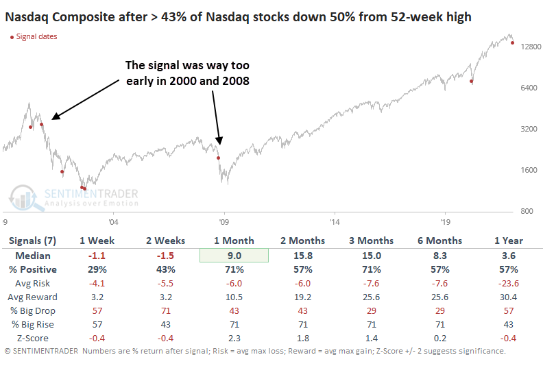
Focusing just on the first day when more than this many stocks dropped by 50%, we can see the two biggest failures. This kind of behavior triggered relatively early in the 2000 and 2008 bear markets. After the others, it wasn't even that great of a "this is the bottom" signal.
As we discussed a few weeks ago, there isn't wholesale selling pressure, at least not on the scale of the big bear market bottoms. Even after last week's carnage, "only" 70% of Nasdaq stocks are down 20%. Other bottoms saw this reach 80% - 95% of stocks.
While people tend to think that Nasdaq = Technology, that's not really the case. A broad universe of Technology stocks has been hit, no doubt about it, with 55% of them down by half. During the last two great bear markets, that figure exceeded 80%.
Selling in Health Care stocks, however, has been merciless. More than 70% of them have been knee-capped, exceeding the pandemic carnage. Only a handful of days in 2008-09 saw more Healthcare stocks down by half.
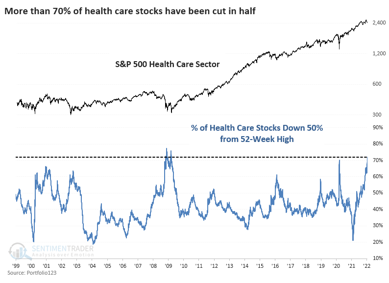
After the 50 days when more than 70% of Healthcare stocks got cut in half, the S&P 500 Healthcare Sector total return was quite positive, though one had to endure some short-term pain to get there. A year later, the sector showed an average return of nearly 28%.
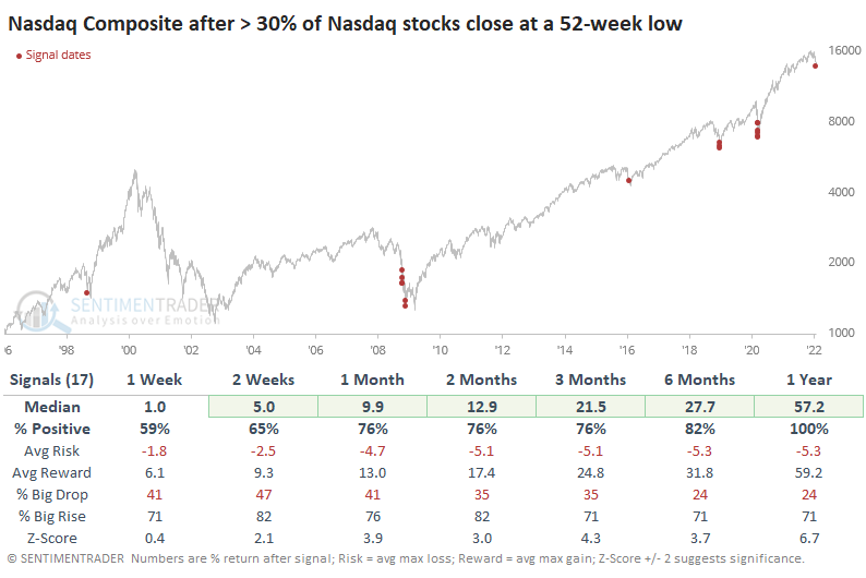
The losses caused a surge in 52-week lows and a jump in hedging activity
Despite Monday's reversal, many more stocks on the Nasdaq exchange touched a 52-week low during the day. Updating the chart from yesterday's note, now 30% of stocks on the exchange have plunged to that extreme on the same day. That's the 18th-highest figure since 1996.
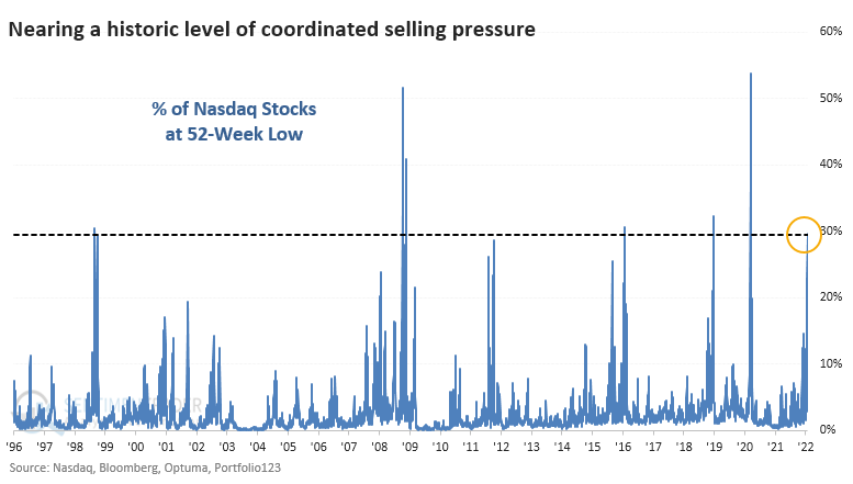
Even though this was exceeded before the final plunges in 2008 and 2020, the Nasdaq Composite's forward returns were impressive. Over the next year, the Nasdaq showed a gain all 17 times, sporting a massive median return of +57.2%.
Heading into the weekend, there had never been more put options traded on U.S. exchanges. We prefer to focus on weekly data that more clearly shows who is doing what. On both the bullish and bearish sides, we've found the most value in watching opening transactions among the smallest of traders.
Last week, they spent 27% of their volume purchasing put options to open (meaning not closing out a previous trade). That's one of the highest readings in the past 20 years. The Backtest Engine shows that high levels of put buying tended to lead to positive returns in the S&P 500 over the next 2-to 3 months.
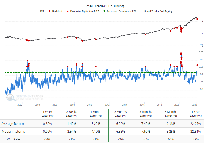
We're at a highly tricky juncture. The market environment has turned unhealthy, but there are signs of widespread pessimism and pockets of outright panic. We're quickly seeing more signs that the risk/reward skew over a 3-12 month time frame is turning positive. Still, again, the most significant risk is that the environment is now negative, and in those cases, sentiment can become much more pessimistic for much longer.
New lows jumped among junk bonds, too
Jay showed another view of a surge in new lows, this time among high-yield bonds.
This indicator shows the net number of high-yield bonds that set a 52-week high minus those that set a 52-week low on the day. The chart below displays the S&P 500, and the red dots highlight those days when the High Yield NH - NL indicator read -500 or lower.
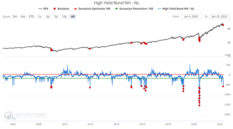
Note the high Win Rate for all periods from 1-month to 12-months. Also, note the robust returns for three months to 12 months.
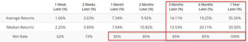
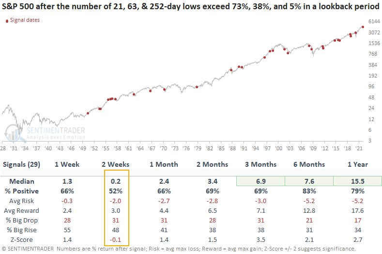
Lows are even increasing among blue-chip S&P 500 stocks
Dean looked at the percentage of S&P 500 members setting new lows across 3 time frames.
He assessed the outlook for the S&P 500 when the percentage of 21, 63 & 252-day lows exceeded 73%, 38%, and 5% within the past week, then tallied the total number of days that met the criteria.
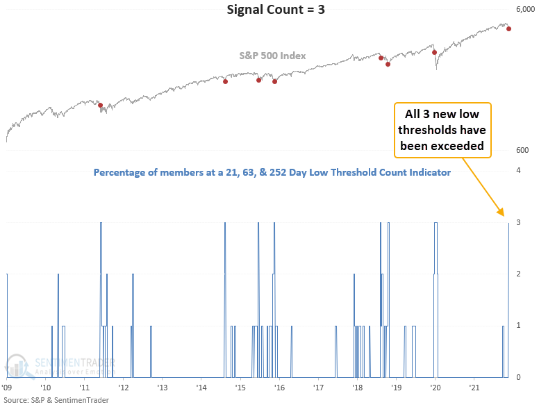
When we exclude the volatile 1929-49 period, results look good across the board except for the 2-week window. We need to be mindful that the market might not respond to the spike in new lows in the near term. And we should also be aware of potential failures like 2011, 2018, and 2020.
This is just like 1998 (kind of)
Trading activity over the past week has the feel of 1998 when stocks suffered a mini-crash. The Russian connection from then (they devalued the ruble) and now is coincidental. It's more that the price moves have a similar feel. The charts are relatively similar, at least in that the Nasdaq went up, then down quickly.
We've learned over and over again over the years that memories and eyeballs can be deceiving. Just because the price action feels similar doesn't mean it necessarily was.
When we use our objective analog calculations to search for the highest-correlated periods since the Composite's inception in 1971, the year 1998 doesn't show up on the radar. It was close but didn't make the cut of highest-correlated 6-month analogs.
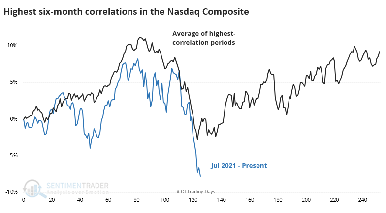
We're less interested in charts that happen to look alike and more interested in what they indicated for future performance. In that sense, it was mostly positive...except when it wasn't, and the Nasdaq crashed harder.
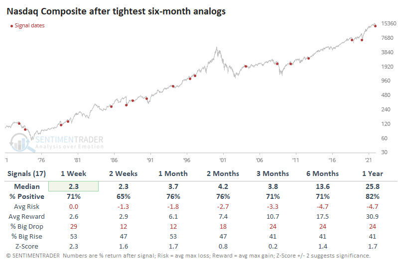
Similar price behavior happened right before the Nasdaq lost another 10% or more within the next 3 months in 1973, 1990, 2008, and 2018. Those were the outliers, though, as the more common outcome was a lasting rebound.
Bad markets are weighing on individual investors
The AAII sentiment survey can be used as a contrary indicator to identify an environment where sentiment has become too pessimistic on the future direction of stocks. When opinions become too bearish, stocks tend to rally.
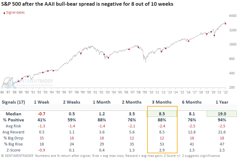
Dean showed a bull-bear spread trading model that identifies when bears have been greater than bulls for 8 out of 10 weeks.
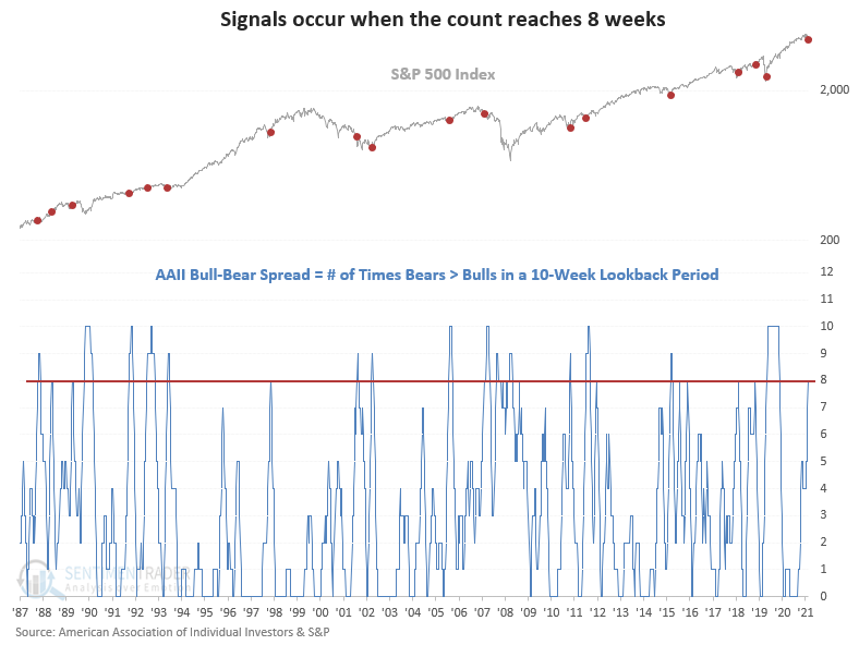
This signal has triggered 17 other times over the past 34 years. After the others, S&P 500 future returns and win rates were solid across almost all time frames, especially the 3-month window. A year later, stocks were higher 94% of the time.
Other sentiment metrics are showing pessimism, too
Jay noted that "Dumb Money" traders have proven themselves to be bad at market timing over history. They get bullish after a market rally and bearish after a market fall. By the time most of them catch on to a trend, it's too late - the trend is about to reverse. They are usually correct during the meat of the trend but wrong at the extremes.
The chart below displays all days when Dumb Money Confidence showed a reading of 0.21 or less, which it reached this week.
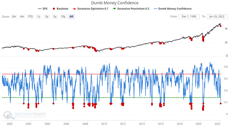
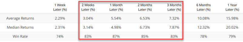
The Win Rates for two weeks to 3 months in the table above are impressive. Still, with the character of the market seemingly in a state of change - and with more significant concern about a potential bear market - it can be helpful to look at action during previous bear markets.
During those stretches, any rallies that may follow a Dumb Money Confidence signal tended to be short-lived (i.e., two weeks to three months).
Treasury Bear Flattener
The move in 2-year Treasury notes after the FOMC meeting on Wednesday seemed to significantly dampen investor sentiment in equities. Yields have skyrocketed, especially on the short end of maturities, and especially especially on Wednesday, with the biggest jump in 2-year yields in almost a year.
The fact that 2-year yields rose more than 10-year yields means that the yield curve got flatter. When a flattening occurs because the yield short-term maturities rises faster than longer-term maturities, it's considered to be a Bear Flattener. This is usually taken as a negative for stock investors because it means money is getting more expensive for consumers and businesses, and the Federal Reserve may be on the cusp of making it even more expensive, potentially triggering a recession.
Since late October, 2-year yields have jumped 71 basis points while 10-year yields have risen 24 basis points. Since both are positive, and 2-year yields rose more than 10-year yields, it's in the Bear Flattener regime. This has been the most common regime, occurring on 31% of the days since 1976.
The chart below shows the growth of $10,000 (using next-day returns) based on which regime the Treasury curve was indicating at the close of each trading day. Since 1976, the worst regime has been a Bear Flattener, which unfortunately is where we find ourselves now. Like we saw with the McClellan Summation Index when it's below zero and declining, this kind of regime has resulted in almost no gains over nearly 50 years. Over the past 20 years, it has preceded a net loss.
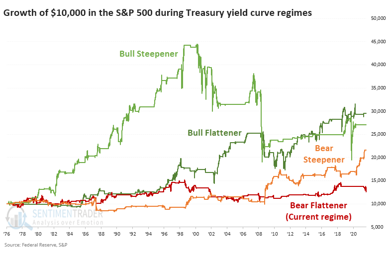
Sector and factor performance showed that Discretionary and Growth stocks suffered among the worst returns, with Technology not far behind. Among the winners, Real Estate, Financials, and Value stocks stood out the most.
Keeping an eye on crude
Jay highlighted some reasons why it pays to keep an eye on crude oil. It has staged a terrific rally since the April 2020 low and conventional wisdom seems to argue that the price will continue to march higher. However, our Optimism Index is signaling a reversal from an extreme reading, crude oil futures term structure has reached an unfavorable level, and Energy stocks have gotten overbought.
Taken together, they suggest that the oil market may soon become a much more volatile affair and less of a one-way street.
The term structure of crude oil futures shows the relationship of the near-term futures contract to a further-out contract. If it is above 1.0, the near-term contract is priced higher than the further-out contract, called backwardation. If it is below 1.0, the near-term contract is priced lower than the further-out contract.
The chart below displays those times when the crude oil terms structure rose above 1.05 for the first time in 21 days. You can run this test in the Backtest Engine.
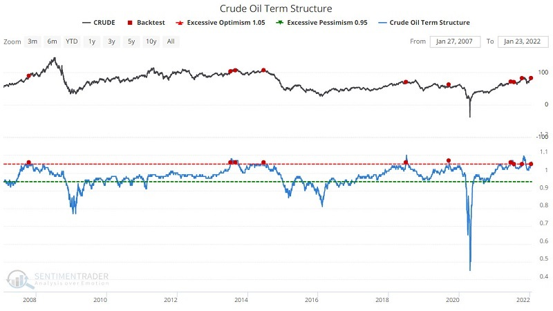
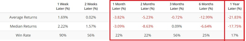
The table below displays the summary of crude oil performance following previous signals. Crude tended to show weakness 1, 2, 6, and 12 months after previous signals.
About the Weekly Wrap...
The goal of the Weekly Wrap is to summarize our recent research. Some of it includes premium content (underlined links), but we're highlighting the key focus of the research for all. Sometimes there is a lot to digest, with this summary meant to highlight the highest conviction ideas we discussed. Tags will show any symbols and time frames related to the research.